
BACKGROUND
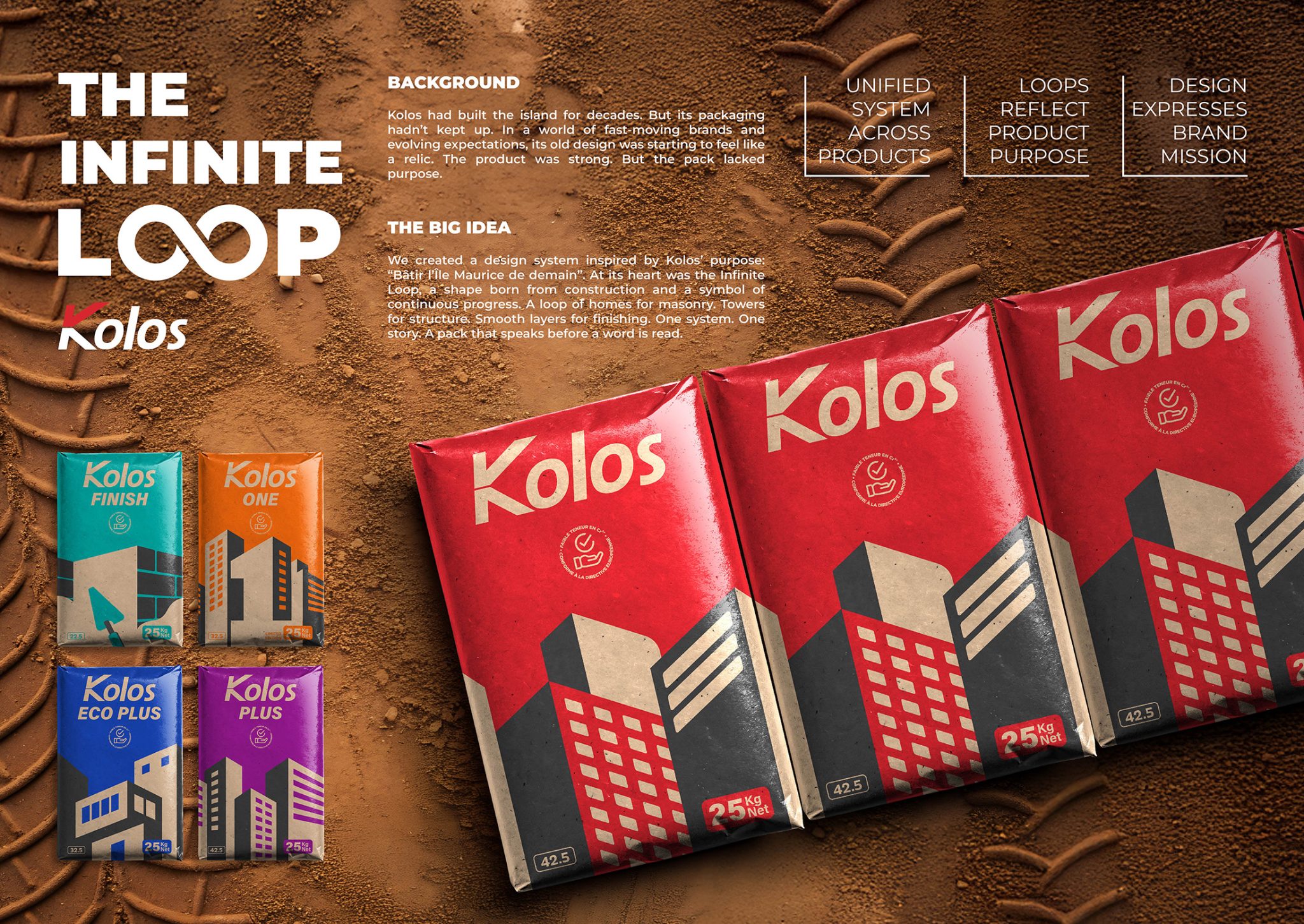
For decades, Kolos has stood as the backbone of Mauritian construction, quite literally shaping the island block by block. From modest homes to towering developments, the brand has earned the trust of generations of builders. But while the product remained reliable and respected, its packaging hadn’t kept pace. In an era of fast-evolving brands and rising expectations, Kolos’ old design began to feel out of step—functional, but forgettable. It lacked clarity, emotion, and a sense of purpose that modern consumers now seek. The brand needed a transformation, not just to look better, but to mean more.
THE BIG IDEA
We set out to create a design system that could visually embody Kolos’ long-standing commitment to progress. Rooted in its core mission, Bâtir l’Île Maurice de demain (Building the Mauritius of tomorrow), the new identity draws inspiration from the act of construction itself. At its heart lies the Infinite Loop, a conceptual design thread that runs across the entire range, symbolizing continuity, evolution, and national development.
This loop is not a literal icon; it is a graphic storytelling device. Each Kolos product line is now distinguished by its own “loop,” tailored to reflect its specific role in the building process: masonry, structure, finishing, and specialty use. From the sturdiness of Kolos Plus to the finesse of Kolos Finish, each pack plays a unique part, yet contributes to one collective vision. It is a single story, told in multiple forms.
DESIGN SOLUTION
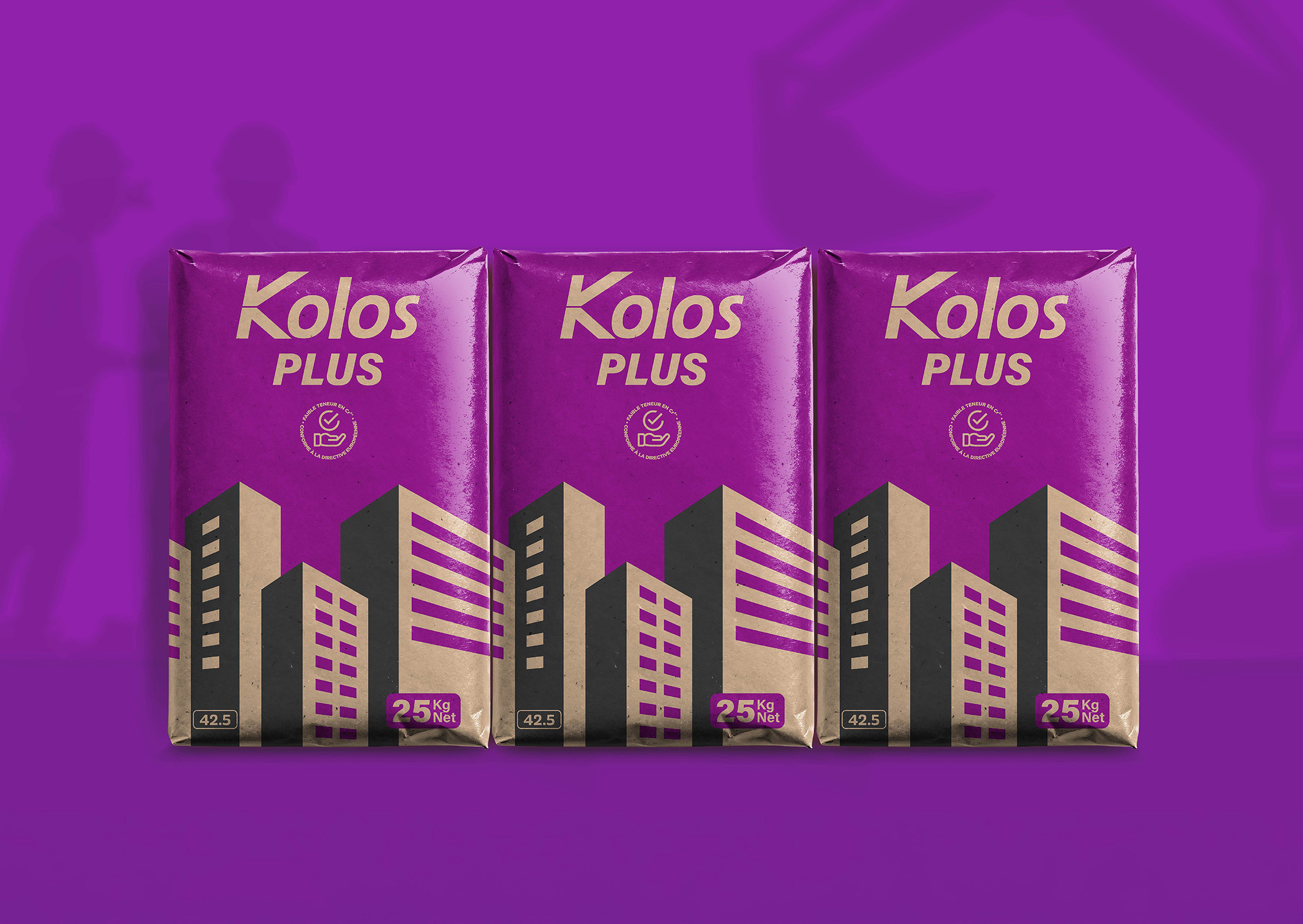
The redesigned Kolos packaging is bold, modern, and unapologetically purpose-led. Each SKU features a striking architectural motif, from stylized facades to skyline silhouettes, grounded in modular geometry and minimalist iconography. These graphic forms are set against raw kraft backgrounds, allowing color to do the heavy lifting:
- Red for strength (Kolos)
- Purple for performance (Kolos Plus)
- Blue for sustainability (Eco Plus)
- Turquoise for precision (Finish)
- Orange for excellence (Kolos One)
This powerful color-blocking not only reinforces shelf differentiation but also reflects the emotional and functional promise of each product. Paired with strong typography, high-contrast detailing, and clearly marked cement grades, the result is a design language that is both practical on site and expressive on shelf.
Most importantly, the system is unified yet flexible—each pack is distinct in purpose, yet unmistakably Kolos. It delivers immediate recognition, improved navigation, and a strong visual metaphor for the brand’s national role.
IMPACT
The new Kolos design does not just modernize the brand. It gives it meaning. It builds emotional connection, reaffirms functional trust, and helps Kolos claim its rightful space—not just as a cement manufacturer, but as a builder of Mauritius’ future.



 Derrick Lin
 43oz
43oz vitoramockup
 Oksana
 KOS
KOS Hui Hua
 Rana Elkady
 Modern Theory
 Eclectic M
 Katya Slobodskaia
 Evgenia Beresneva
 CreativeWise
 宏洛图品牌设计HONGLT
 erandy
 Abbas Sayyed
 Ollie
Ollie Moço Wine Branding
 khadijaaljifri
 Abdulrahman Taha
 Juana Sarabia
 Mohammed Nasr Sharfi