

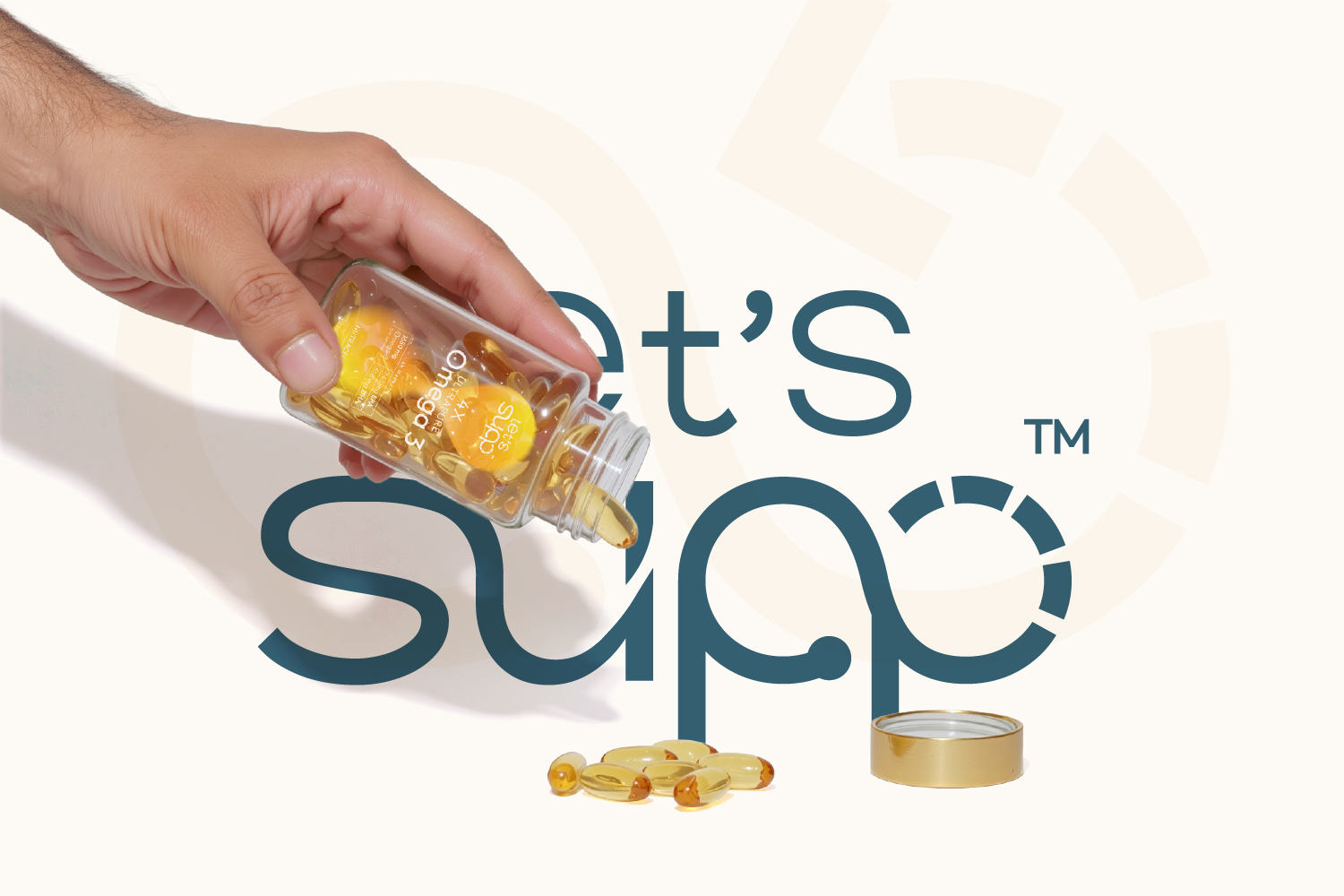
Let’s Supp is a nutraceutical brand built around the belief that wellness should feel simple, joyful, and consistent.
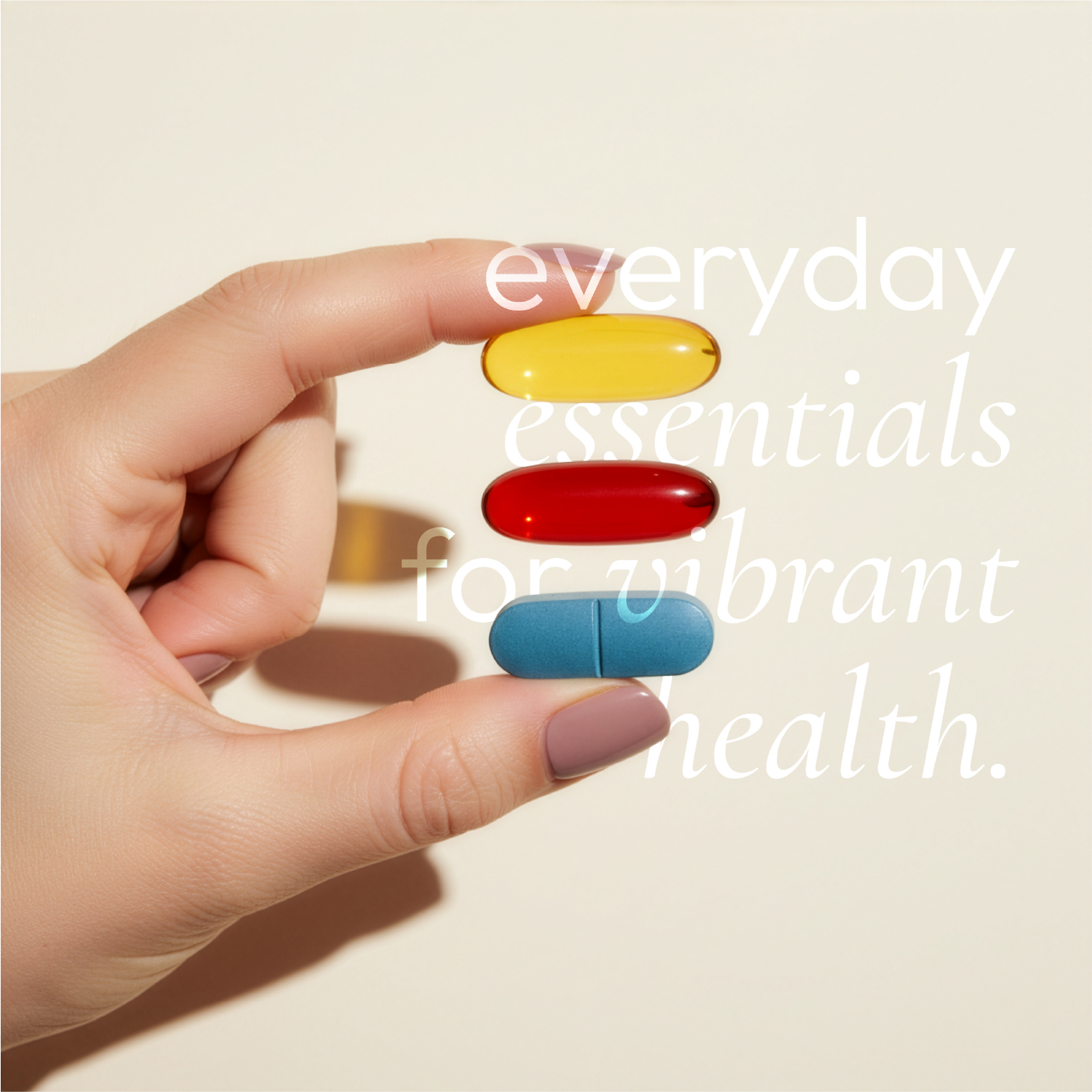
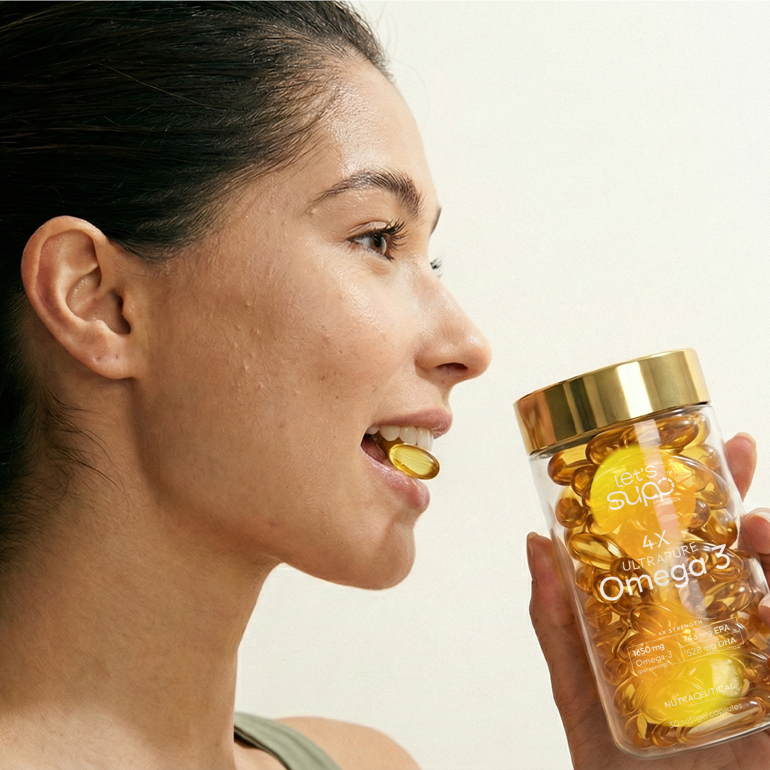
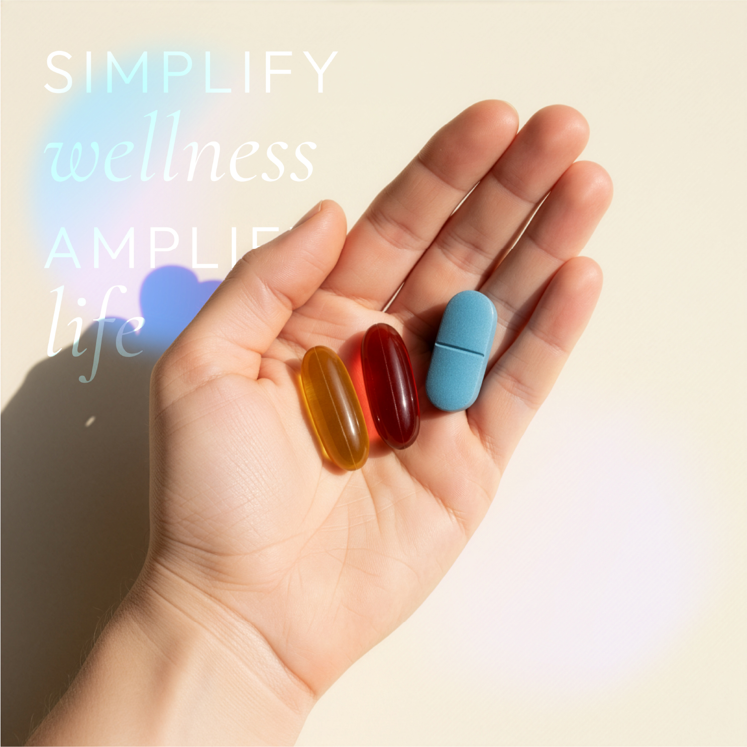
The product focuses on health supplements positioned not as complex performance solutions, but as part of a daily wellness routine.
The core challenge came from the nutraceutical category itself. It is dominated by complex scientific information, exaggerated claims, and visually overwhelming packaging. This creates friction for consumers, making it difficult to understand products and build long-term trust.
The objective was to create a brand and packaging system that stands apart through clarity, continuity, and calm confidence rather than adding more noise.
CONCEPT
The concept is built on a simple insight: wellness is not defined by intensity, but by consistency and repetition in everyday life.
This led to positioning supplementation as a daily ritual, not a performance-driven act.
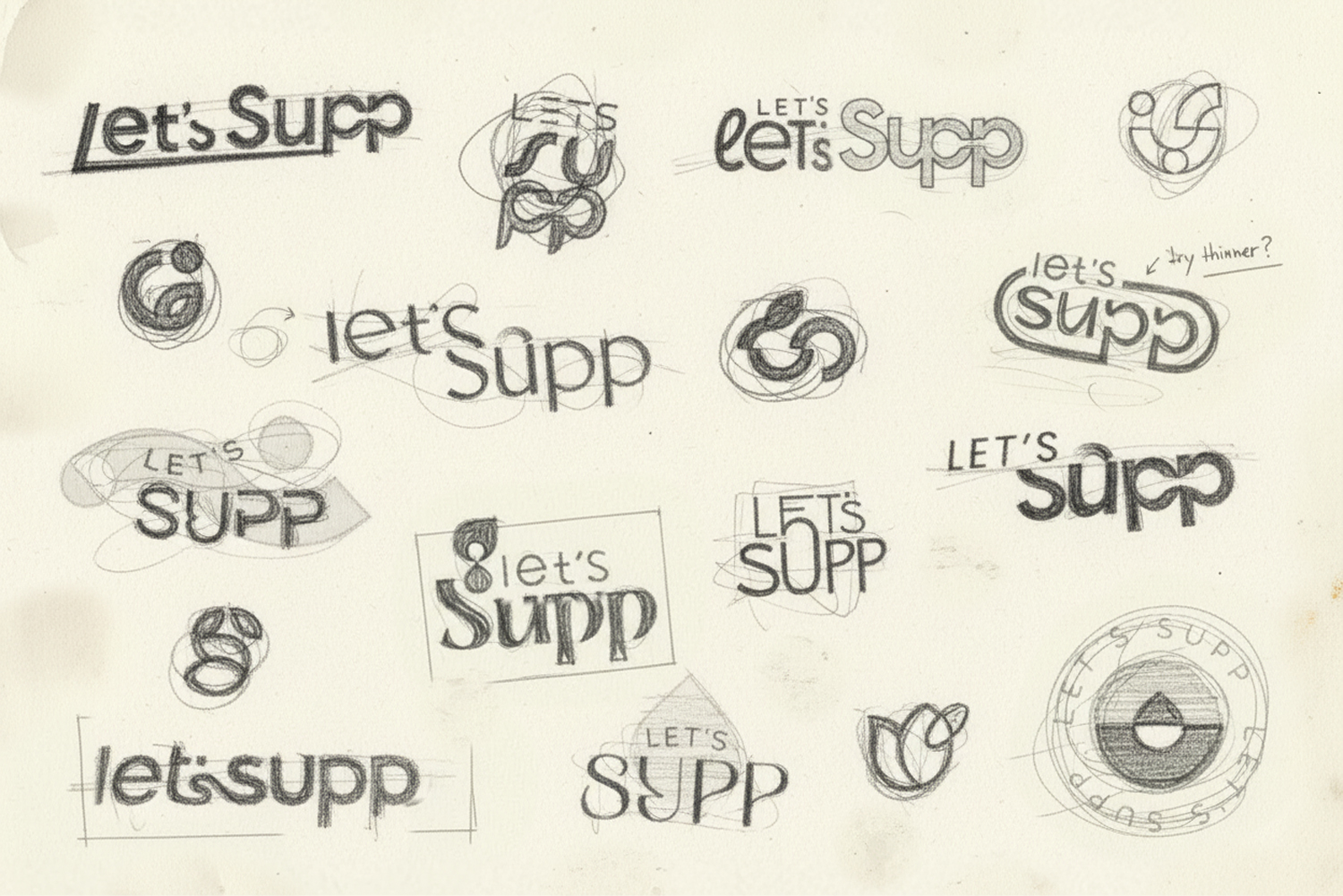
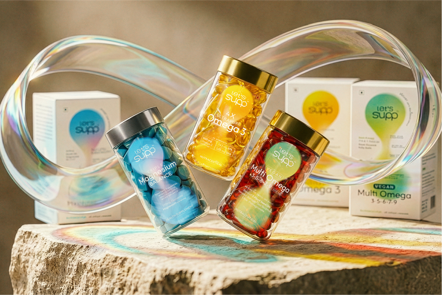
To express this idea, the brand is built around the principle of continuity, represented visually through an infinity structure. This symbolizes uninterrupted nourishment, repetition, and sustained wellbeing.
SOLUTION
The solution was a complete identity and packaging system designed to simplify decision-making and reduce cognitive load.
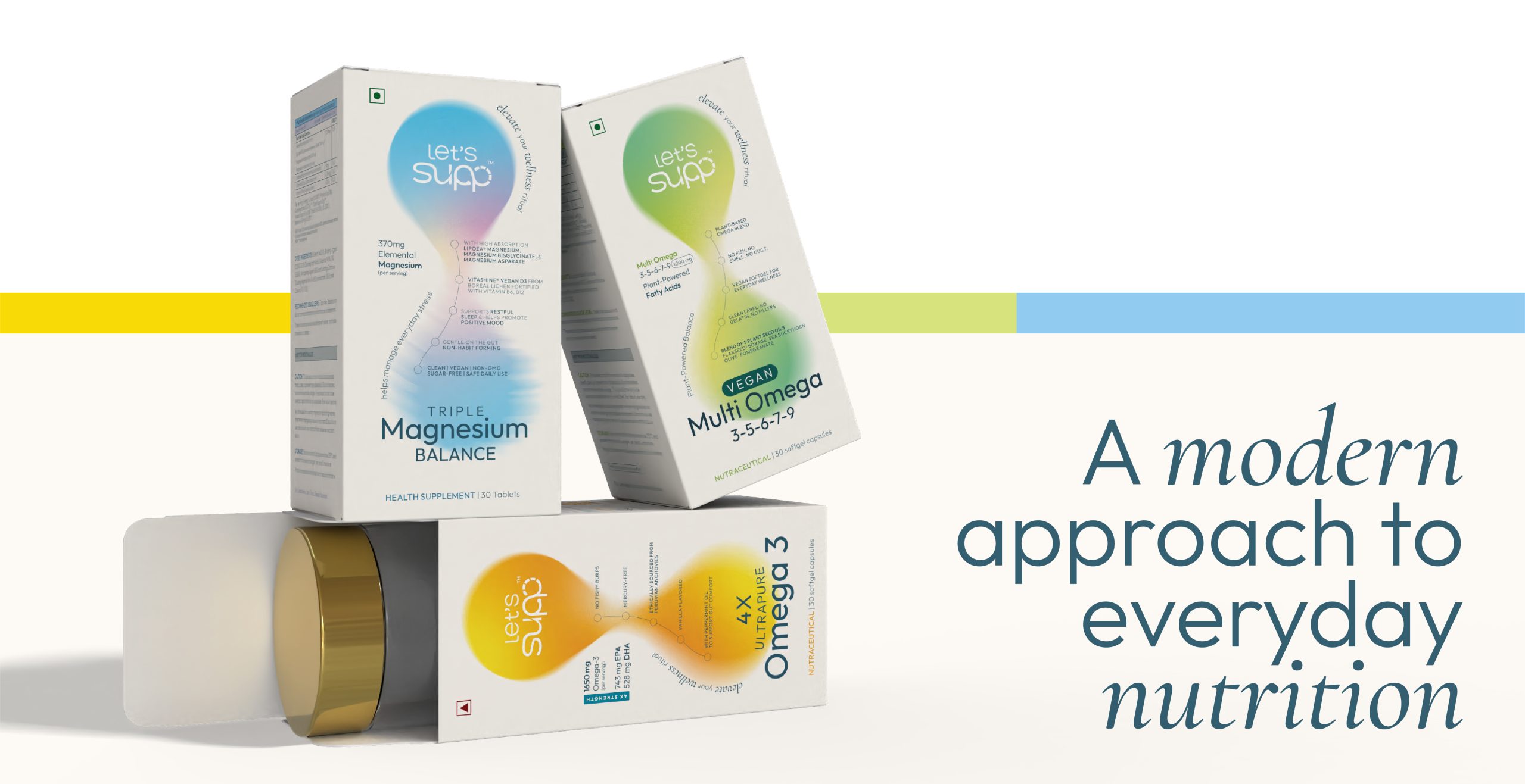
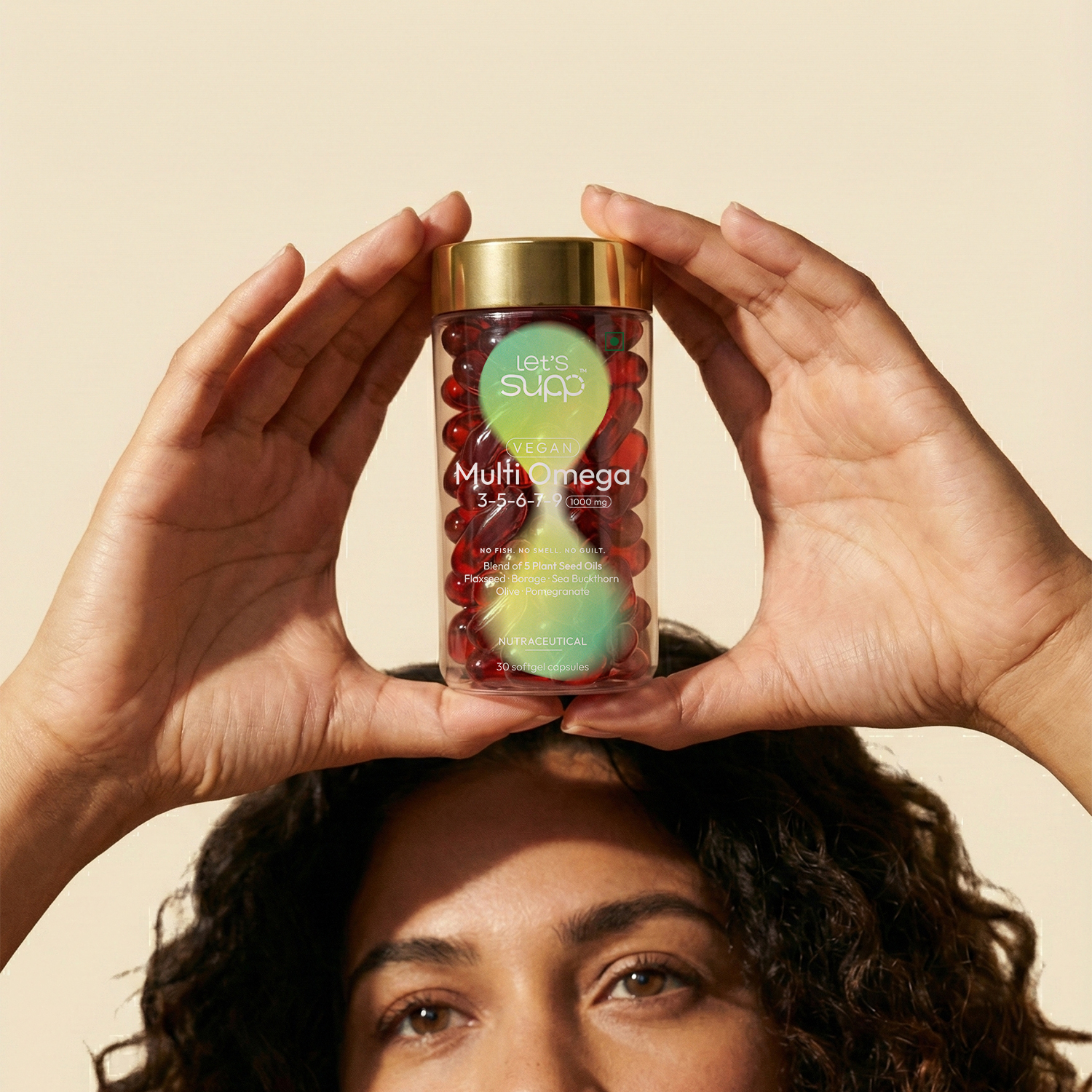
A structured information hierarchy allows users to quickly understand the product without confusion. The design removes unnecessary visual clutter and focuses on clarity and ease of navigation.
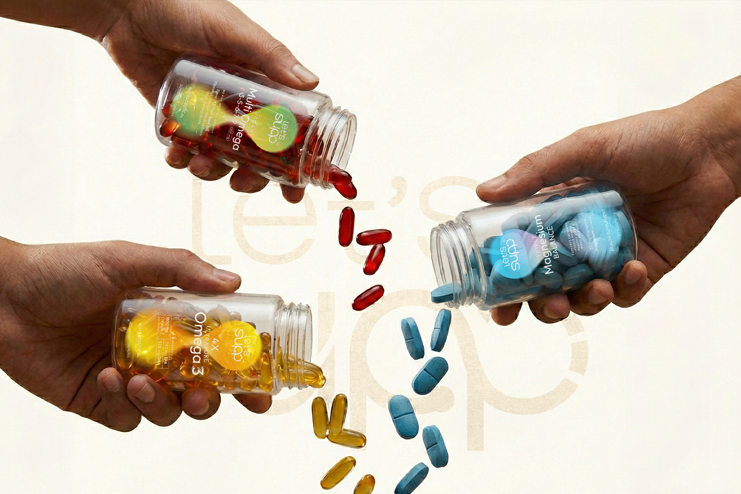
The system is consistent across all touchpoints, ensuring that the brand feels unified, intentional, and easy to recognise.
TECHNIQUE
The packaging design is governed by a system-based approach rather than isolated visuals.
- The infinity principle is embedded into the logo and visual structure
- It defines layout behaviour, information hierarchy, and overall composition
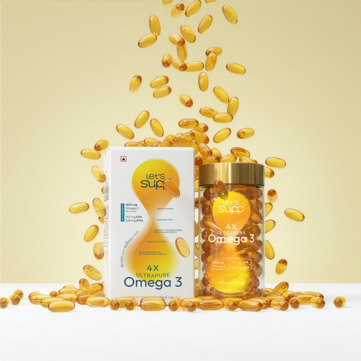
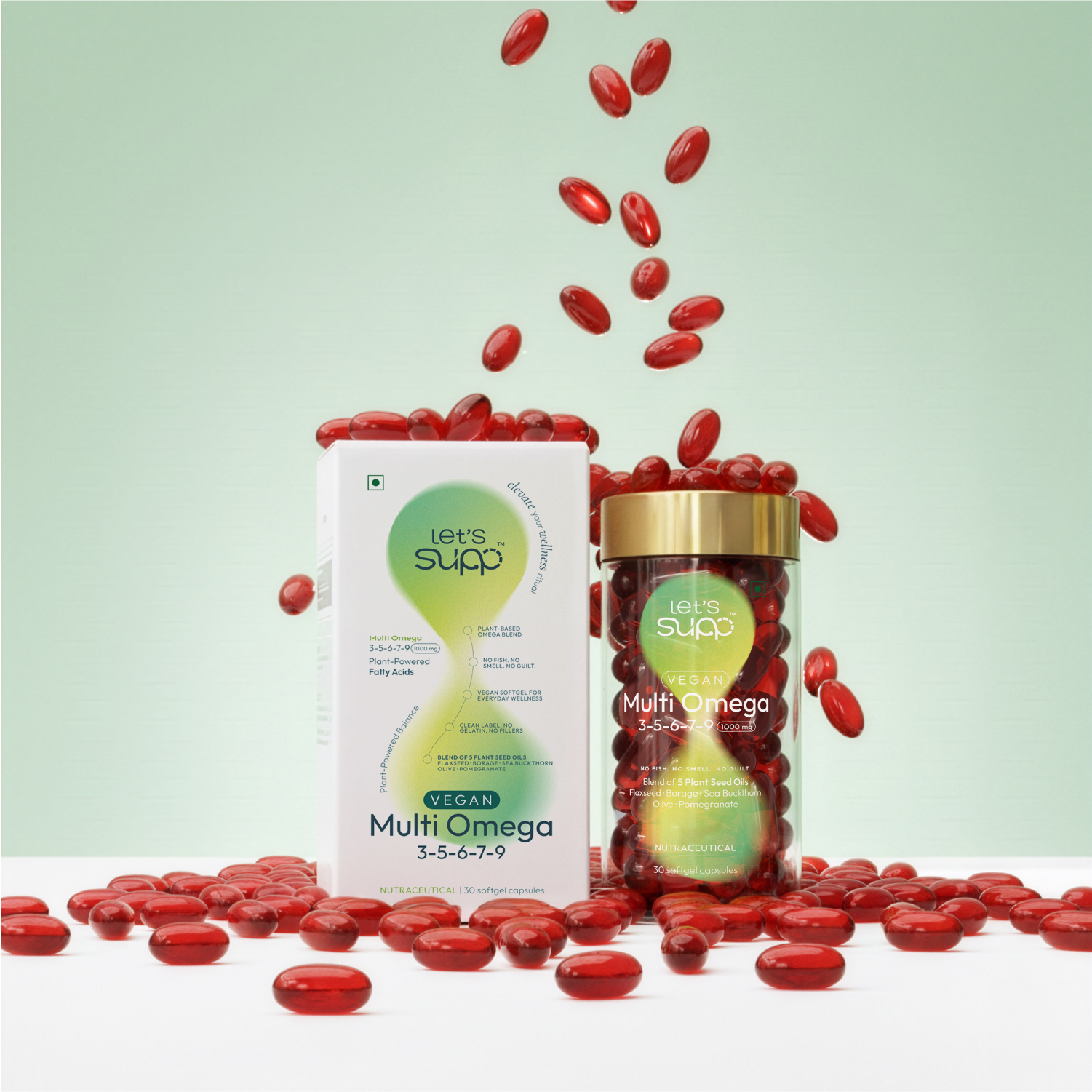
- Colour is used as a navigational tool to differentiate product categories while maintaining unity
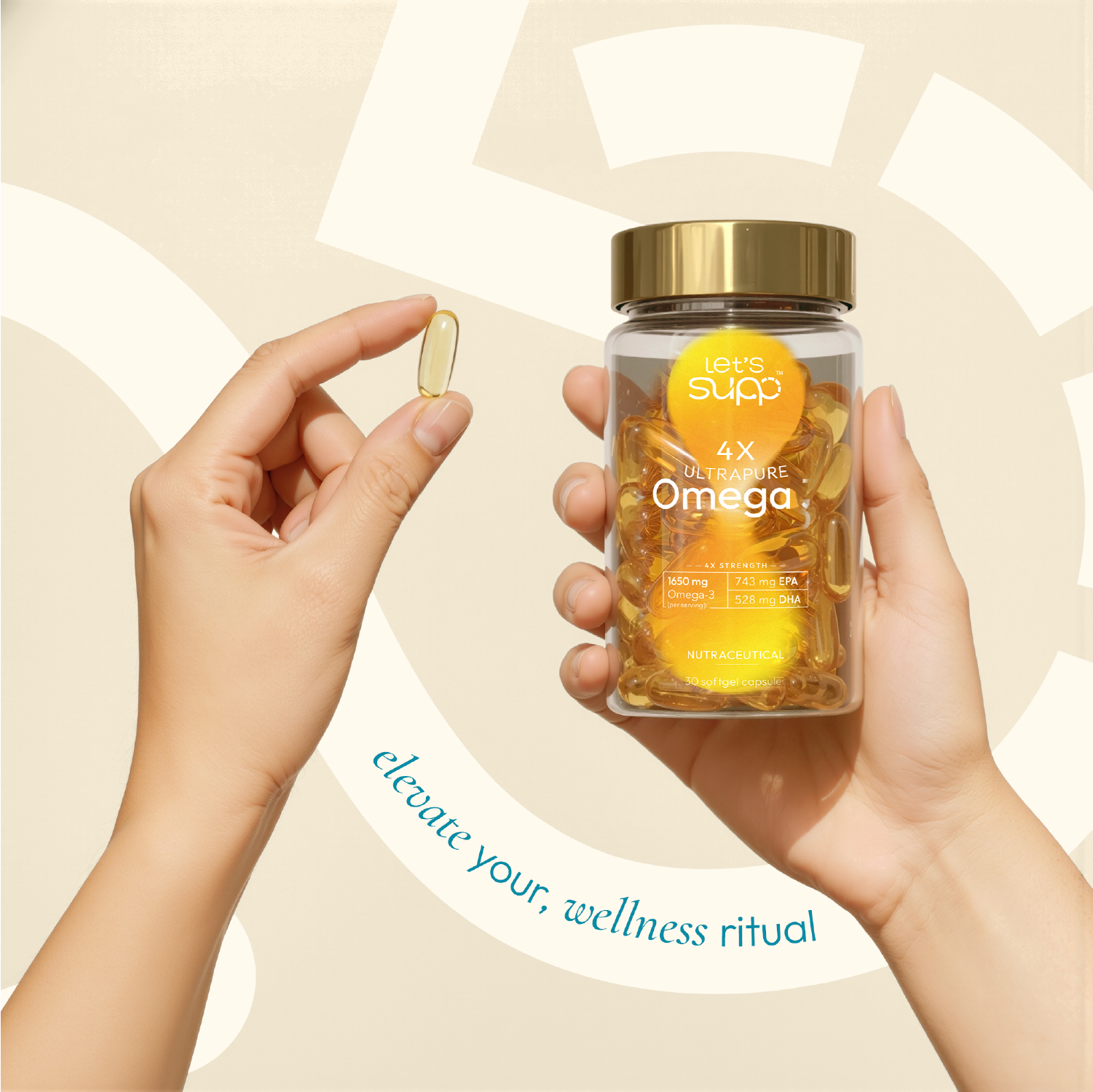
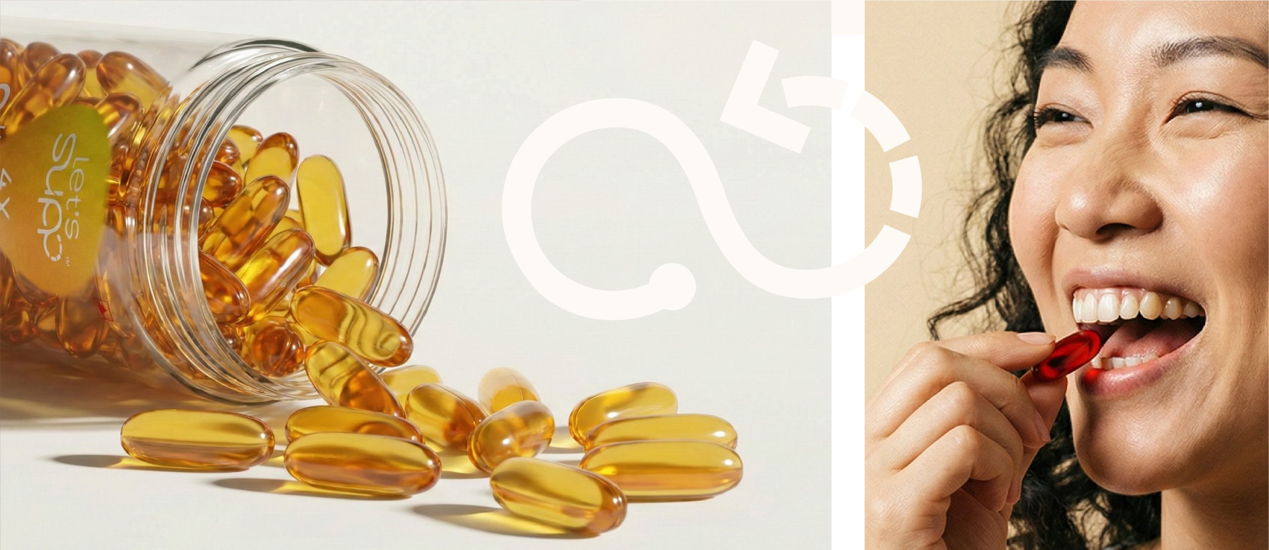
- The infinity form appears as an abstract flowing element across packaging
- Transparent containers are used to reinforce honesty and purity
This creates a cohesive and scalable identity system where every element is interconnected.
WHAT MAKES IT UNIQUE
The uniqueness lies in turning a visual idea into a structural system.
Continuity is not used as decoration. It becomes the foundation that governs logo design, layout, colour, and packaging behaviour.
Unlike typical supplement packaging that relies on heavy information and aggressive communication, this system focuses on calmness, clarity, and intuitive understanding.
It repositions supplements from something complex and clinical into something simple and repeatable in everyday life.
RESULT
The outcome is a packaging and brand system that makes supplementation feel effortless and accessible.
The design achieves:
- Clear differentiation in a saturated nutraceutical market
- Strong shelf presence through simplicity and structure
- Improved product understanding through intuitive hierarchy
- A cohesive identity that builds recognition and trust over time
Ultimately, the project transforms the product from a one-time purchase into a daily ritual that users return to.






 Derrick Lin
 VincoStudio
 lisakaplina
 CreativeWise
 alchimistestudioParis
 Adriana Adamo
 tauqueer
 MAISON D'IDÉE Prague
 Pixels Studio
 Atchayaa
 DESIGN CONCEPTS
 hello ocean
 monther al omari
 the Labelmaker
 alamgirbrands
 kat bres
 Vantablack Studio
 GruppoSaida
 studiorevv
 grafisercreative
 Kate Reichel
 UPRISE