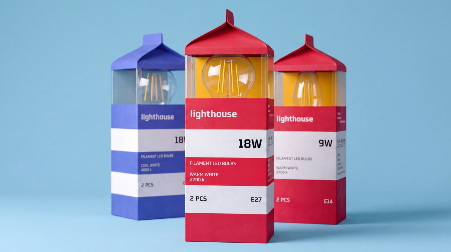

At the heart of the concept is the image of a lighthouse as a guiding point in the dark. Light in a window is a familiar sign that helps you find your way to the place where you are expected. Home. This idea is translated into the very form of the packaging. Its silhouette references the architecture of a lighthouse, while the lamp becomes the main element. It sits inside the package while simultaneously shaping its visual identity.
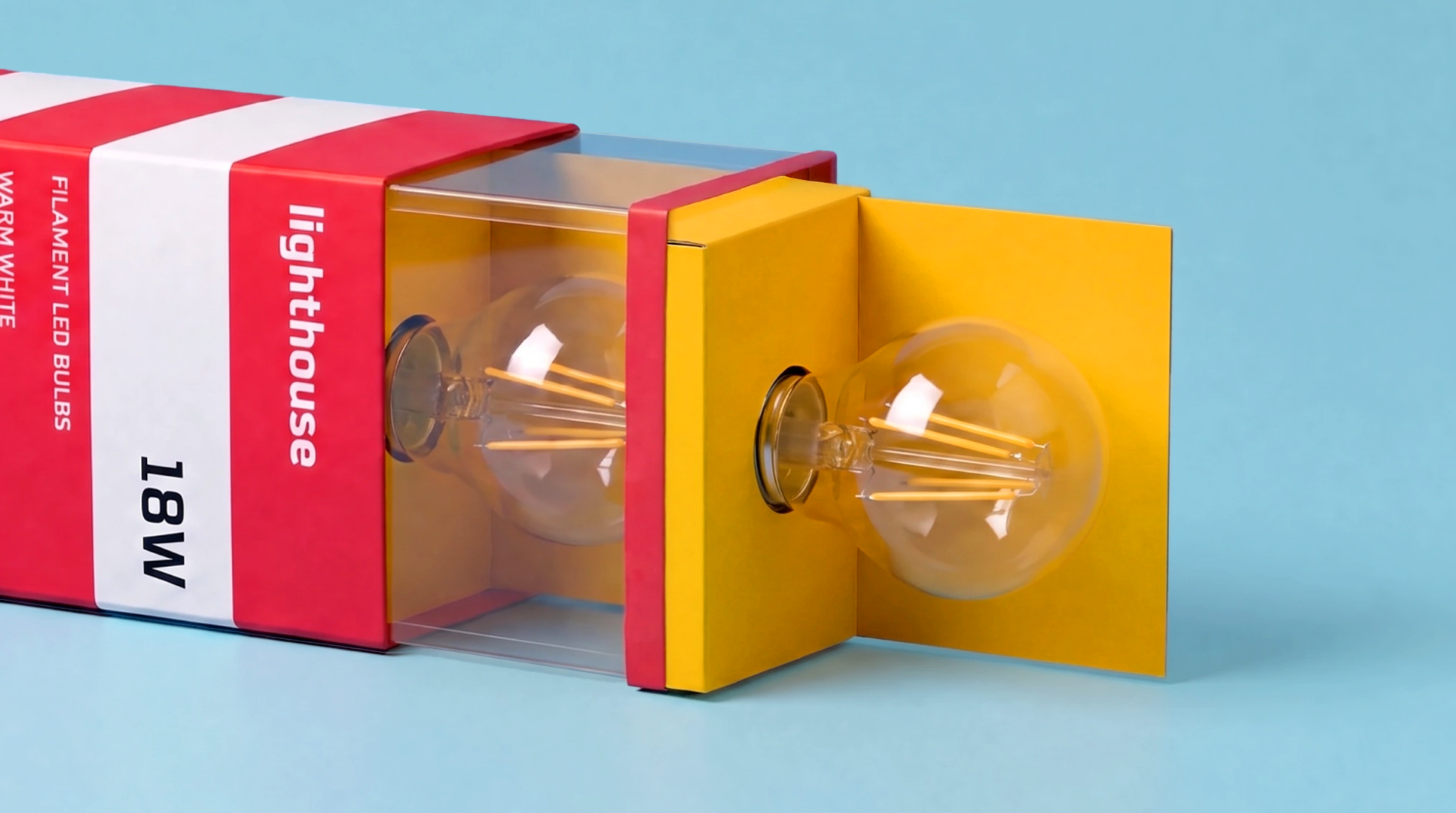
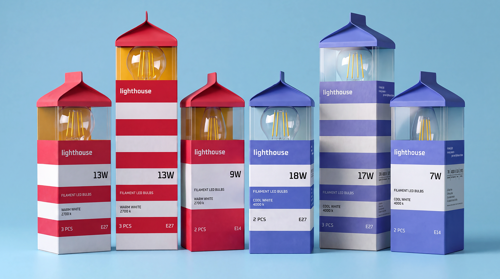
Color becomes a navigation system. Warm light is represented by the red series, while cool light is represented by blue. This logic continues inside the packaging, where the color creates a sense of the corresponding light glow and helps navigate the range at a glance. Patterns and different packaging formats bring different SKUs together into one cohesive system while preserving the series’ recognizability and character.
Lighthouse transforms ordinary lamp packaging into a carrier of an idea. Light is not only there to illuminate a space, it also helps you find your way home.
Curator’s Insight
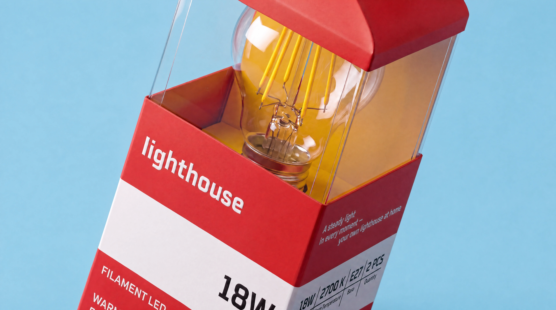
Lamp packaging usually treats its technical data as clutter to be minimised. Here the striping does the opposite. The red and white bands recall a lighthouse tower, but they also work as a filing system, with each band holding one tier of information: brand, wattage, bulb type and colour temperature, then quantity and base. Wattage gets the widest white band and the largest type, so the number a shopper checks first is the easiest to find. The gable-top carton is a familiar everyday format, and the clear window turns the bulb into the lantern room, so the product supplies its own imagery. The yellow interior card makes opening the pack a small reveal. When required information is structured as the pattern itself, it stops competing with the concept.




 Derrick Lin
 salutifg
 ADStudio
 WeAreDepot
 Manuvila
 Yellow Umbrella Creative
 Toka
Toka Studio Zak
 Atiq Alam
 monther al omari
 Modern Theory
 Sirka Agency
 DESIGN CONCEPTS
 Puigdemont Roca
 marianaaworks
 bloomburo
 andreamarinnn
 Alina
Alina Saadmost
 Bruhken
 Maruf Nishat
 Richest Branding Pvt. Ltd.
 Sophiagdotcom
 saifullahmaslool
 Up-Brands