

Project: Loulanxiang / Honeydew Melon Top Packaging
Service: Packaging Design
Channel: Supermarkets
——
Loulanxiang is a professional brand under Fresh Moment, specializing in high-quality honeydew melons. Positioned as a “honeydew melon selector,” its products are priced in the mid-to-high range compared to similar products due to their superior quality. However, the brand has long faced several challenges: 1. High market share, but low brand awareness; 2. Abundant melon product variety, but lack of connection between packaging; 3. High product pricing, but weak expression of perceived value. To address these issues, we used strategy and visual design, focusing on consumer decision-making pain points and retail scenarios, to construct a holistic solution encompassing “trust → choice → memory,” helping Loulanxiang enhance its brand power, fully release the core value of its products, and shorten the consumer decision-making process.
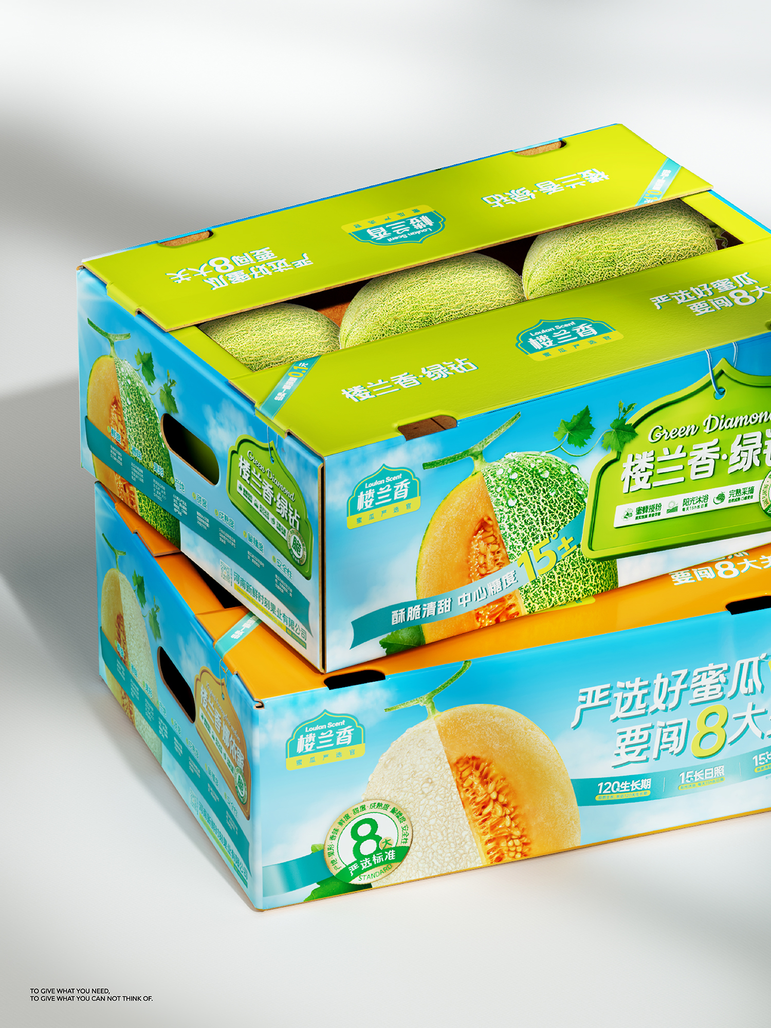
In this project, we targeted mainstream honeydew melon packaging formats: label packaging, cut fruit packaging, and boxed/straw-box packaging. By focusing on the core value “Strictly selected honeydew melons, passing 8 rigorous tests,” we transformed high-standard selection into a clear and intuitive symbol of trust. Based on this, we fully expressed the product’s “freshness” and “quality” characteristics.
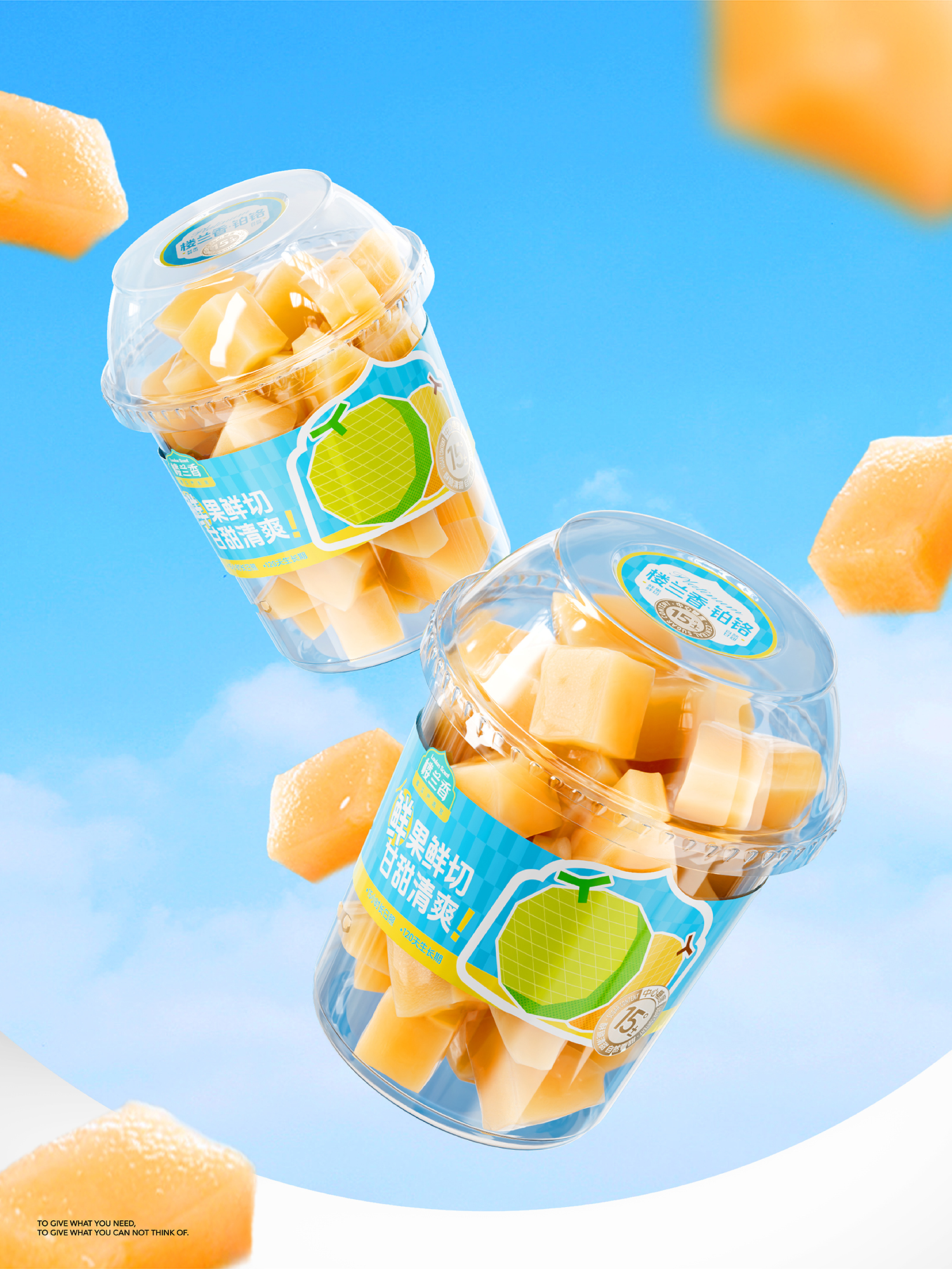
Under the core design philosophy, our first priority was to ensure a clear hierarchy of information on the page: The “brand logo” uses eye-catching fonts and colors to reinforce the “8 key aspects” concept, coupled with crucial planting data, establishing a professional and trustworthy image of rigorous selection before consumers even see the product. For “cut fruit” products, the label focuses on the immediate experience of “freshly cut fruit, sweet and refreshing!” and continues to display the growth days and sugar content, quickly addressing consumers’ core concerns about the freshness and sweetness of pre-cut fruit.
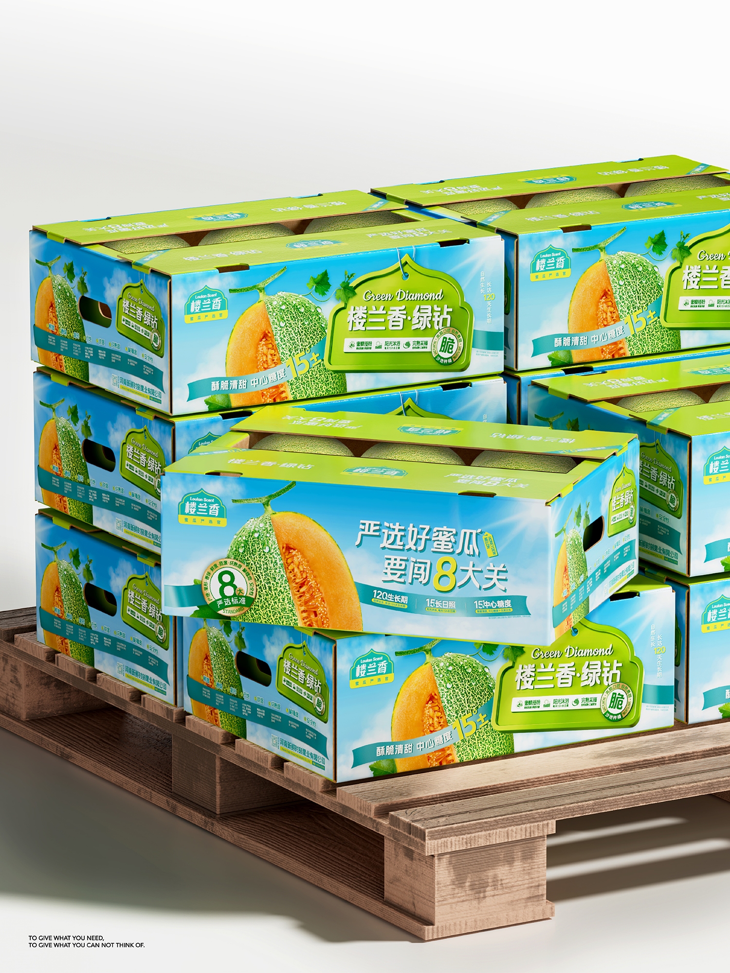
The “boxed/straw box” products are sold as bulk items, using the detail of “fruit flesh + netting” to solve the decision-making difficulty of “how to choose melons,” translating varietal differences into intuitive visual language. Simultaneously, an A/B side design is used, with different sides carrying the product’s core visual symbols. When stacked at the point of sale, the product images create a series of arrays, allowing “Loulanxiang = high-quality melon” to naturally solidify in consumers’ minds, forming a stable and lasting quality association.
The ultimate goal of the entire design is to use a highly unified packaging identification system to guide consumers from purchasing “high-quality melons” to remembering the “Loulan Fragrance” brand, thereby allowing Loulan Fragrance to further accumulate brand assets and deepen its competitive advantage.




 monther al omari
 Ximena Ureta Design Studio.
 vitoramockup
 Up-Brands
 Sophiagdotcom
 Peter said
 ayeidadezigns
 Tancybox
 宏洛图品牌设计HONGLT
 Modern Theory
 Dozen Agency
 Atiq Alam
 Olio Studio
 Ruchi S. Joshi
 mmdesign
 awaiskhadim
 Octasoft
 United Creatives Studio
 Kingdom & Sparrow
 Anastasia Bakhmatskaya
 CreativeWise
 Great and Golden