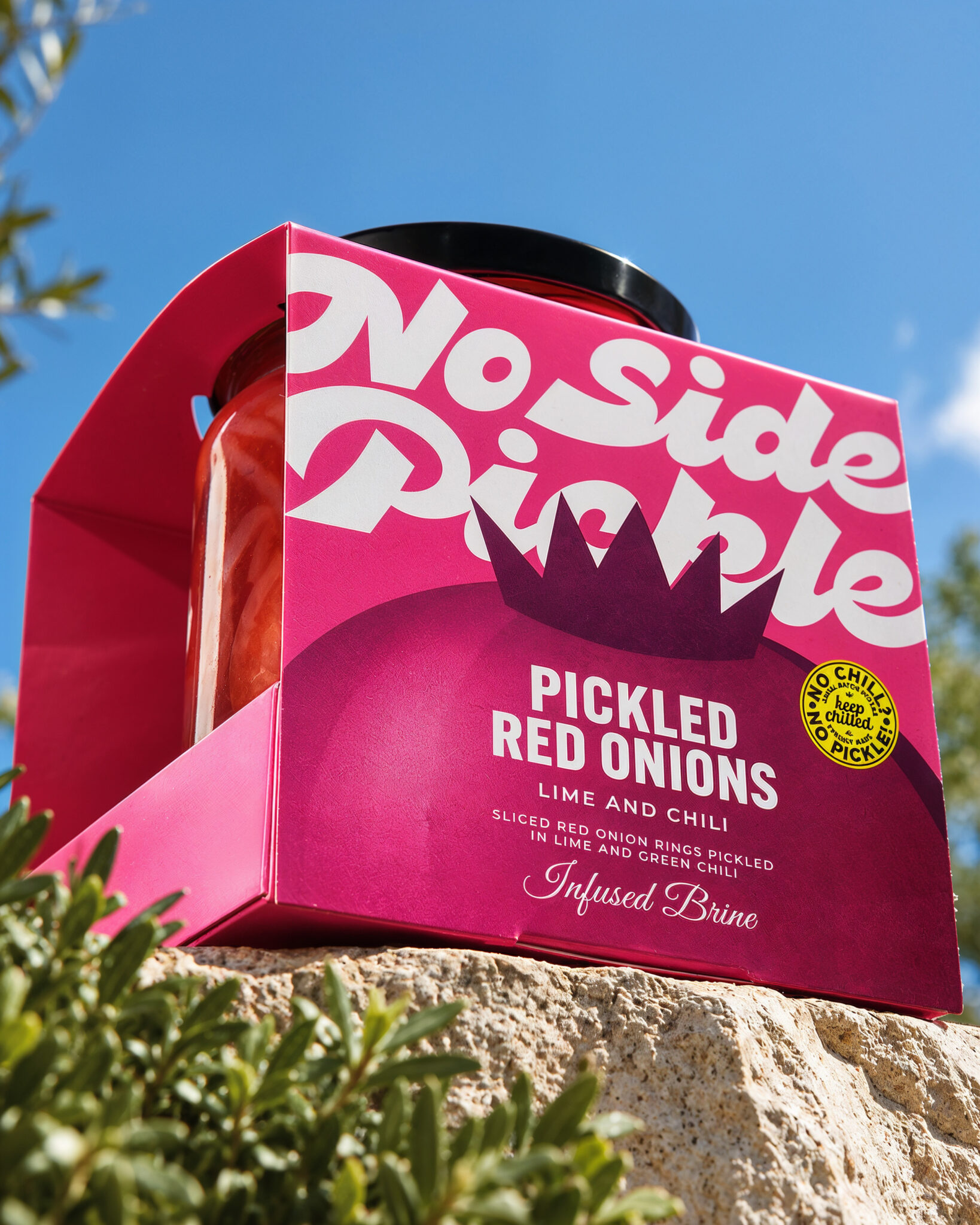

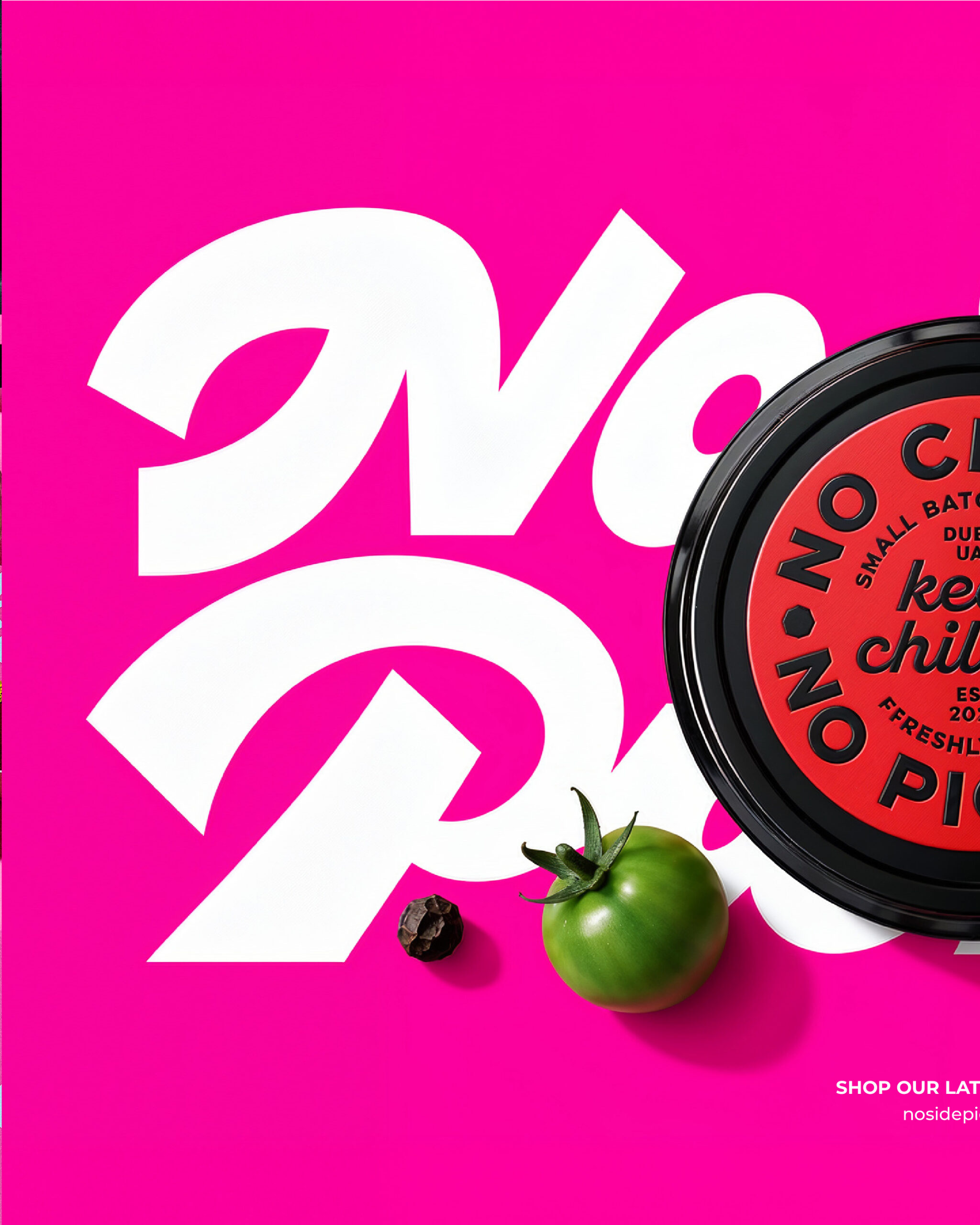
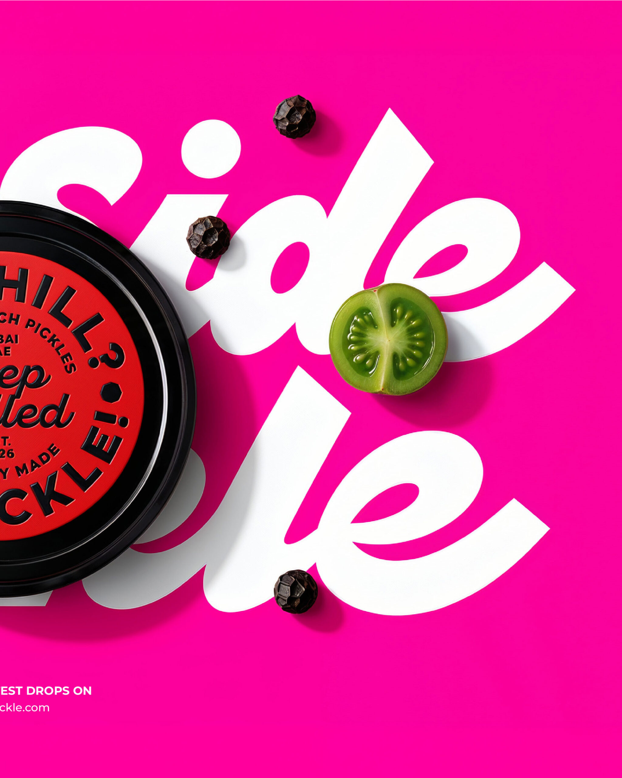
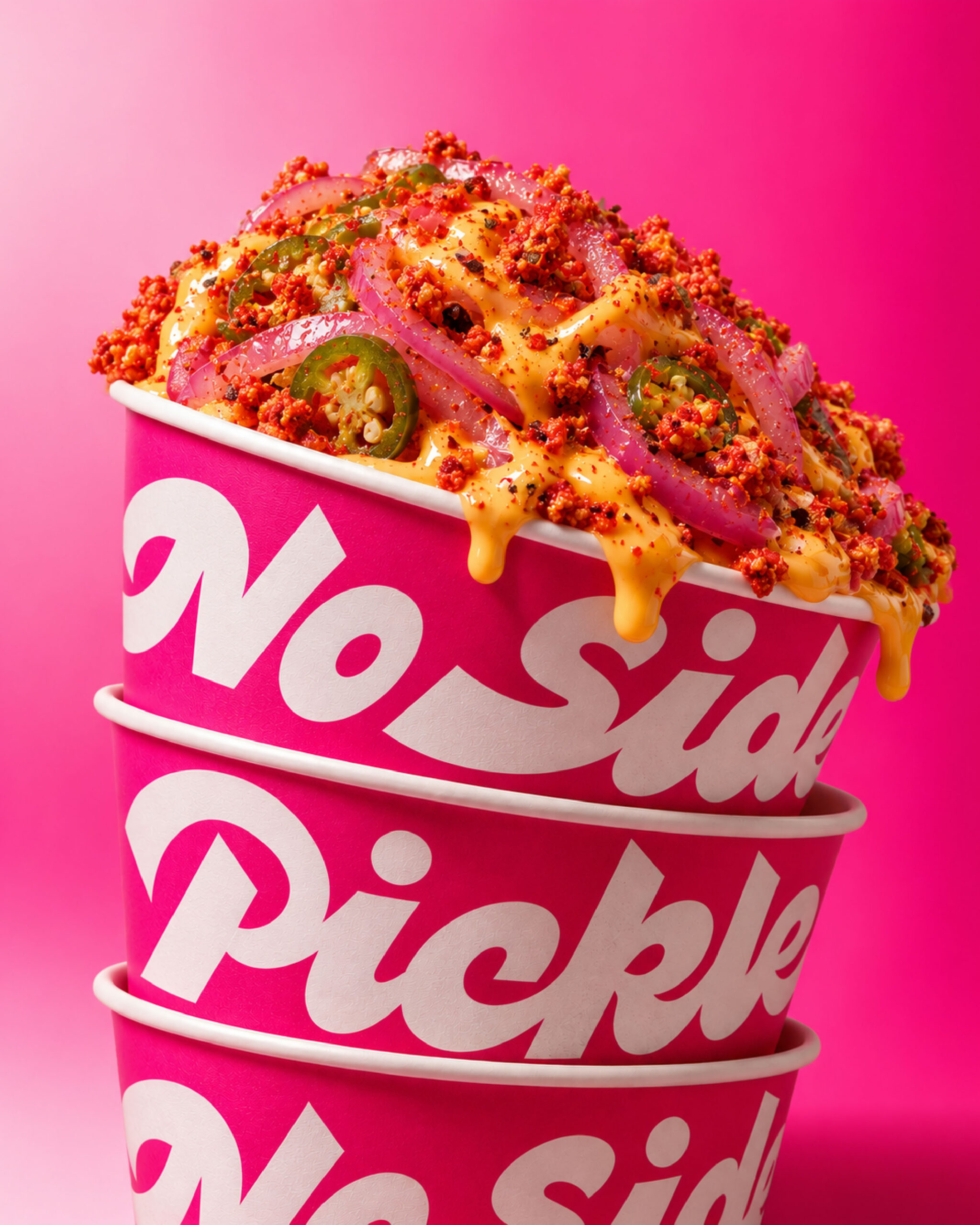
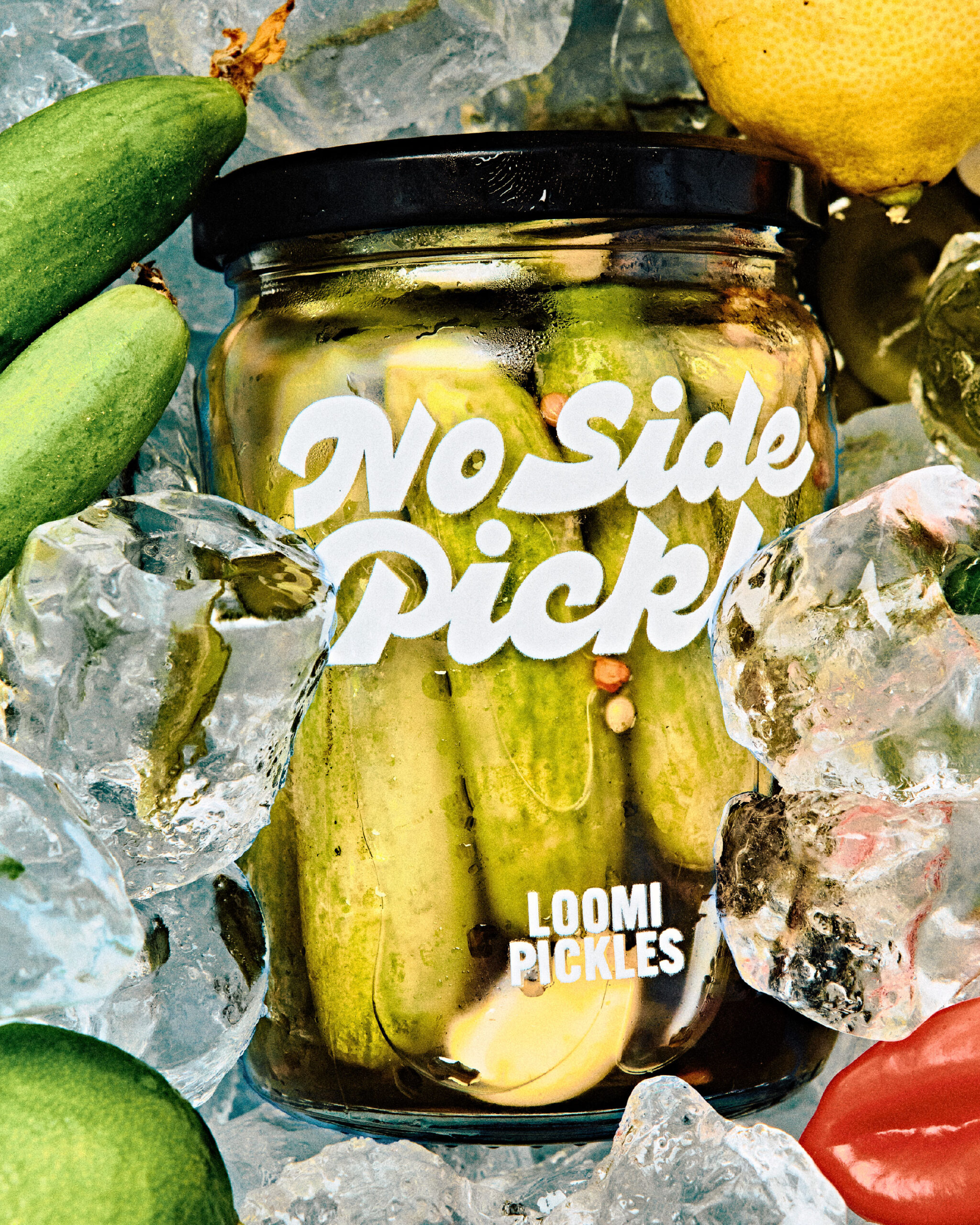
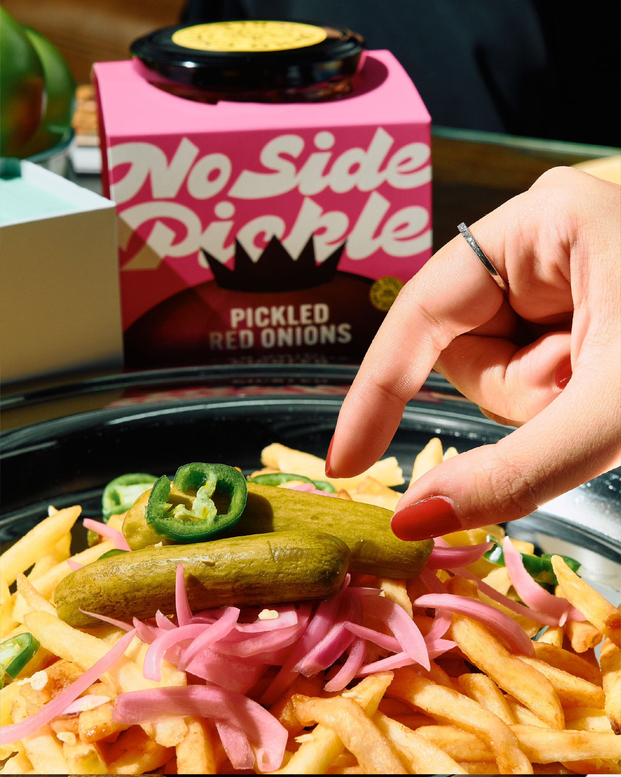
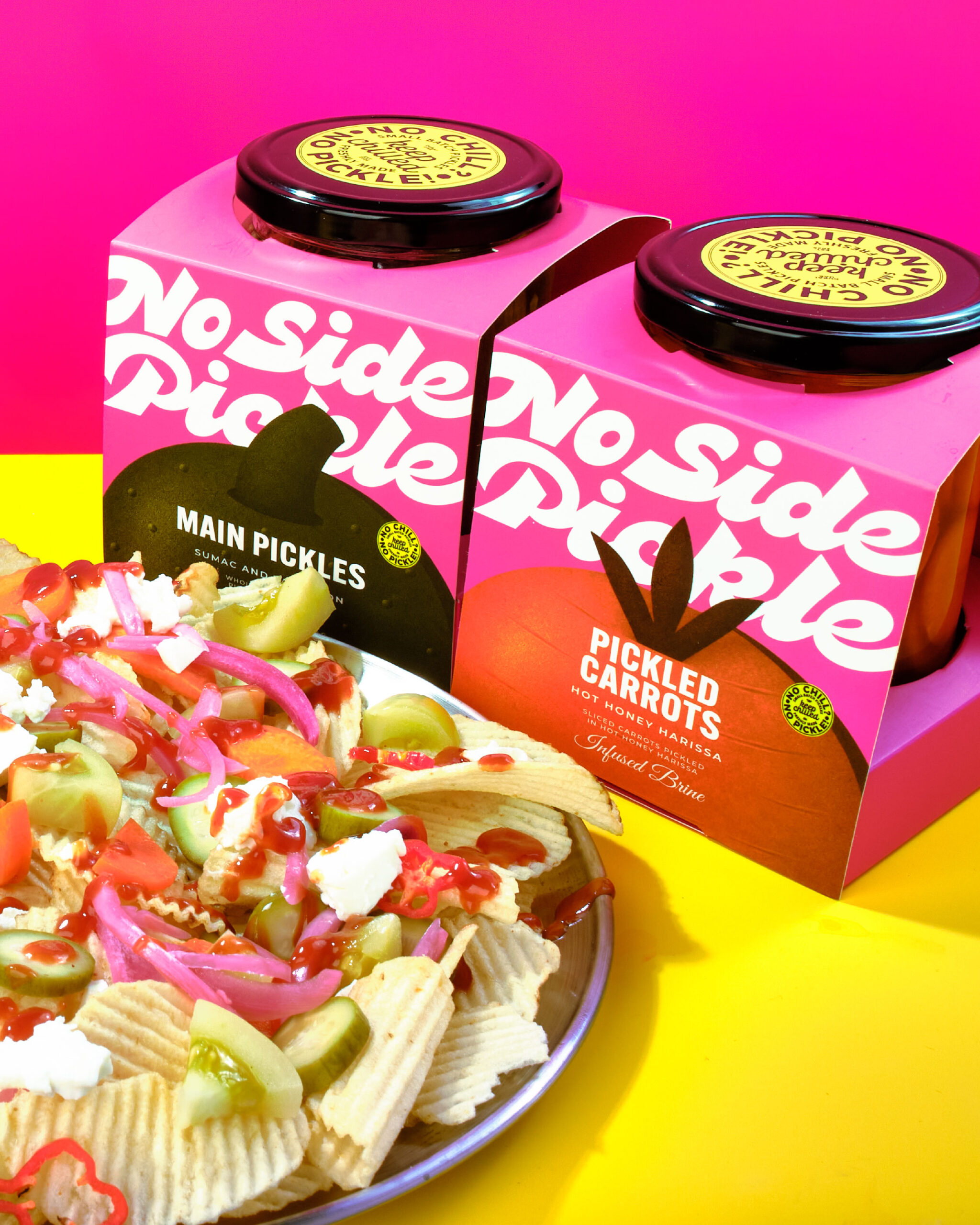
A packaging refresh for No Side Pickle, created to give the brand a bolder, more distinctive presence while keeping its playful and irreverent personality at the core. The new identity combines vibrant color, expressive typography, and character-driven visuals to create packaging that feels contemporary, unexpected, and instantly recognizable.
The refresh extends across the packaging system, building a cohesive visual language that brings the brand’s attitude to life while making each jar stand out on shelf and in the hands of its audience.
Curator’s Insight
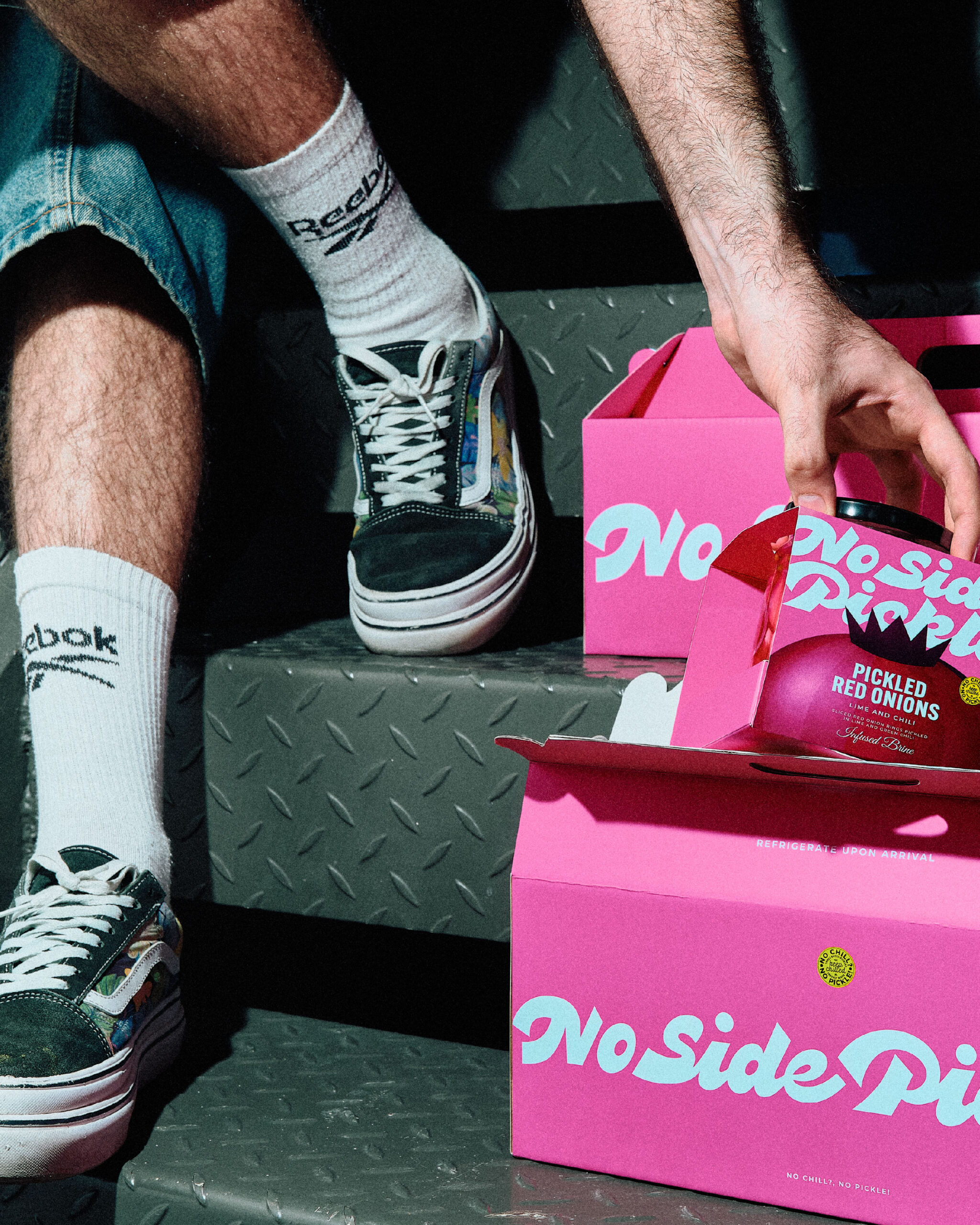
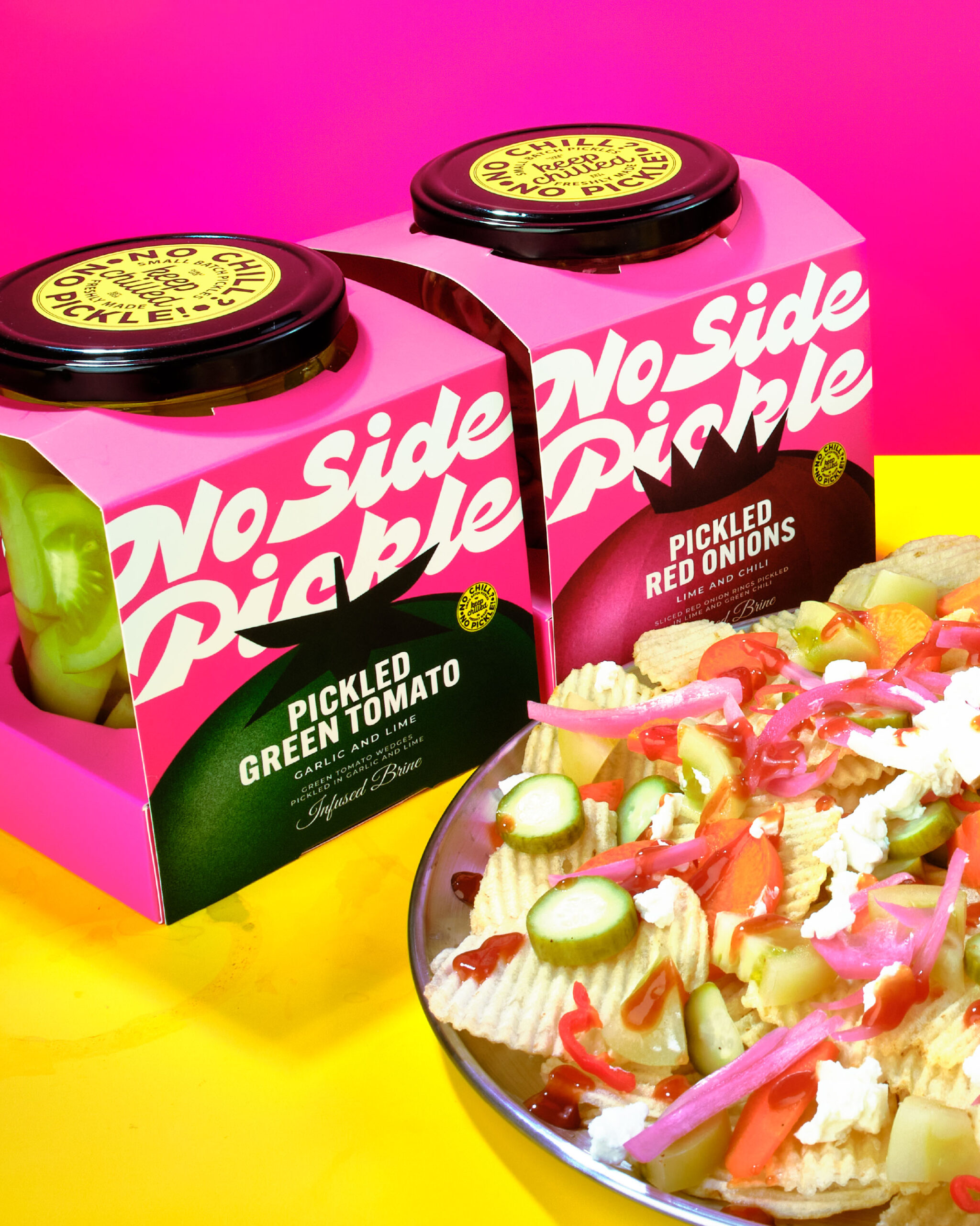
The crown-on-onion mark is doing more work than it first appears. Rendered as a flat, gradient-shaded dome with a crown perched on top, it reads simultaneously as an abstracted onion, a seal of authority, and a nod to the “no side pickle” wordplay, without needing any of those readings spelled out.
The die-cut window is the quieter decision. By letting the jar itself interrupt the box’s graphics, the packaging admits it’s a wrapper rather than pretending to be seamless, and that transparency (visual and literal) does more to build trust on a refrigerated shelf than another photograph of onions ever would.
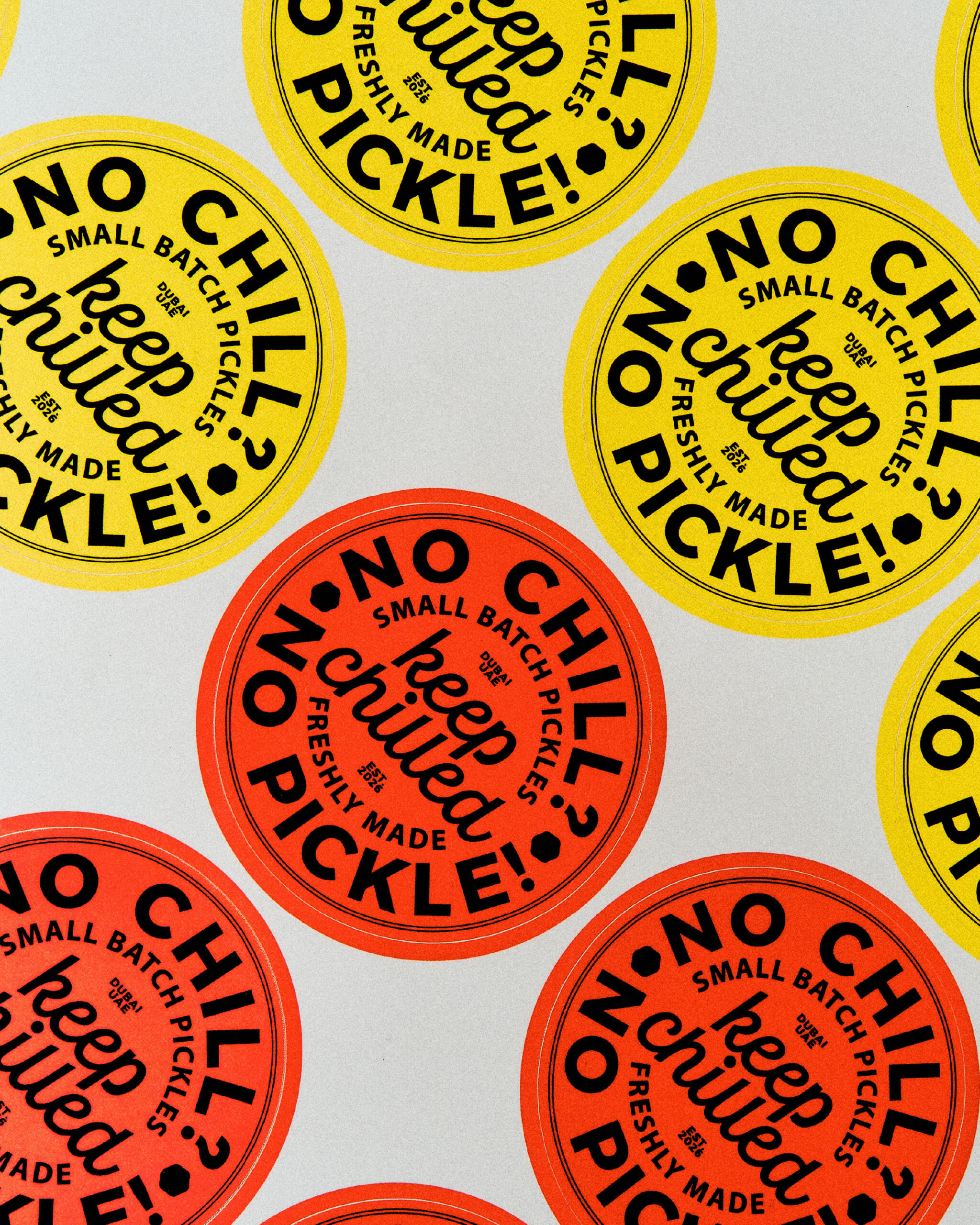
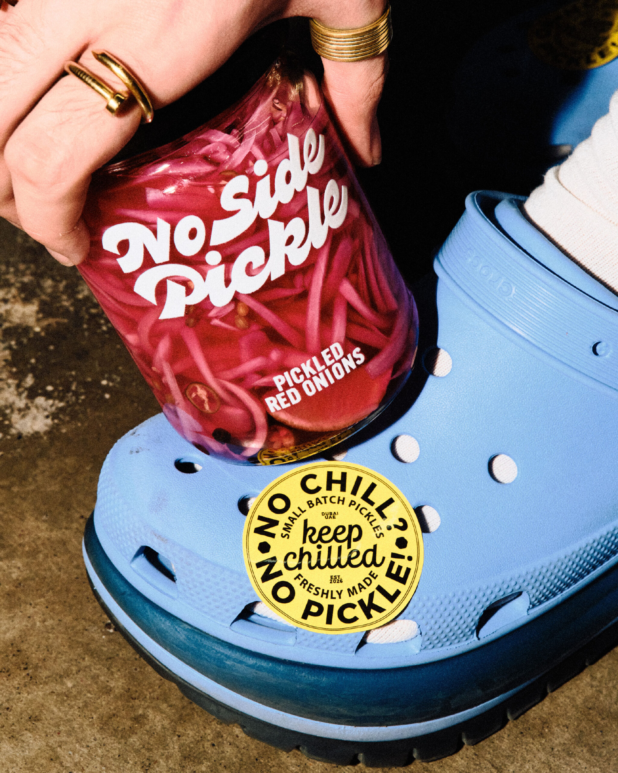
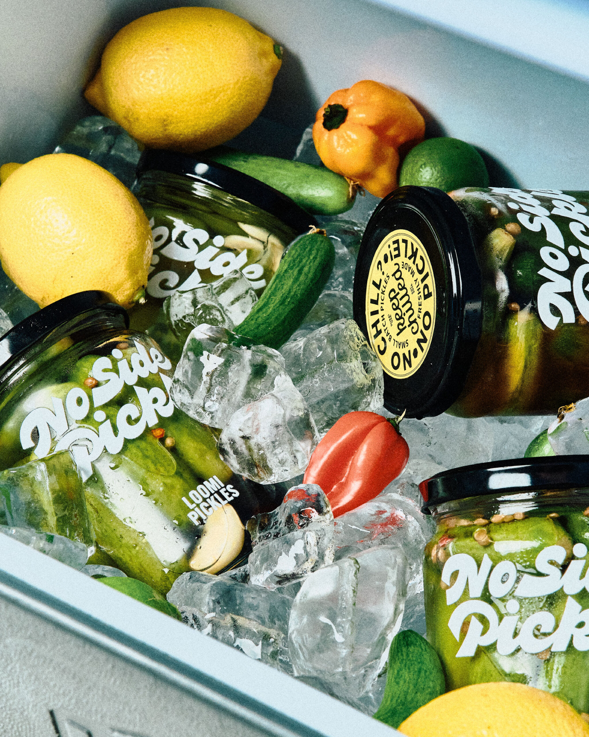
The yellow circular badge borrows the visual shorthand of a supermarket freshness sticker, but repurposes it as a joke (“No chill? No pickle!”) rather than a compliance mark. It is a small move that keeps the system from tipping into pure design exercise and back toward the shelf-floor humor the brand is built on.

 Derrick Lin
 VincoStudio
 lisakaplina
 CreativeWise
 alchimistestudioParis
 Adriana Adamo
 tauqueer
 MAISON D'IDÉE Prague
 Pixels Studio
 Atchayaa
 DESIGN CONCEPTS
 hello ocean
 monther al omari
 the Labelmaker
 alamgirbrands
 kat bres
 Vantablack Studio
 GruppoSaida
 studiorevv
 grafisercreative
 Kate Reichel
 UPRISE