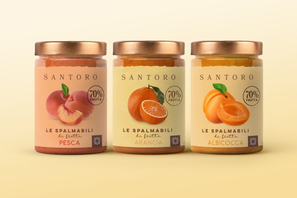

Santoro “Le Spalmabili” Packaging Restyling – An Artisanal Soul for the Breakfast Market
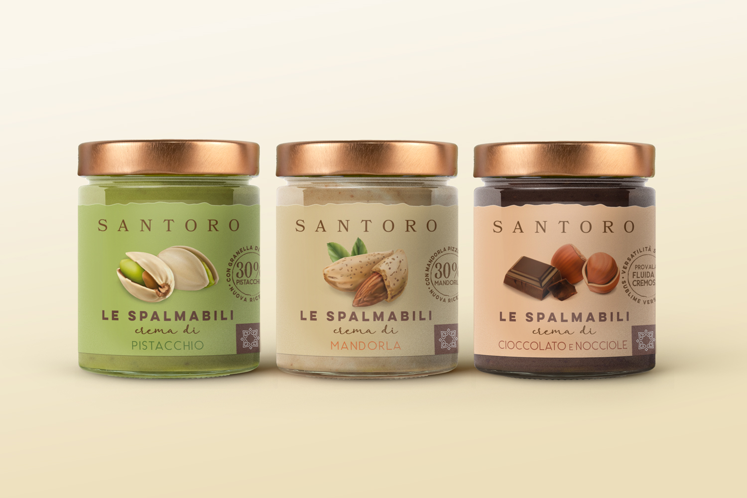
The Project and the Challenge: Strategic packaging restyling for the Santoro (BMC Foods) “Le Spalmabili” line. The goal was to unify two different segments (sweet spreads and fruit jams) within a single brand ecosystem, designed to quickly stand out in the crowded breakfast market.
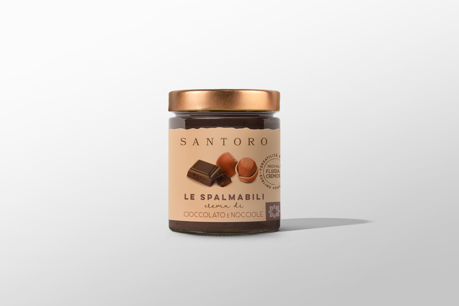
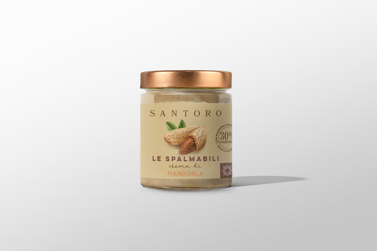
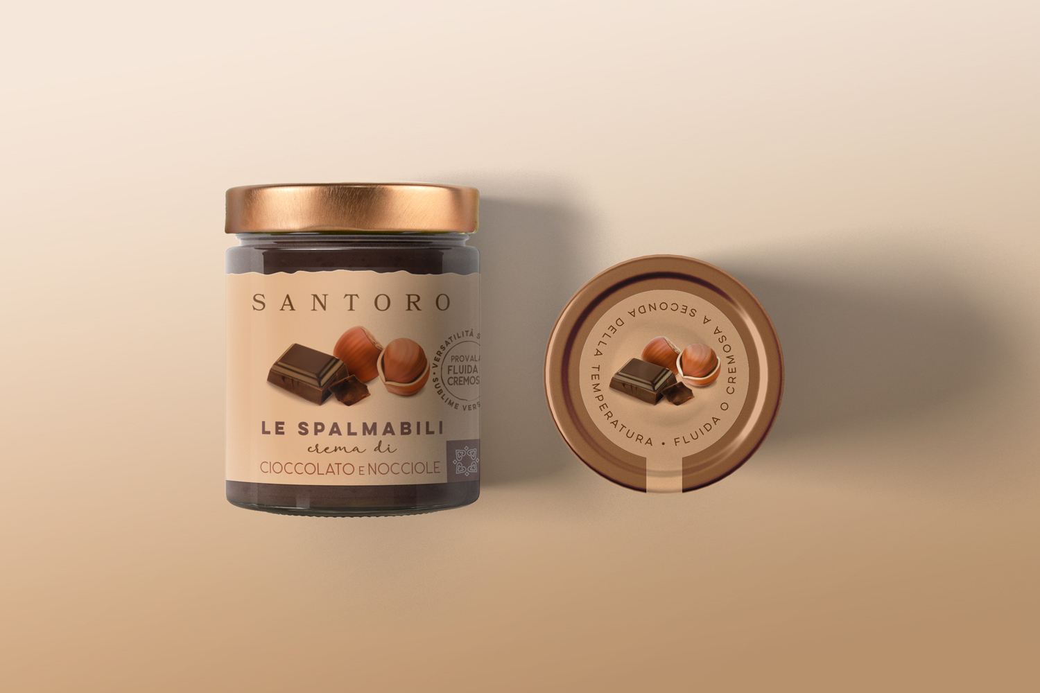
The Strategy (Material Synthesis): We stepped away from typical industrial clichés to invert the visual hierarchy: the raw ingredients are no longer just a backdrop, but the absolute protagonists of the communication.
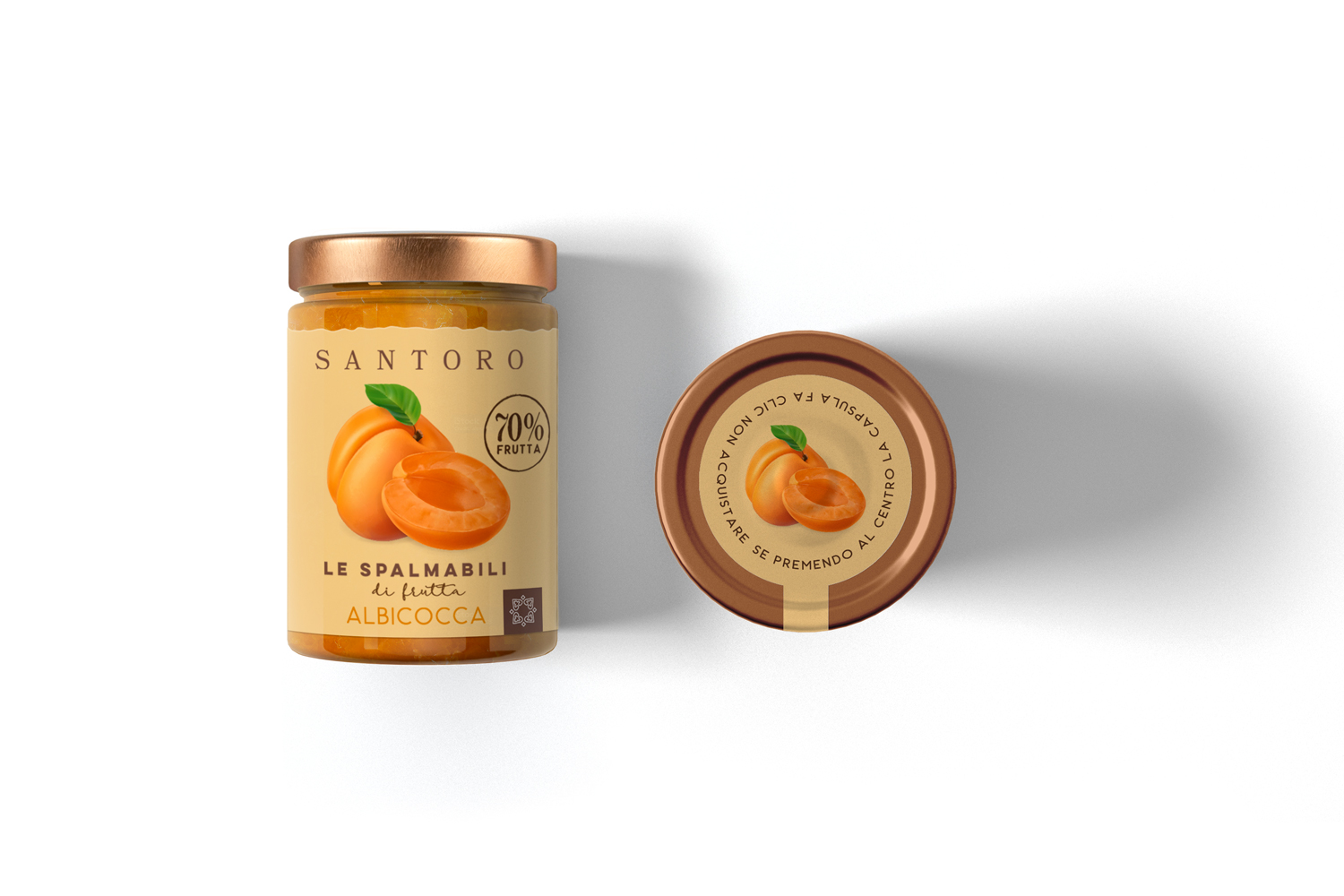
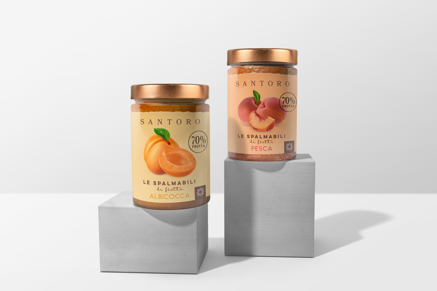
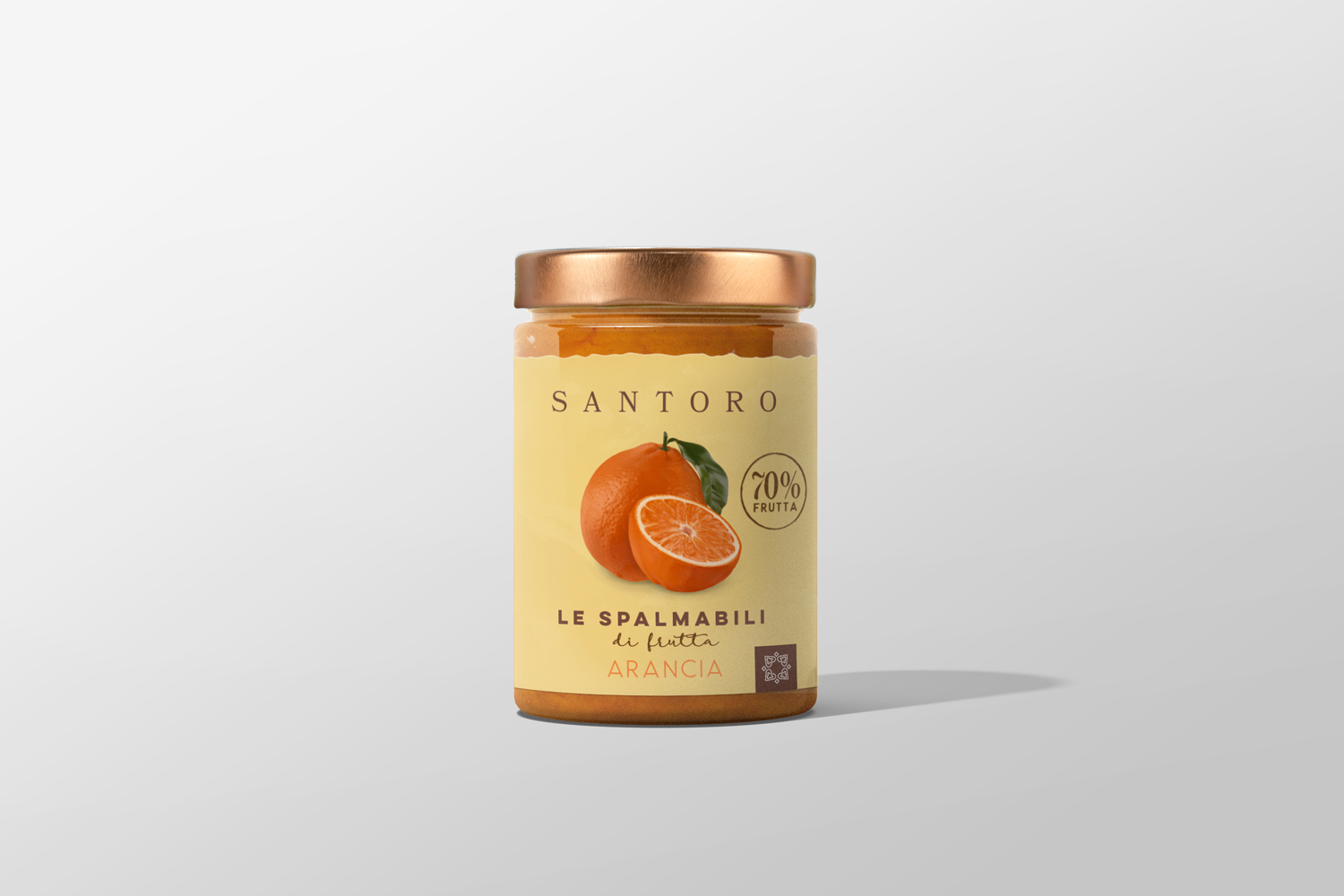
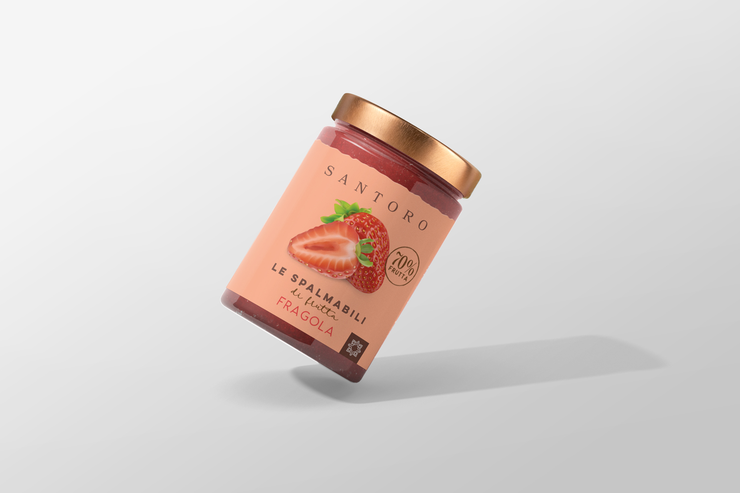
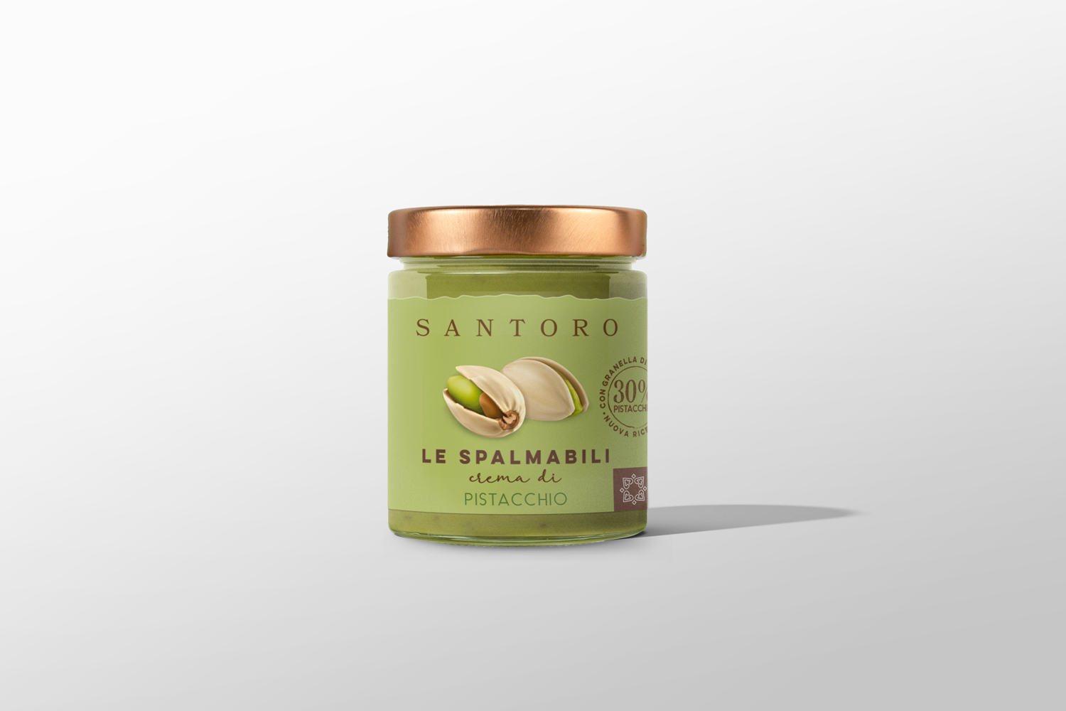
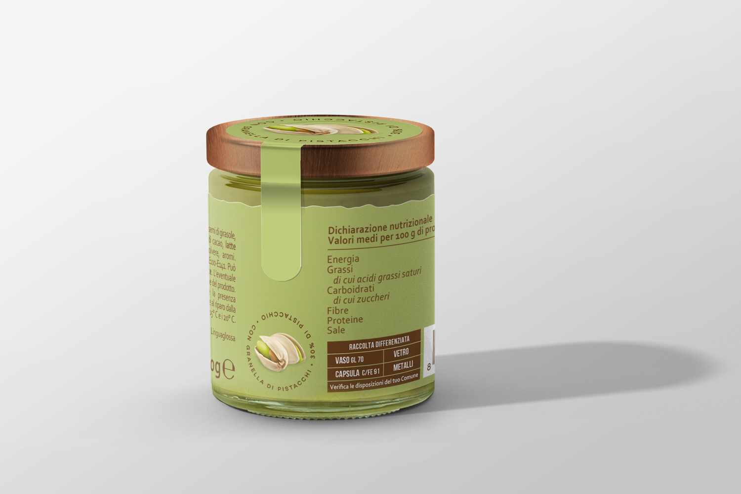
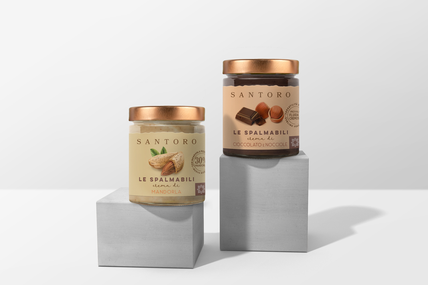
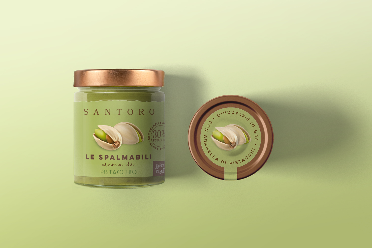
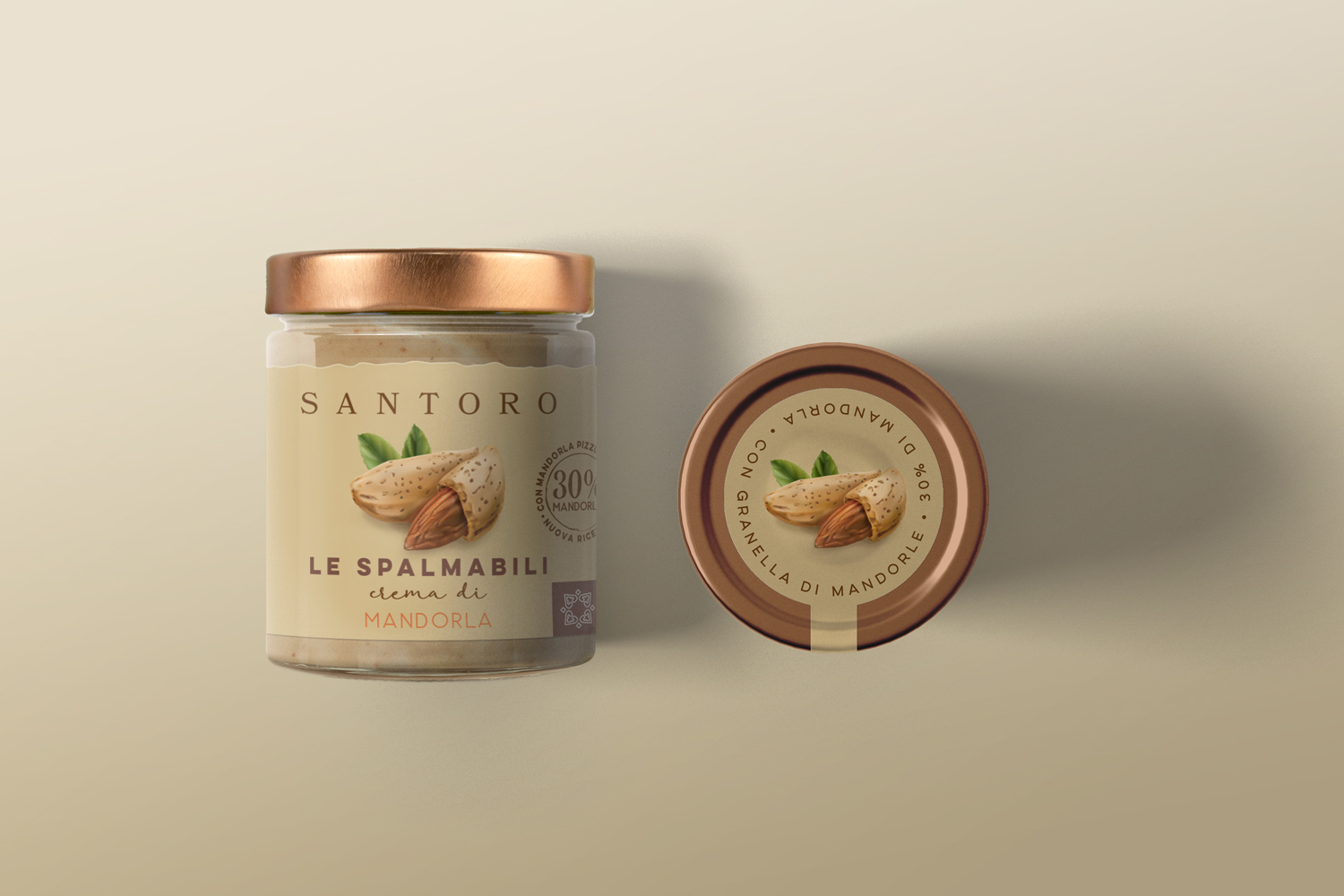
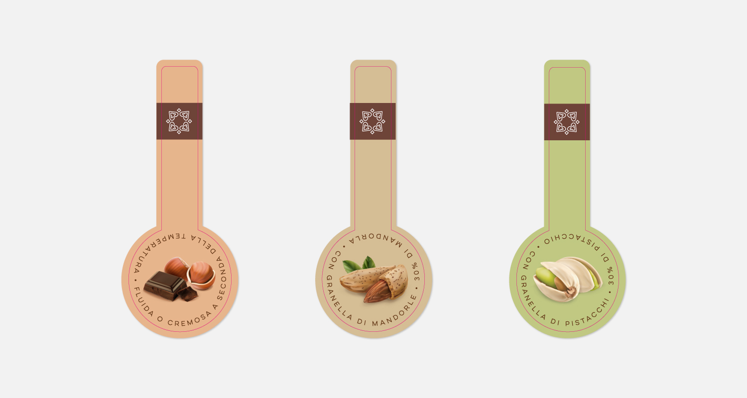
Artisanal Die-Cut: The most distinctive element is the jagged and irregular top edge of the label. This strategic choice breaks the industrial linearity of the glass jar, evoking the visual codes of premium artisanal craftsmanship.
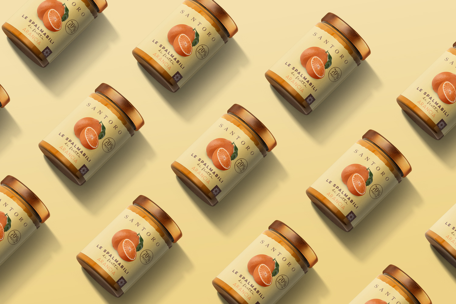
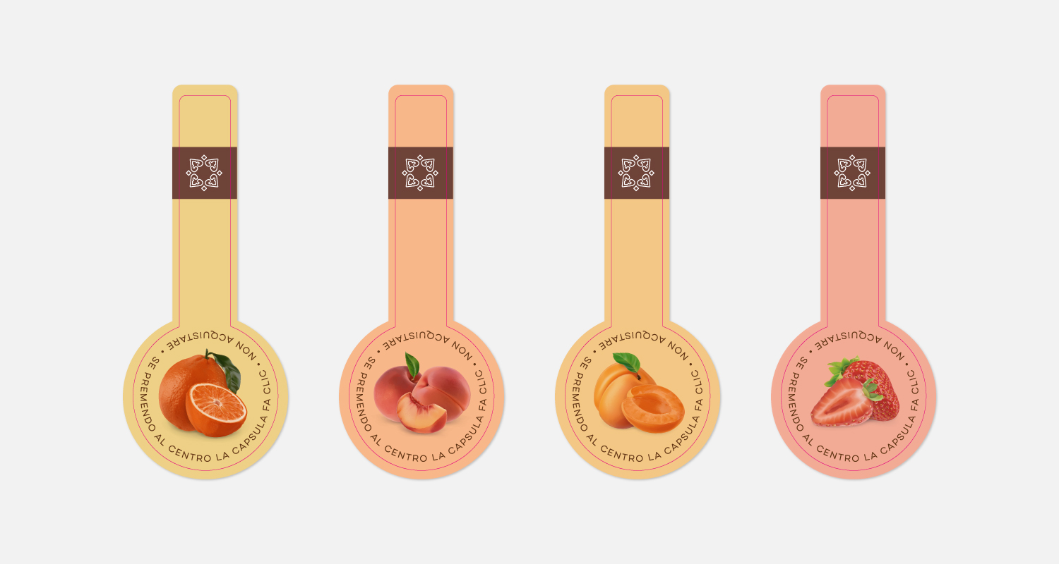
Illustrations and Colors: Hyper-realistic illustrations of the ingredients pop off the label, conveying exceptional appetite appeal and freshness. These are enhanced by a pastel color palette that creates a refined color-blocking effect, making shelf navigation easier for the consumer.
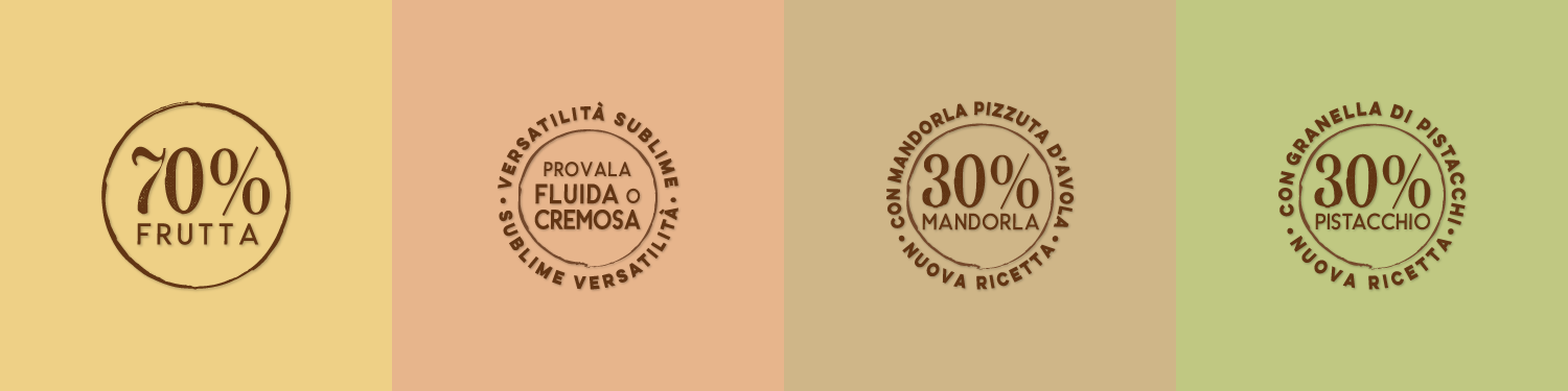
Typography and Details: A sophisticated interplay of contrasts between the elegant logotype and soft, cursive lettering. Product claims (such as the “70% FRUIT” stamp) were engineered to serve as authentic quality seals.
The Result: A tactile packaging design that communicates authority and premiumness, transforming the product into an object of desire meant to be “tasted with the eyes” first.
 Lisa Pokrovskaya
 Simple Studio
 Studio Unbound
 David Byerlee
 M&A CREATIVE AGENCY
 alchimistestudioParis
 monther al omari
 Studio Be Design
 LogoSayLove
 agenciabud
 Shustova p
 mutta
 @Allenarts13
 Sirka Agency
 Atiq Alam
 Dozen Agency
 j.substance
 SCD
 Cristian Lepore | crilep Copia
 Chris Creative Works