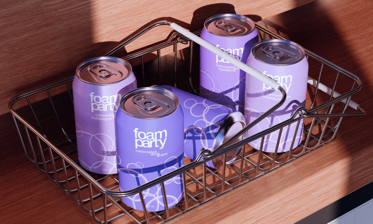

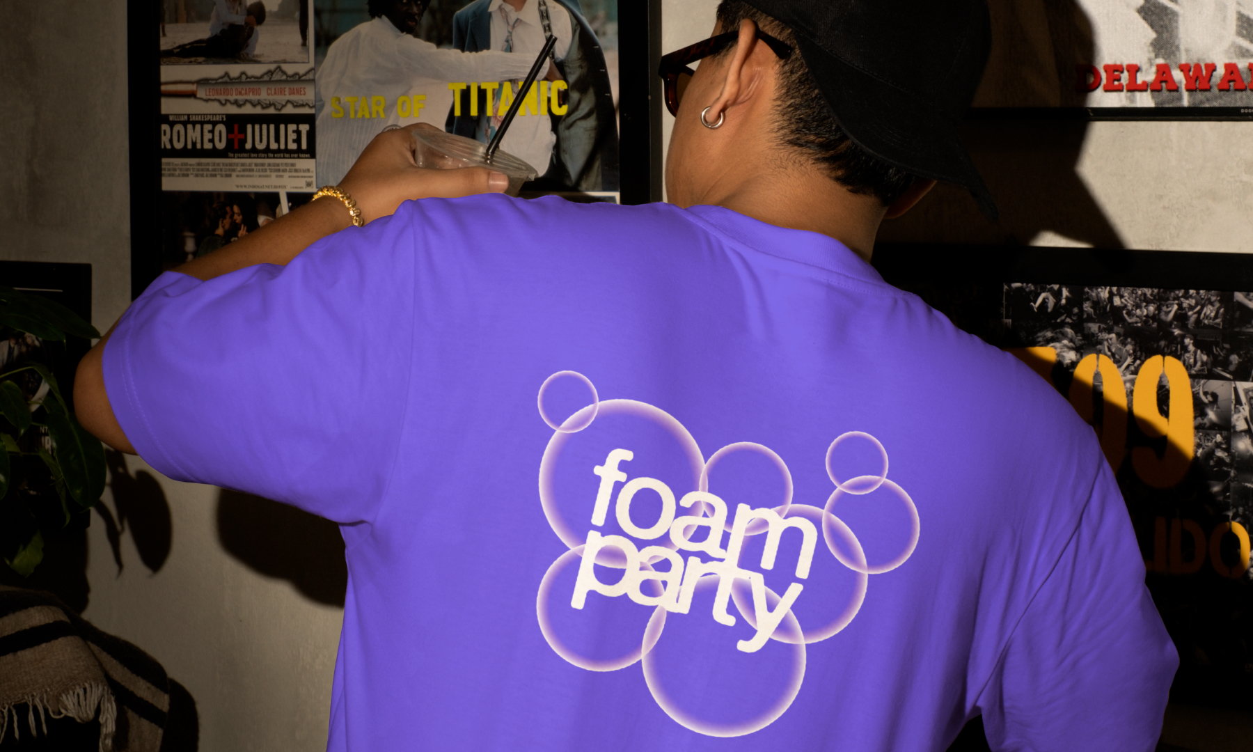
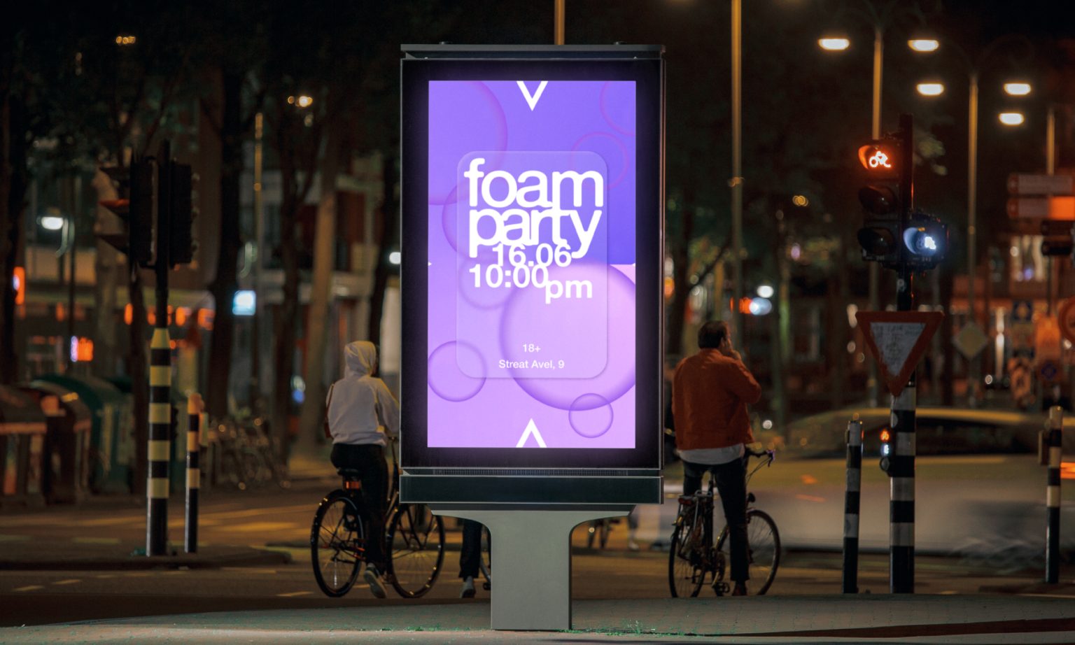
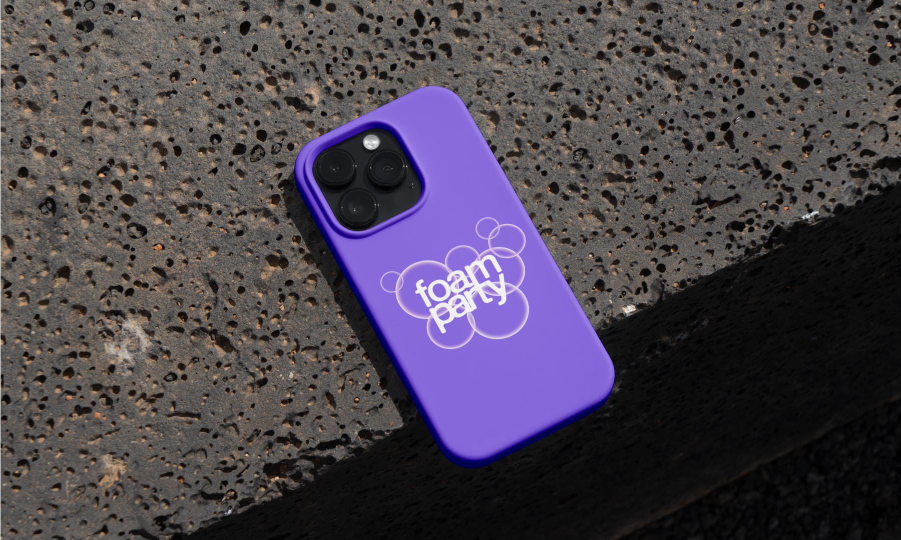
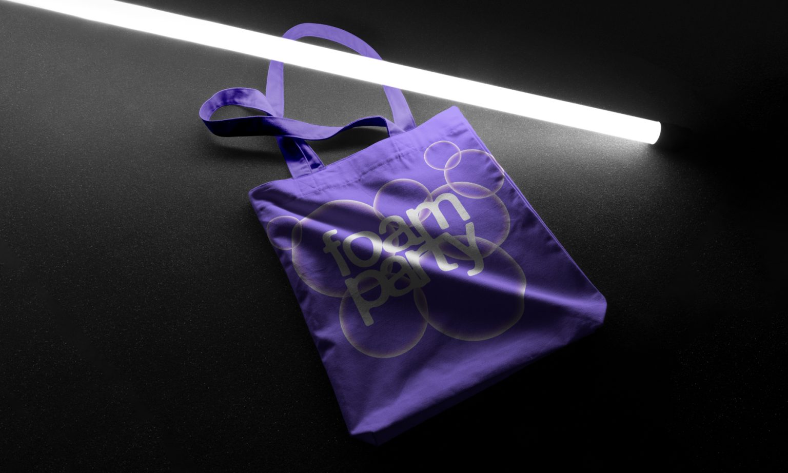
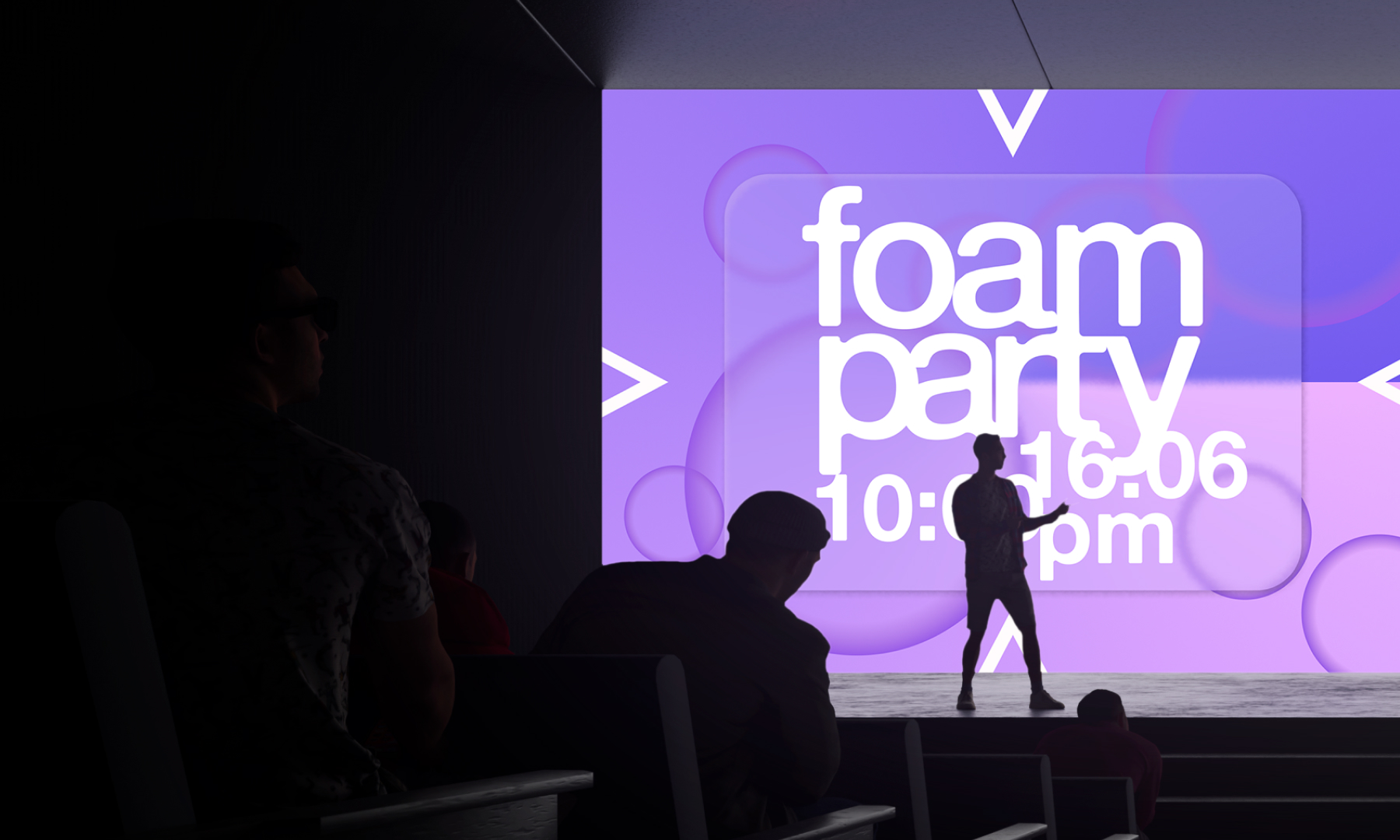
The *Foam Party* project is a visual concept inspired by the atmosphere of a summer party, neon-lit city nights, and fizzy drinks. At the core of the identity lies fluidity, transparency, and softness. Every element—from color to typography—is designed to evoke a sense of foam and lightness, as if you’re diving into a bright, warm, soapy dream. The color palette is built on gradients of lavender, pink, and deep violet, glowing like city lights after dark. Translucent bubbles float across the background, creating a sense of movement and rhythm.
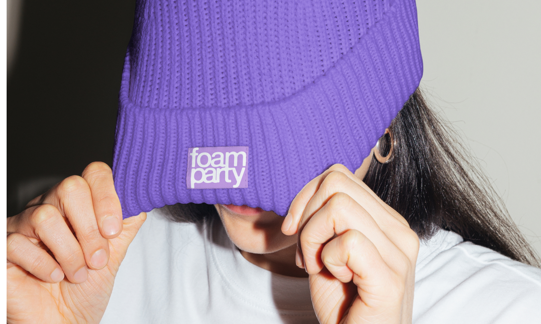
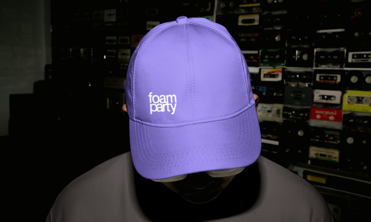
Typography doesn’t just fit into the visual style—it extends it. The letters seem to merge with each other, echoing the shape of bubbles, sometimes appearing slightly blurred, like lather. The visual focus is on the unity of form and content: the text becomes part of the image while remaining legible. The overall impression is airy, smooth, and at the same time full of energy—just like the party itself.
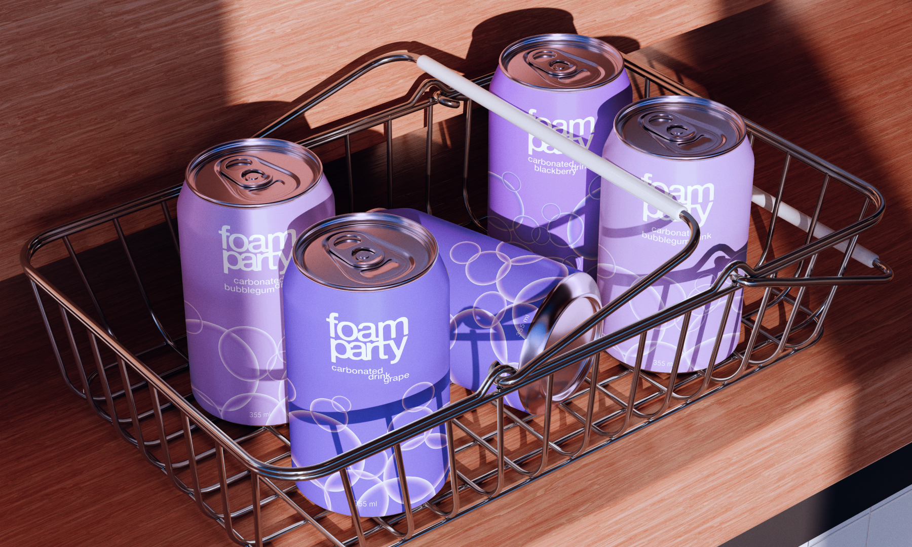
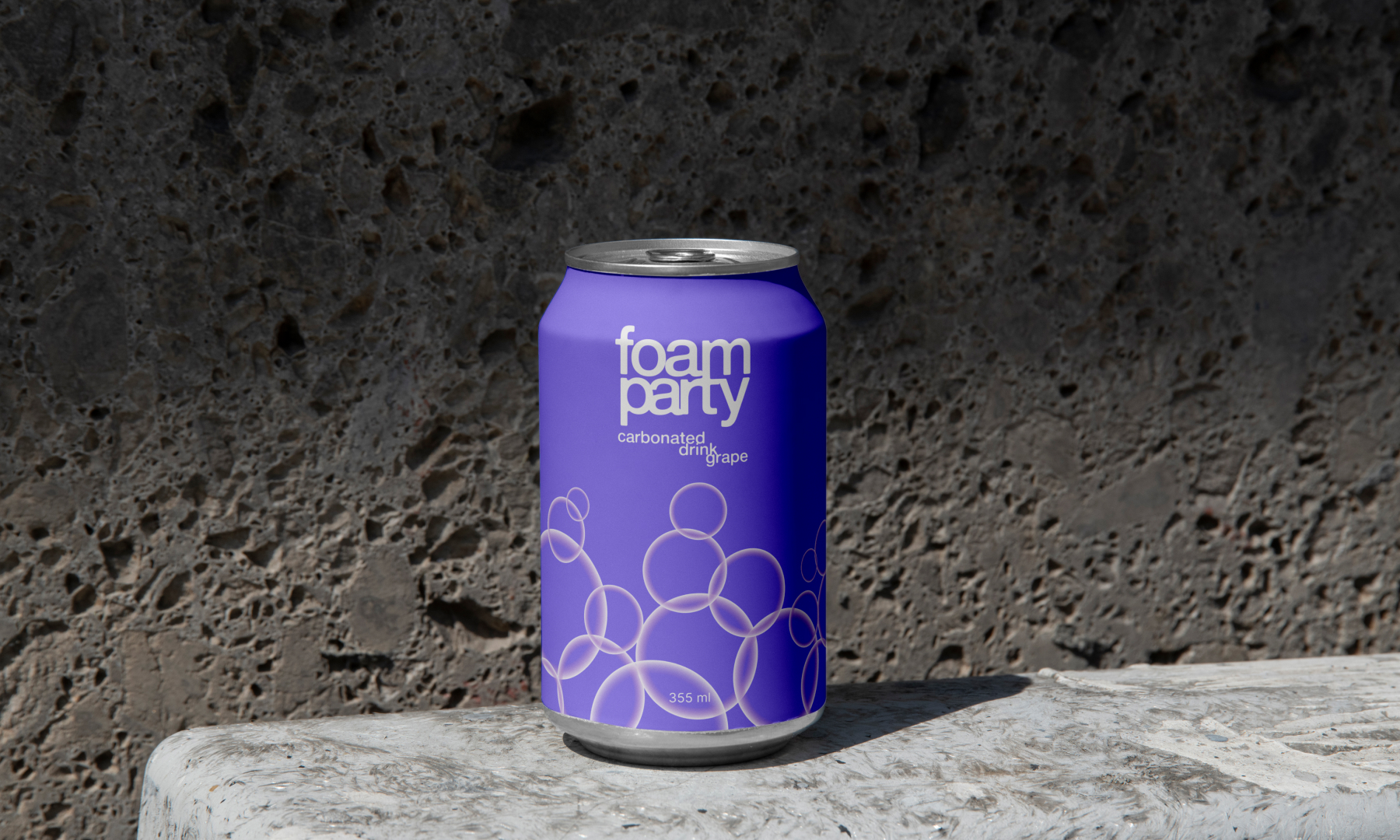
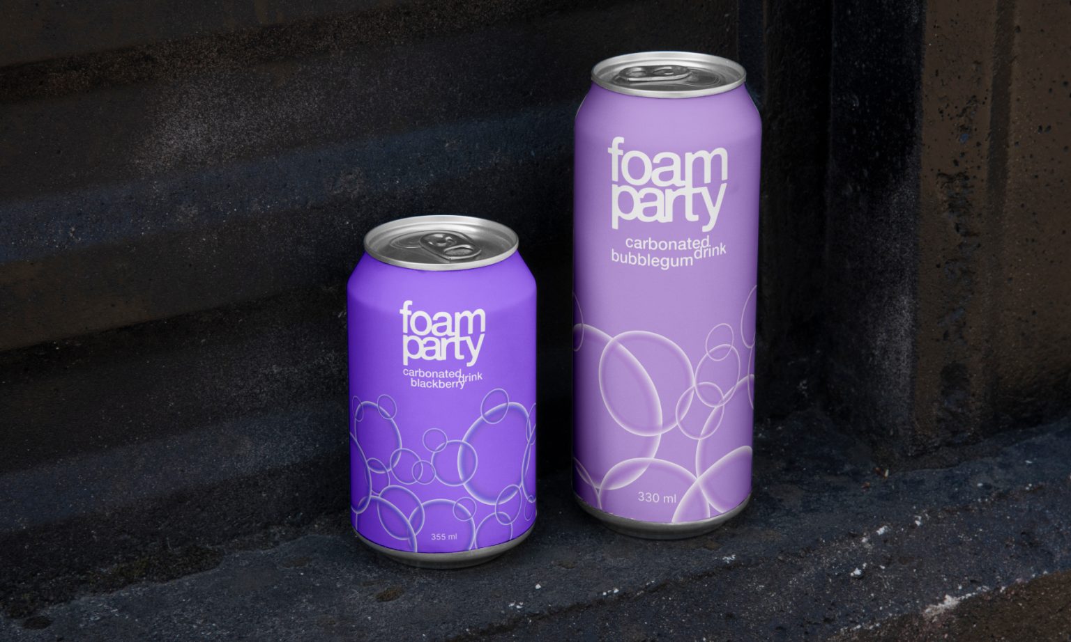
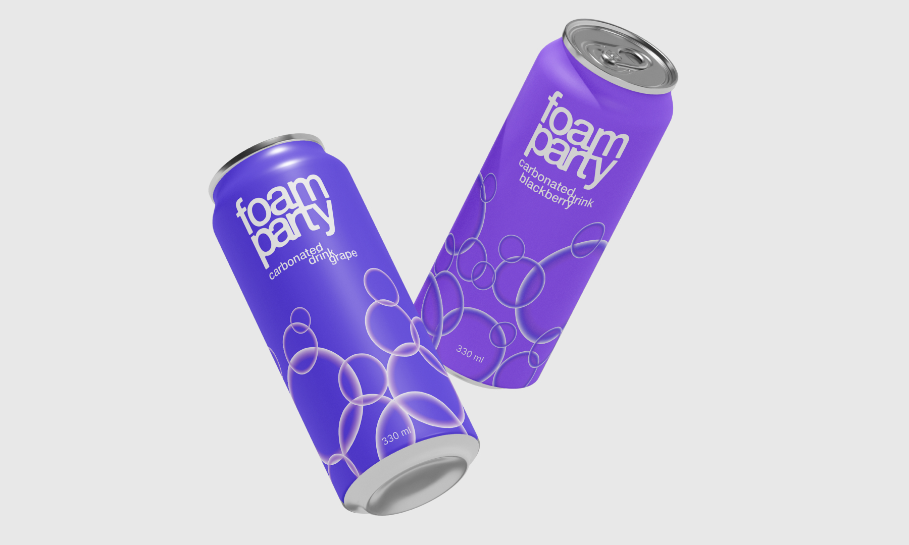
Built on this identity, the project also includes a line of carbonated beverages under the same name—*Foam Party*. Each flavor is a separate SKU with its own unique character. They differ in color, the composition of bubbles, and the placement of text on the packaging. The bubbles on each can form their own pattern and rhythm, reflecting the taste and mood of that specific drink. The labels follow the same soft, rounded aesthetic—as if they’ve floated up naturally to the surface. Despite the cohesive visual system, each SKU feels like its own story—a part of the party, but with a distinct vibe.
This project merges the aesthetics of pleasure and visual freshness, turning soda into an event, and packaging into an extension of light, dance, and carefree energy.

 lunapanda
 Tridimage
 Analoguecreative
 lettera7
 alchimistestudioParis
 Lana B
 Colossal
 Pivot Studio
 M&A CREATIVE AGENCY
 monther al omari
 Anastasia Cherepanova | xtramez
 Hollóka Grafikai Műhely / Graphic Design Studio
 BOLD branding
 Antonia Skaraki
 Pâmella Lorrany
 Z9BKAdsgn
 Francesco Paternoster
 b1studio.ro
 Chris Creative Works
 Boordon
 Dmitriy Kuzovlev
 Brand Society
 yasharpic