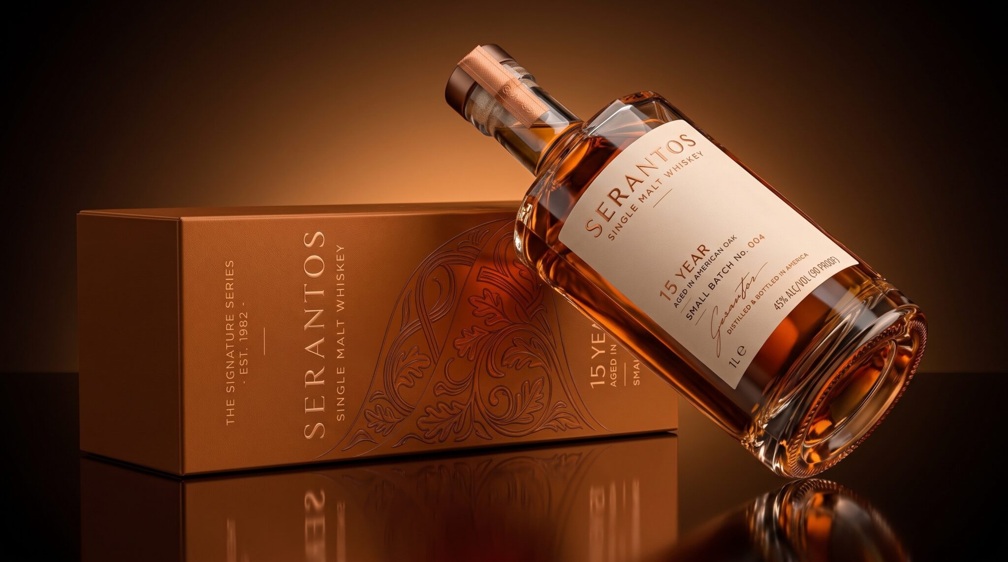

SERANTOS is a premium single malt whisky packaging concept built around the idea of time, craftsmanship, and quiet confidence. The design was created to feel established and sophisticated without relying on excessive decoration, allowing the quality of the product and the character of the materials to lead the visual experience.
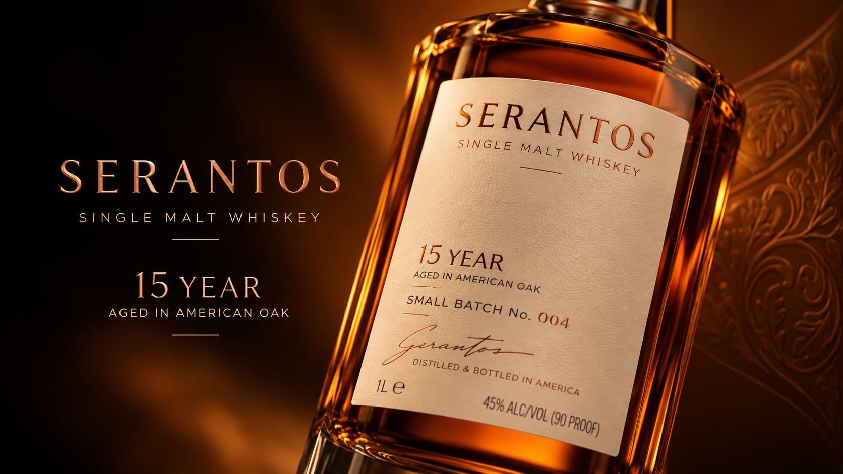
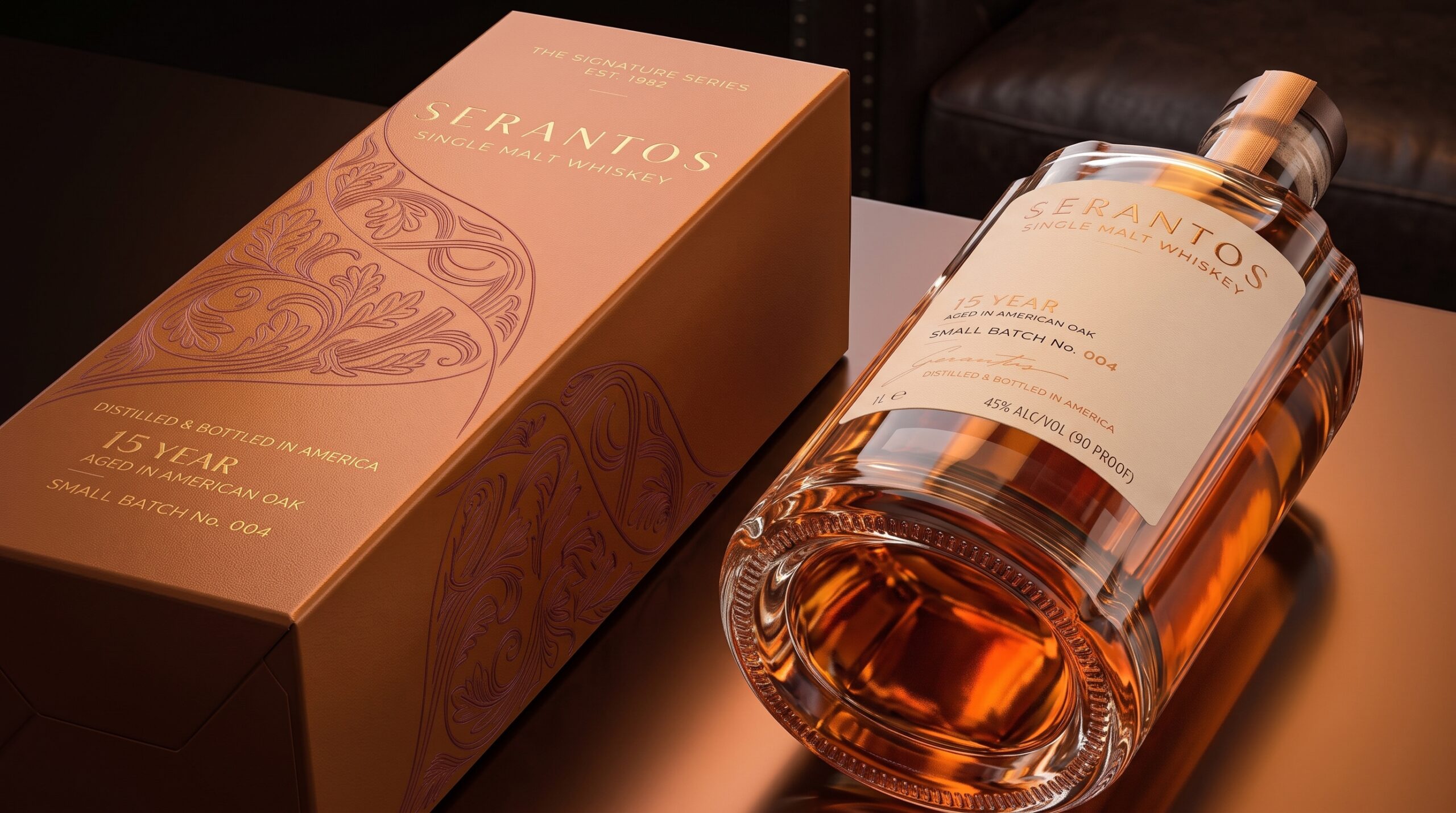
At the center of the identity is a refined typographic approach that gives SERANTOS a strong, timeless presence. The bottle label uses a warm ivory base paired with restrained copper-brown typography, creating a natural connection to the rich amber tones of the whisky. The generous spacing and carefully structured hierarchy keep the information clear and elegant, while details such as the age statement, batch information, signature, and production notes reinforce the feeling of a carefully crafted spirit.
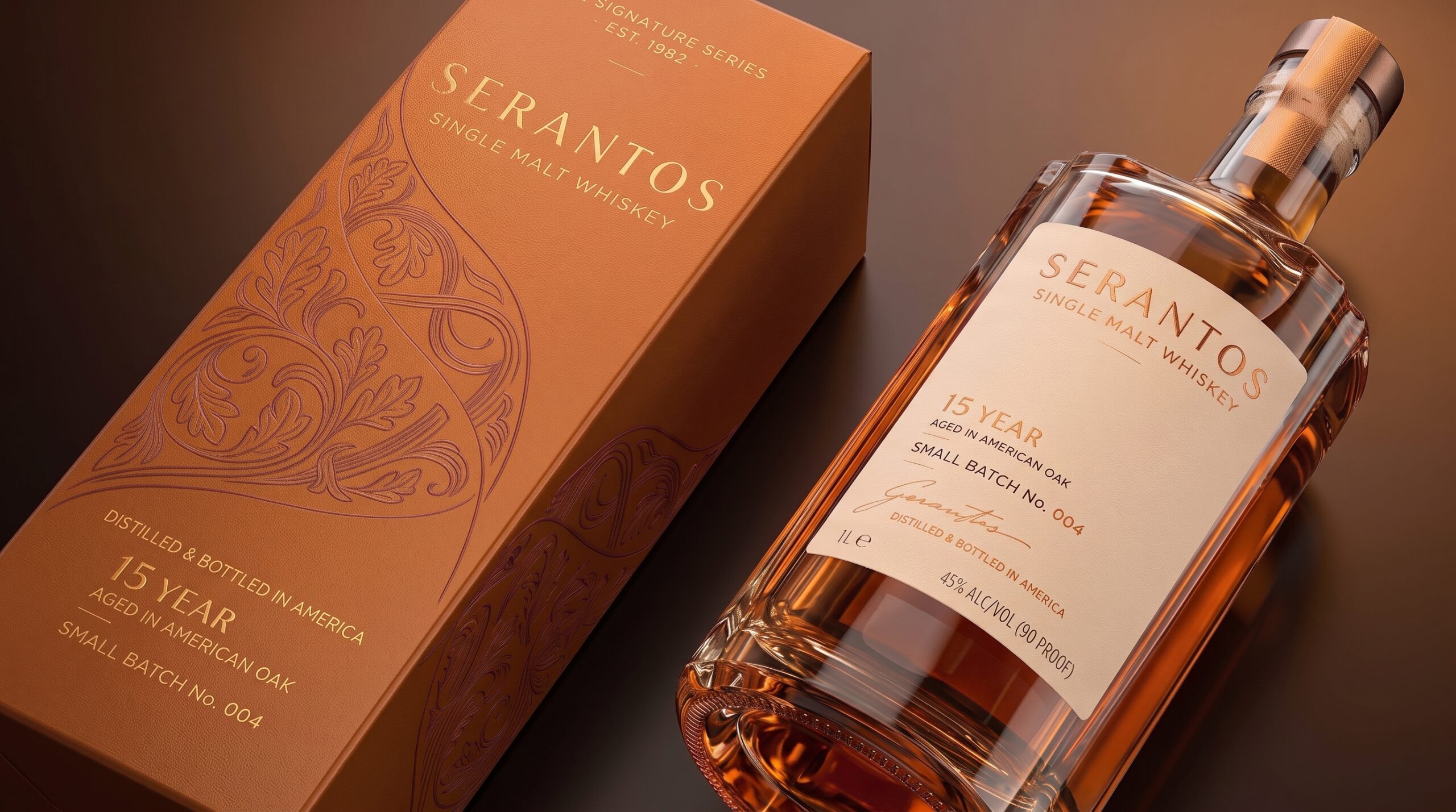
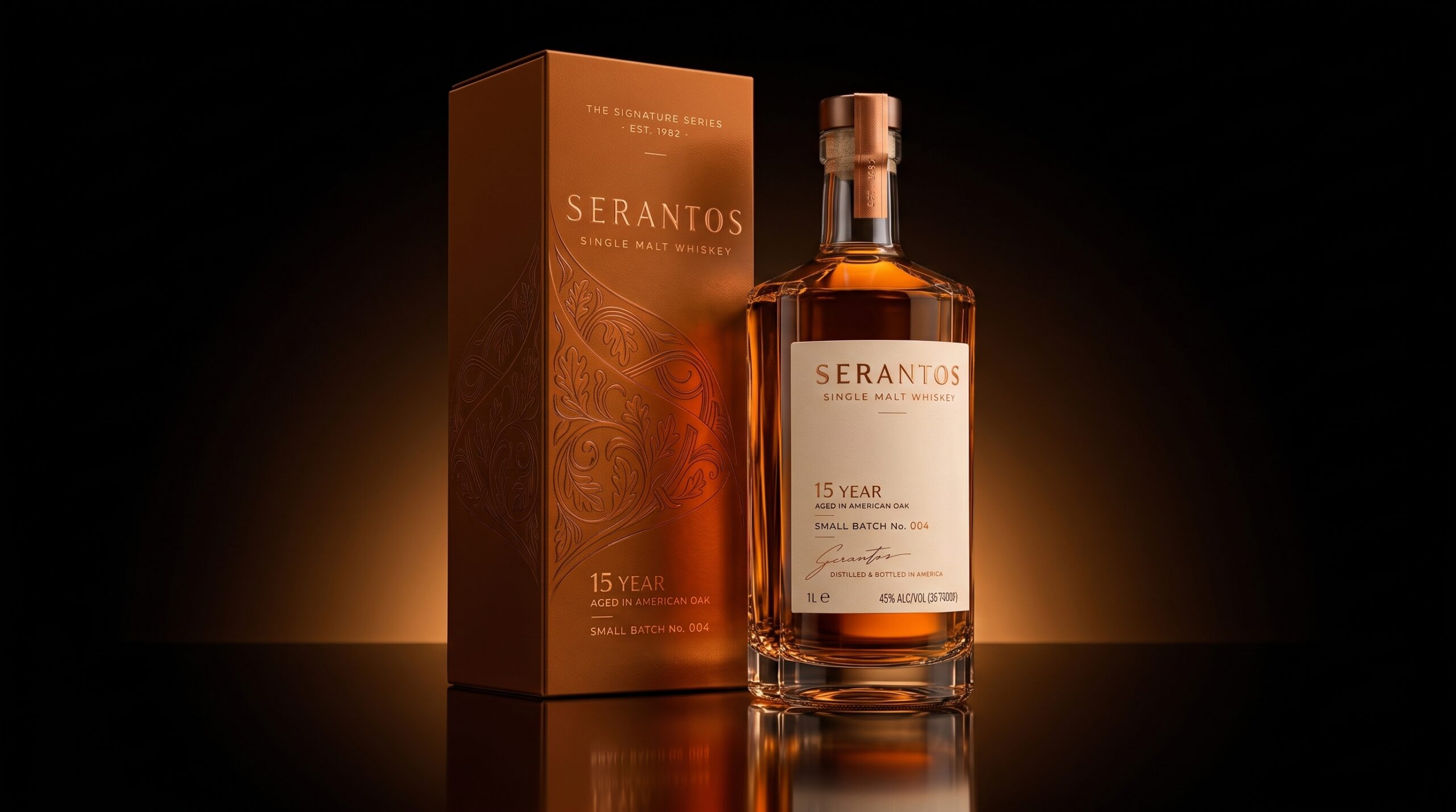
The outer packaging expands this visual language through a deep copper-brown palette inspired by the whisky itself. Rather than treating the carton as a secondary element, it becomes part of the complete presentation. A subtle ornamental illustration is integrated into the surface using a tonal treatment, adding depth and craftsmanship without overwhelming the composition.
One of the main objectives was to create a strong relationship between bottle and box. Both elements share the same warm color family, understated typography, and premium detailing, yet each maintains its own character. The contrast between the lighter bottle label and the darker carton creates visual balance while making the bottle immediately recognizable when displayed beside its packaging.
The glass bottle was kept clean and architectural, allowing the whisky’s natural color to become an important part of the identity. Warm metallic details and the refined closure complement the liquid without making the design feel overly luxurious or decorative. Every element was considered to create a presentation that feels mature, contemporary, and authentic.
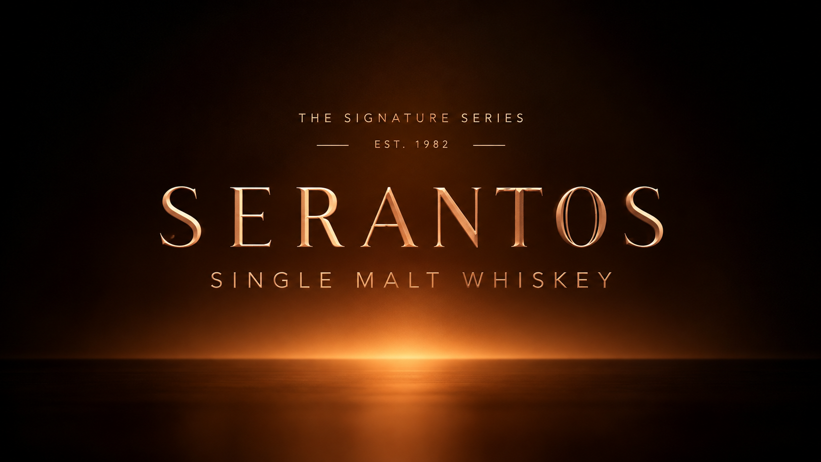
The overall art direction uses warm directional lighting, deep shadows, reflections, and amber tones to extend the identity beyond the physical packaging. The environment feels closely connected to the product, creating a visual world that communicates warmth, depth, and the passage of time.
SERANTOS is designed around a simple idea: great whisky does not need to demand attention. Its character, craftsmanship, and time speak for themselves.
 lunapanda
 Tridimage
 Analoguecreative
 lettera7
 alchimistestudioParis
 Lana B
 Colossal
 Pivot Studio
 M&A CREATIVE AGENCY
 Anastasia Cherepanova | xtramez
 Hollóka Grafikai Műhely / Graphic Design Studio
 BOLD branding
 Antonia Skaraki
 Pâmella Lorrany
 Z9BKAdsgn
 Francesco Paternoster
 b1studio.ro
 Chris Creative Works
 Boordon
 Dmitriy Kuzovlev
 Brand Society
 yasharpic
 Lisa Pokrovskaya