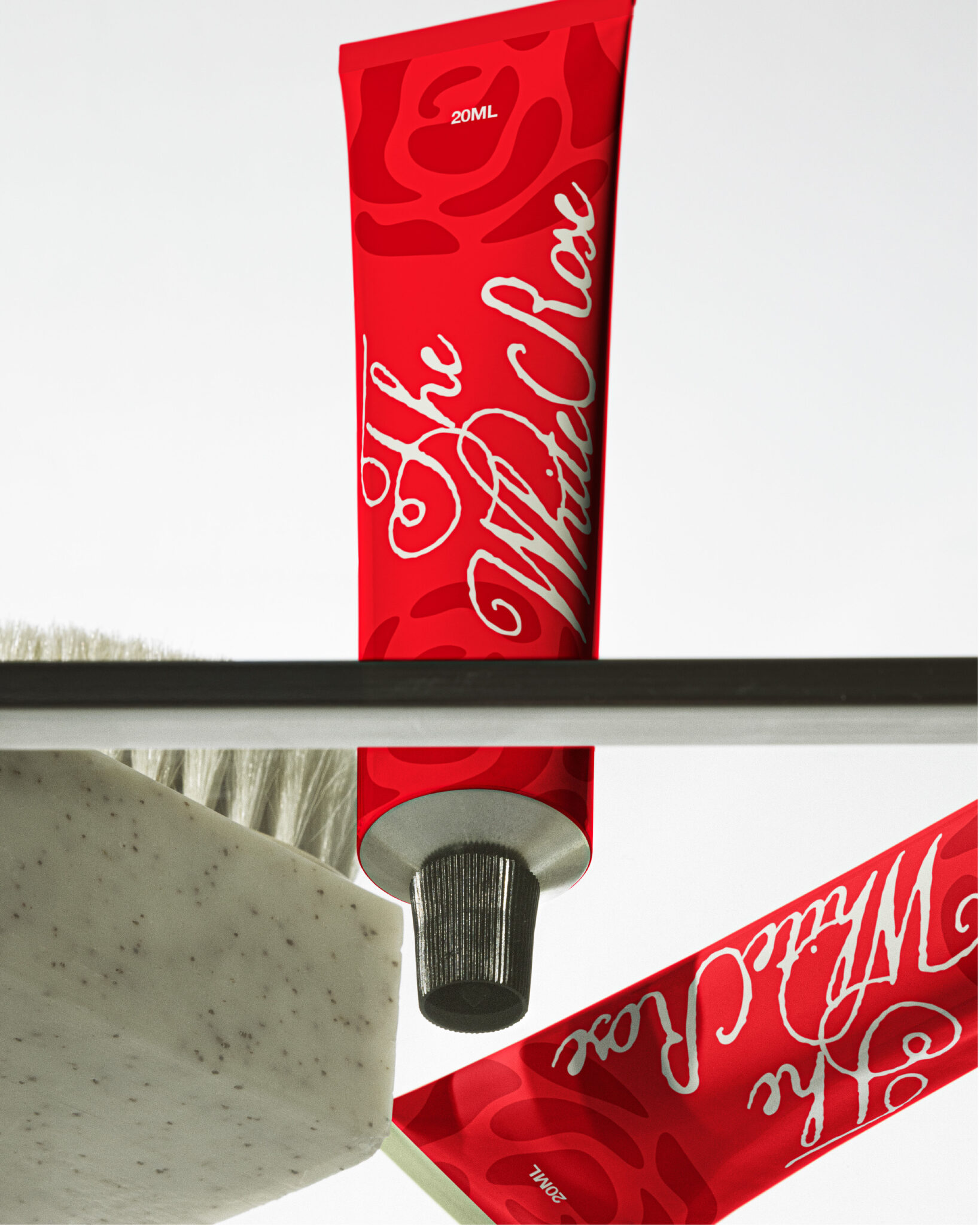

Bold packaging that doesn’t just sit on the shelf — it demands attention. ❤️
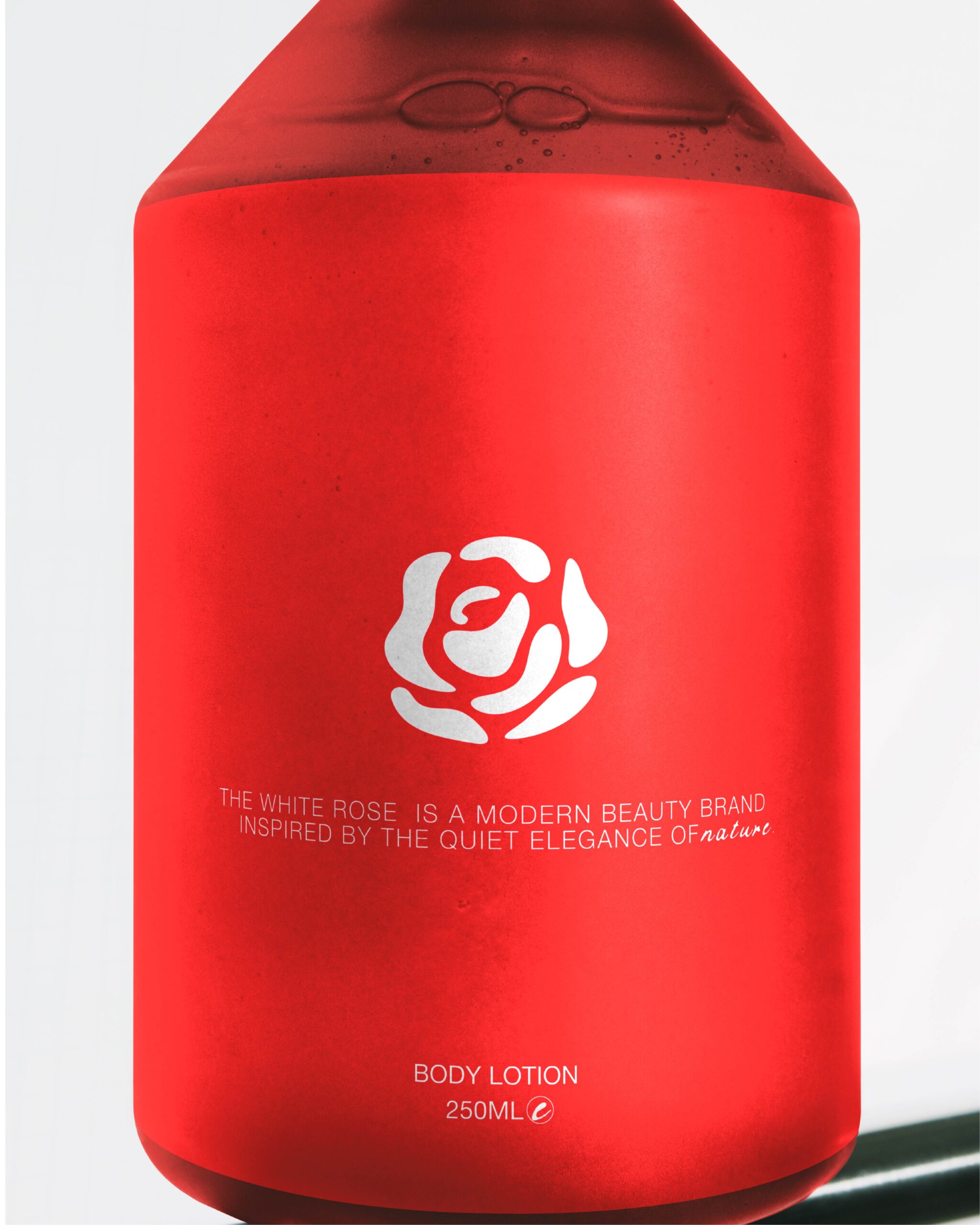
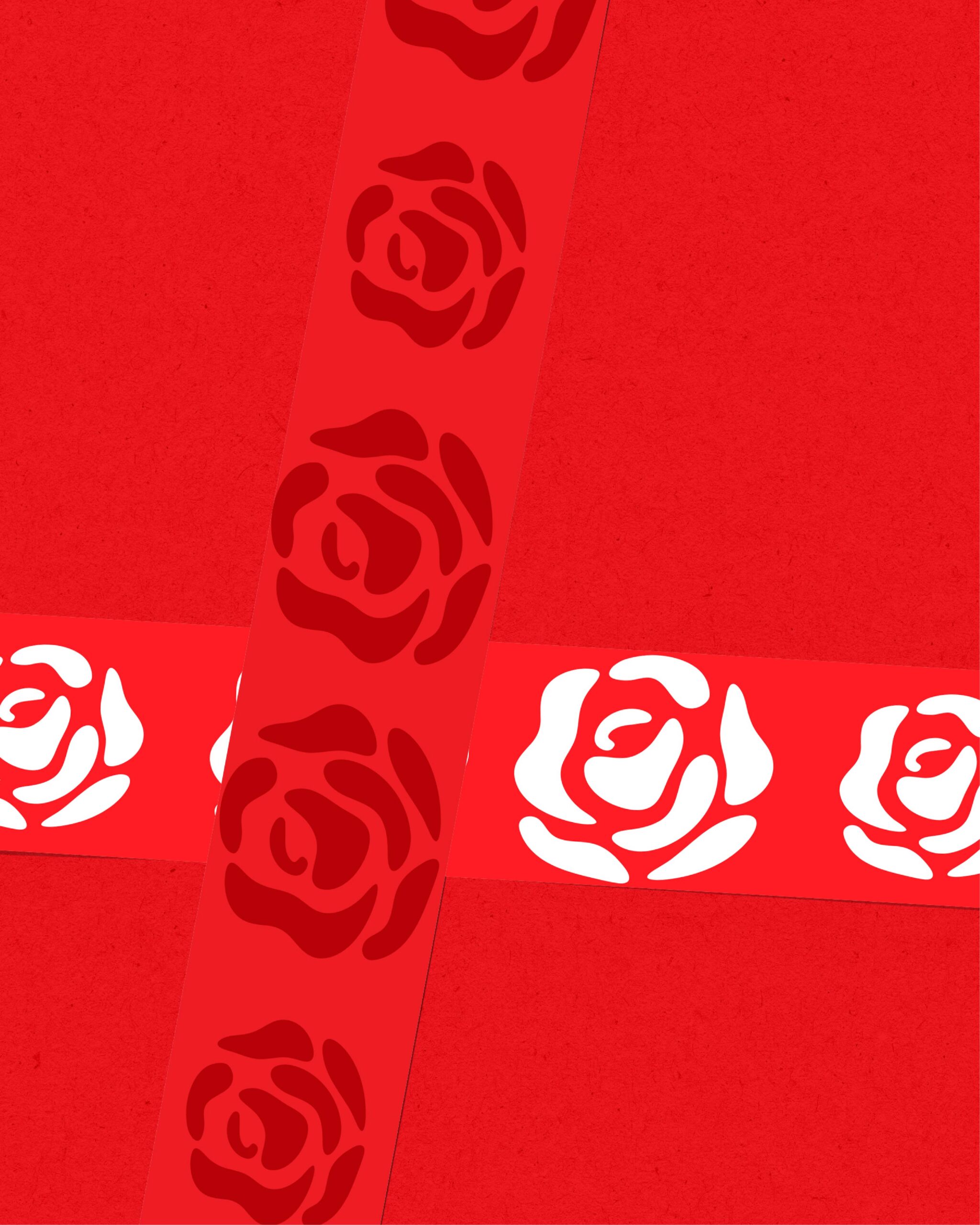
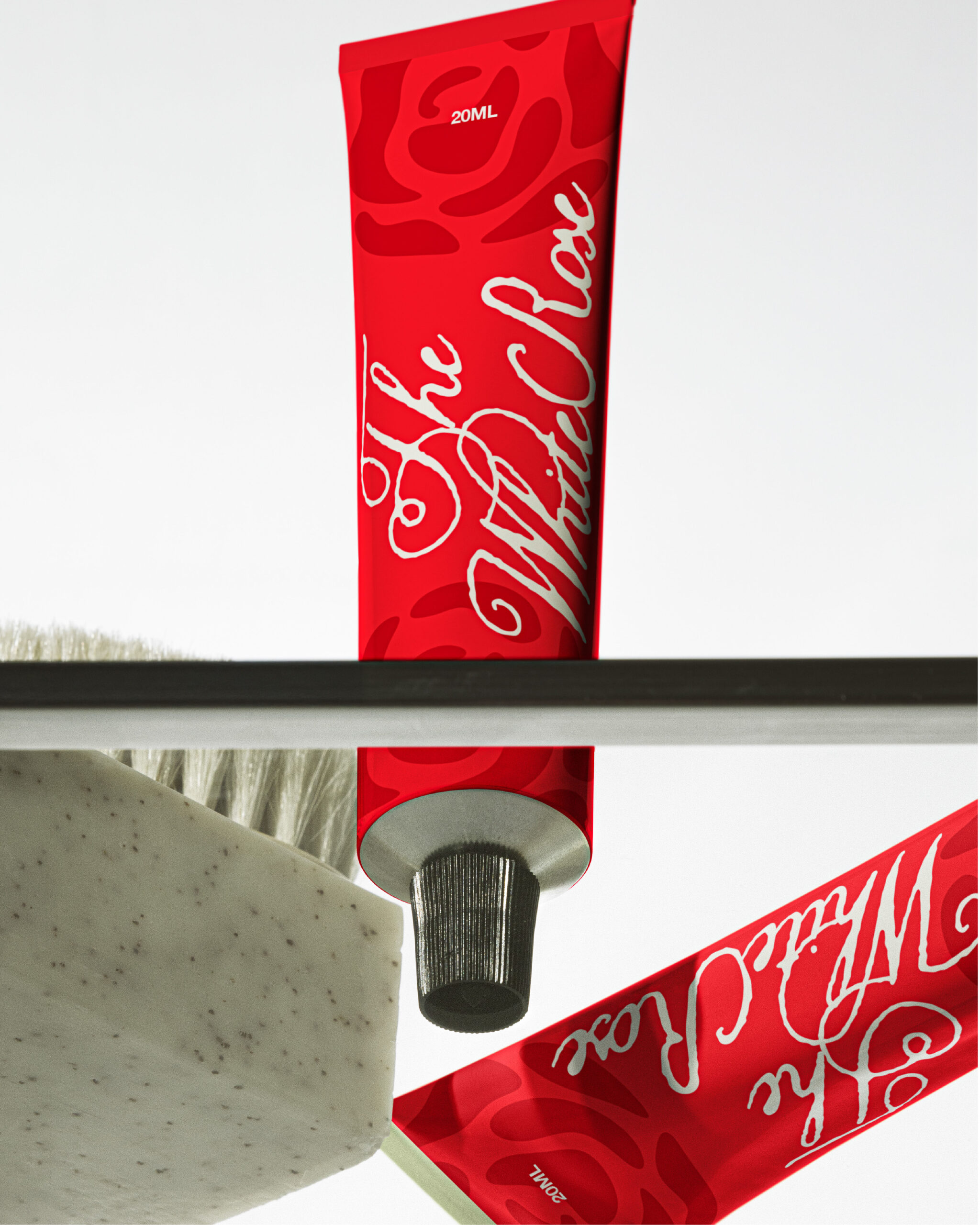
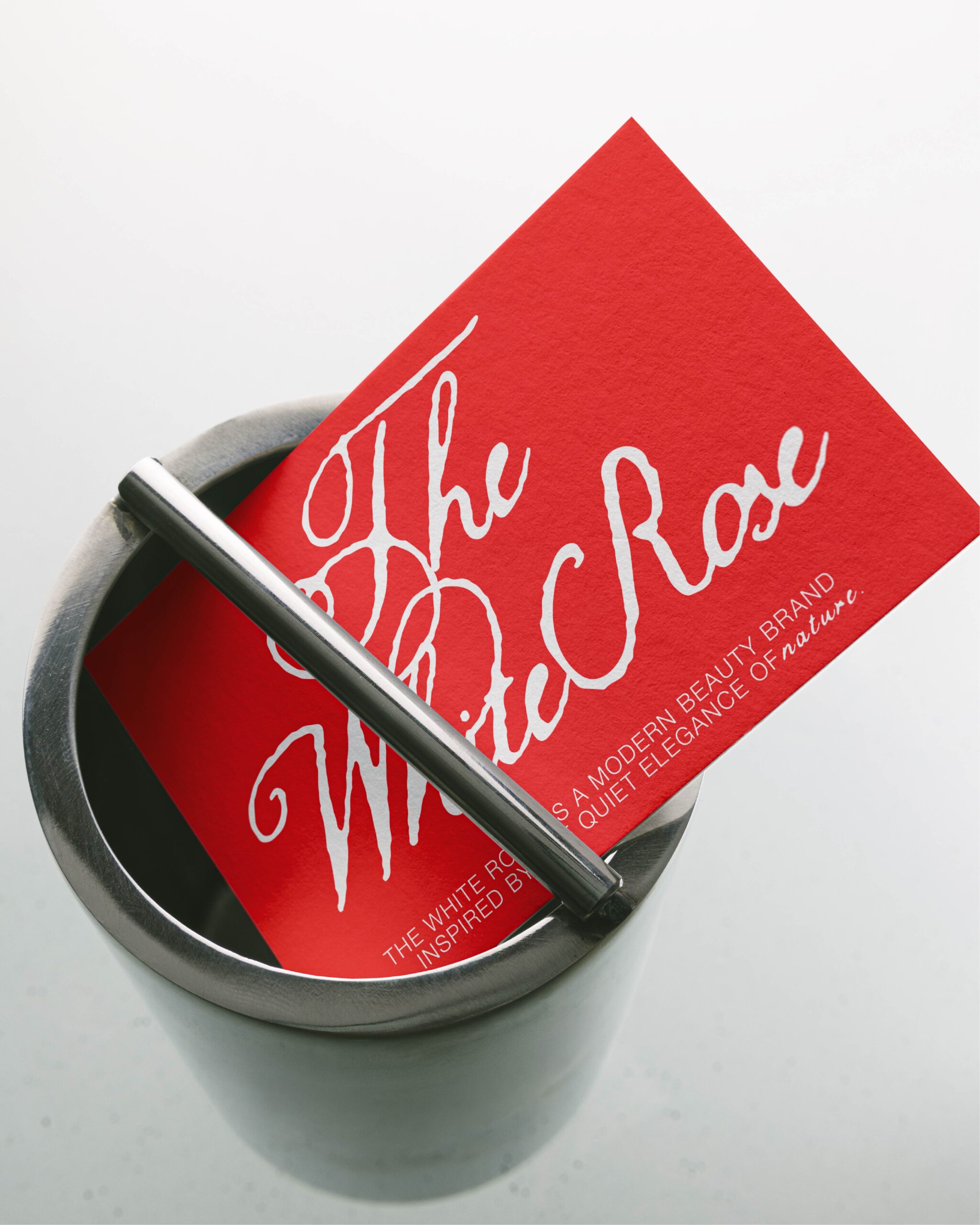
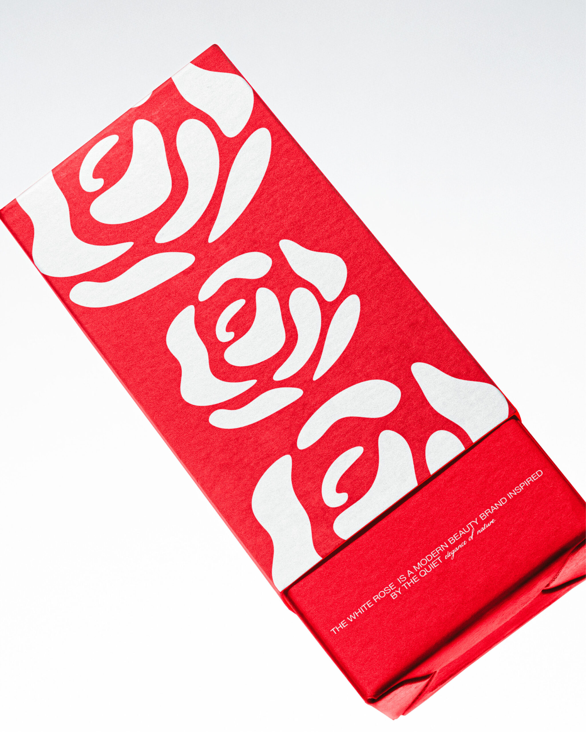
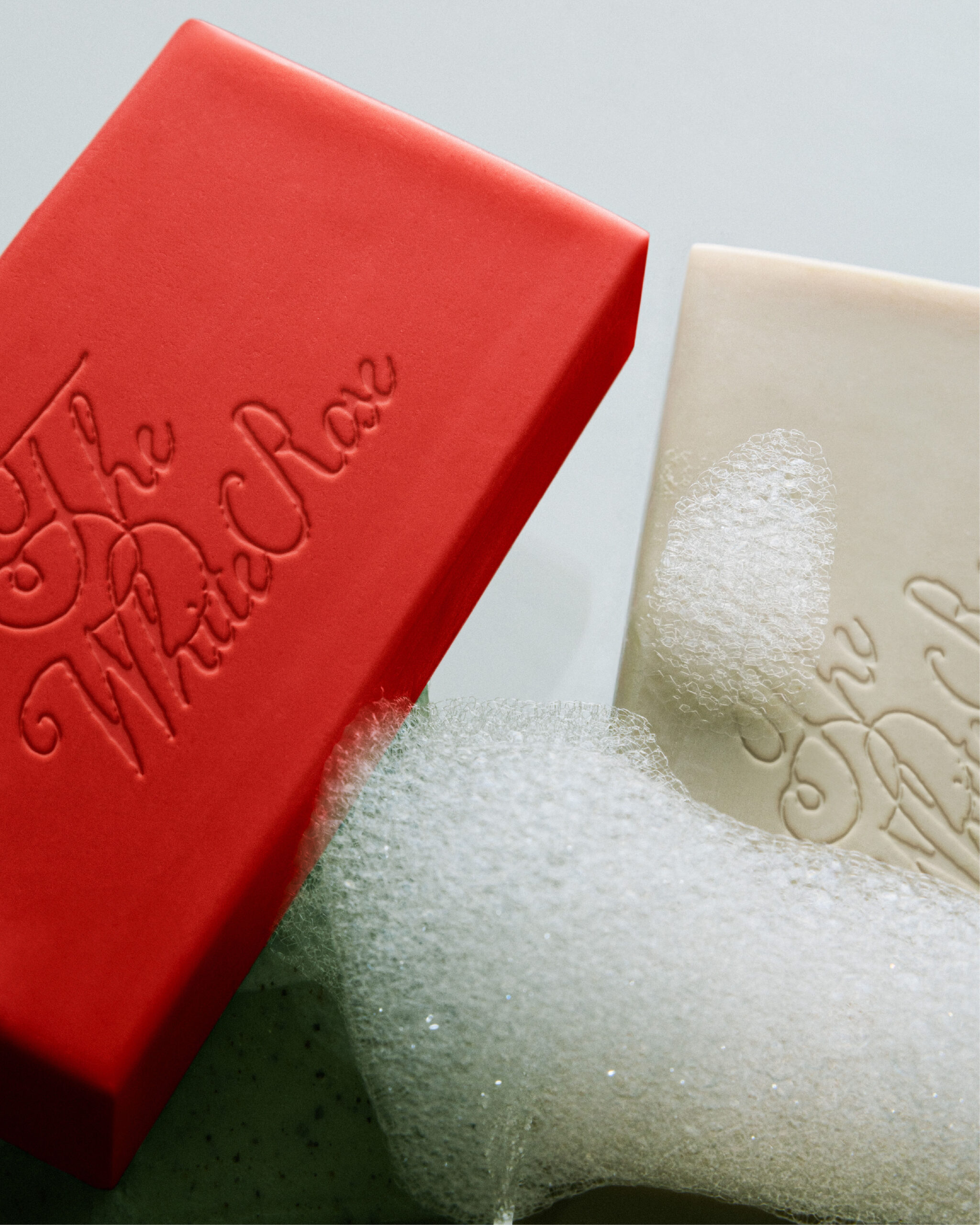
For The White Rose, I explored a bold red-and-cream visual language with expressive typography, tactile details, and sculptural packaging forms to create a beauty identity that feels confident, playful, and unmistakably its own.
From the embossed soap bars to the statement tube and structured box — every touchpoint was designed to make the brand feel like an experience, not just a product.
 hello ocean
 monther al omari
 the Labelmaker
 alamgirbrands
 kat bres
 Vantablack Studio
 GruppoSaida
 studiorevv
 grafisercreative
 Kate Reichel
 UPRISE
 Modern Theory
 MAISON D'IDÉE Prague
 Kinshuk Bainss
 Palashcc
 www.branding.uz
 Hutton Creative
 DESIGN CONCEPTS
 Tancybox
 habiba hatem
 Up-Brands
 sayadworks
 Kingdom & Sparrow
 furtgoods
 Si me preguntas
 Narrow House Packaging Branding & Design