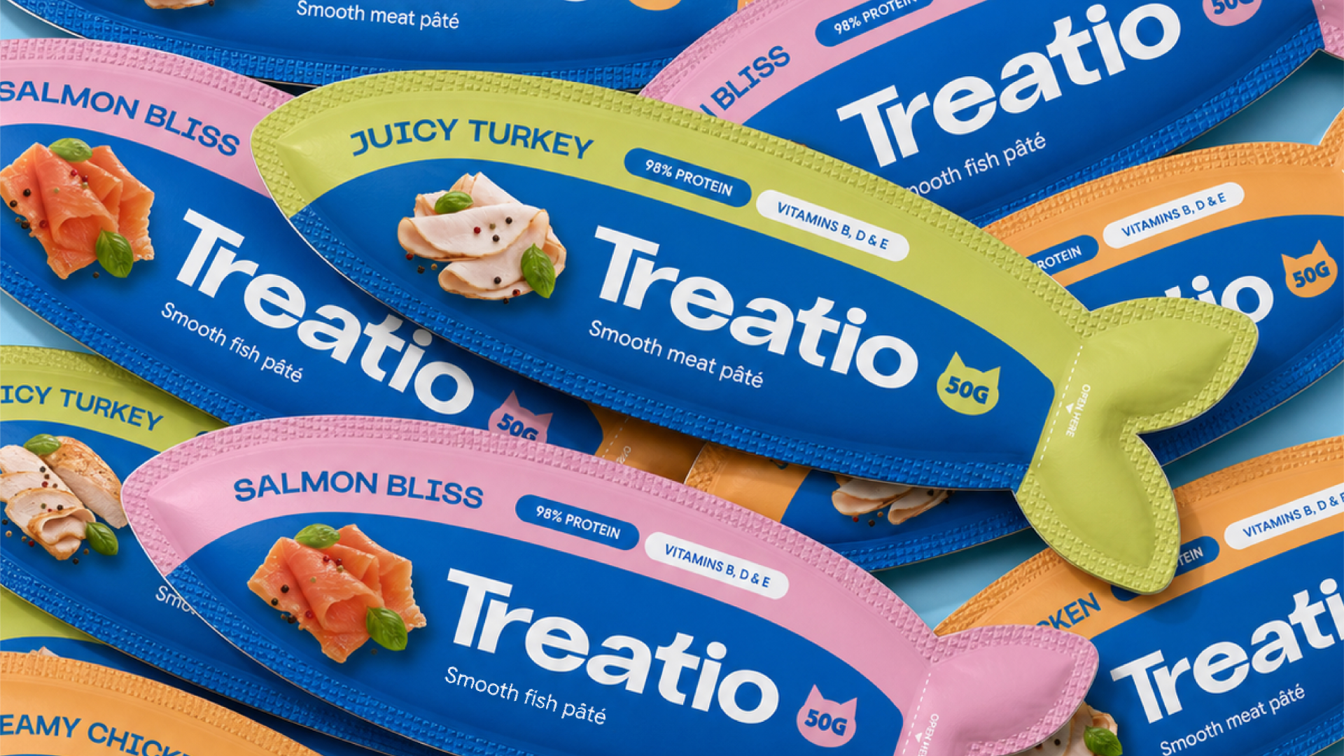

Treatio is a brand of single-serve treats for cats and dogs. Its range includes pâtés in different flavours, served directly from the pouch or added to a pet’s bowl. The project brings together logo design, brand identity and packaging in a system designed to grow with the product range.
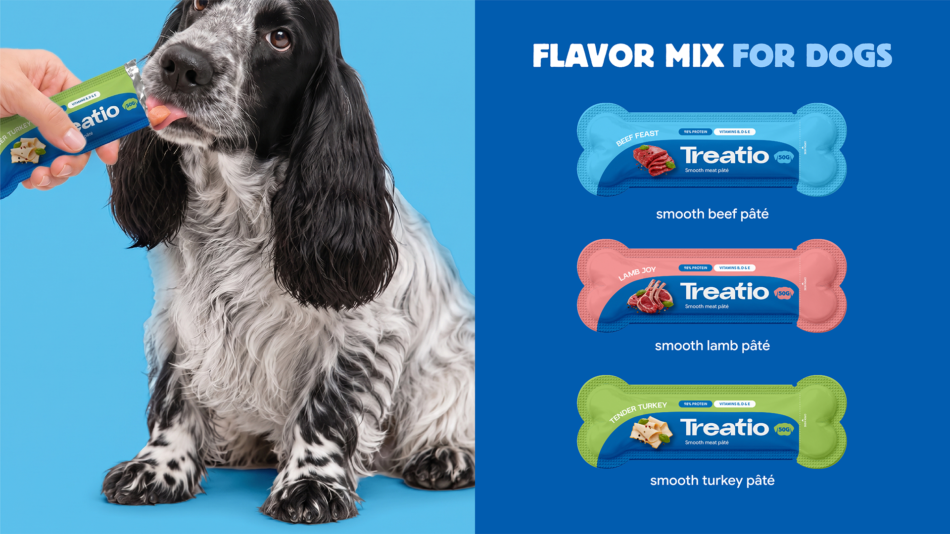
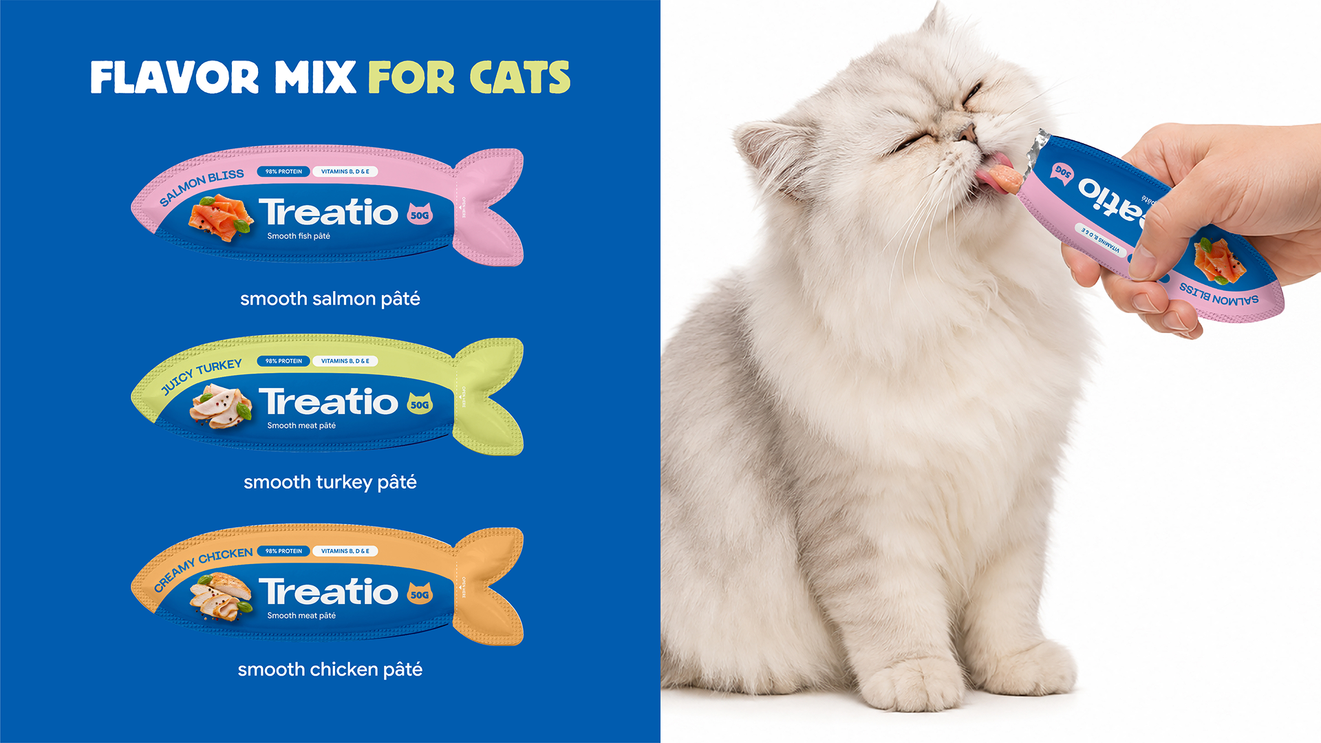
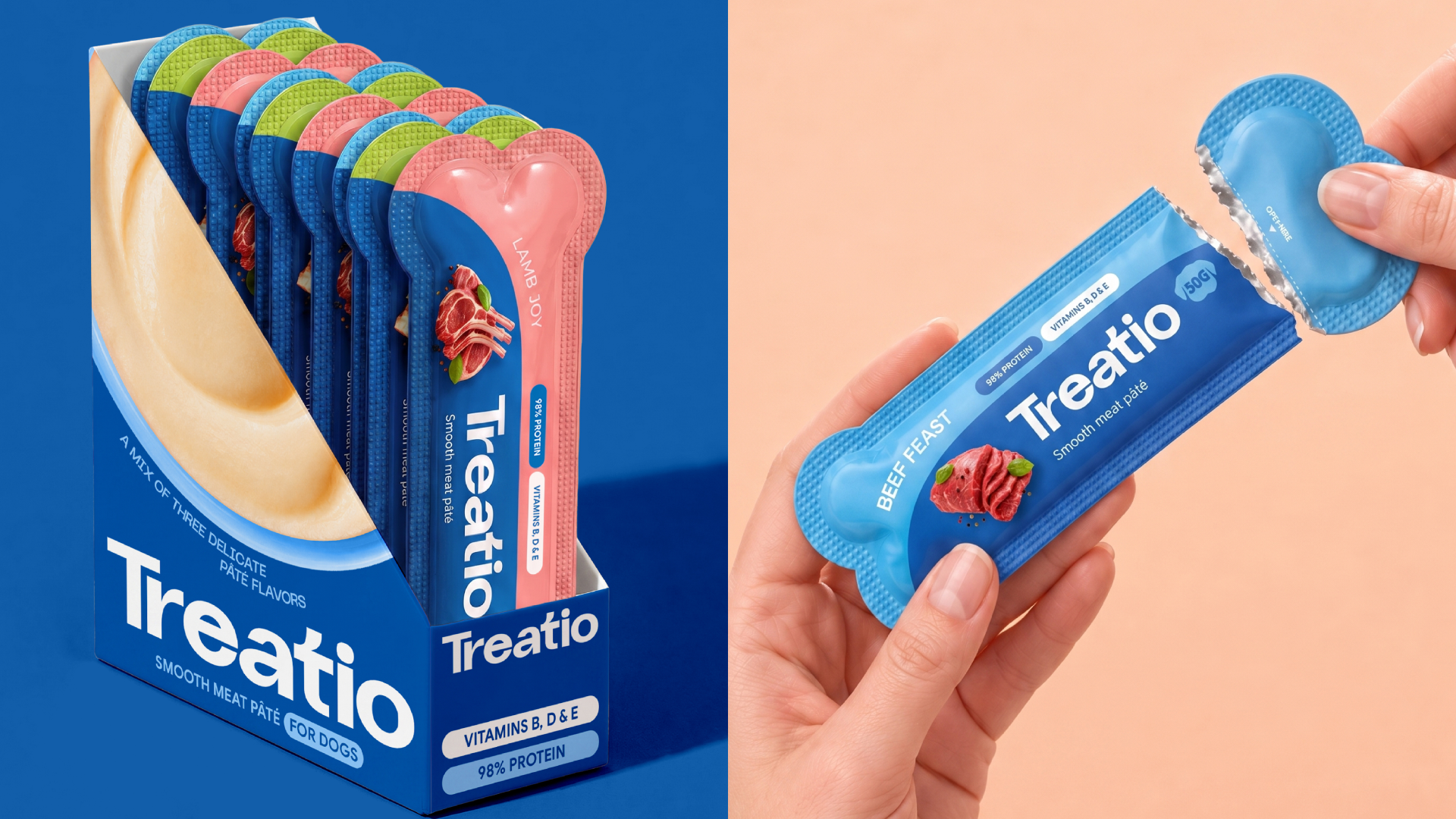
The concept uses familiar shapes to make the packaging intuitive: a fish for cats and a bone for dogs. These silhouettes become the defining elements of the identity, helping customers distinguish the two product lines while giving the brand a playful character.
A signature blue colour connects the range, while secondary colours identify individual flavours. This shared visual structure keeps the cat and dog products recognisable as part of the same brand and makes the assortment easier to navigate.
The packaging combines a prominent Treatio logo with ingredient imagery and a clear typographic hierarchy. Each element has a specific role: the shape signals the intended pet, the imagery introduces the flavour, and the text provides essential product information. The distinctive pouch formats also reinforce the idea of a small, individual treat.
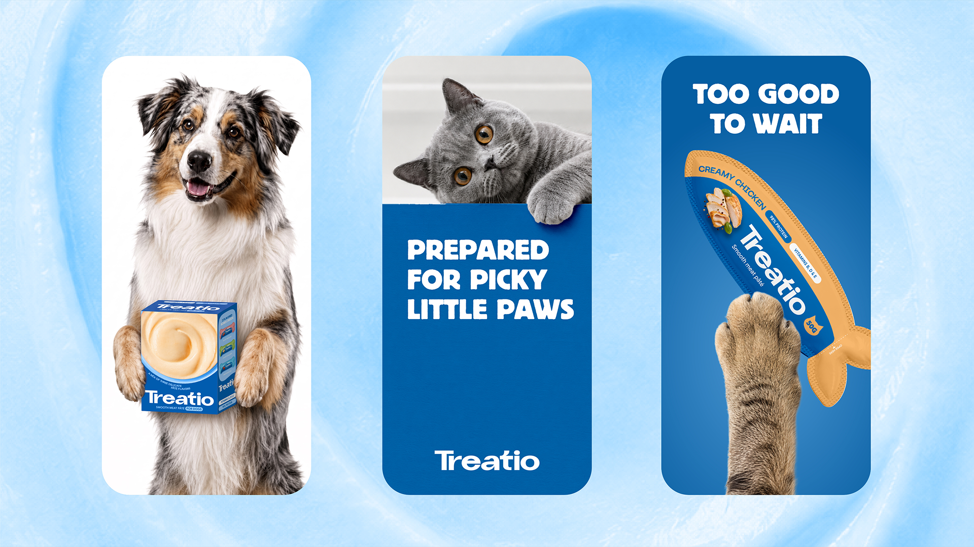
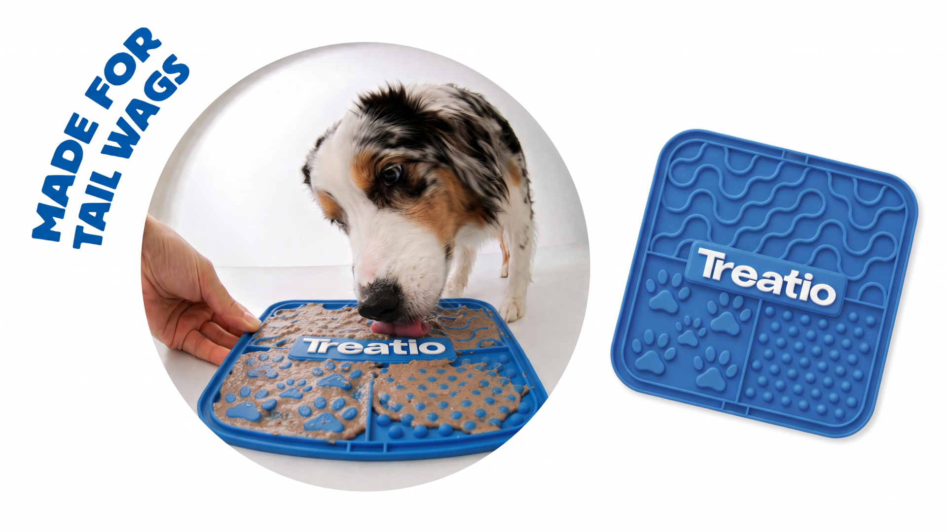
The visual language extends into advertising and branded accessories, carrying the same colours, typography and playful approach across different applications. The result is a brand and packaging concept with two clearly differentiated product lines and a consistent foundation for future flavours, products and communications.

 Up-Brands
 Almighty
 Desember Design Studio
 Daria Levina
 Yuliya Likhacheva
 carola matalinares
 daniitenaa
 StudioMordius
 Simon Pendry Creative
 Sti&Co Design
 Yasmin Sherif
 Roberto De Simone
 aseelstudio
 Rabia zouina
 UPRISE
 HazelBishop
 Qianyu Liu
 siyajacob
 Rohan Barwal | D2C Brand Identity, Logo & Packaging Designer
 Karen Salem
 omarchafik
 nastyaabeketova
 Roberto Núñez Studio