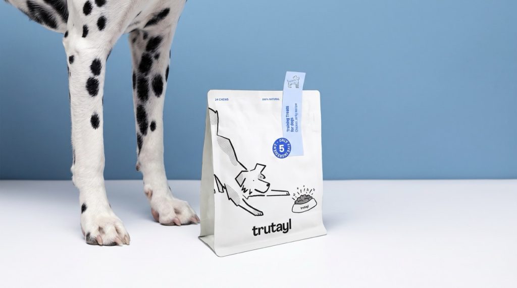

TruTayl is a pet wellness brand built around a clear premise: pets deserve the same quality standards as their owners. The brand offers human-grade, all-natural formulations designed to support everyday pet health through simple, effective products. The project scope covered full branding and packaging design — from visual identity strategy through to the complete packaging system.
The core design challenge was to communicate functional quality and ingredient transparency without falling into the clinical aesthetic that dominates the wellness category. The brand needed to feel trustworthy and rigorous, while remaining warm and approachable for everyday pet owners.
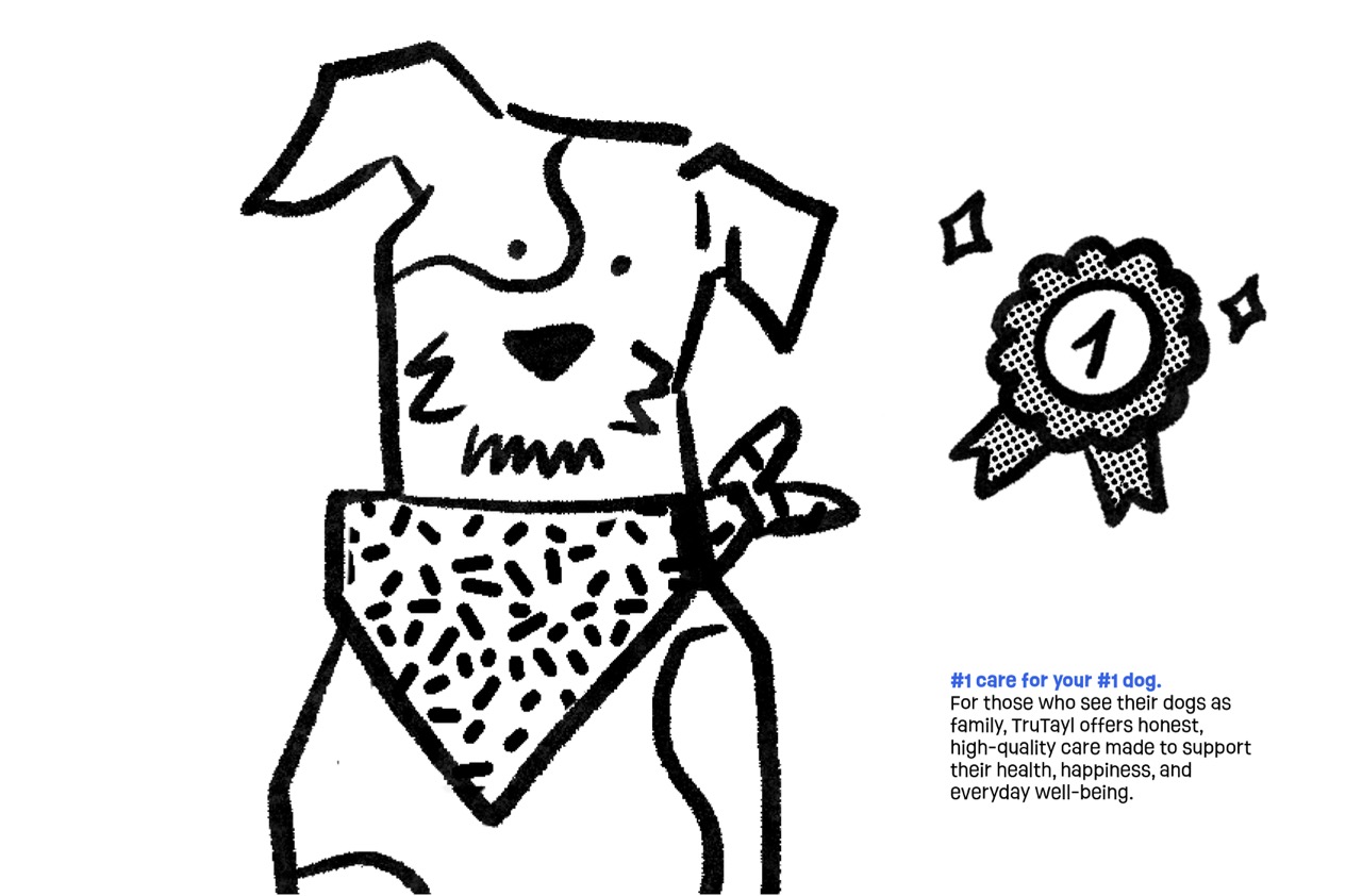
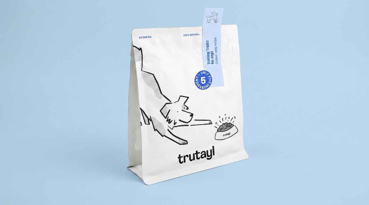
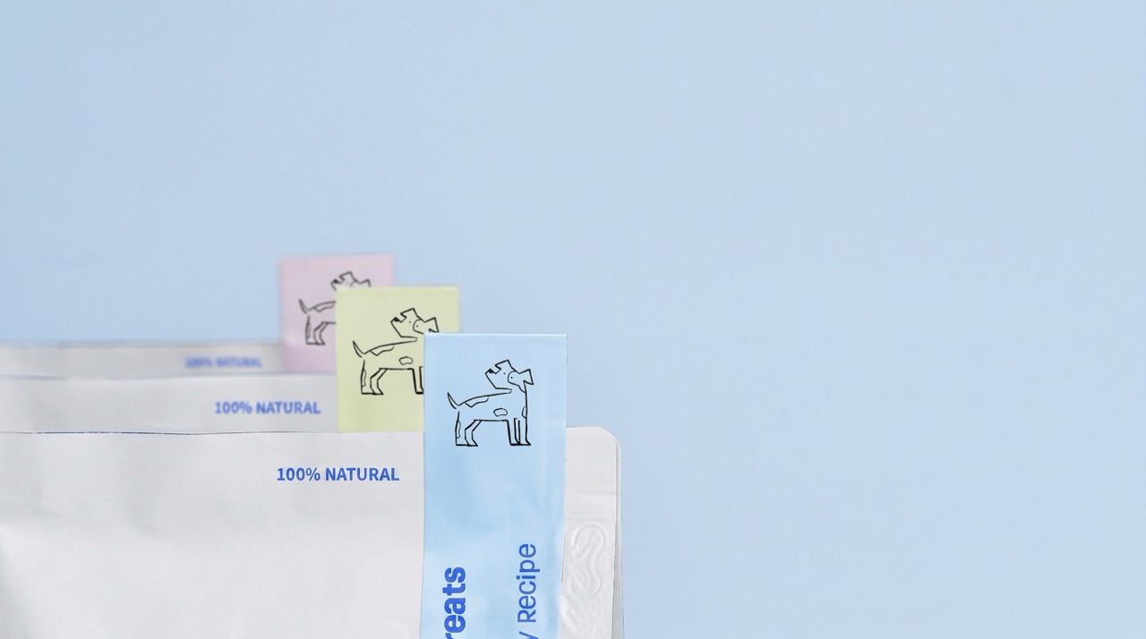
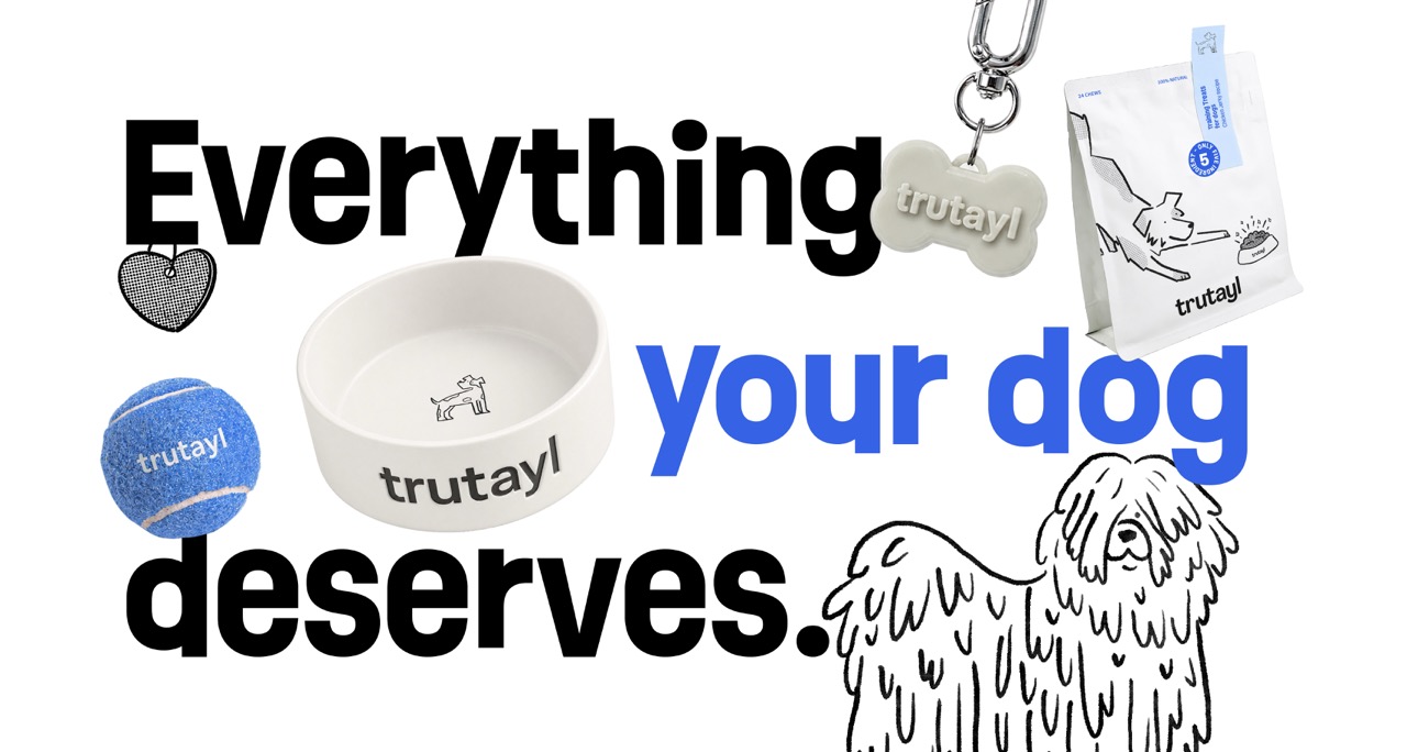
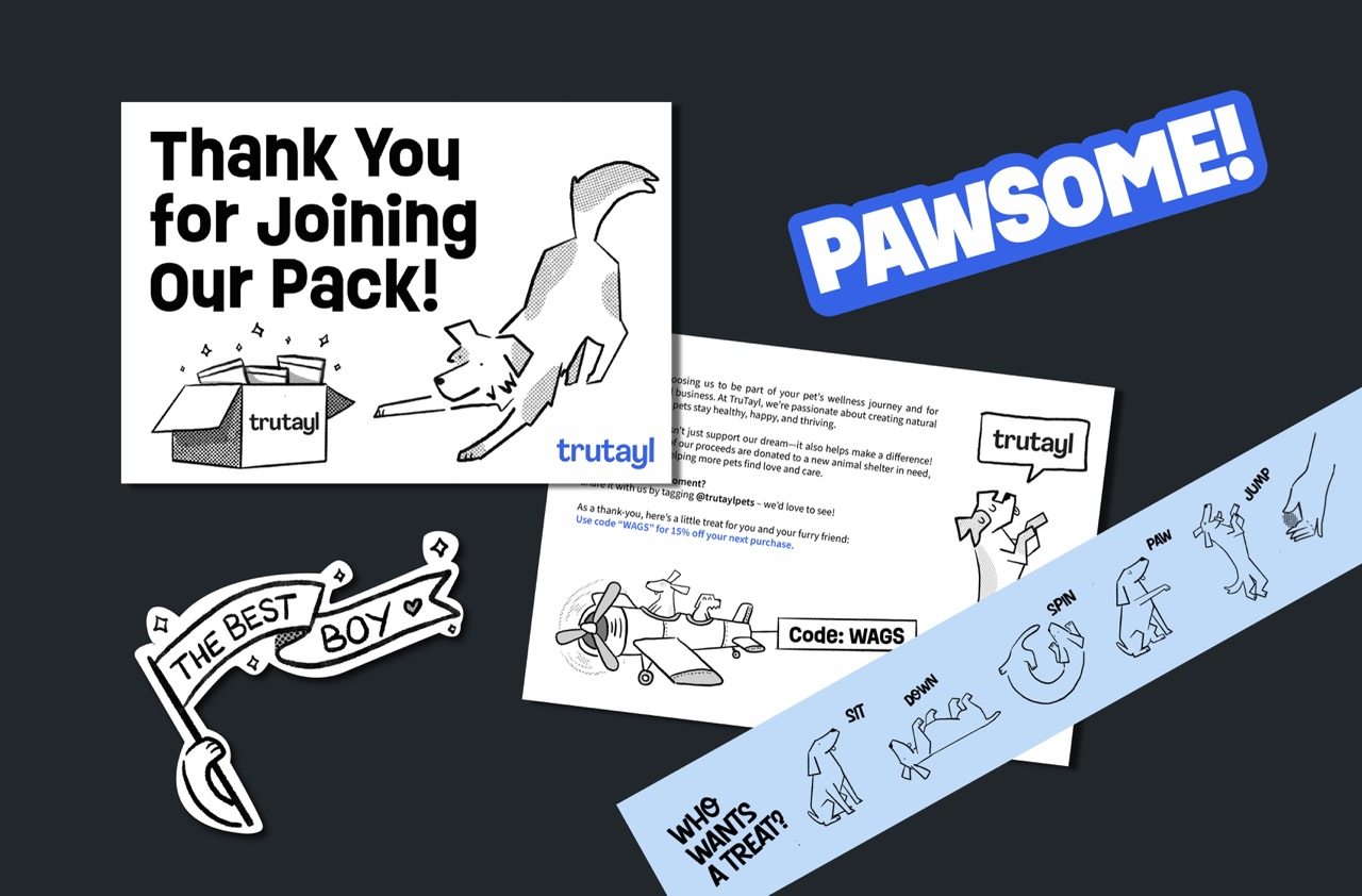
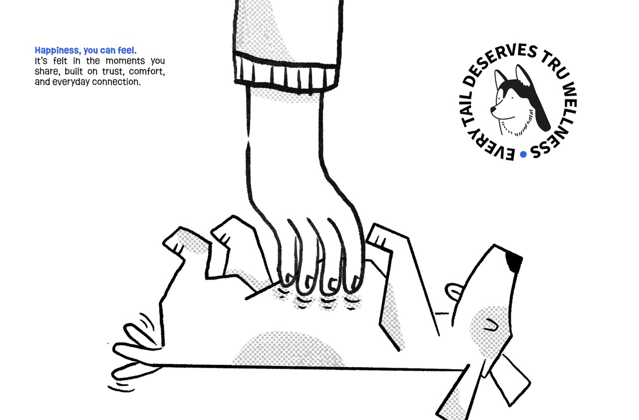
The design direction is rooted in simplicity and honesty. A minimal visual system was developed using a soft, considered colour palette combined with custom illustrative elements. This combination allows the brand to occupy a distinctive space — clean and structured enough to signal quality, but with enough warmth and character to build an emotional connection with the consumer.
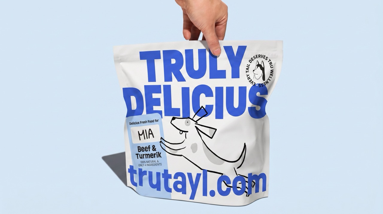
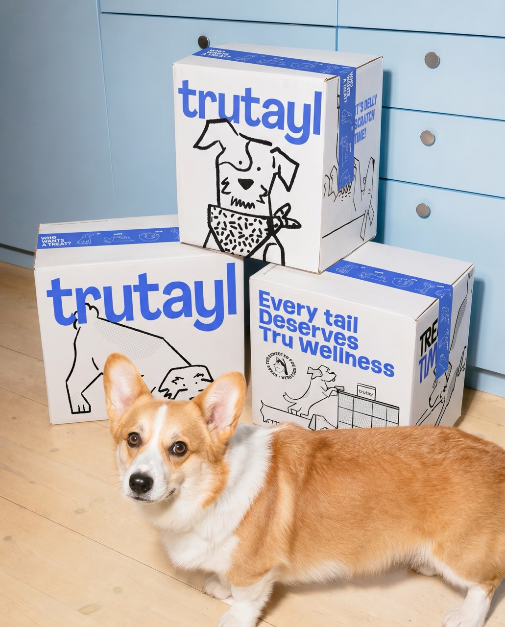
Typography and layout decisions prioritise legibility and consistency across all packaging formats, reinforcing the brand’s commitment to clarity at every touchpoint. The illustrative layer adds personality and shelf differentiation, giving TruTayl a recognisable visual voice within a crowded market.
The resulting identity positions TruTayl as a reliable, modern choice for pet owners who approach their pets’ wellbeing with the same care and intention they bring to their own.
Curator’s Insight
What makes TruTayl’s packaging system worth studying is how it resolves a tension most pet wellness brands don’t even acknowledge: the gap between looking trustworthy and feeling loved.
Clinical packaging signals rigor but creates distance. Character-forward packaging feels warm but can undermine perceived quality. TruTayl threads this by keeping the structural language tight — flat color, restrained layout, consistent typographic hierarchy — while using loose, hand-drawn illustration as the sole expressive outlet. The result is a system where the two registers don’t compete; the illustrations read as personality layered over a credible foundation, not as decoration masking a weaker one.
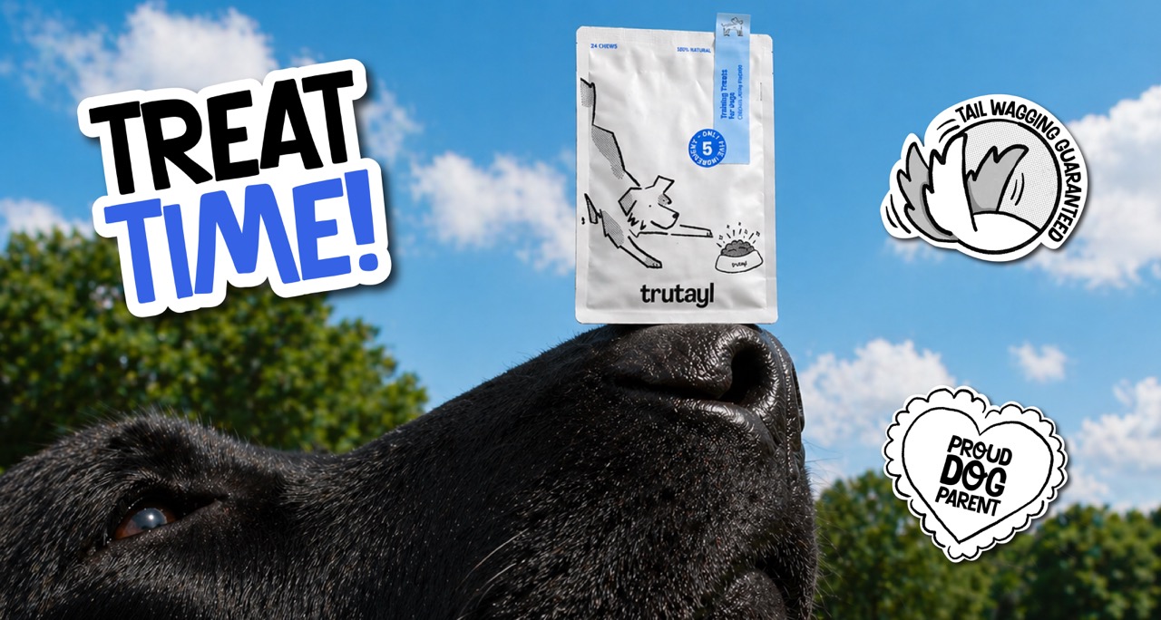
The choice to keep illustrations in outline only, without fill, is particularly sharp. It aligns visually with the white packaging substrate and prevents the illustrative elements from ever feeling heavy or overdesigned. On shelf, this would read as lighter and more premium than many competitors using full-color artwork in the same category. The brand badge and seal motifs add a subtle nod to quality assurance without the earnestness that typically makes such devices feel forced.
 Lisa Pokrovskaya
 Simple Studio
 Studio Unbound
 David Byerlee
 M&A CREATIVE AGENCY
 alchimistestudioParis
 monther al omari
 Studio Be Design
 LogoSayLove
 agenciabud
 Shustova p
 mutta
mutta @Allenarts13
 Sirka Agency
 Atiq Alam
 Dozen Agency
 j.substance
 SCD
SCD Cristian Lepore | crilep Copia
 Chris Creative Works