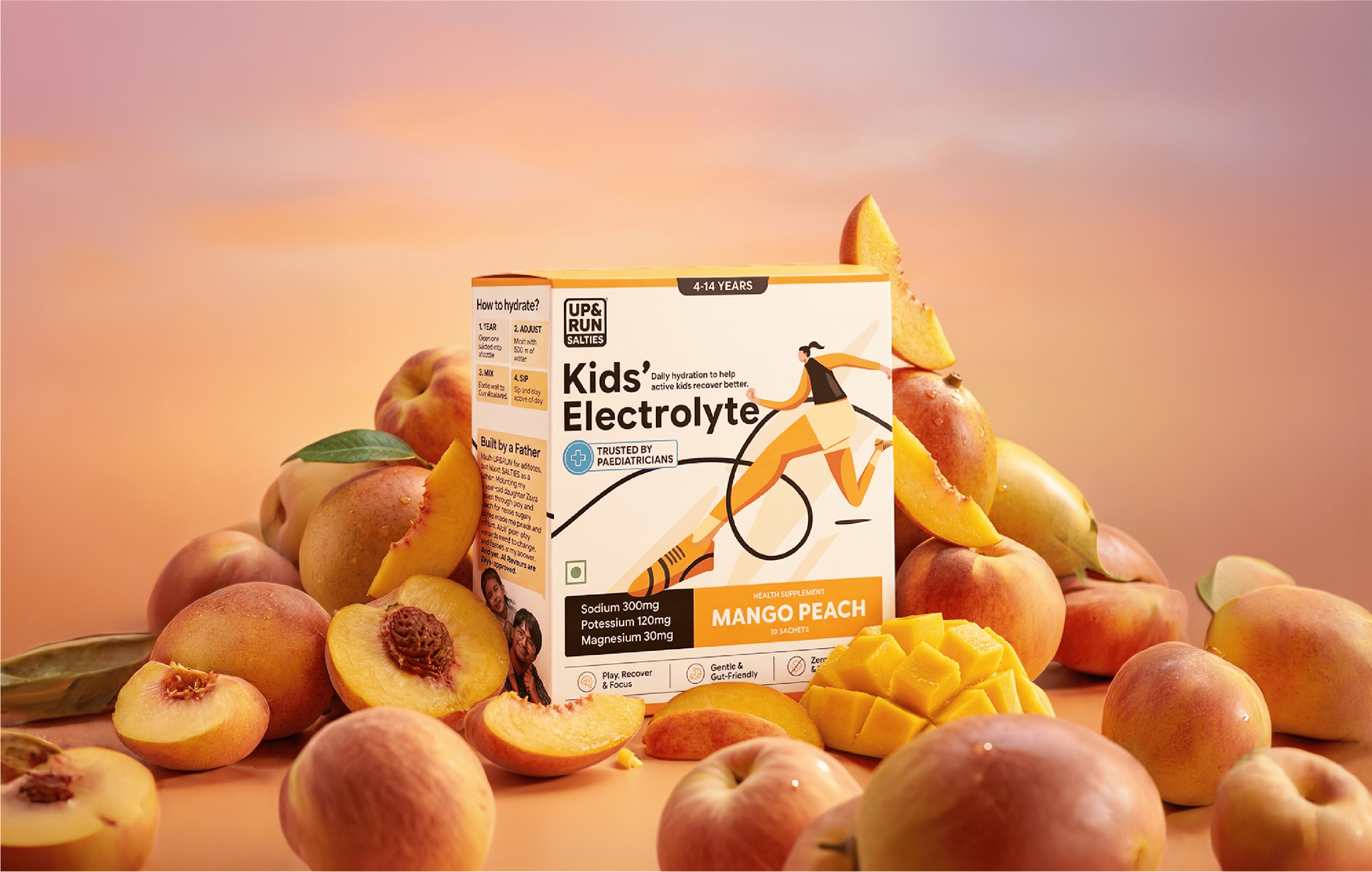

ABOUT – UP & RUN is India’s first hydration-only brand, created specifically for active individuals who refuse to slow down. The brand needed packaging for their kids’ electrolyte line that would break through in a market dominated by homemade solutions like lime water and coconut water that Indian parents have trusted for generations. The challenge was creating packaging that speaks to both decision-makers: parents who prioritize safety and transparency, and kids who want something exciting and engaging.
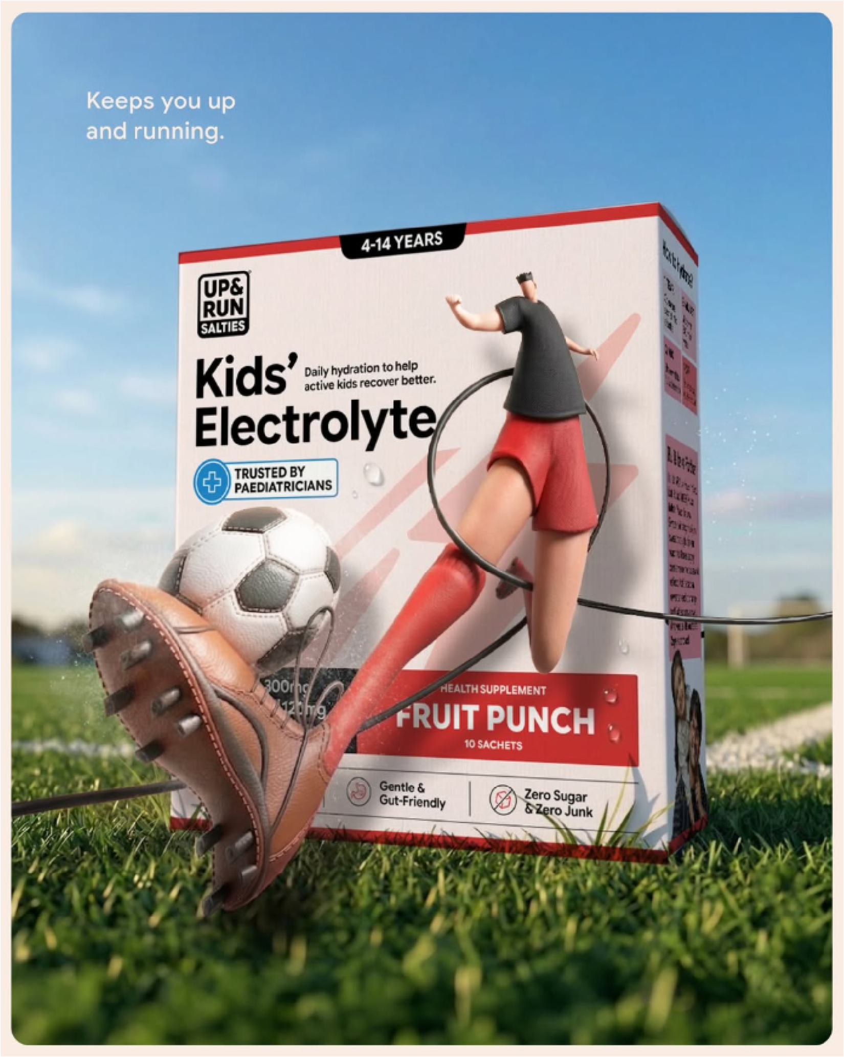
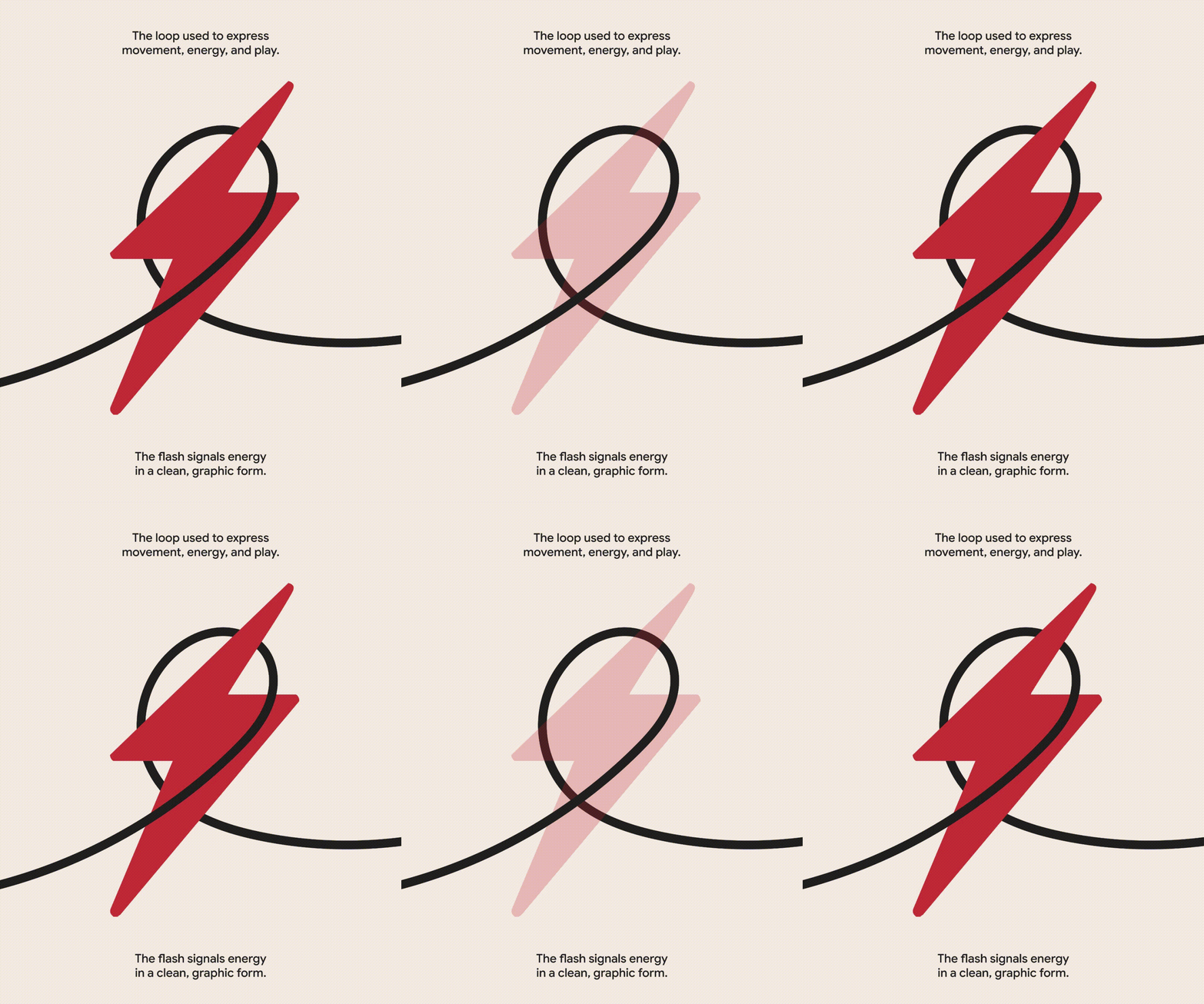
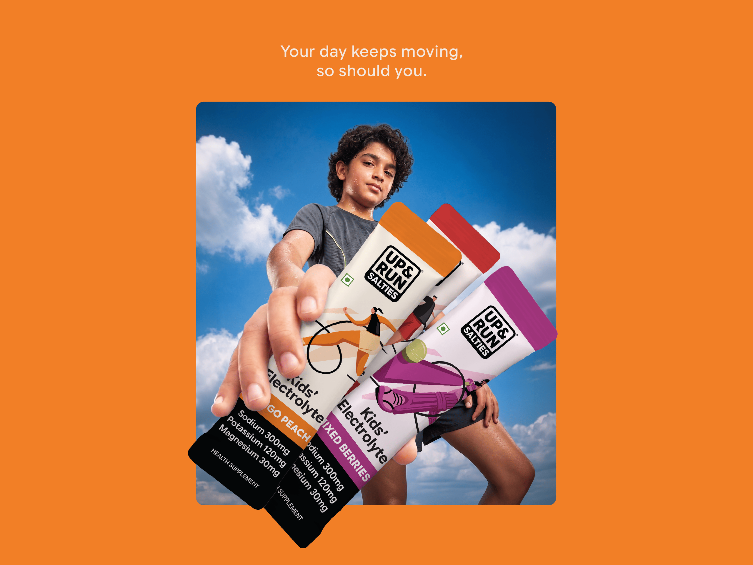
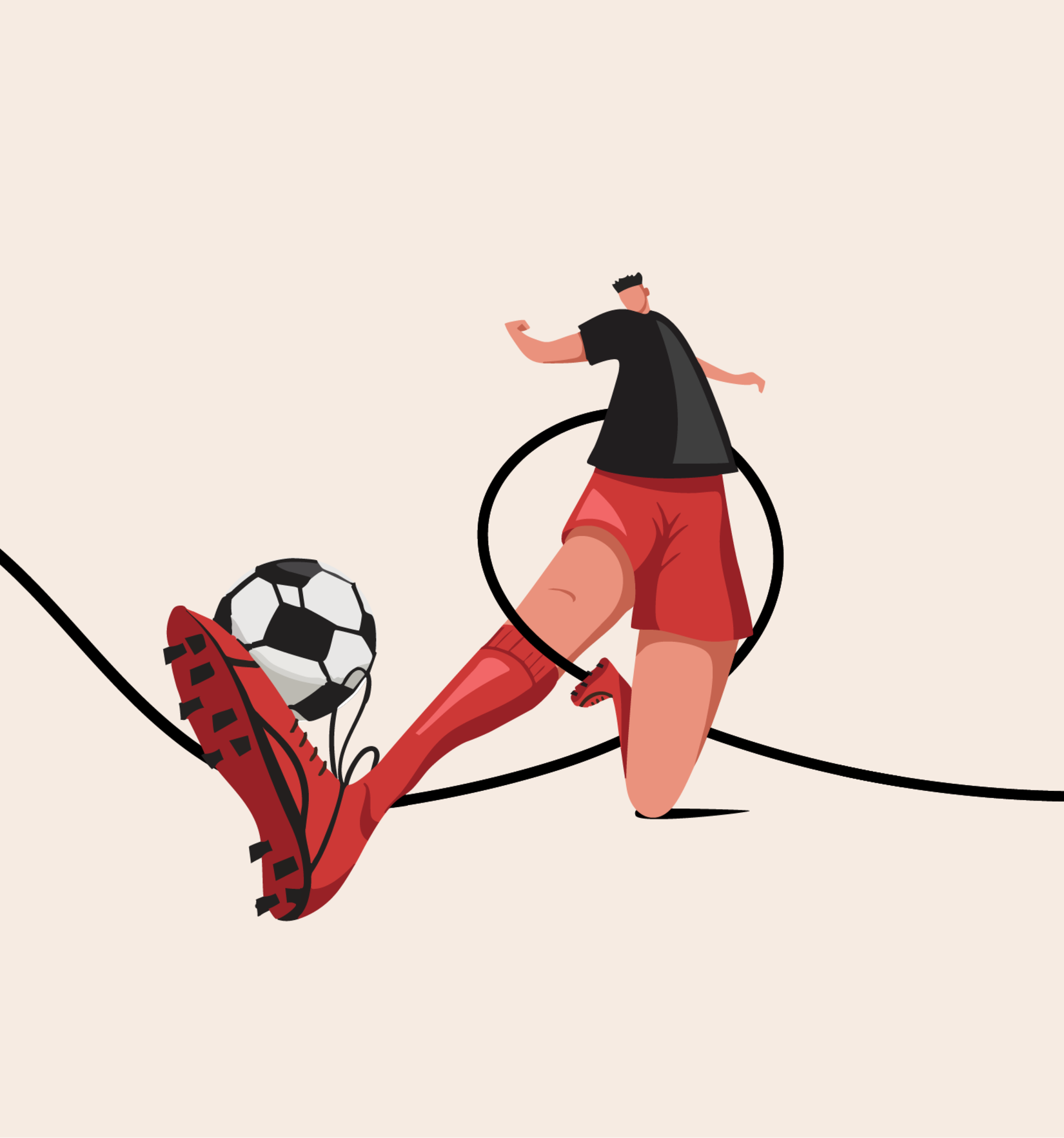
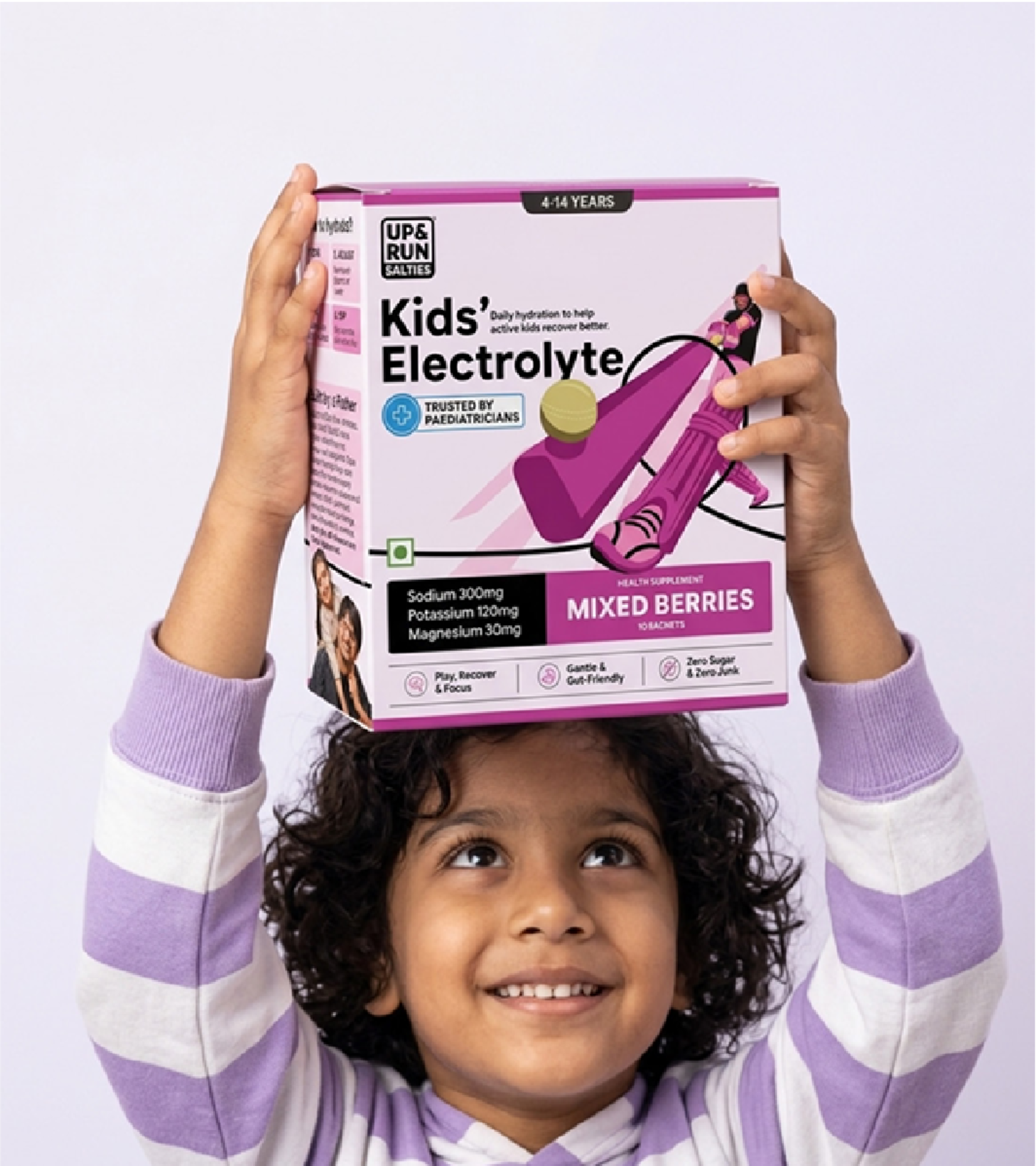
SOLUTION – We developed a movement-driven visual identity that positions hydration as fuel for an active lifestyle rather than a medical intervention. The key breakthrough was replacing static product photography with dynamic custom illustrations showing kids in real sporting scenarios—soccer players mid-kick, swimmers in motion, cricketers smashing the ball. This visual language communicates that UP & RUN isn’t about treating dehydration; it’s about sustaining movement.
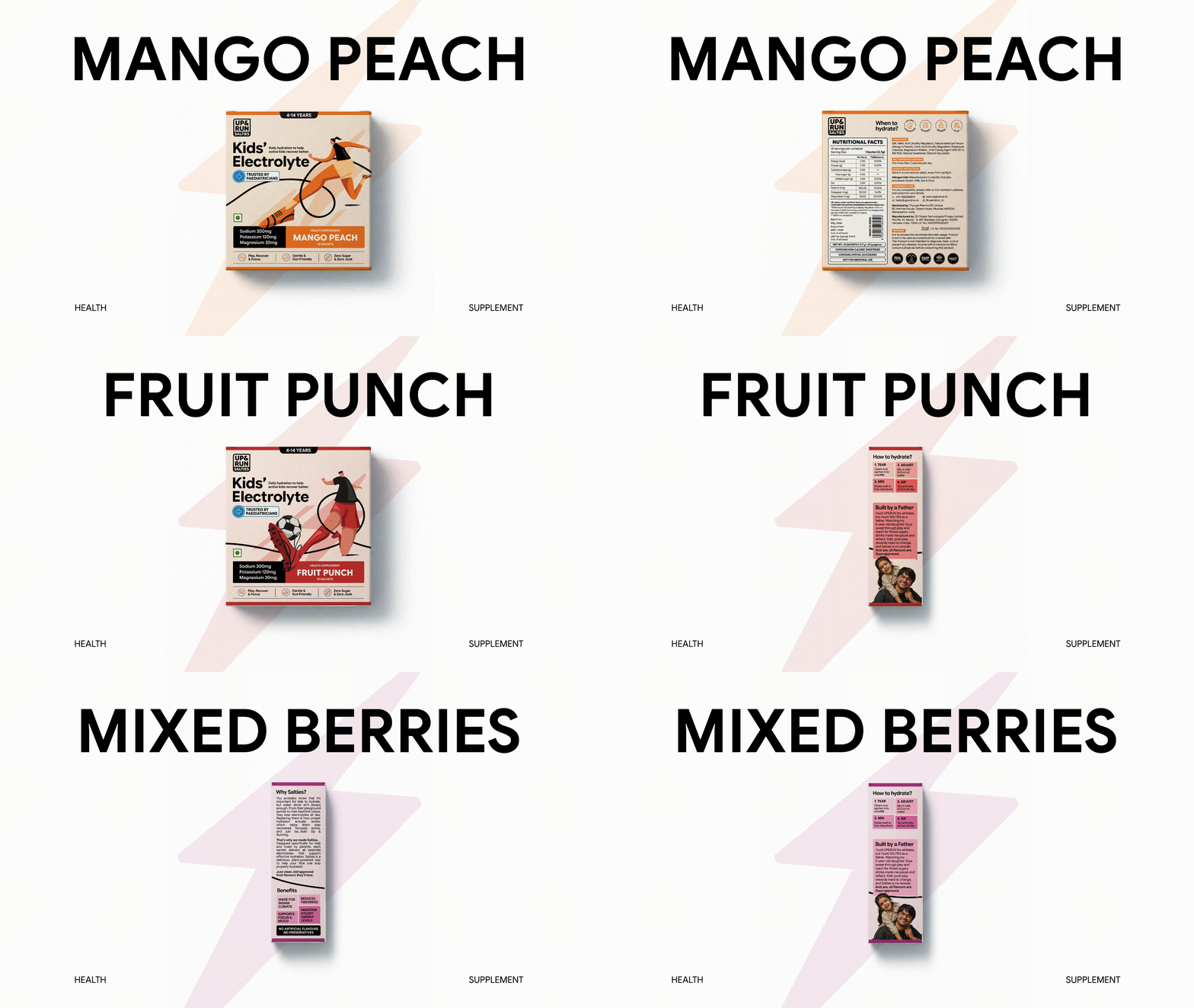
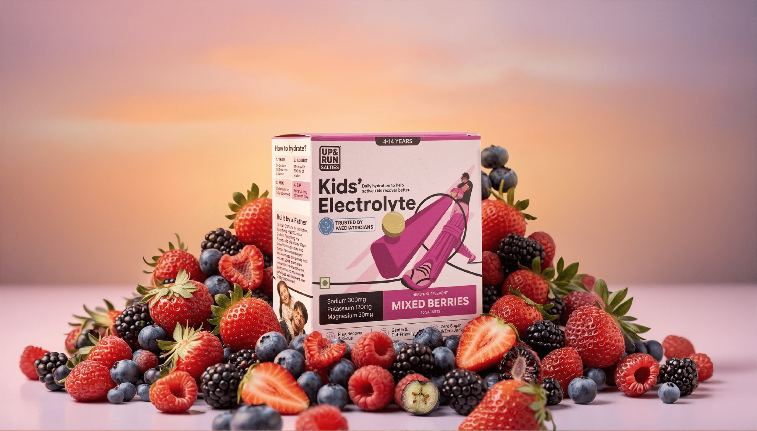
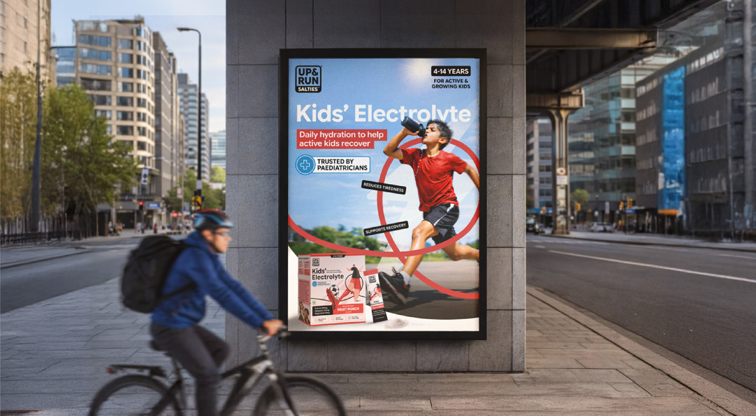
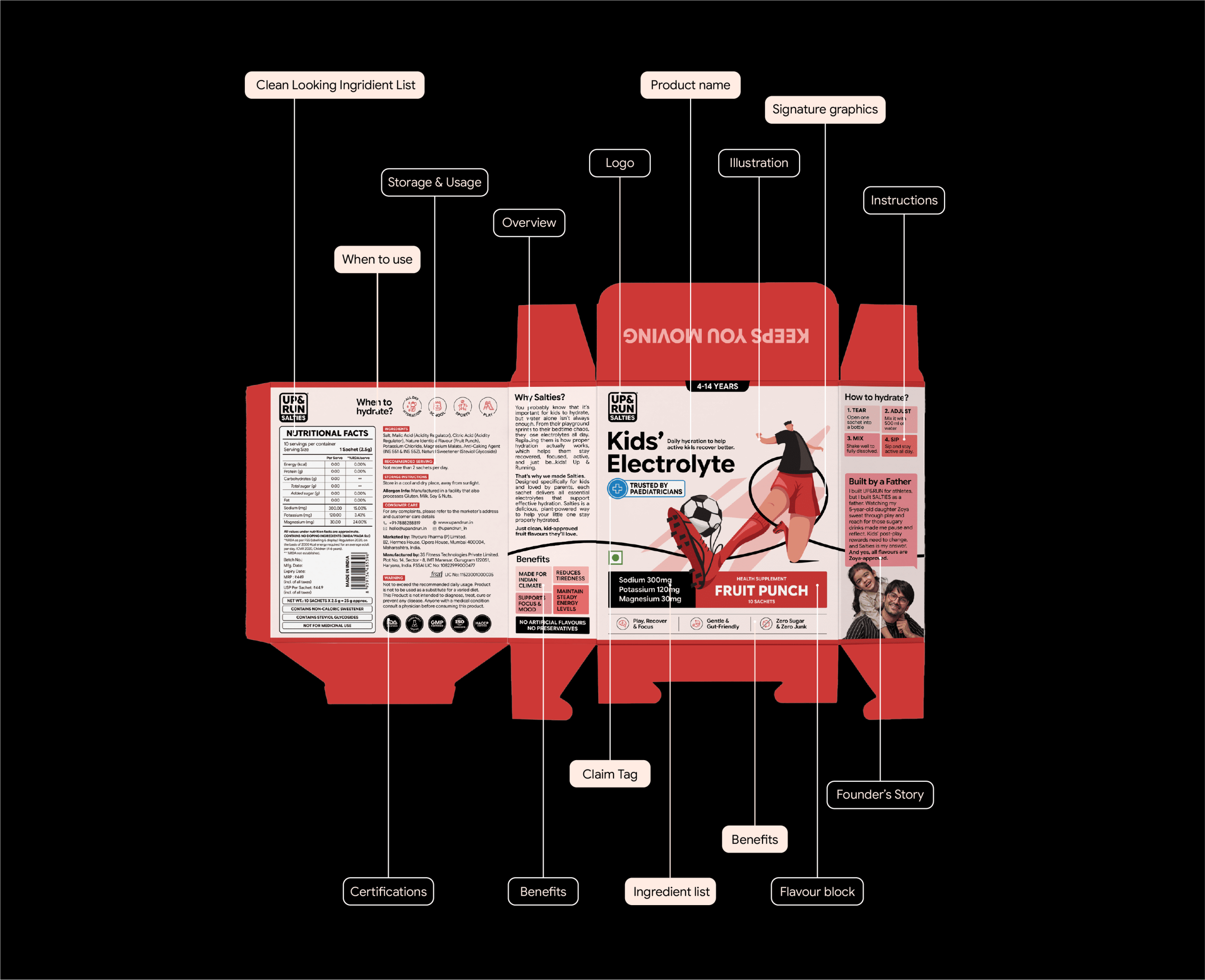
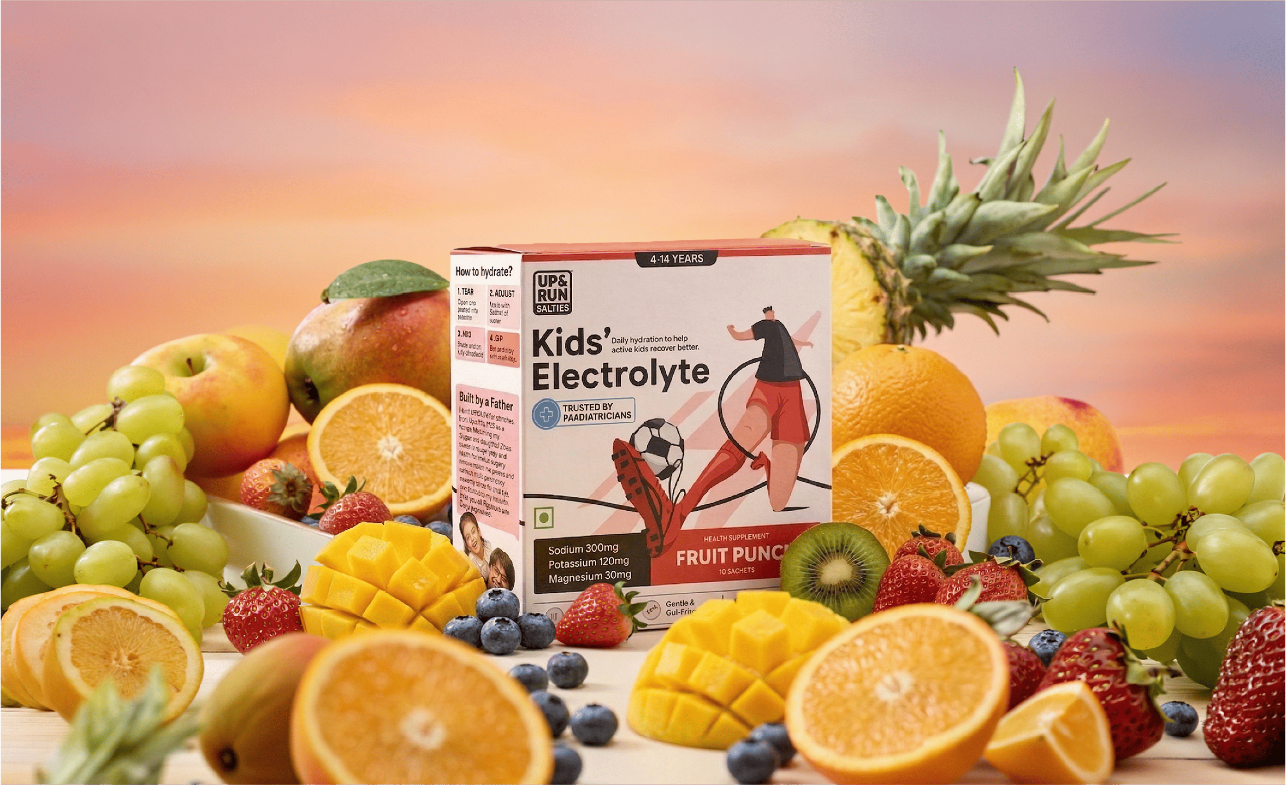
The packaging architecture employs a dual-narrative approach: the front panel builds parental trust through pediatrician approval badges, transparent ingredient listings, and prominent “no added sugar” messaging, while energetic sport illustrations engage young users. The back panel transforms typical supplement education into lifestyle guidance, showing when and how to use the product as part of daily activity rather than crisis management.
Typography hierarchy ensures critical safety information remains visible without overwhelming the playful aesthetic, while the SALTIES sub-brand creates clear product differentiation across flavor variants.
RESULT – This packaging successfully bridges the parent-child decision gap in a category where safety concerns typically override appeal. Kids love the dynamic sport illustrations and energetic visual language, while parents appreciate the transparent ingredient communication and pediatrician approval messaging. By positioning electrolytes as performance enhancement rather than medicine, UP & RUN carved out new territory in the Indian hydration market. The movement-focused design language differentiates from clinical supplement aesthetics while building the credibility needed to compete with trusted homemade alternatives, establishing UP & RUN as both modern convenience and familiar safety that resonates with both generations.
This addition makes the success story more tangible and shows that the dual-narrative strategy actually worked in practice with both target audiences.
 Derrick Lin
 monther al omari
 43oz
43oz lilyz design23
 Modern Theory
 Eighteen Brand Studio
 Bhumika Singh
 MohamedMashaly
 Pixels Studio
 Gulya
Gulya UPRISE
 Lizaveta Kharitonyuk
 Bonsanco Creative Studio
 DesignRepublic
 GIRAFA STUDIO
 PiotrWisniewski
 Sophiagdotcom
 CreativeWise
 SoreThumbStudio®
 Modern World Studio
 Palashcc
 Valérie Colace