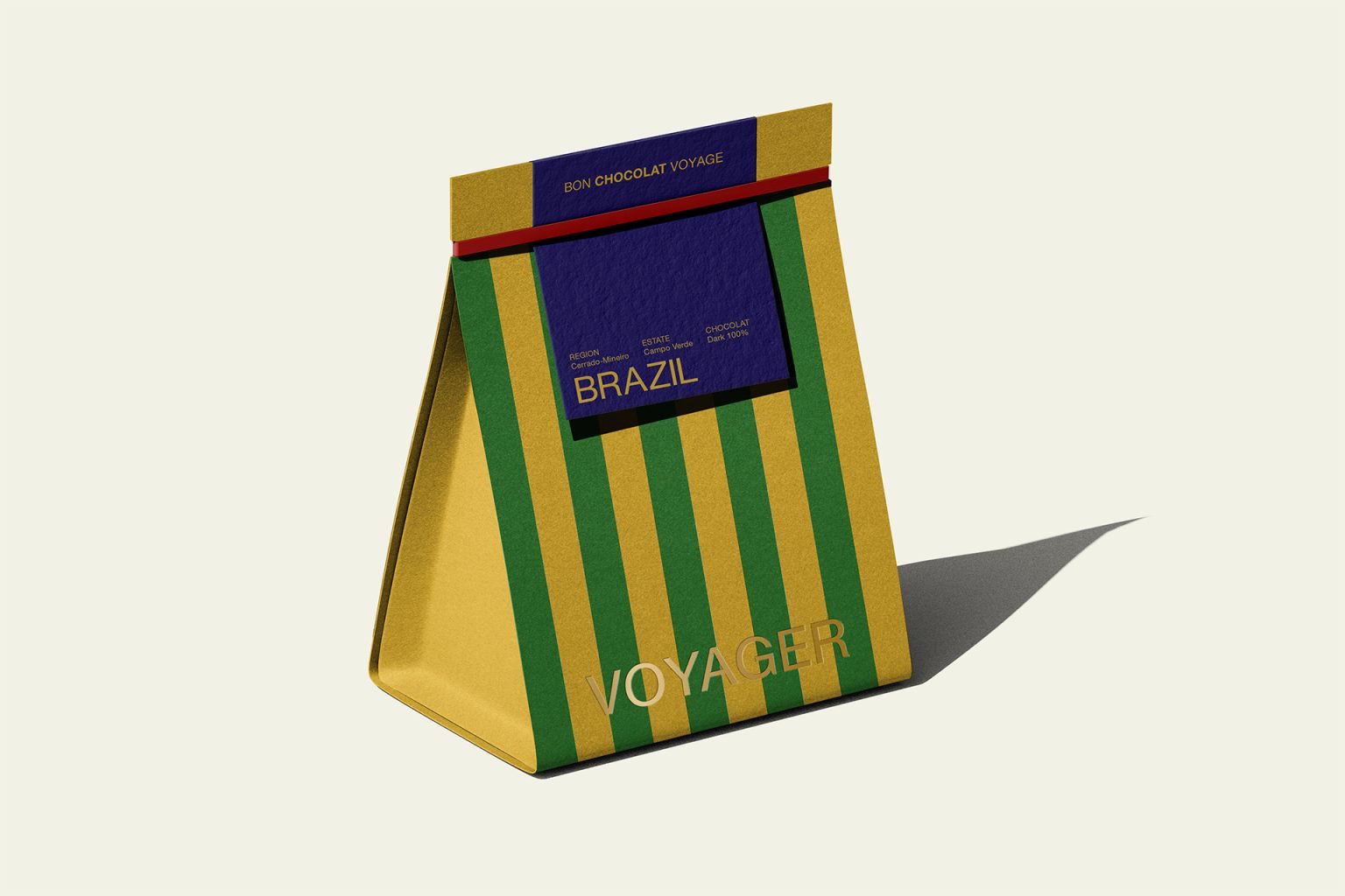

CONTEXT/ A premium chocolate that embodies the founder’s spirit of adventure. The goal is to stand out through the shape of the packaging, while also offering a sustainable solution.
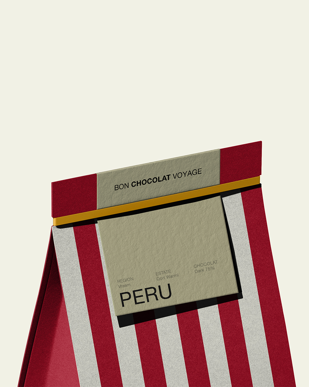
DESIGN/ Its iconic striped design pays homage to the camping tarps spread out in the most remote and unexplored corners, reinforcing the “voyager” (traveler) name. The French name was chosen to give the brand a more chic touch.
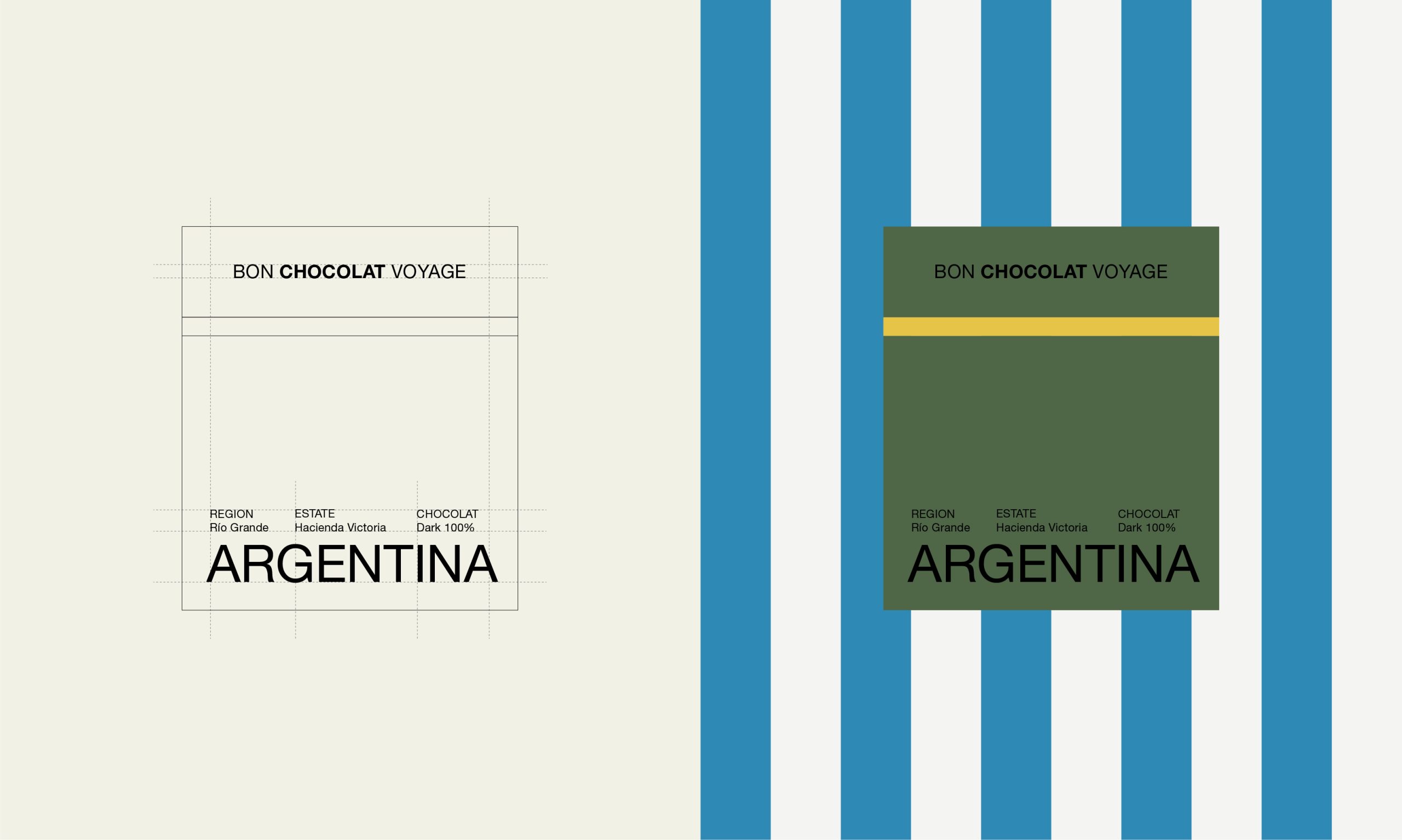
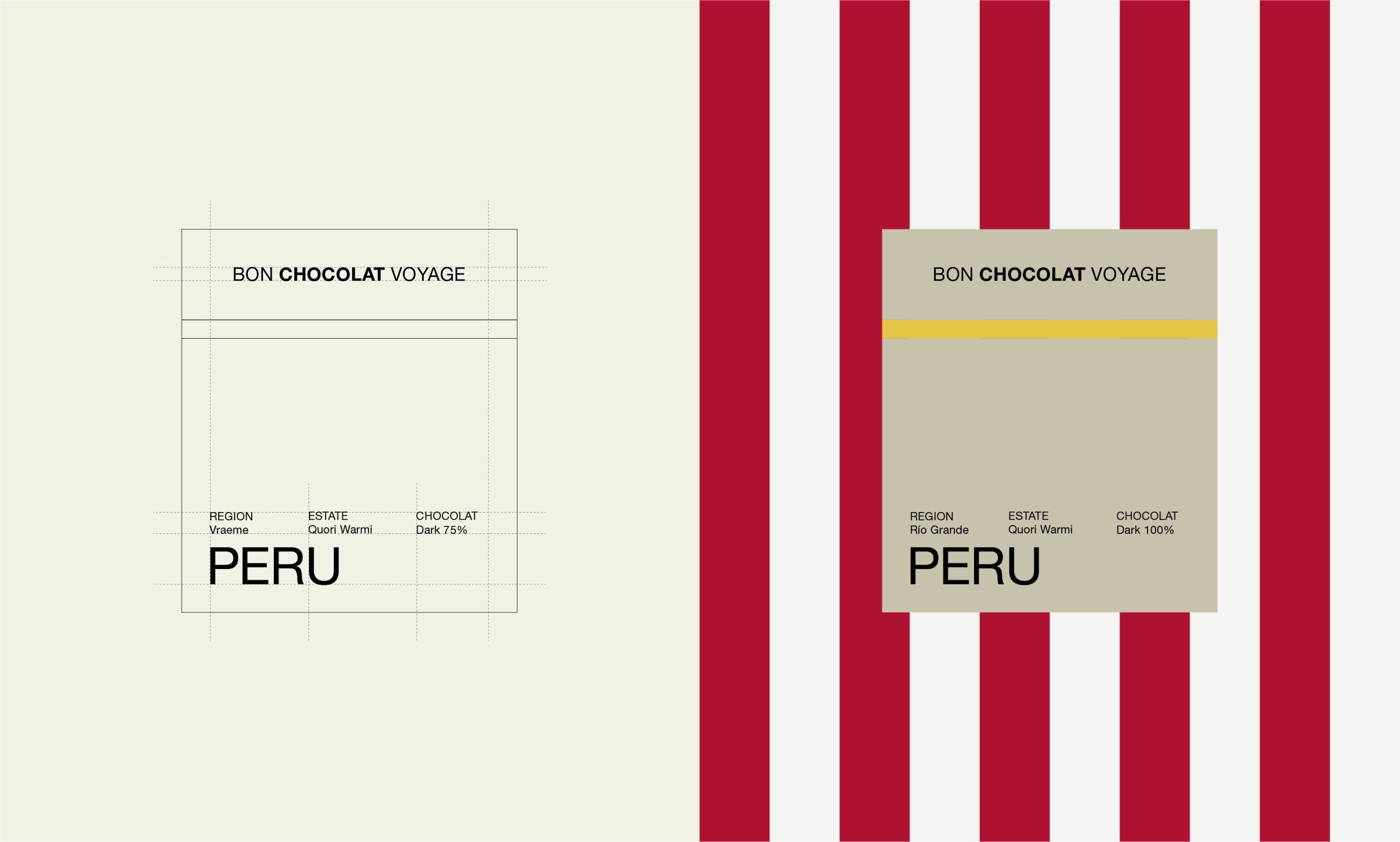
COLORS/ The colors of the canvas represent the colors of each country’s flag, reinforcing the idea of geographical origin. In addition, this geometric design provides physical stability on store shelves and helps the product stand out through its design.
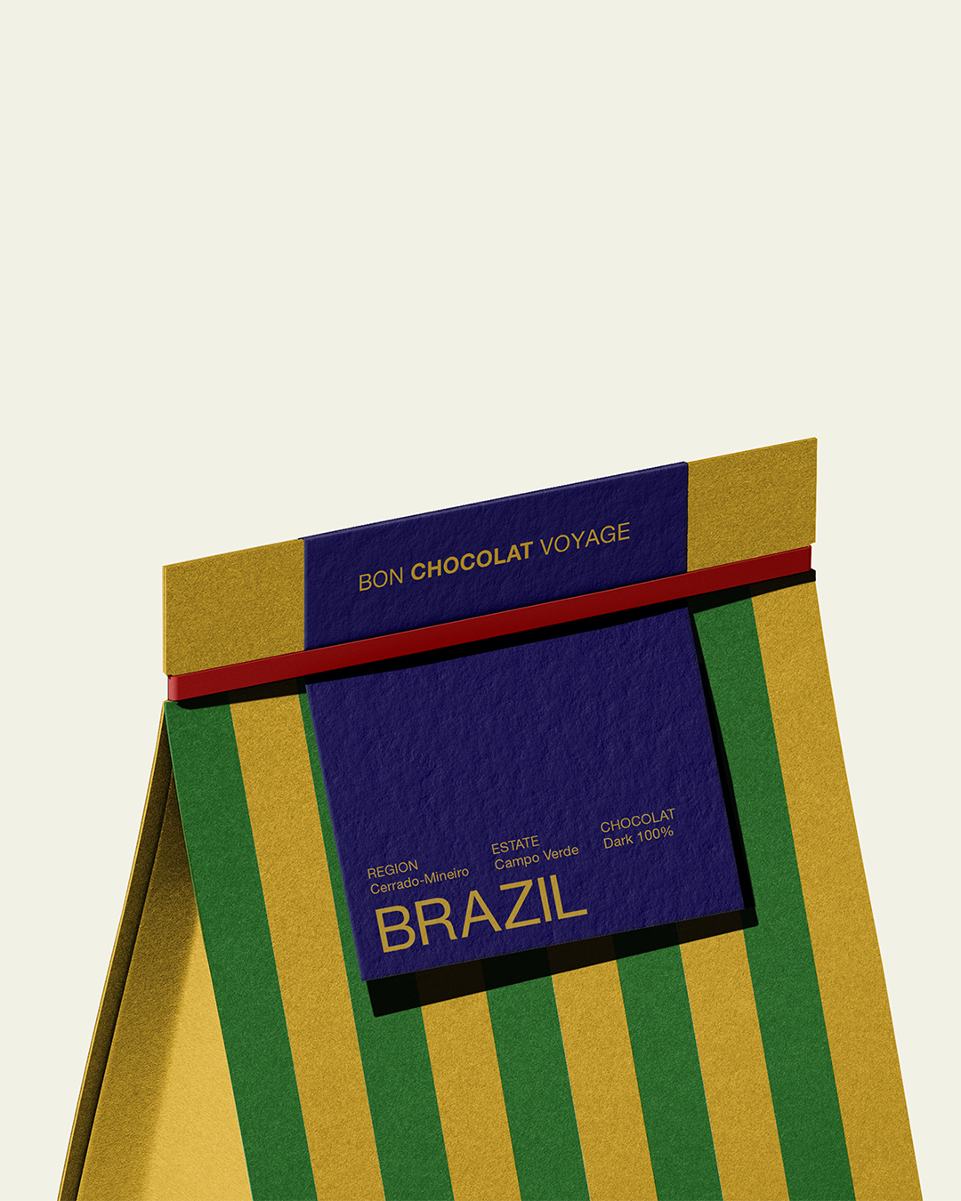
GRAPHIC DESIGN/ Horizontal seal: The top is folded and sealed with a strip that mimics the adhesive labels or security straps used on suitcases or international packages. Information Hierarchy: This top seal features the main brand name (Bon Chocolat Voyage), serving as the product’s “letterhead” or “passport” before the specific details of the country of origin are revealed. The central label indicating the country (Brazil / Peru) is designed with an embossed texture and layout that simulates a shipping label, a ticket, or a postage stamp affixed hastily yet elegantly to a suitcase during a trip. This graphic element invites consumers to think of the chocolate as a directly imported product—a gourmet “souvenir” brought back from expeditions around the world.
WHAT’S UNIQUE? / “VOYAGER” aims to transform a simple chocolate wrapper into an experience of travel and discovery from the very moment it appears in the consumer’s hands.
CREDITS / CONCEPT IDEA, GRAPHIC DESIGN, ART DIRECTION / Marco Arroyo-Vázquez
PROJECT TYPE / Concept Industry / Food (Chocolate)
Market Region / Global





 NEV
NEV Stefano Bracci
 Alina
Alina monther al omari
 Lizakjx
 JOAOMARCOSDESIGN
 alchimistestudioParis
 Harriet Neild
 octavio rojo
 宏洛图品牌设计HONGLT
 DESIGN CONCEPTS
 Alexander Skurihin
 Studio K95
 ARMBRAND
 Richa Rai
 houseoferas by Miti
 Agence des Coteaux
 Kushi Eaknath
 Ann Treasa
 Xiao Ning
 krrrrrllii
 babyage
 Deep
Deep