BRIEFING/ Creation of packaging that highlights the origin of Matcha grown at the foot of Mount FUJI. It must be three-dimensionally disruptive (not a box or cylindrical container) to maximise attention on the shelf.
WHAT’S UNIQUE/ In today’s hyper-accelerated world, Japanese tea culture offers something valuable: a moment of stillness. This packaging captures the original essence of the Japanese personality – its mindfulness, elegance, and honesty -& transports it to modern life, like a breath of calm spreading through a bustling city. FUJI Matcha offers a space to pause, reconnect, and rediscover the present. All through a sip.
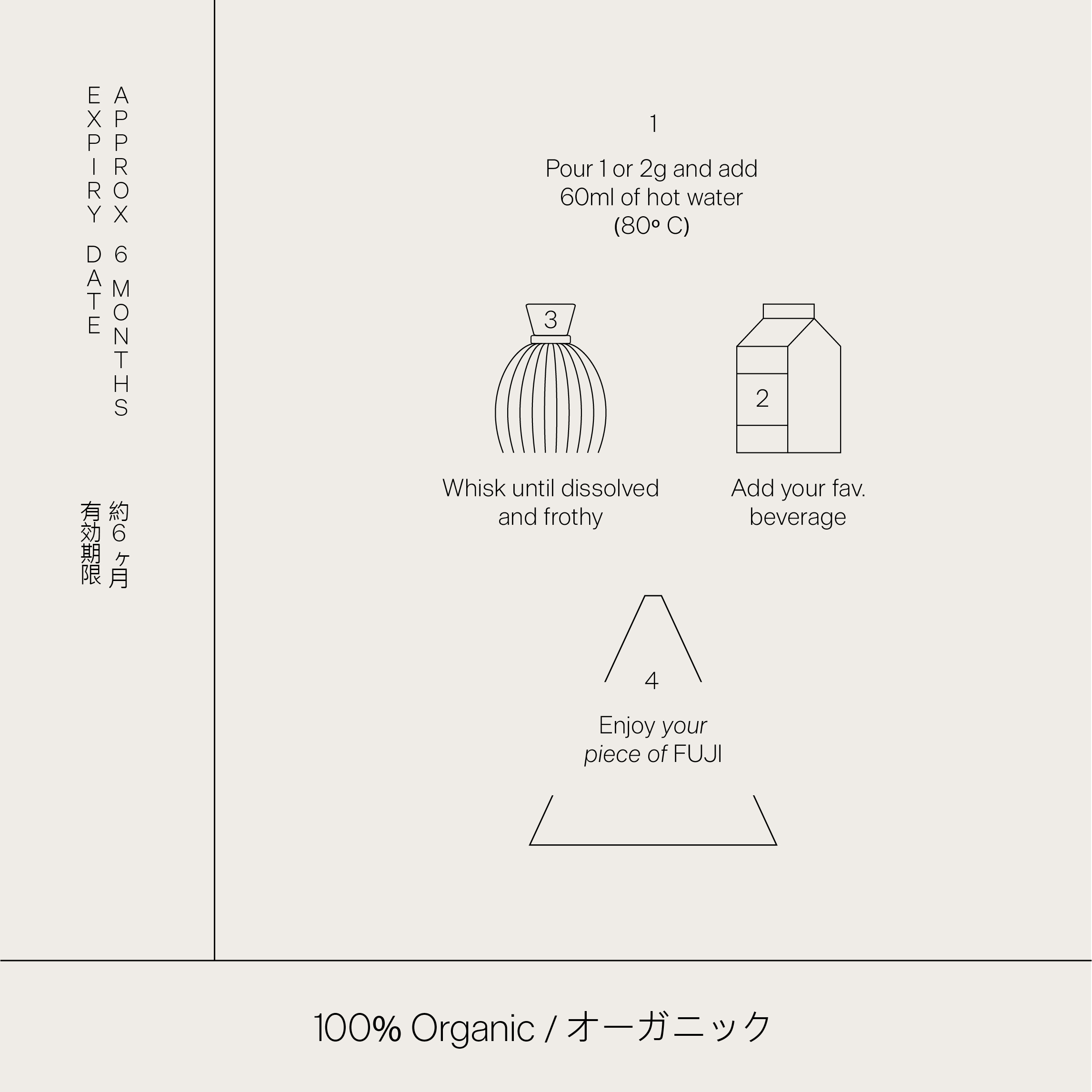
PACKAGING IDEA/ The main concept of the packaging is a minimalist and elegant representation of Mount Fuji and its relationship with the origin of Matcha green tea. The logo is subtle and elegant, prioritizing the visual impact of the shape over the prominence of the branding. The only splash of color is the green Matcha powder concentrated at the apex. This subtle and intentional graphic application is a nod to the tea ceremony. Furthermore, it is an object that goes beyond a single use, collectable and worthy of being displayed, or simply a box to store whatever the customer wants. A functional element (the cord) was also incorporated to help transport the container.
LOCAL IMPACT/ The aim was to highlight the origin as a distinctive feature, and not only that, but also to contribute to the tea-producing regions by promoting the origin through the packaging. Part of the proceeds will be donated to the tea-producing communities of FUJI to help preserve and spread Japanese tea culture.
ICONS/ A unique iconography was developed, following the look and feel of Japanese typography.
The packaging “FUJI Matcha”, with its disruptive shape inspired by the snow-capped summit of Mount Fuji, transforms matcha tea into an elegant collectible ‘object of calm’ that invites you to practice mindfulness in modern life.