Milk with a Passport: Introducing the New Dairy Brand OLOMOLO
How Russian agency Radar helped a newcomer speak the one language consumers still trust — transparency.
Shoppers don’t read labels anymore — they look for proof. The new dairy brand OLOMOLO shows how that proof can actually work.
A Shelf Where Trust Has Run Out
The dairy aisle has become one big blur: everything is white, natural, premium, “farm-fresh,” and indistinguishable. The whole category talks exactly the same — and in that sameness, the consumer simply shuts down and grabs whatever they already know.
No one believes in “100% natural” anymore. But there hasn’t been an alternative either.
Krasnogorsk Dairy Plant wanted to bring a new brand to the market with a fundamentally different point of view. Name, concept, story, logo, packaging — everything had to break through the default loyalty loop and give people a real way to choose. Not another pack with green fields and a smiling cow, but an actual decision-making tool.
That’s how the idea of “Milk with a Passport” came to life.
When Trust Turns Into Data
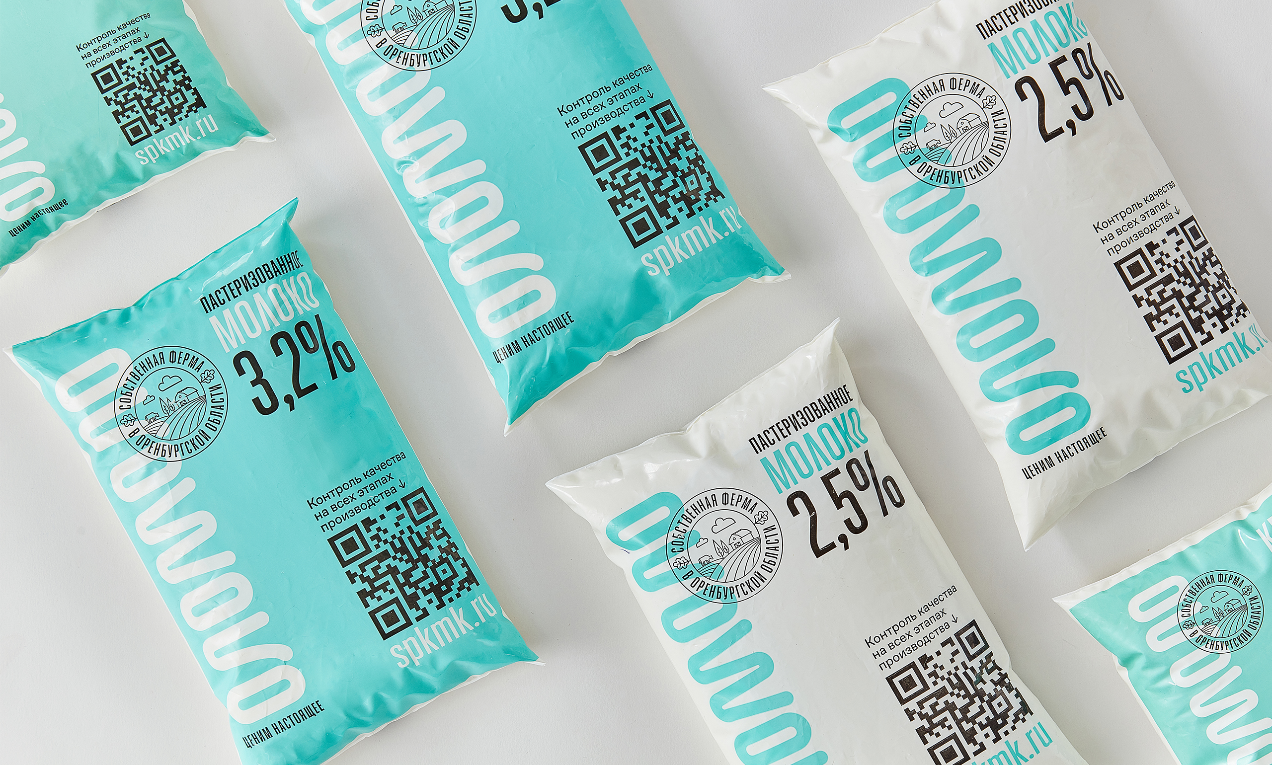
If we scan QR codes on tickets, taxis, and medicines — why not on milk?
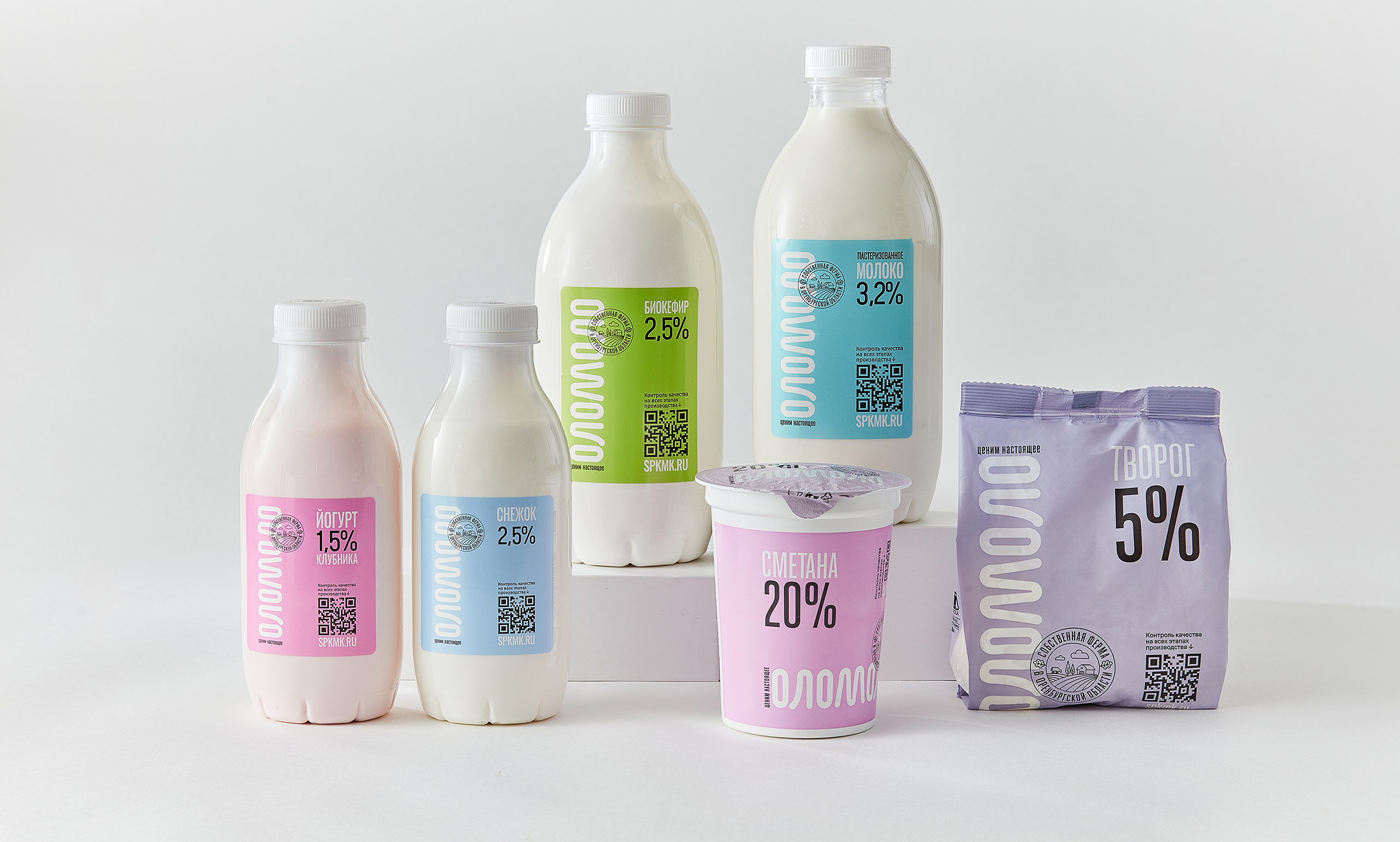
OLOMOLO isn’t built on promises. It’s built on traceability. Every product comes with a unique QR code that leads to batch-specific “passport” data:
weather during milking, filtration time, the logistics route — right down to the real cow behind your carton.
The idea appeared before Russia’s national traceability system (“Chestny Znak”) rolled out. It wasn’t about regulatory compliance — it was about shaping a new habit: transparency by default.
A Naming Idea Made of Three Letters
Creating a trademarkable name in an oversaturated dairy category is a challenge in itself. It needs to be simple, memorable, product-adjacent — and still unlike anything else on the shelf.
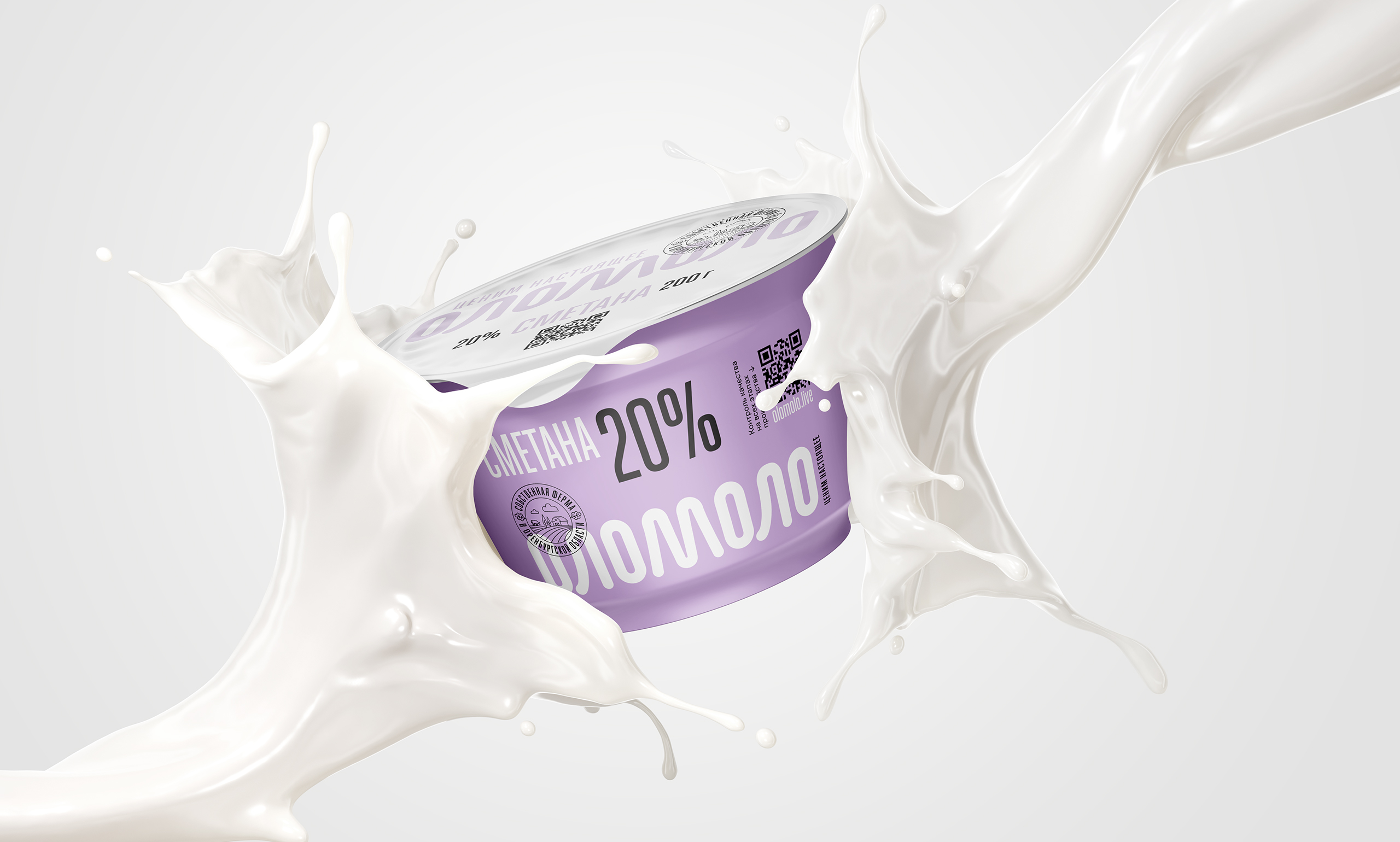
The answer: the palindrome OLOMOLO.
It reads the same forwards and backwards, sounds fresh and milky, and is built from just three letters. That simplicity mirrors the product philosophy: no fluff, only essence. This minimalism became the basis for the visual identity.
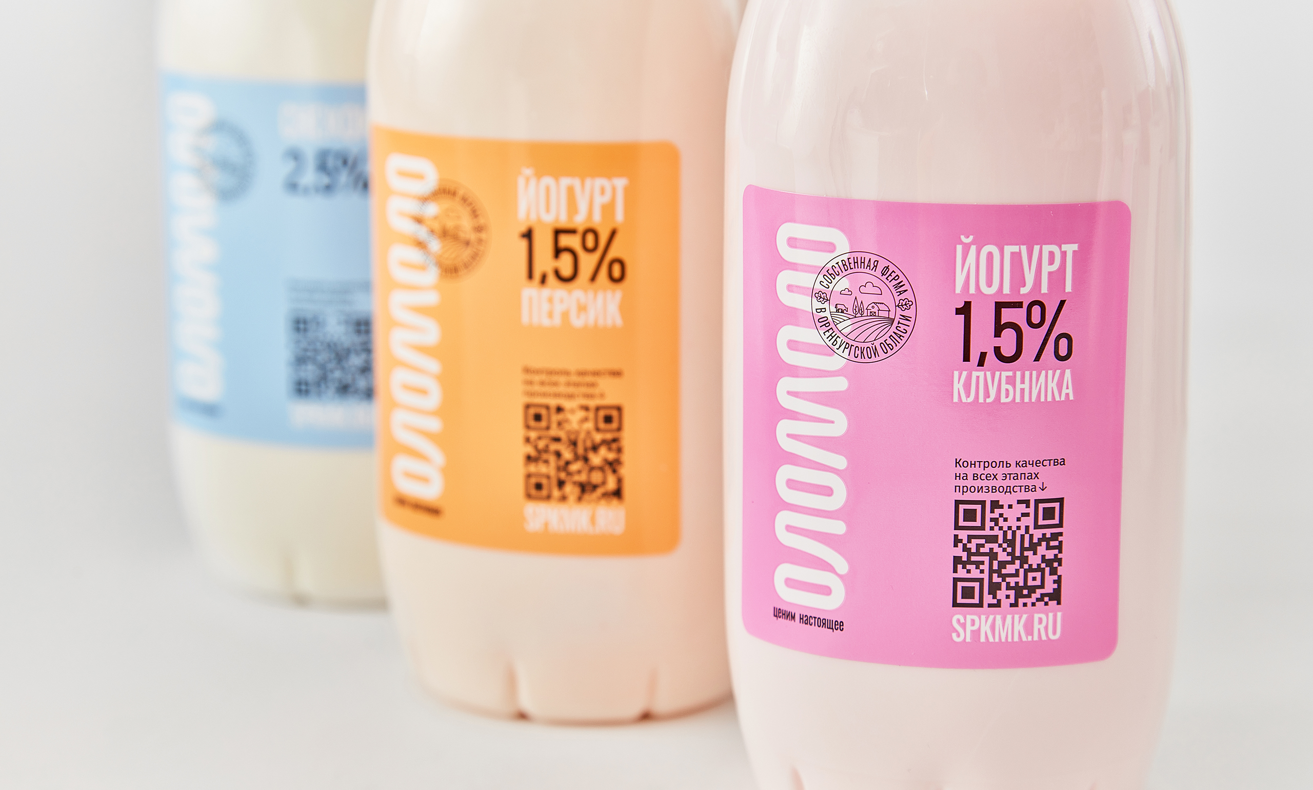
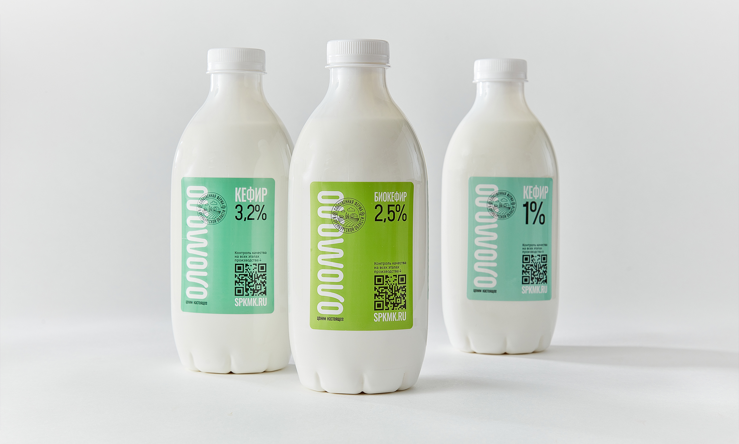
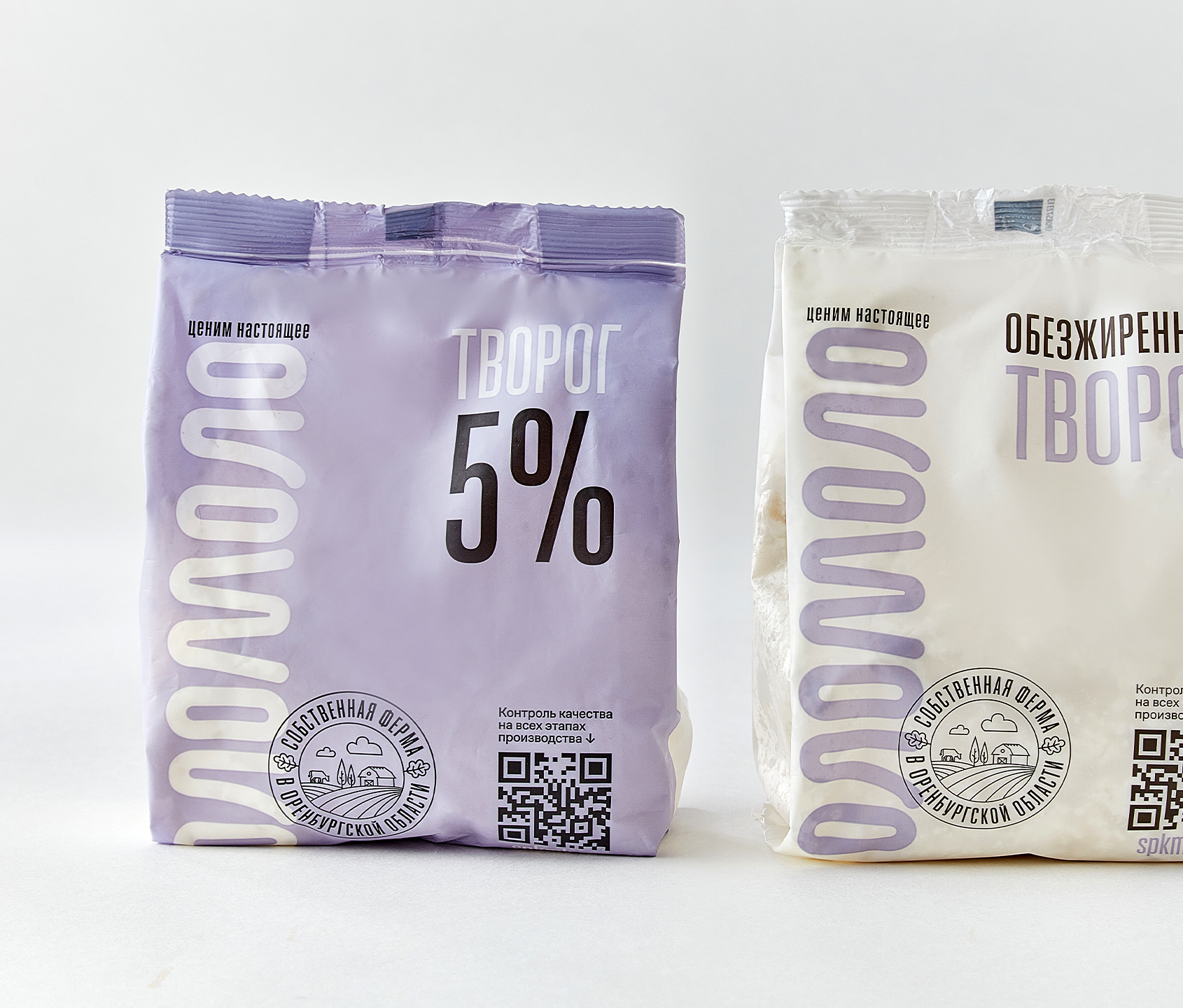
No Cows. No Meadows. No Tropes.
The packaging rejects every dairy cliché: no rustic barns, no soft-focus fields, no happy mascots. Just typography. Just numbers. Just facts.
A tall, expressive grotesque typeface creates pace and immediacy. The unusual color palette gives a sense of freshness and clarity. Each pack works like a compact infographic: zero noise, maximum information.
So… What’s Actually in Your Glass?
OLOMOLO is more than another carton on the shelf. It taps into a 2025 mindset: people want to know what they’re actually consuming.
Now, to find out what you’re buying, you just point your camera.
Creative Team
Client: SPK MK “Krasnogorsky”
Agency: Radar
Maria Lopatina — Executive Director
Maxim Abushaev — Creative Director
Anton Grishchenko — Strategy Director
Daniil Shumakov — Art Director
Daria Lukina — Creative Group Head
Svyatoslav Lobanov — Senior Creative Copywriter
Alexey Panov — Senior Designer