

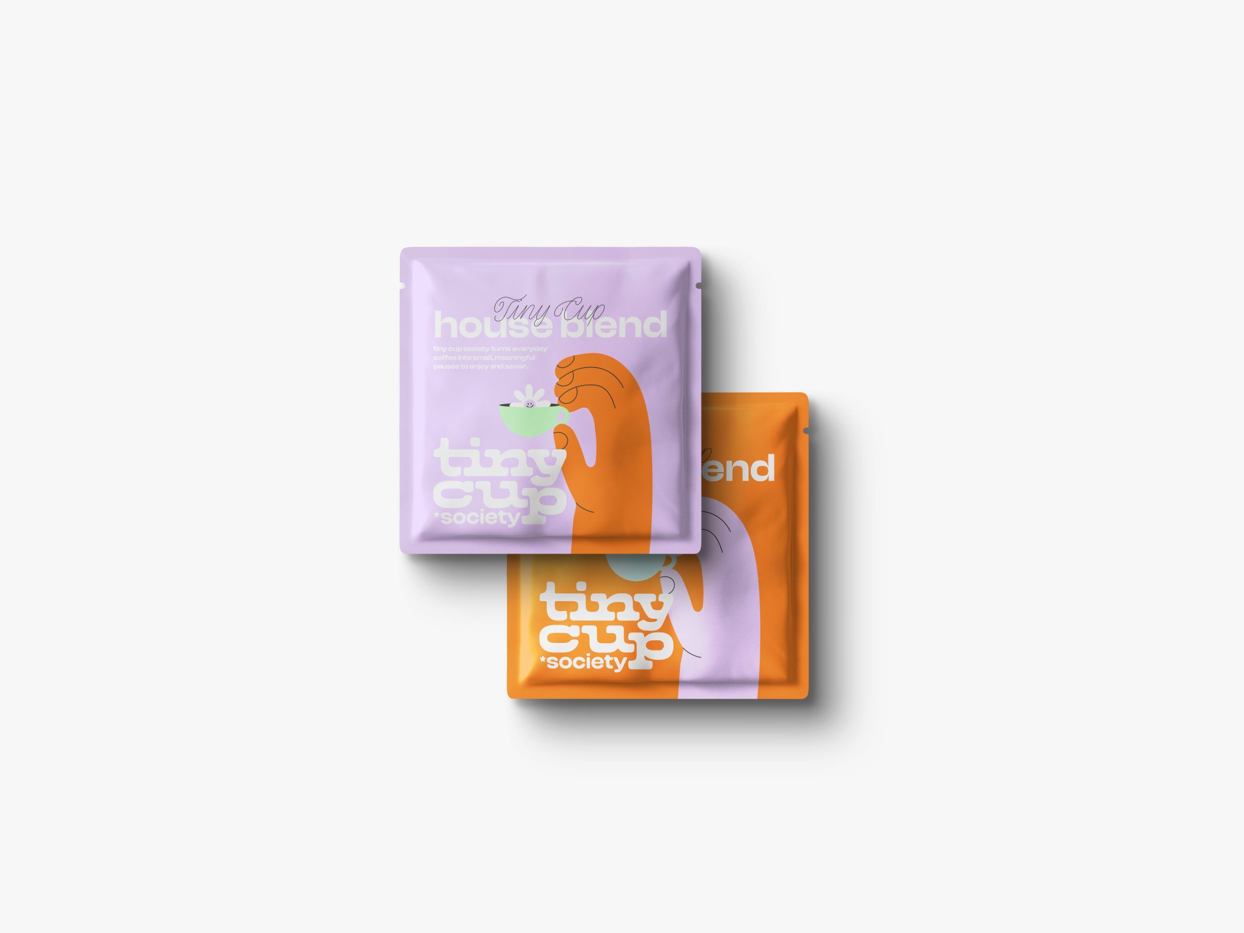
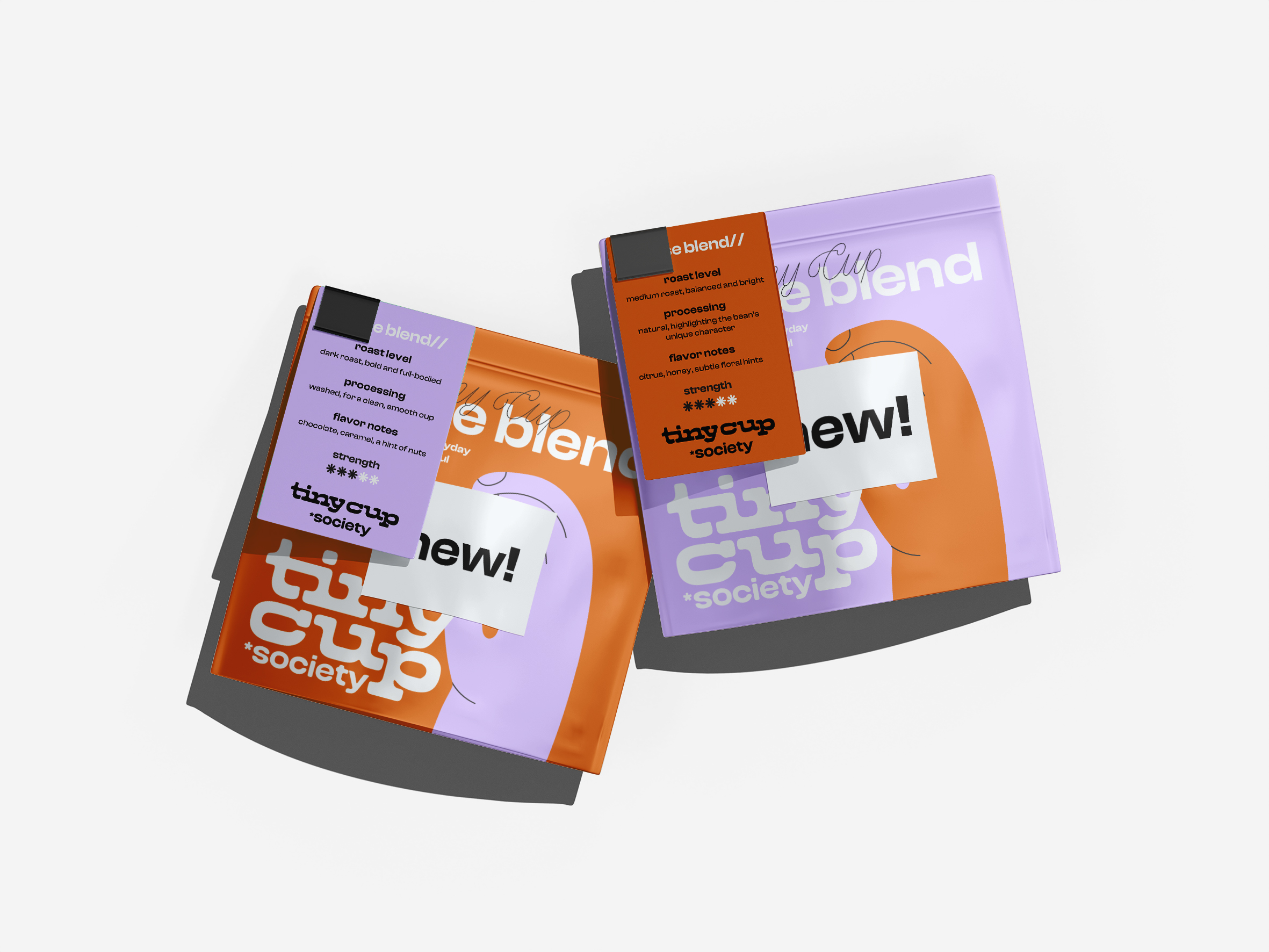
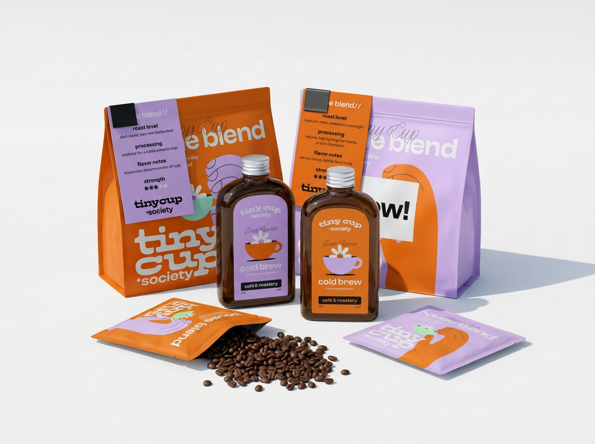
Tiny cup society is a roastery and café. Its branding is light and colorful, just like the cafés personality.
Curator’s Insight
Tiny Cup Society’s packaging leans hard into personality-first branding, using a playful mix of warm orange and soft lavender to create a look that feels friendly, modern, and instantly approachable. The bold color blocking and chunky typography give the brand strong shelf presence, while the illustrated coffee cup motif adds charm without tipping into gimmicky territory. Across bottles and coffee packs, the system stays consistent yet flexible, allowing different products to feel cohesive while still distinct. The flat-lay-friendly design language feels made for social sharing, reinforcing a café culture that’s casual, cheerful, and design-aware. Overall, the branding communicates warmth and simplicity, positioning Tiny Cup Society as a roastery that doesn’t take itself too seriously—but clearly takes design seriously.




 Gefen Benda
 NEV
NEV Stefano Bracci
 Alina
Alina monther al omari
 Lizakjx
 JOAOMARCOSDESIGN
 alchimistestudioParis
 Harriet Neild
 octavio rojo
 宏洛图品牌设计HONGLT
 DESIGN CONCEPTS
 Alexander Skurihin
 Studio K95
 ARMBRAND
 Richa Rai
 houseoferas by Miti
 Agence des Coteaux
 Kushi Eaknath
 Ann Treasa
 Xiao Ning
 krrrrrllii
 babyage
 Deep
Deep