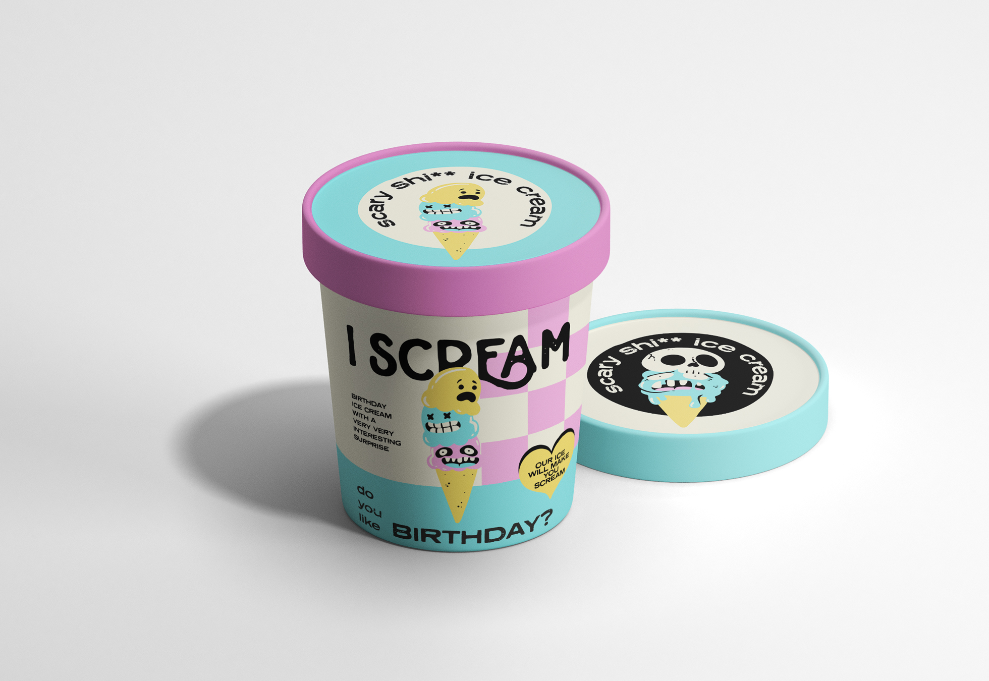
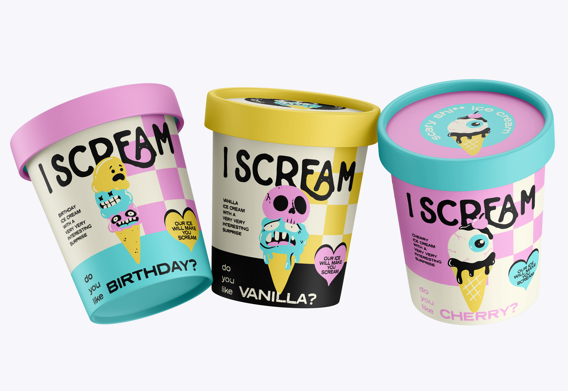
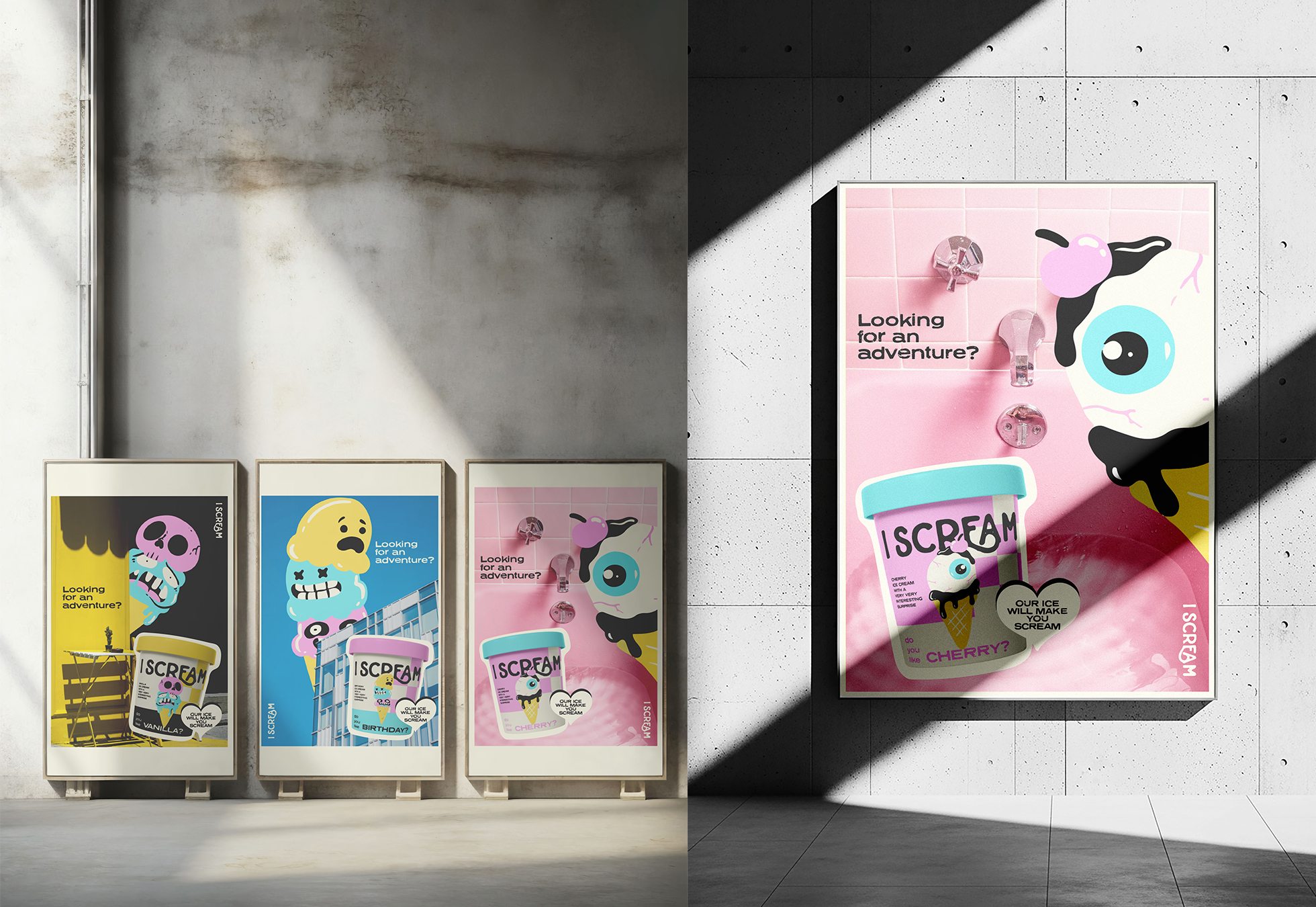
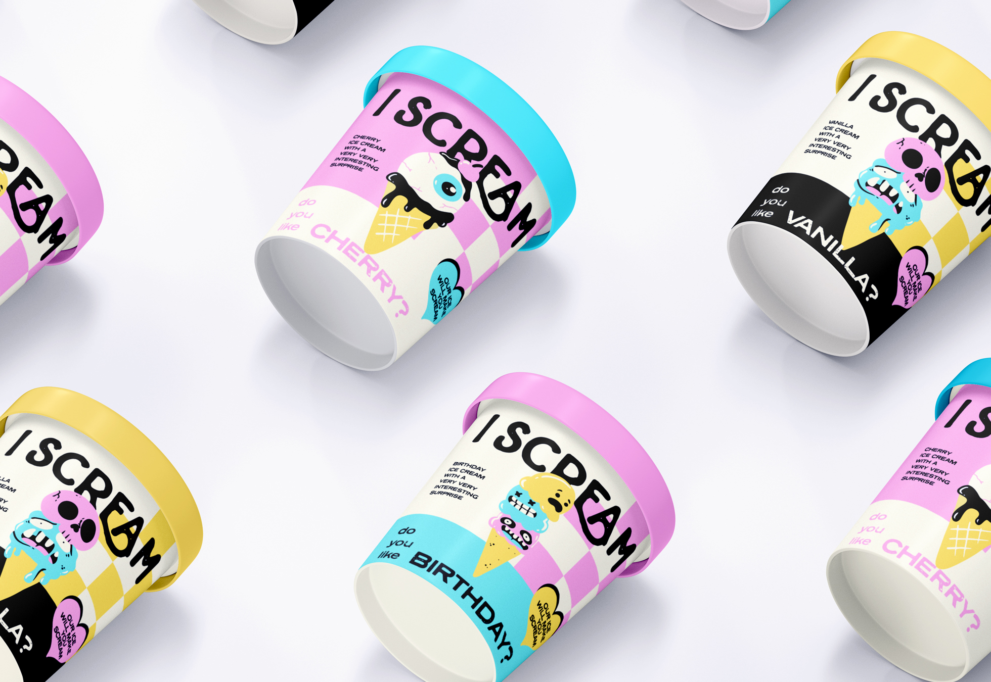
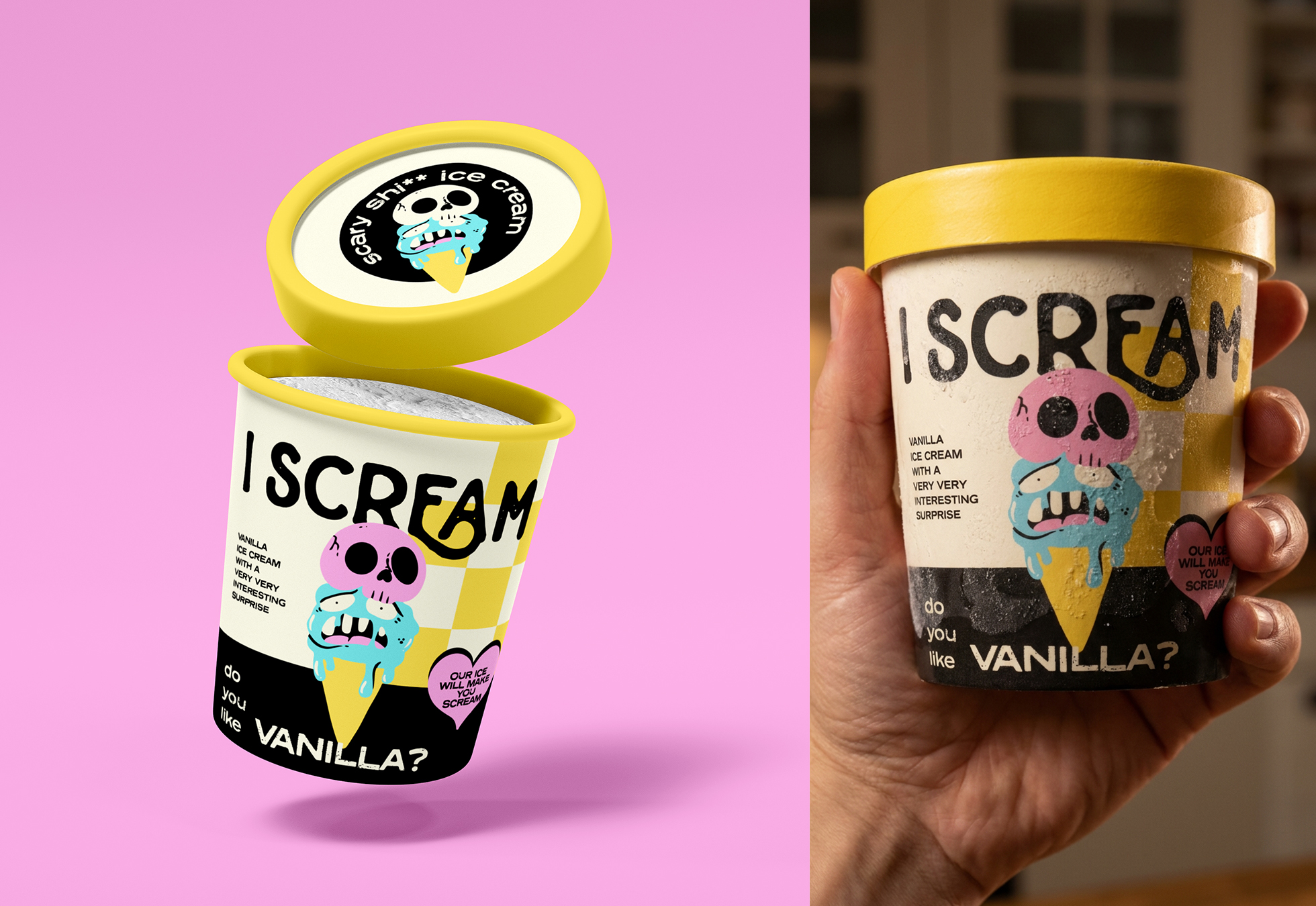
I Scream is an ice cream brand full of humor and attitude. Aimed at a young audience, the branding features bold, playful illustrations and loud, vibrant colors that make it impossible to ignore.
Curator’s Insight
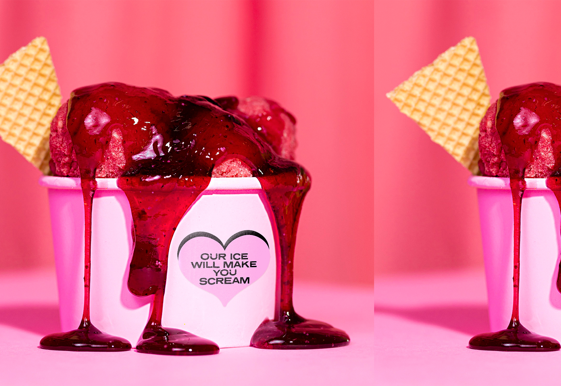
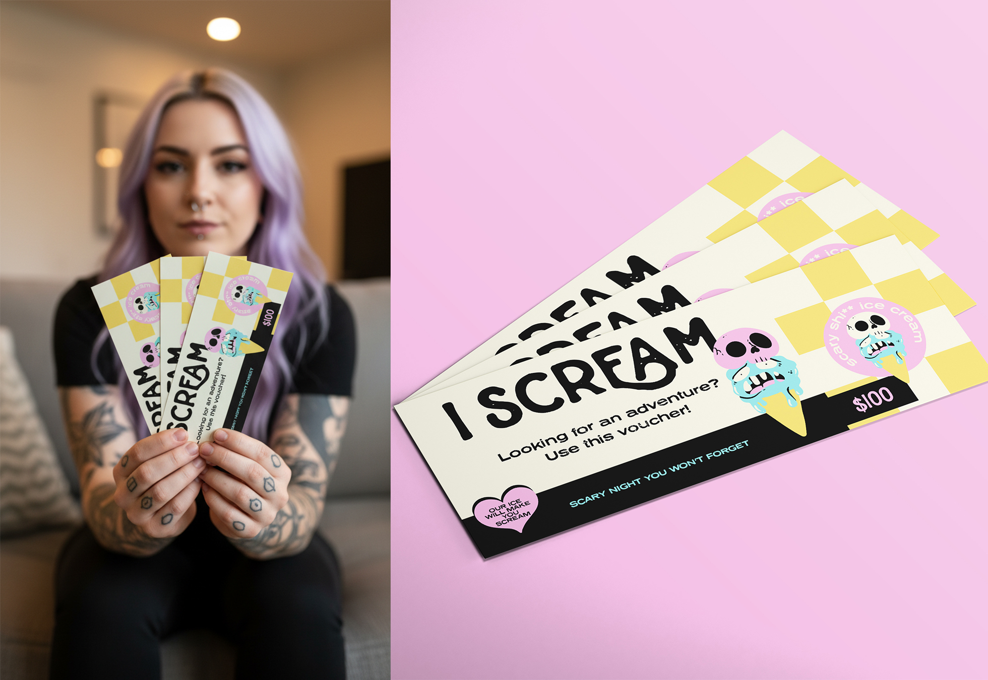
I Scream’s packaging embraces loud, unapologetic fun, using exaggerated illustrations and punchy color palettes to instantly grab attention in the freezer aisle. The design leans into irreverent humor, pairing quirky characters with chunky typography and playful copy that feels deliberately cheeky. Checkerboard patterns and high-contrast color blocking give each flavor its own identity while keeping the overall brand system cohesive and recognizable. The slightly chaotic visual language feels intentional, reinforcing a rebellious, youth-driven brand that doesn’t aim for elegance—but memorability. Overall, the branding positions I Scream as an ice cream brand with attitude, built to resonate with a younger audience that values personality, bold visuals, and a sense of not taking life (or dessert) too seriously.