Designing AMIGA was a brand strategy exercise before an aesthetic one. The challenge was clear: to build a complete family of craft beers for Madrid, Spain that worked as a coherent system, instantly recognizable from a distance, flexible enough to grow, and strong in character without losing authenticity.
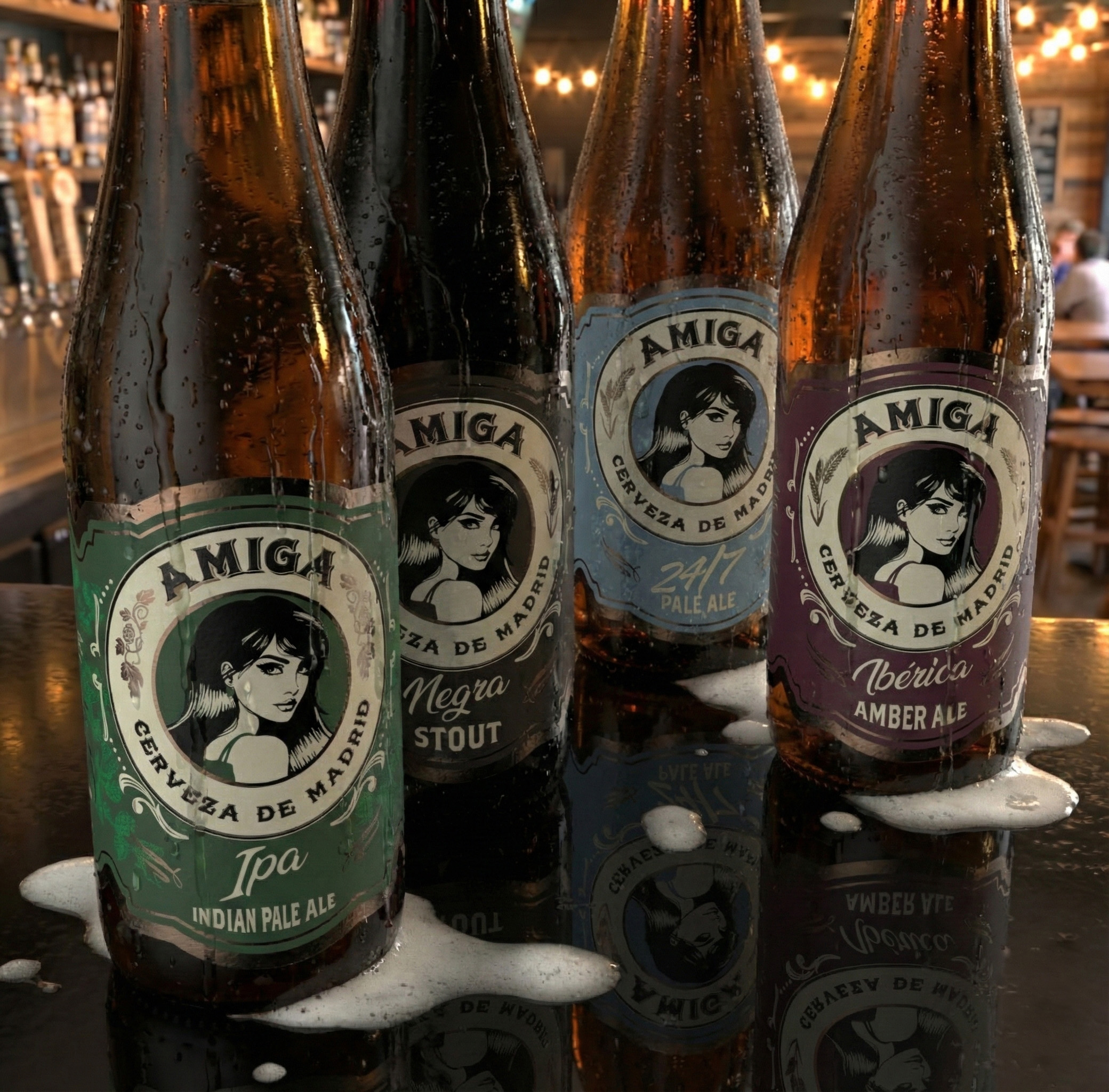
The project started from a simple yet powerful idea: AMIGA as a symbol of closeness, tradition, and Madrid’s personality, far from generic craft clichés. From there, a unified visual system was developed, where the central illustration acts as the brand’s anchor and each beer style is differentiated through color, graphic details, and tone, while always maintaining a shared structure. Clear brand governance: one DNA, multiple expressions.
The design balances classic European beer references with a contemporary execution, conceived to stand out both on shelf and in digital environments. Character-driven typography, reinterpreted ornamental frames, and a carefully curated color palette allow each style, Lager, IPA, Stout, Amber Ale, among others, to have its own voice without breaking the brand narrative.
Rather than designing isolated labels, the focus was on creating a scalable portfolio, ready to expand with new varieties, special editions, or future collaborations.
From a business standpoint: a consistent, memorable brand prepared to compete in a saturated market without shouting yet impossible to ignore.