Challenge
The protein bar category is crowded with exaggerated health claims and visually noisy packaging. SMASH needed to stand apart with an identity that communicated clean nutrition, performance credibility, and taste confidence without sounding preachy or looking generic. The packaging had to appeal to disciplined, active consumers while remaining honest, clear, and easy to trust at shelf.
Solution
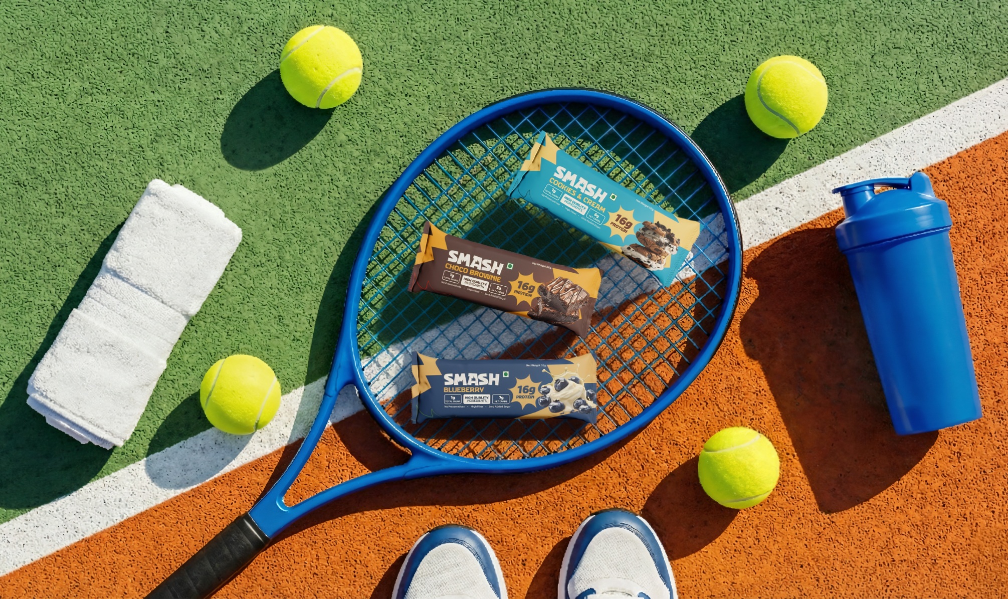
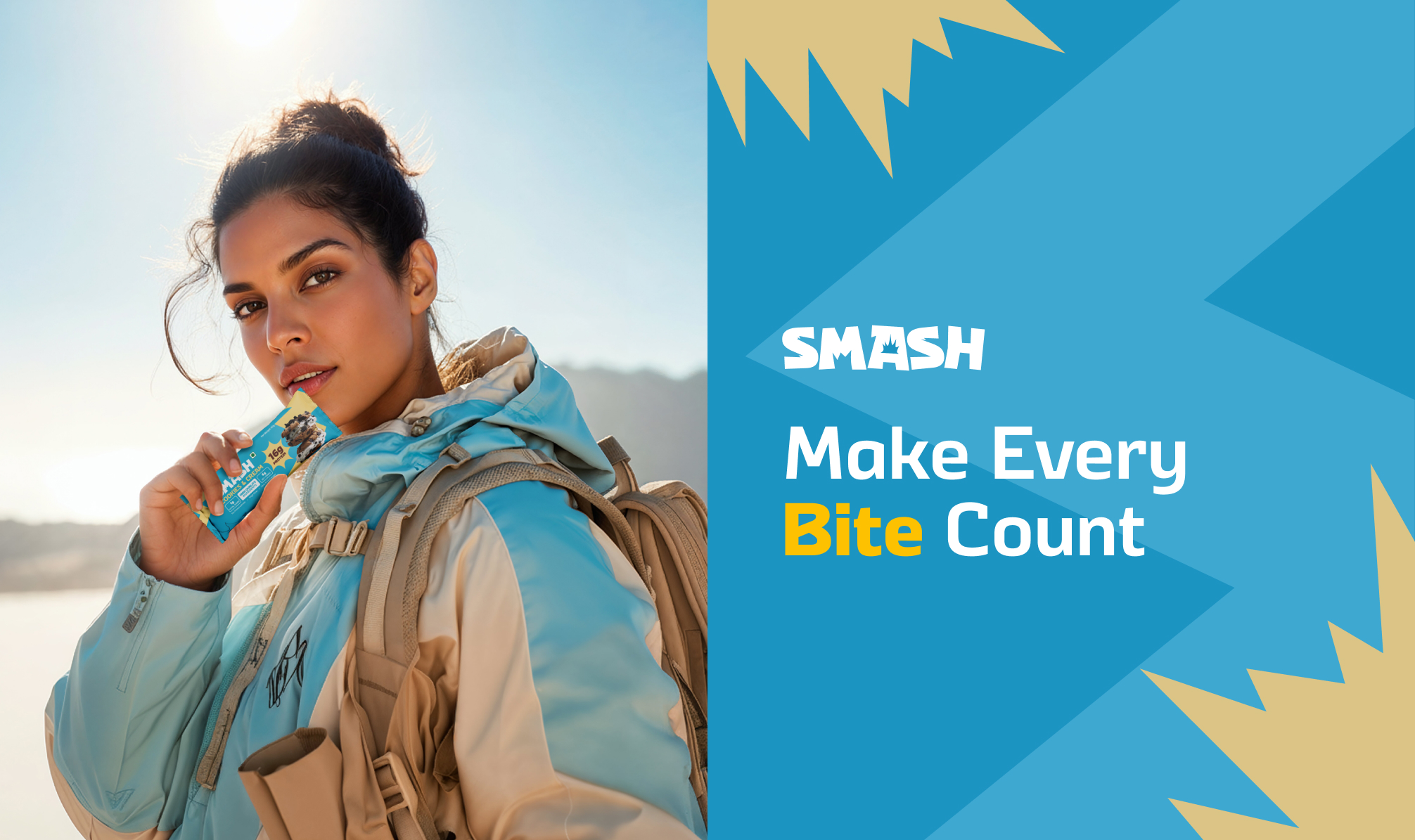
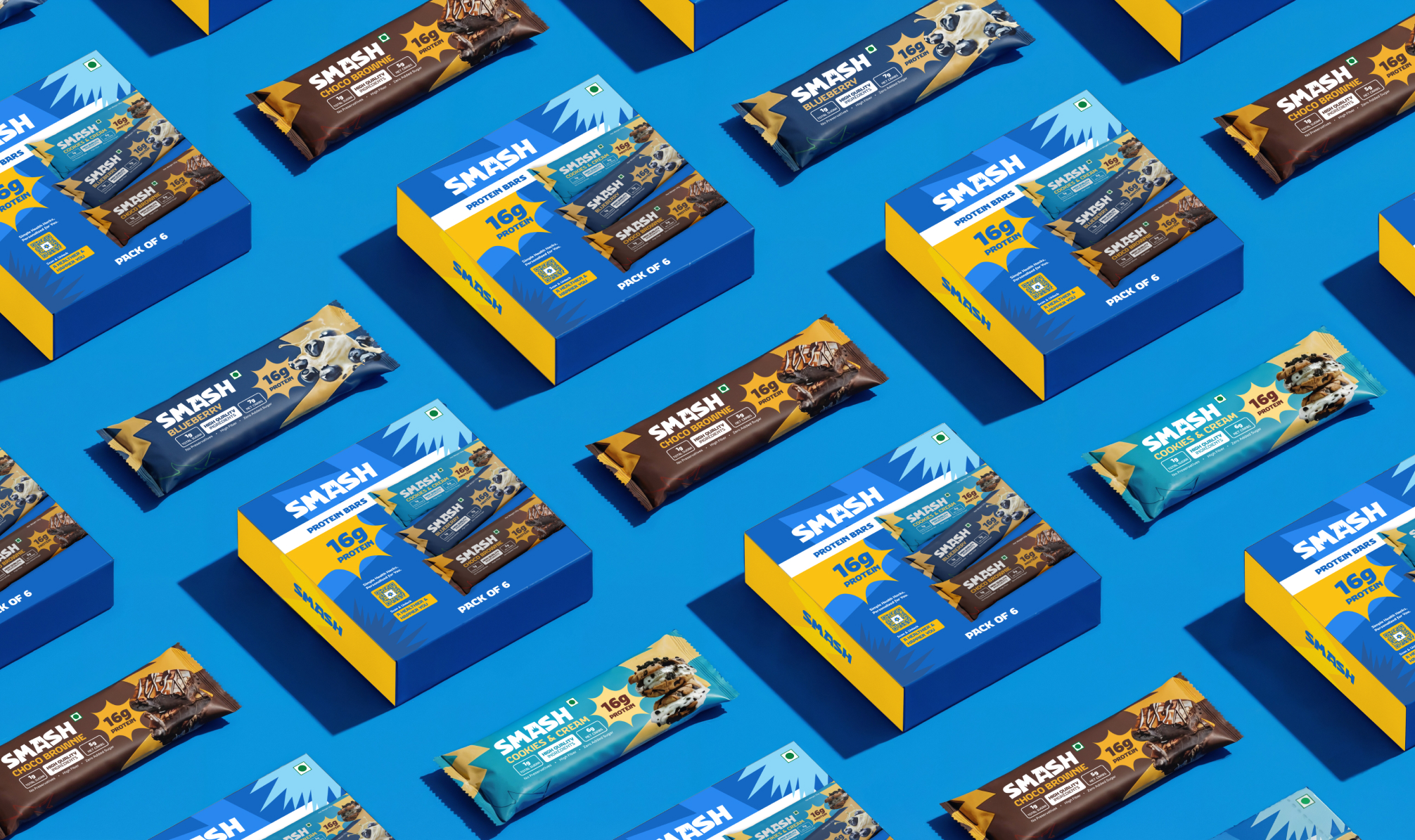
We developed a performance-first packaging system built around clarity and restraint. The visual language prioritises nutritional transparency, bold hierarchy, and direct communication, allowing the product to speak without unnecessary embellishment.
A structured flavour architecture was designed across three variants, balancing strong shelf impact with easy decision-making. Consistent layout logic, colour cues, and typography ensure instant recognisability while keeping the focus on function, not hype.
Result
SMASH launched with a confident, no-nonsense presence in a cluttered category. The packaging reinforces trust, improves shelf recall, and supports repeat purchase by making the product simple to understand and easy to choose. The system is scalable by design, providing a strong foundation for future flavour extensions and retail expansion.