Challenge
As The Chickster scaled across Pune and expanded to Dubai, its packaging began to blend into the crowded QSR landscape. While the menu was built around bold, fusion-inspired flavours, the packaging lacked a distinct narrative and failed to reflect the brand’s global positioning. The need was to create a packaging system that felt expressive, recognisable, and scalable across dine-in, delivery, and takeaway formats.
Solution
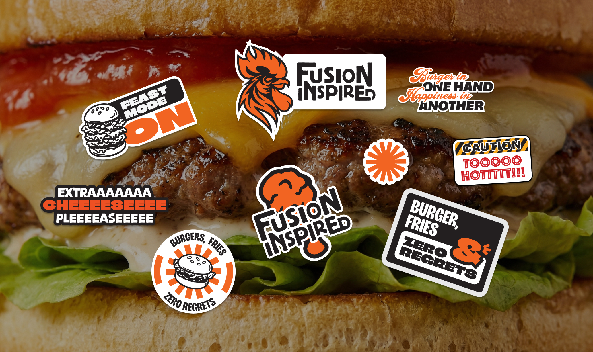
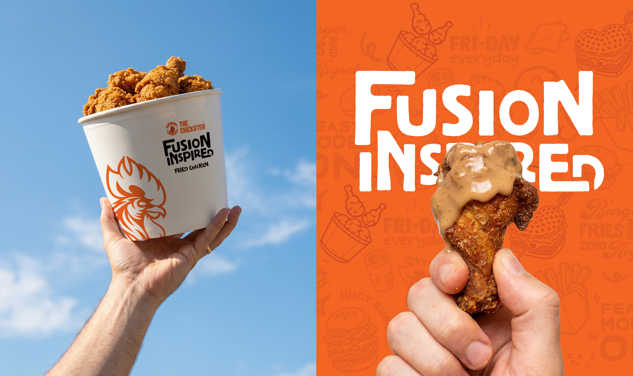
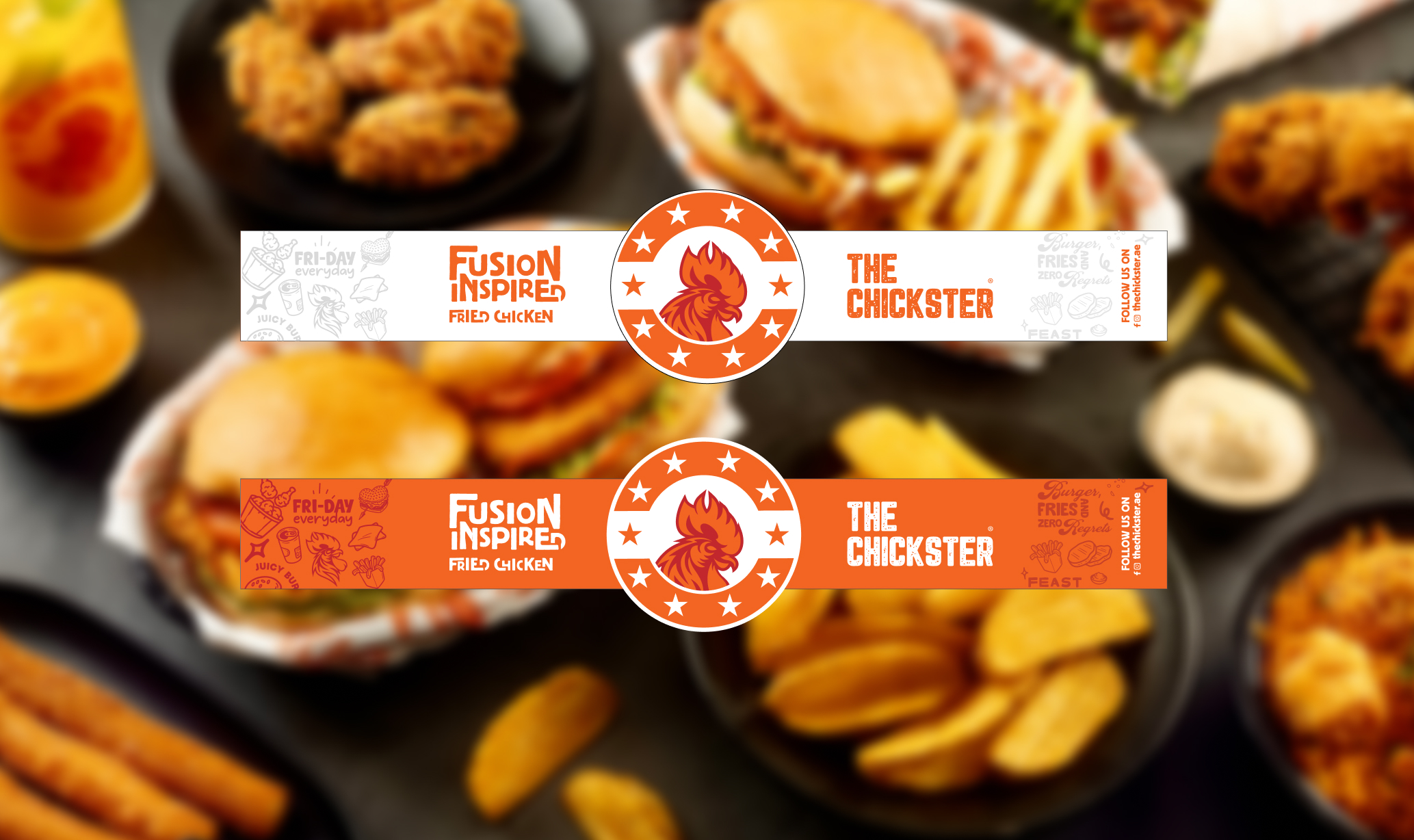
We developed a fusion-led packaging system rooted in the brand’s core idea of bold, global fried chicken. A strong typographic voice, high-energy colour palette, and expressive graphic elements were introduced to create a confident and ownable visual language. The system was designed to work seamlessly across boxes, wraps, bowls, and delivery formats, ensuring consistency while allowing flexibility for future SKUs and outlets.
Result
The Chickster’s packaging now clearly communicates its fusion-driven personality and stands apart in the QSR space. The refreshed system supports the brand’s growth across multiple outlets in Pune and its international presence in Dubai, creating strong shelf and screen recall while remaining scalable for long-term expansion.