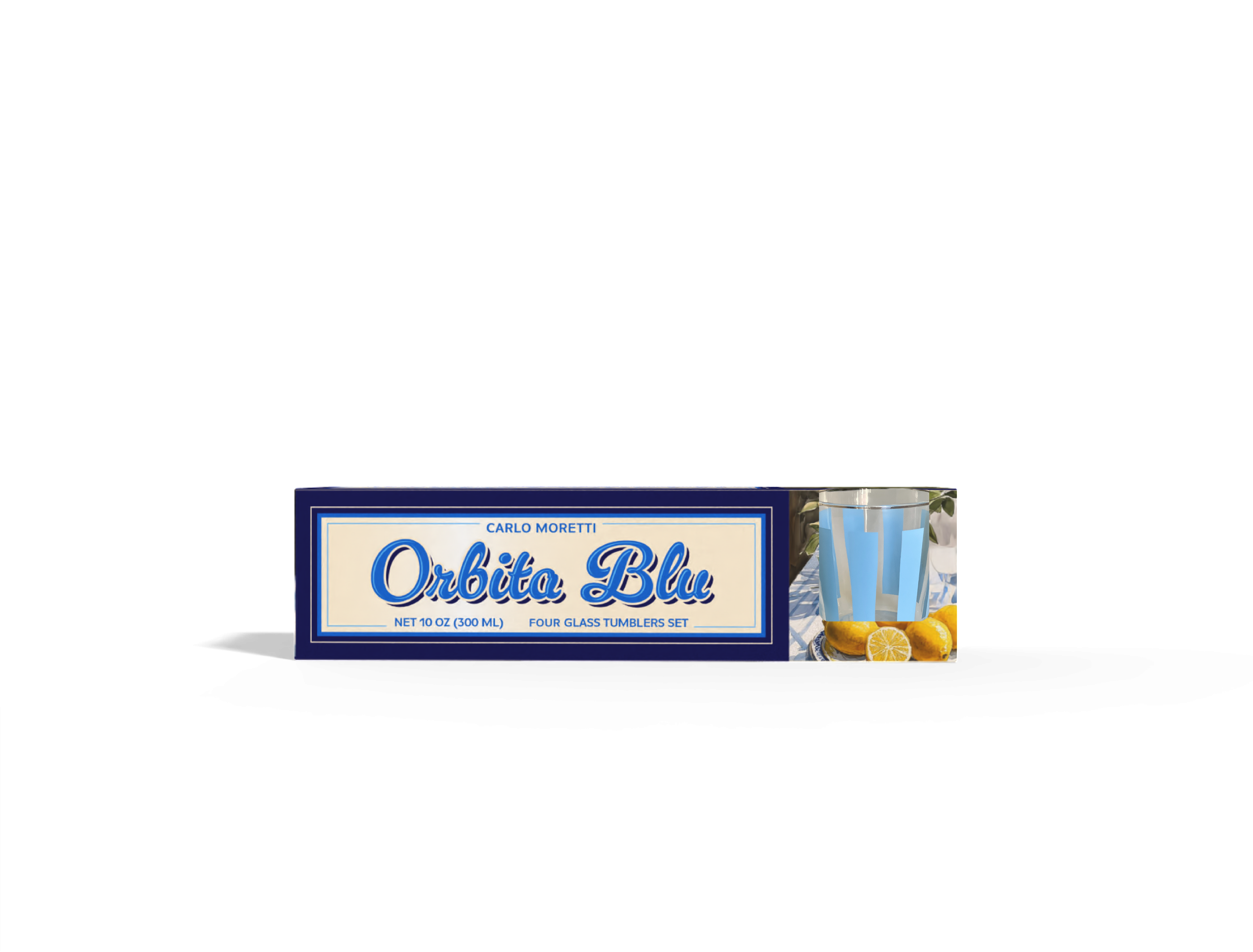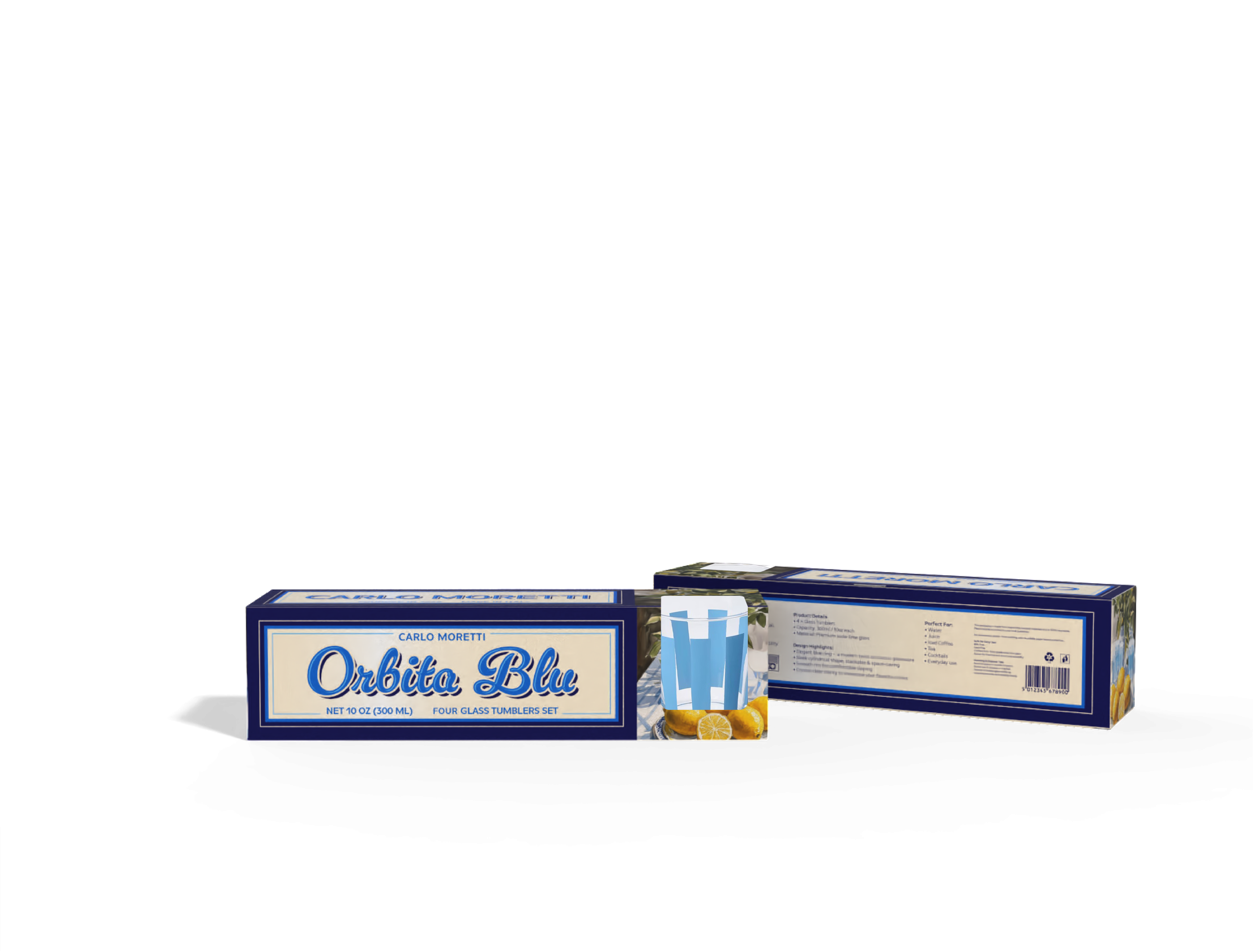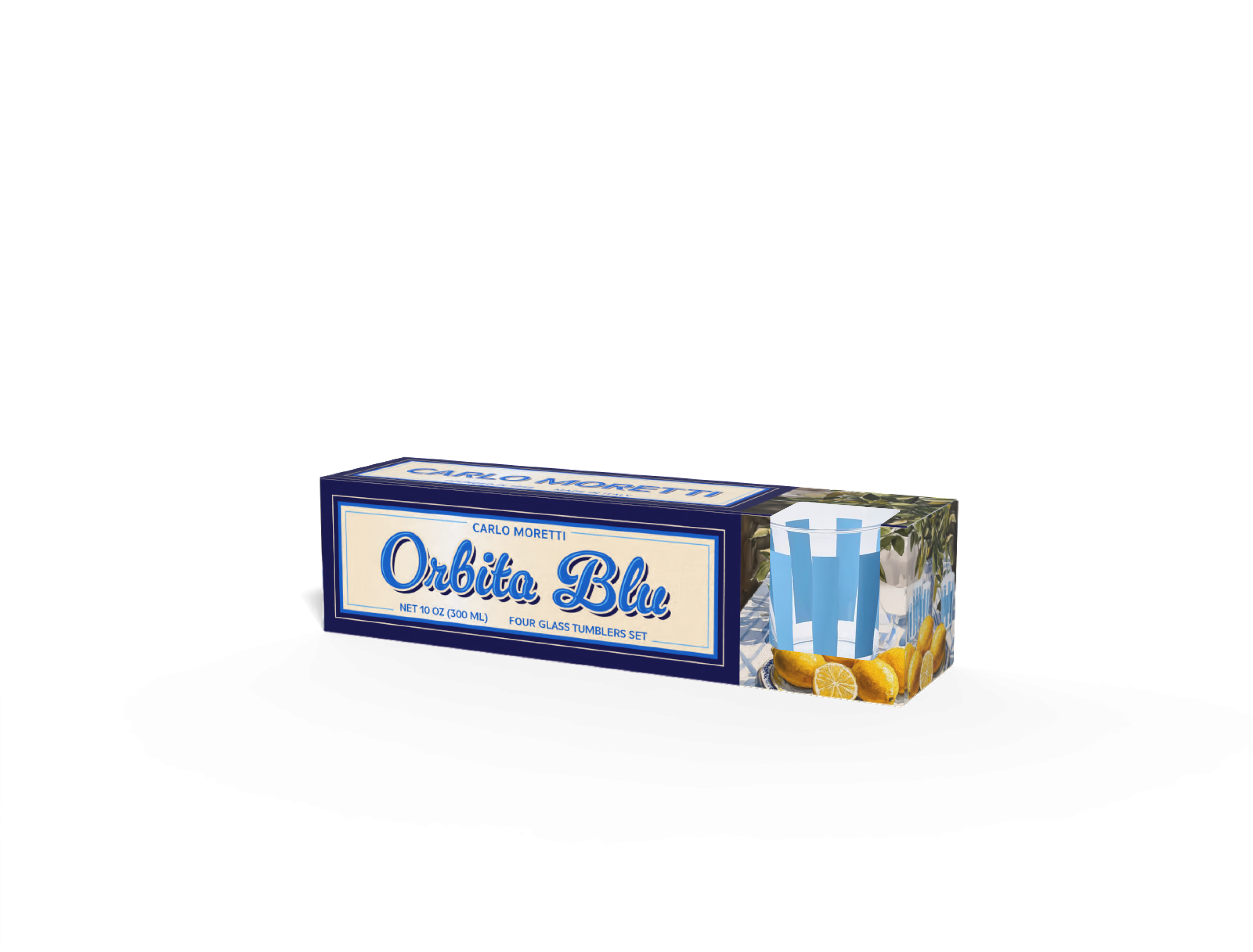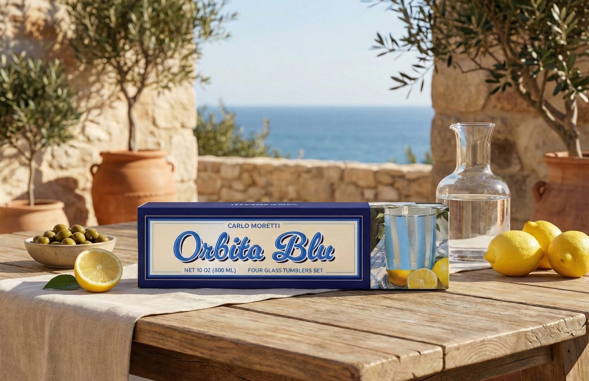
This packaging project was created for Carlo Moretti, drawing from the brand’s heritage in Italian glass artistry and the atmosphere of Mediterranean coastal living. Designed for the Orbita Blu glassware set, the packaging translates the clarity, lightness, and elegance of glass into a graphic and structural language that feels both nostalgic and refined.
The design combines a classic European typographic style with a deep blue palette inspired by the sea, ceramic tiles, and summer skies. Framed layouts, script lettering, and balanced composition evoke traditional Italian product labels, while the clean structure and spacious layout keep the system contemporary. Rather than competing with the glassware, the packaging acts as a visual prologue — setting a mood of sunlight, water, and leisurely ritual before the box is even opened.
Material and proportion are treated with the same care as the glass objects themselves. The elongated box format, controlled color blocking, and restrained detailing create a sense of order and quiet confidence. The result is a packaging system that feels collectible, transportive, and rooted in place — where product, lifestyle, and cultural memory meet.