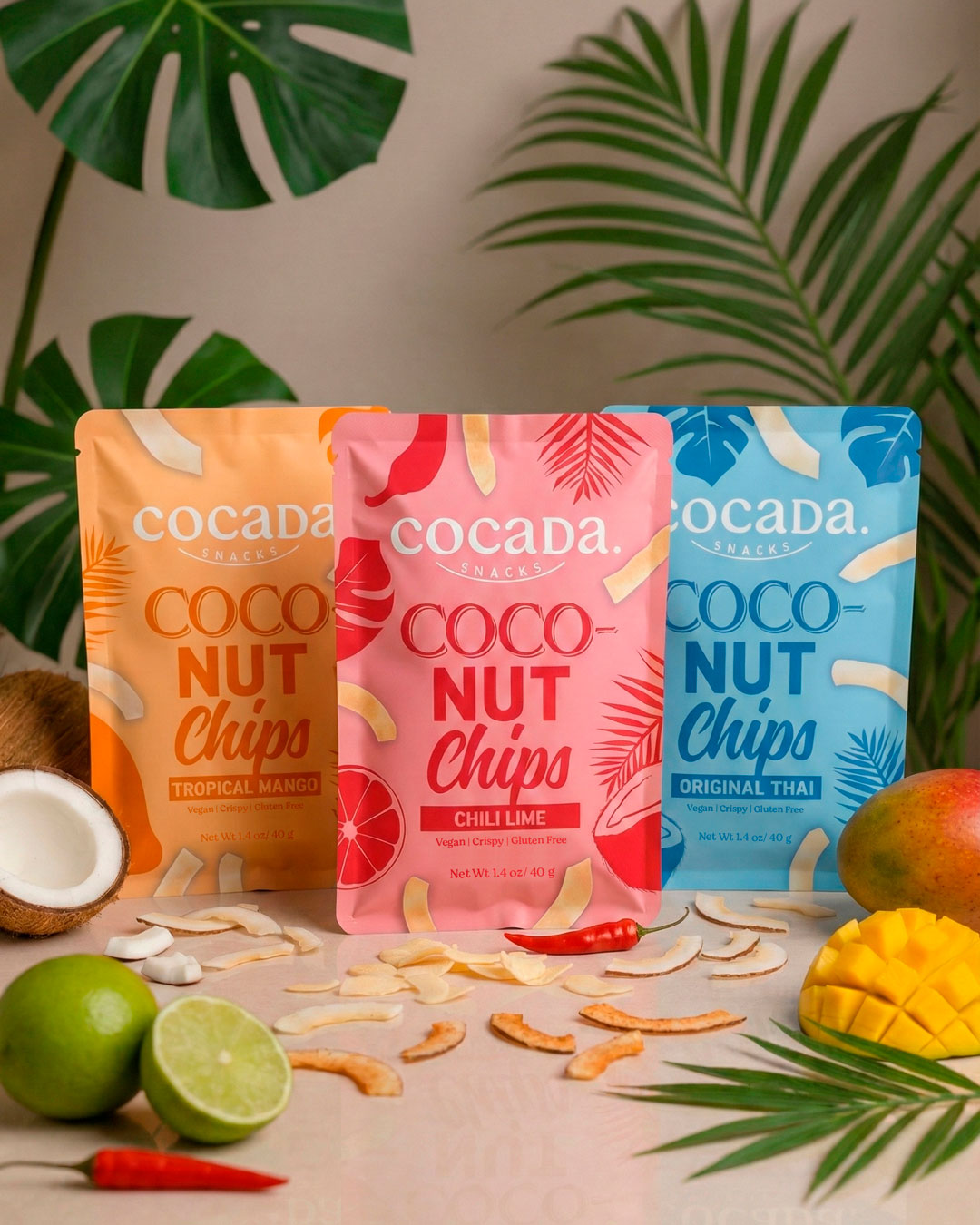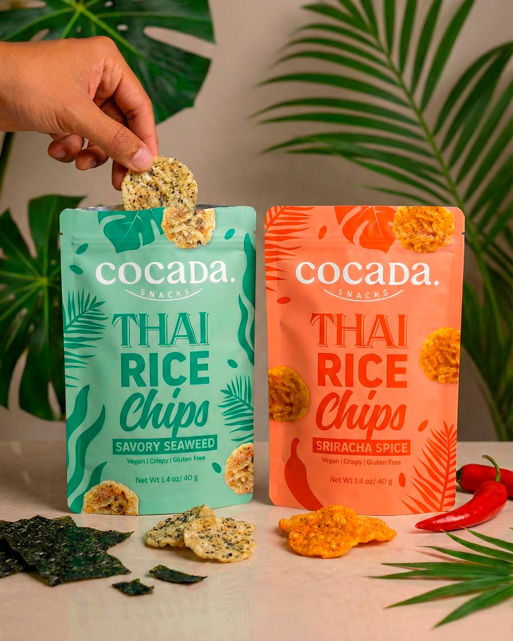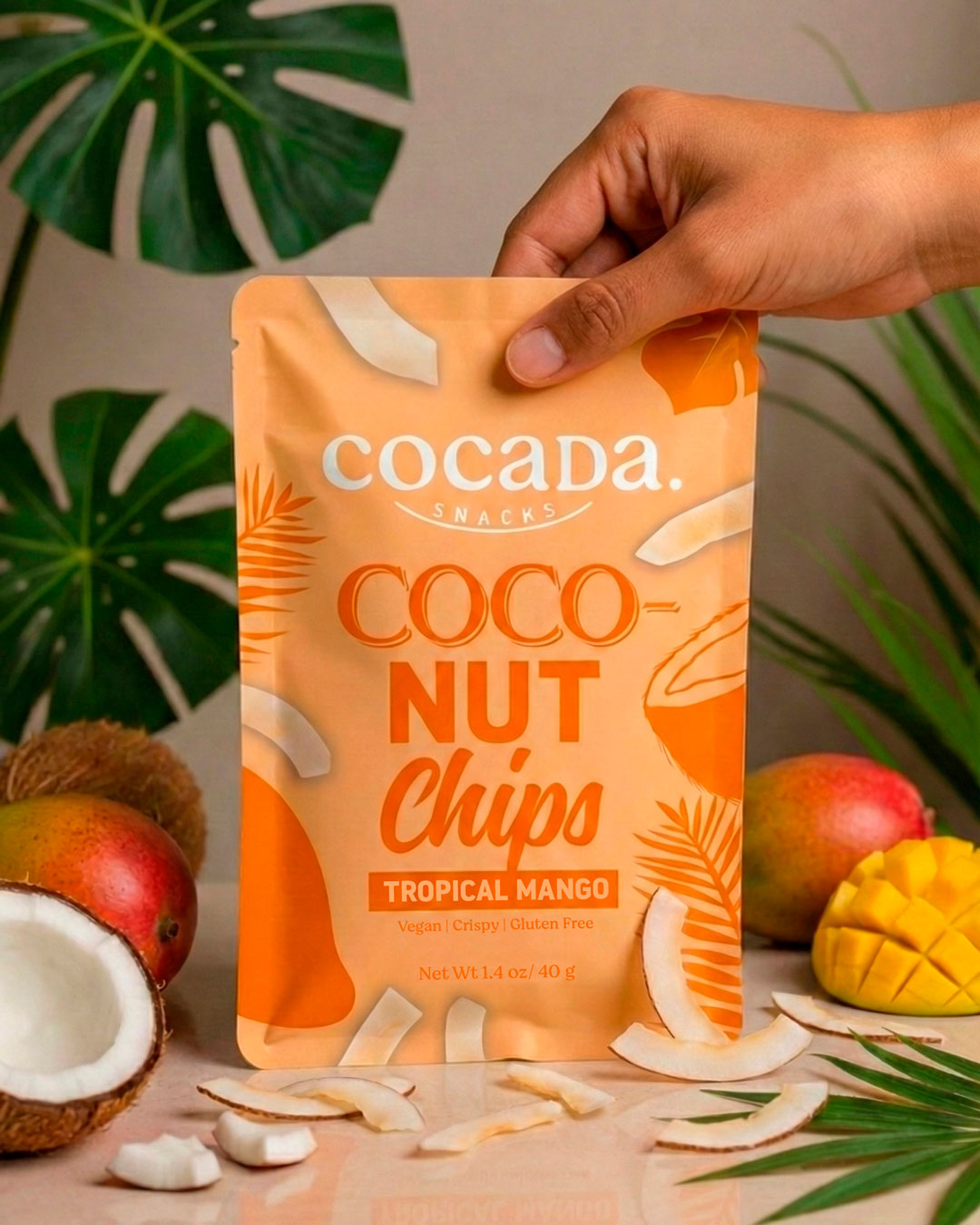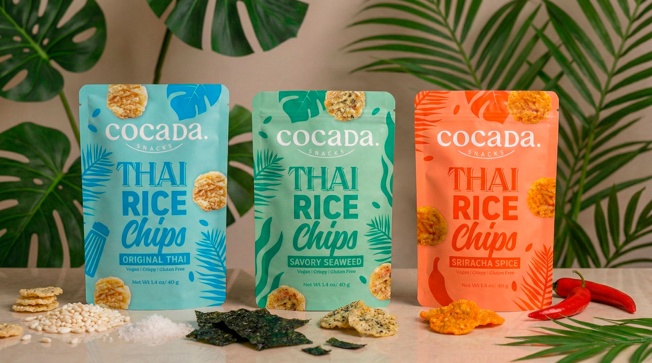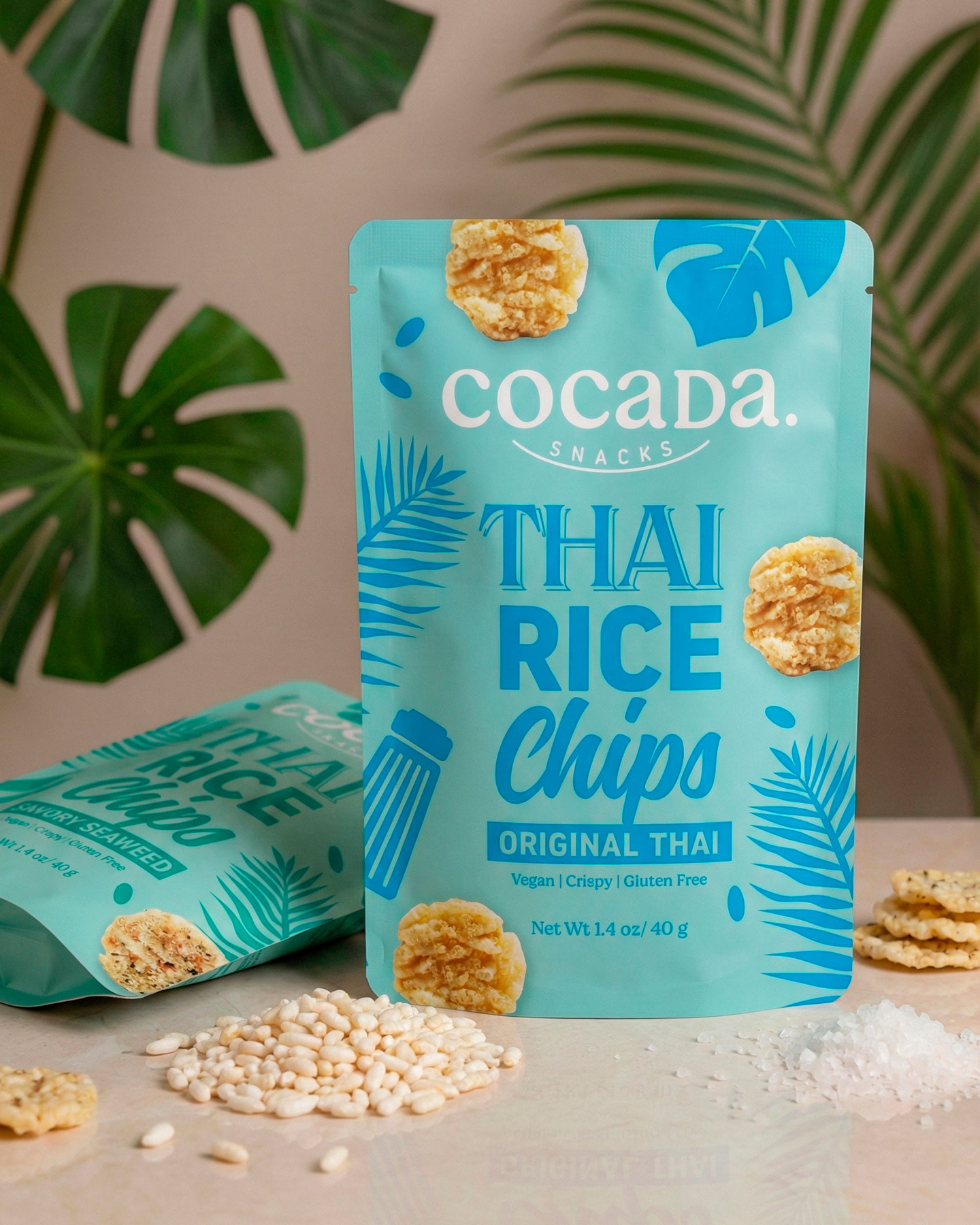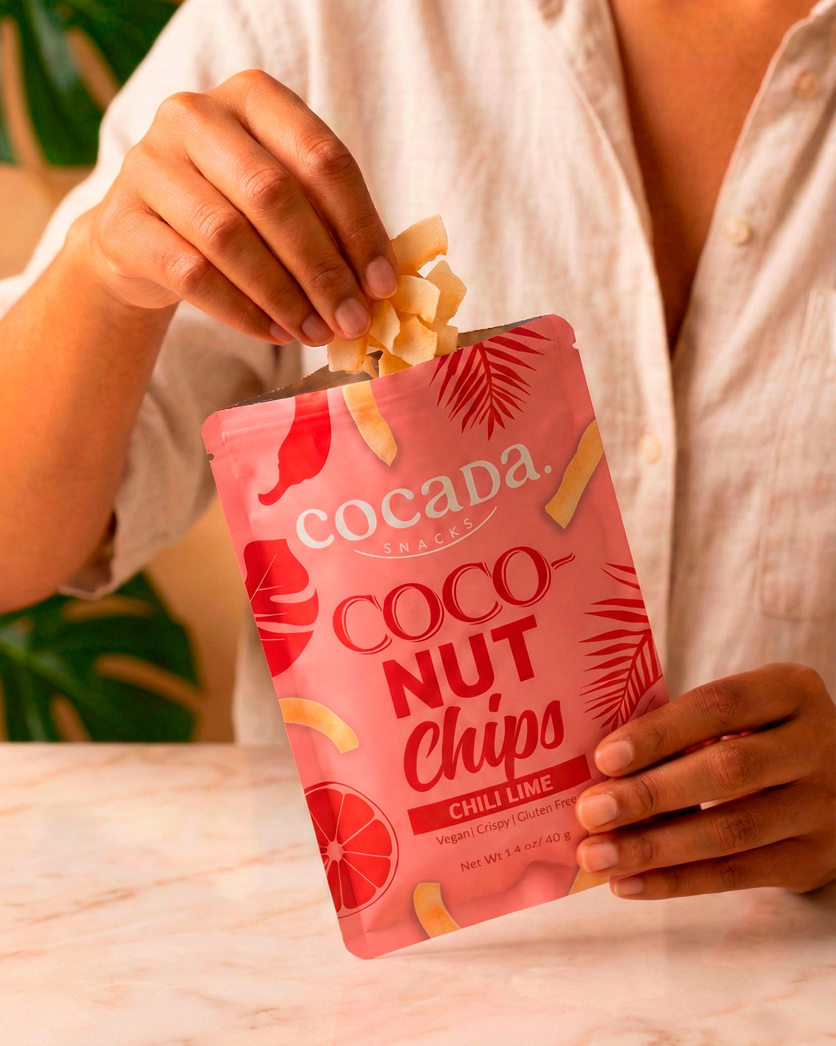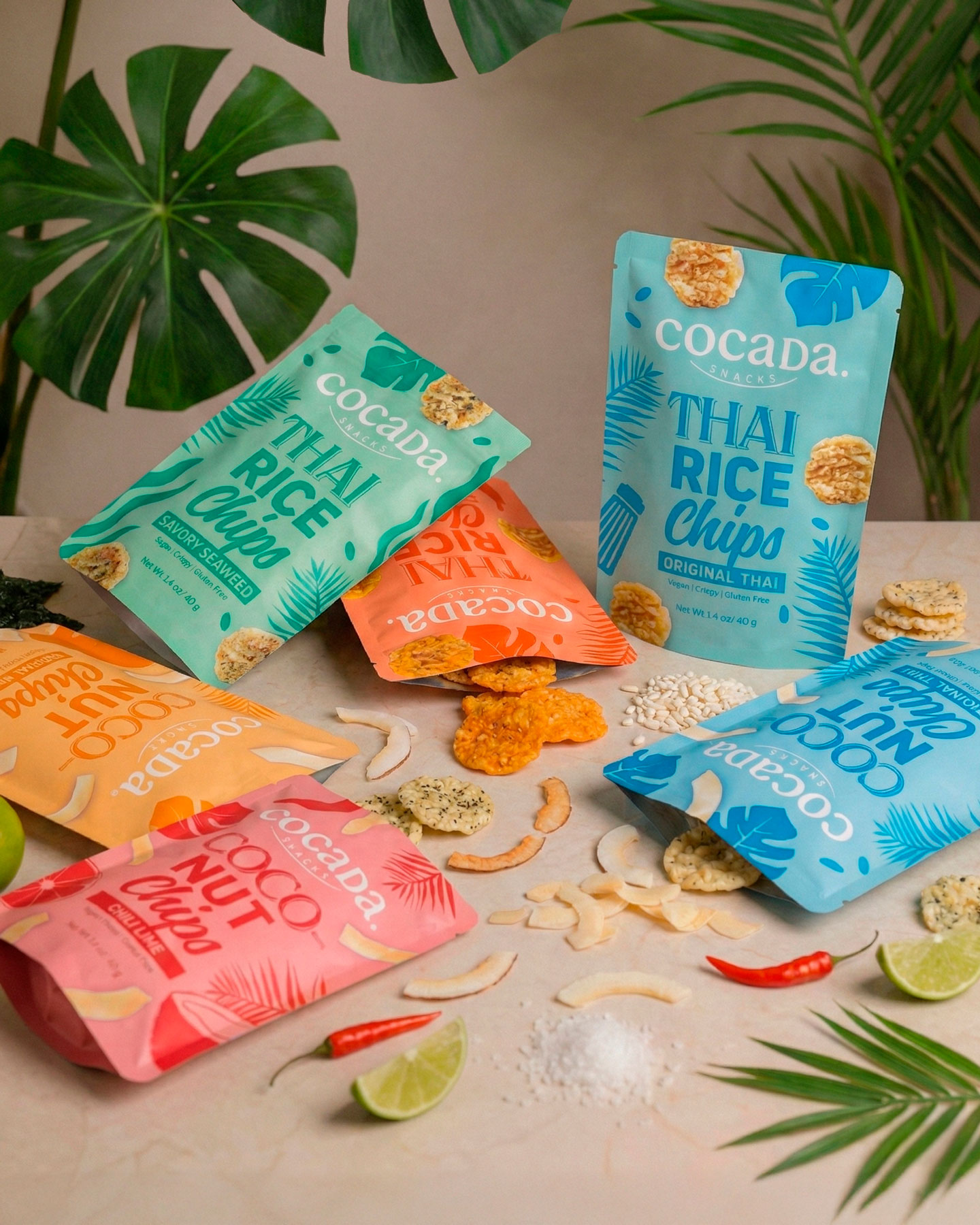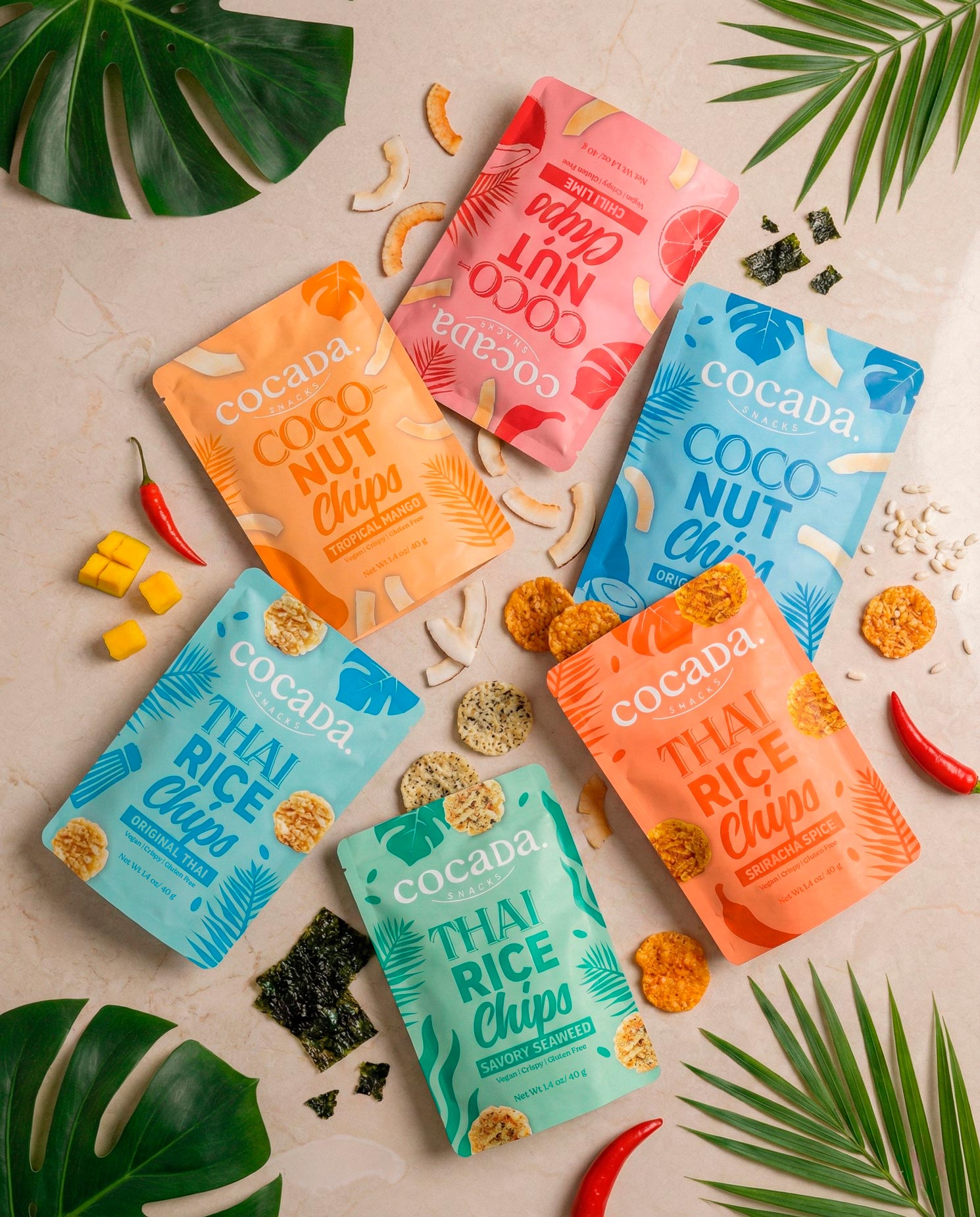
Packaging redesign for Cocadas Snacks, a new line of coconut snacks and rice snacks inspired by Thai cuisine. The goal was to build a visual identity capable of conveying origin, flavor, and personality from the very first moment on shelf, connecting with an international audience eager to discover flavors from around the world.
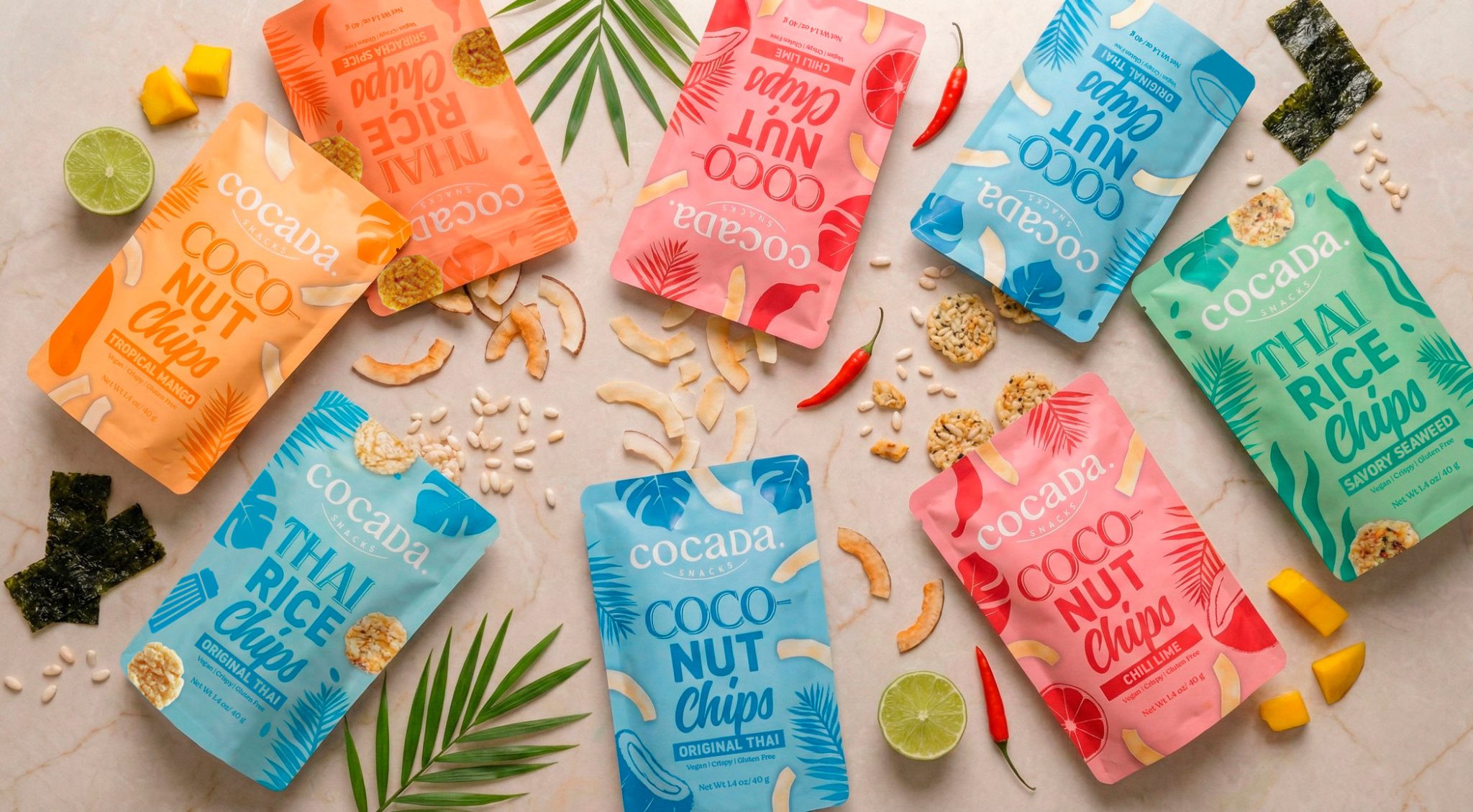
The graphic system is structured around a clear brand architecture, bringing together two product families with three flavors each. Color acts as the main structural element, allowing for easy differentiation between varieties while maintaining strong visual coherence. The intense, saturated color palette references Asian cuisine and reinforces the bold character of the product.
Typography and front-facing composition ensure high legibility and a clear information hierarchy, prioritizing the product name and flavor, while illustrated and graphic elements add context, energy, and a distinctive brand language. The entire system is designed to scale easily across new SKUs and formats.
The result is a contemporary, expressive, and functional packaging design, where design serves as a bridge between the product’s origin (Thailand) and a global consumer seeking authenticity, flavor, and strong visual identity.eño.