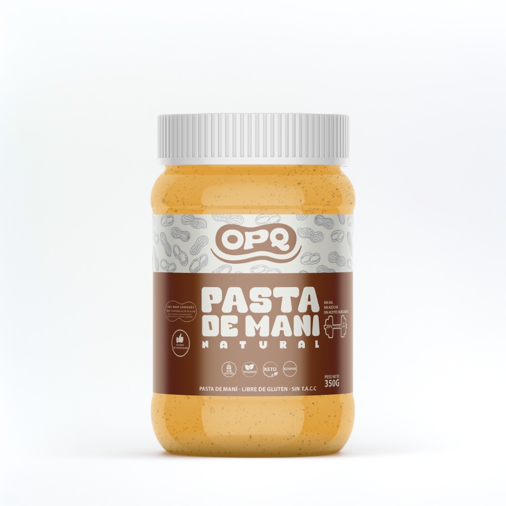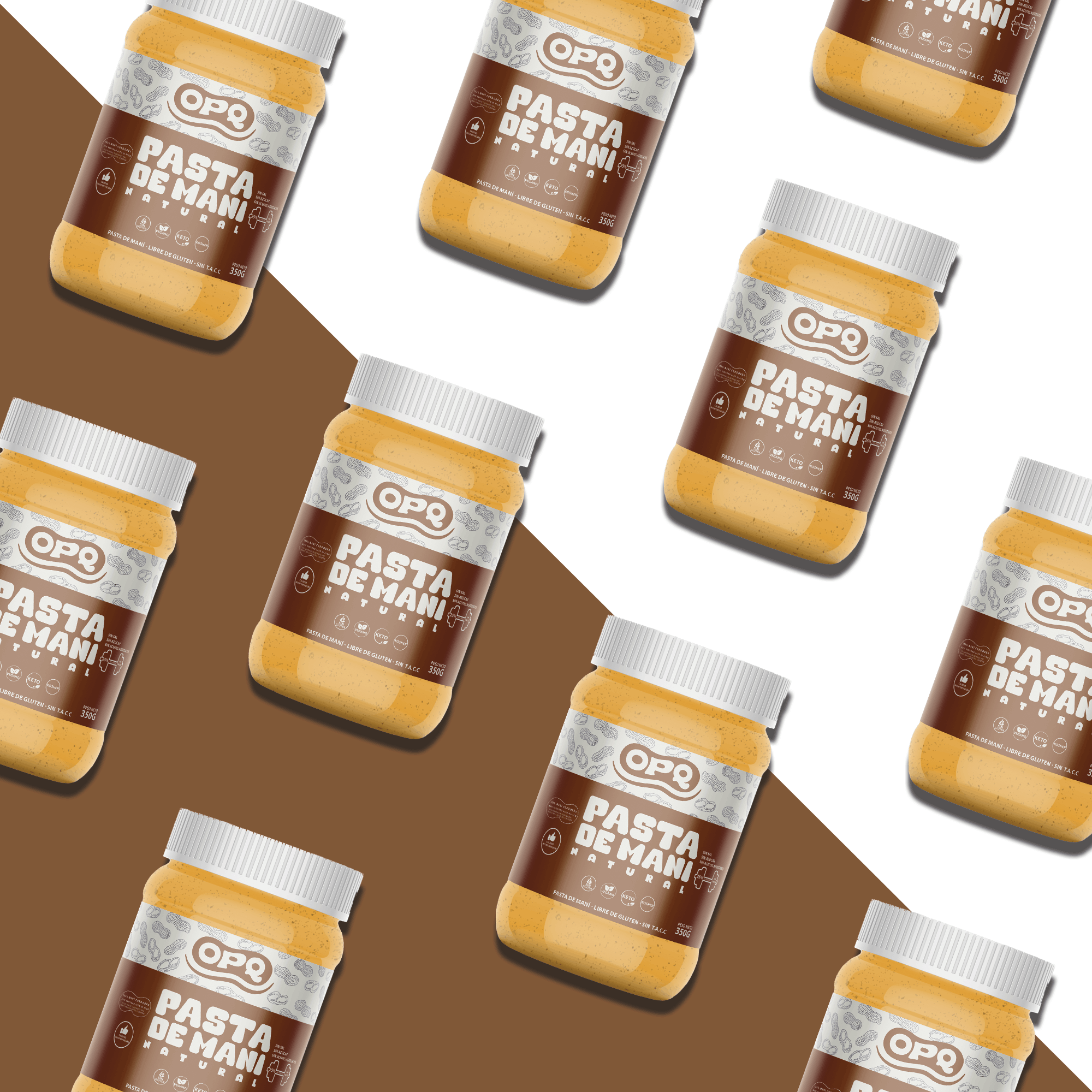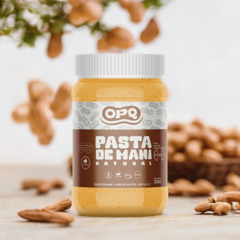
Peanut Butter Packaging Design
This peanut butter packaging project focuses on creating a bold yet friendly visual identity that reflects the product’s natural richness and everyday appeal. The design uses a warm color palette inspired by roasted peanuts, paired with clear typography to ensure strong shelf visibility and easy readability.
The label balances a modern look with a classic food-packaging feel, making it suitable for a wide audience. Special attention was given to hierarchy, spacing, and simplicity so the product feels trustworthy, appetizing, and premium without being overcomplicated.
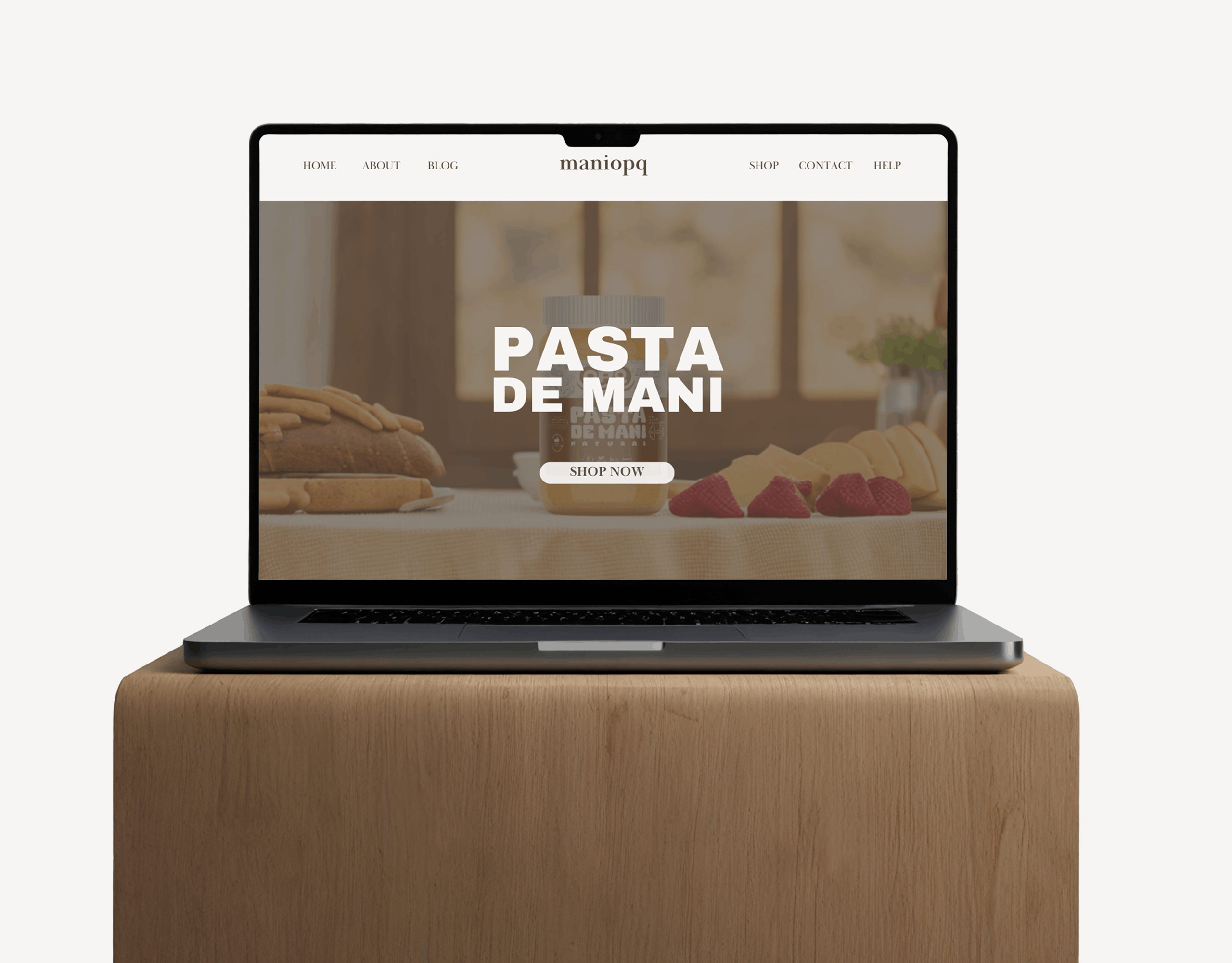
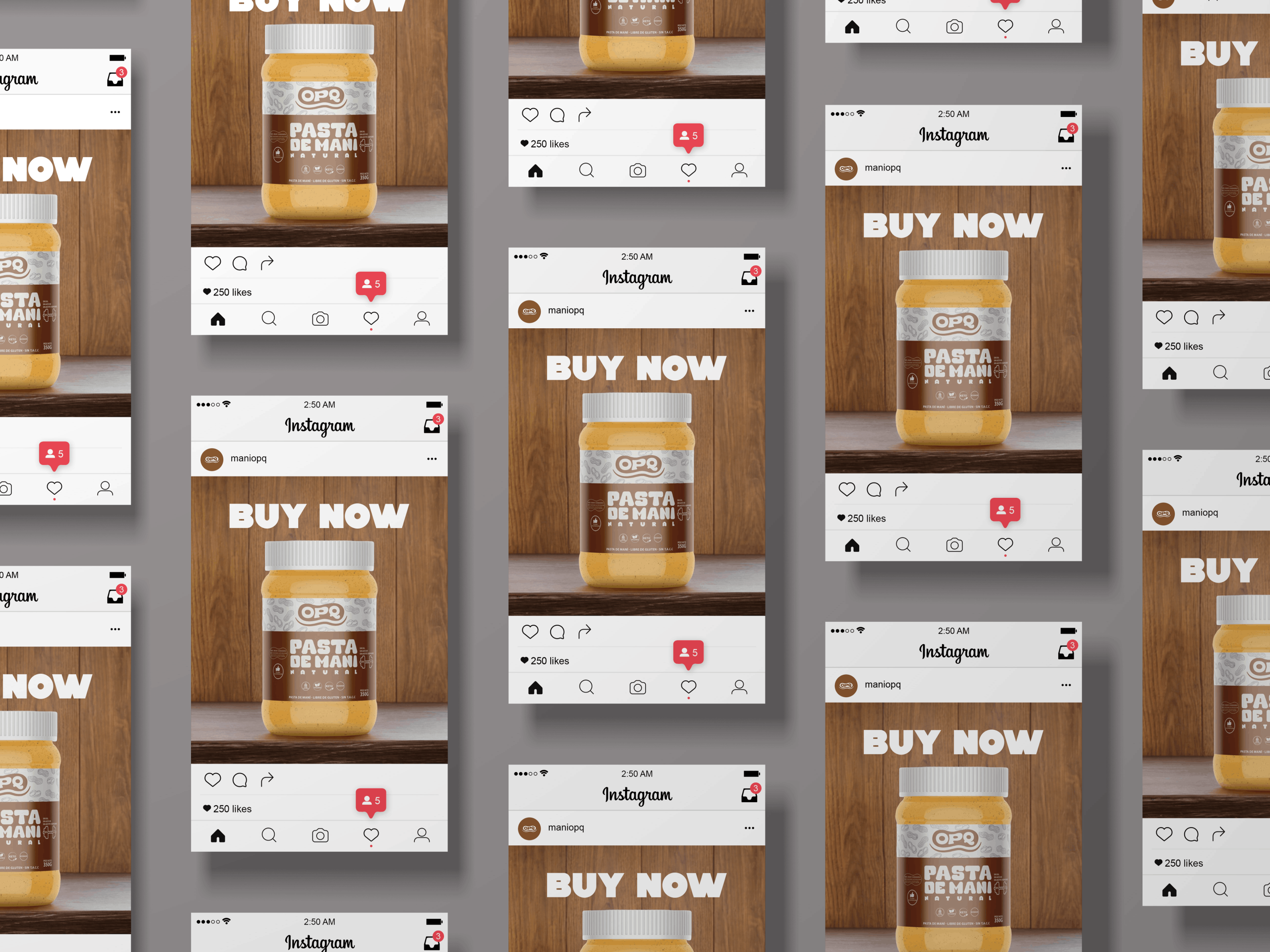
This concept is designed to stand out on retail shelves while clearly communicating flavor, quality, and brand personality.