Curator’s Insight – Sipclub Cocktails designed by Yuliana Pakhomova
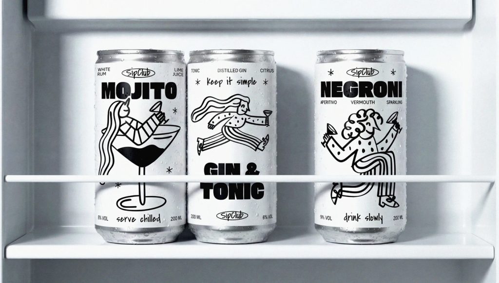
The illustrations feel playful but not childish. The characters look like they’re caught mid-moment—dancing, moving, enjoying a drink—almost like doodles from someone’s notebook during a good party. Another smart move is the consistent illustration style across different flavours. Each can has its own personality, but they clearly belong to the same friend group. On a shelf or in a fridge, they work as a set, which quietly encourages collecting and mixing—great for social settings.
Typography is also doing sneaky good work here. The bold drink names ground the playful drawings, stopping the design from floating off into “craft chaos.” It’s a nice balance: loose illustrations, disciplined type. That contrast makes the cans feel modern, not messy.
My personal take? It’s selling vibes. Casual. Human. Unpretentious. The kind of can you’d happily be seen holding at a house party—or leaving in your fridge when friends come over.


