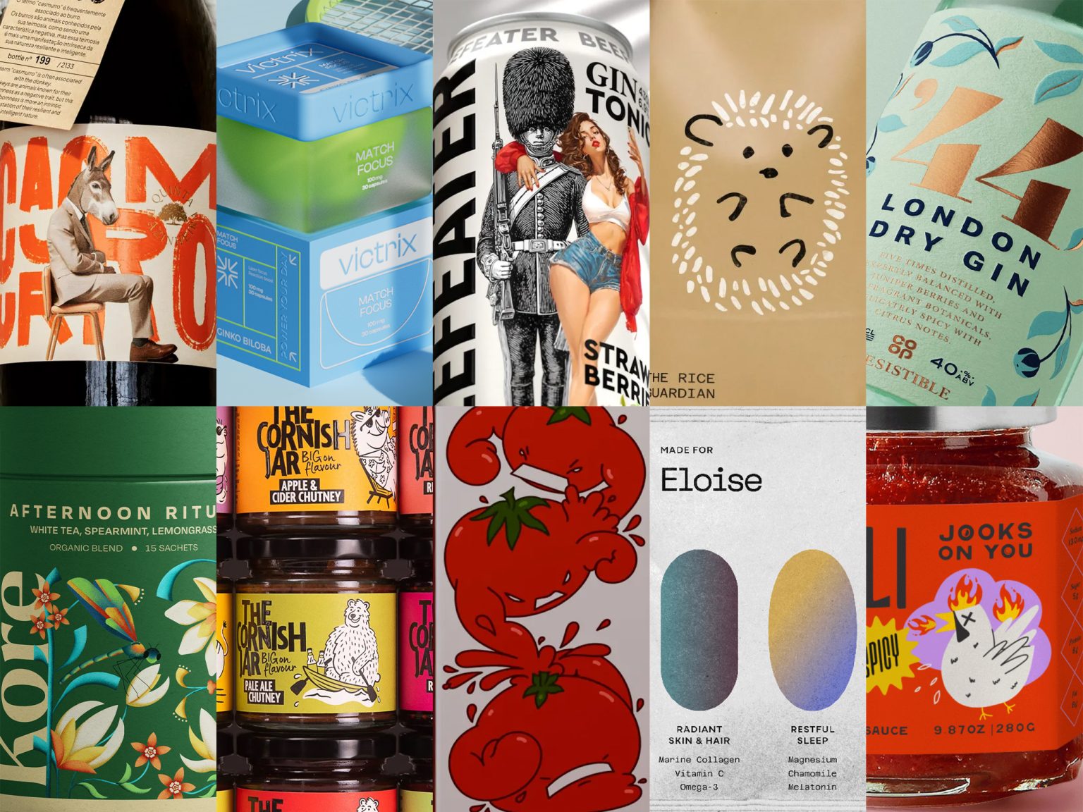
Welcome to Issue #136 of Packaging of the World! This month, we’re showcasing 10 standout designs that push the boundaries of creativity and innovation—you’ll definitely want to see them.
These eye-catching projects are trending across social media, generating buzz from designers and design lovers alike. Follow us on Instagram, Facebook, and Pinterest to catch the hype and discover why these packaging ideas are turning heads. From seasoned pros to rising stars, this collection proves that bold, imaginative packaging is making a serious impact.

¡TOMATADOR! Tomato juice designed by Alina Shamilova
¡TOMATADOR! stands out with a bold and dynamic identity that transforms tomato juice into a playful battle of flavor and energy. Heroic tomato characters, illustrated with a sense of action and humor, bring the brand’s fighting spirit to life on pack. Vibrant reds and energetic graphics capture freshness and vitality, while strong typography reinforces its confident, victorious tone. The result is packaging that feels lively, fun, and empowering—positioning the juice as more than a drink, but a burst of strength and character in every glass.

Olura designed by Fictorium
Olura’s brand identity and packaging balance scientific precision with feminine elegance, creating a personalized wellness experience. Each pill shape carries a soft gradient, symbolizing individuality and the uniqueness of every wellness journey. Clean typography paired with calming color palettes communicates trust, while subtle yet confident design details celebrate empowerment. The packaging system goes further by customizing each box with the customer’s name and tailored blend, reinforcing the brand’s promise of care crafted for the individual.

THE RICE’s Guardian designed by Marco Arroyo-Vázquez
This rice brand’s packaging blends heritage and charm with a modern premium touch. Featuring a hedgehog as the silent guardian of the fields, the design tells a story of care and tradition while standing out with warmth and authenticity. Handwritten typography, inspired by rice grains, pairs with playful grain-shaped visuals to indicate variety, creating both recognition and uniqueness. Crafted from kraft paper with tie closures and finished with a cardboard tag, the packaging evokes sustainability, handmade quality, and storytelling—making it feel less like a commodity and more like a cherished product for gourmet markets.

BEEFEATER designed by Bolimond
Beefeater Gin & Tonic’s packaging fuses heritage with contemporary energy. The iconic London guard anchors the design in tradition, while vibrant fruit graphics and playful pin-up illustrations bring modern flair and liveliness. Bold, confident typography contrasts with a clean white backdrop, reinforcing brand strength and visibility. The result is a visually striking identity that honors history while feeling fresh, dynamic, and instantly recognizable on the shelf.

Kore Tea Organic Blends designed by Punk Studio
Kore’s packaging embraces minimalism and nature to reflect the brand’s calm, conscious ethos. Each organic tea blend is distinguished by delicate, nature-inspired illustrations and soft color palettes, creating a serene yet cohesive identity. The clean, transparent design emphasizes purity and sustainability, positioning the brand as a ritual of self-care rather than just a beverage. By balancing simplicity with subtle differentiation, the packaging communicates calm, balance, and respect for the earth while standing out gracefully in the organic tea market.

Jooks on You designed by Fictorium
“Jooks On You” captures the Lees’ playful spirit through a bold and whimsical brand identity. Lively doodle-style illustrations bring bowls of jook and ingredients to life, while vibrant colors and dynamic typography create an energetic, conversational feel. The design mirrors the warmth of a family kitchen, blending humor and hospitality into every detail. More than packaging, the branding turns a simple comfort food into a joyful experience—inviting people not only to enjoy the dish but also to share in a story of heritage, laughter, and belonging.

The Cornish Jar designed by Buddy Creative
The Cornish Jar’s identity breaks away from the dull conventions of traditional chutneys with a design that’s as bold as its flavors. Playful, larger-than-life illustrations squeeze into unexpected scenes, mirroring the brand’s daring ingredient combinations. A vibrant color palette and energetic typography inject fun and personality, ensuring the jars pop off shelves in a market often dominated by muted, predictable designs. The result is a brand that celebrates flavor with flair, turning every jar into a joyful rebellion against the ordinary.

Co-op Irresistible Spirits & Cider designed by Robot Food
Robot Food’s redesign of Co-op’s Irresistible spirits and cider range transforms own-label into a true premium contender. Each bottle now carries a unique story, expressed through bespoke illustrations, refined typography, and tactile finishes that reflect provenance and character. A unifying copper thread runs across the range, adding cohesion while signaling quality and craft. Luxury foils, textured papers, and tailored label shapes elevate the collection beyond generic packaging, creating a sophisticated identity that feels both distinctive and collectible. The result is an own-brand that looks every bit as desirable as leading names in the category.

VICTRIX. Dietary supplement designed by Yana Dudkina
VICTRIX brings tennis culture onto the shelf with a striking supplement packaging system that transforms performance into ritual. A transparent square jar symbolizes the court, holding a glowing lime “ball” that conveys energy and benefit. Each variant takes its color cue from the Grand Slam tournaments—sky blue for focus, clay orange for energy, grassy green for reset, and cobalt blue for protection—creating instant recognition and storytelling through design. Bold yet minimal, the system unites sport, science, and style, making the supplements feel as essential to preparation as stepping onto the court itself.

Casmurro designed by Bisarro Studio
Bisarro Studio’s Casmurro packaging turns stubbornness into a visual strength. A donkey in a suit takes center stage, symbolizing resilience and determination, while oversized, raw typography asserts character and presence. Bold orange hues reference the wine itself, making color an integral part of identity. Matte paper conveys tactile honesty, balanced with metallic stamping for modern precision. Minimal finishes and strong contrasts focus attention on concept over embellishment, creating a brand that is unapologetically bold, visually striking, and memorable—where every design choice reinforces the paradox of tradition meeting ambition.