Let’s talk design like we’re sipping this mezcal designed by S&Co (Siegenthaler &Co) on a moonlit rooftop for this edition of Curator’s Insight.
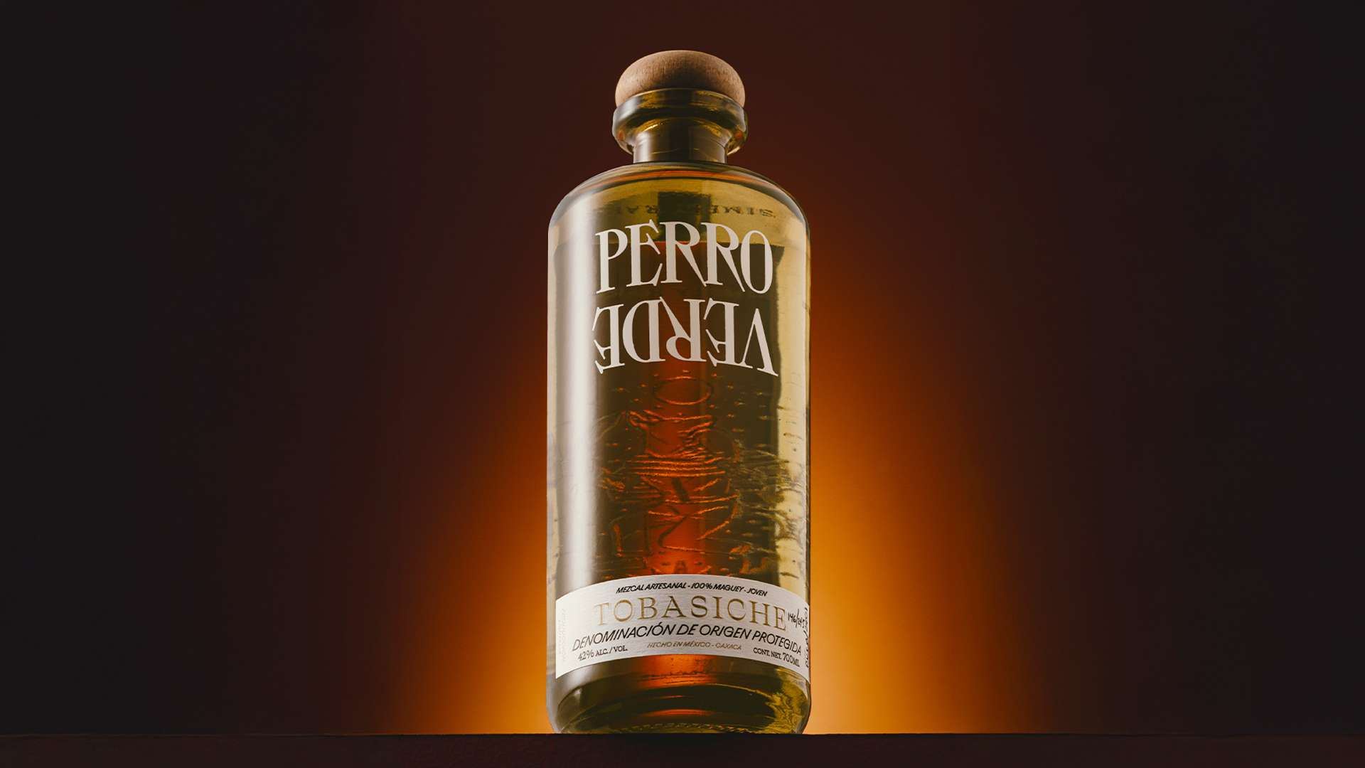
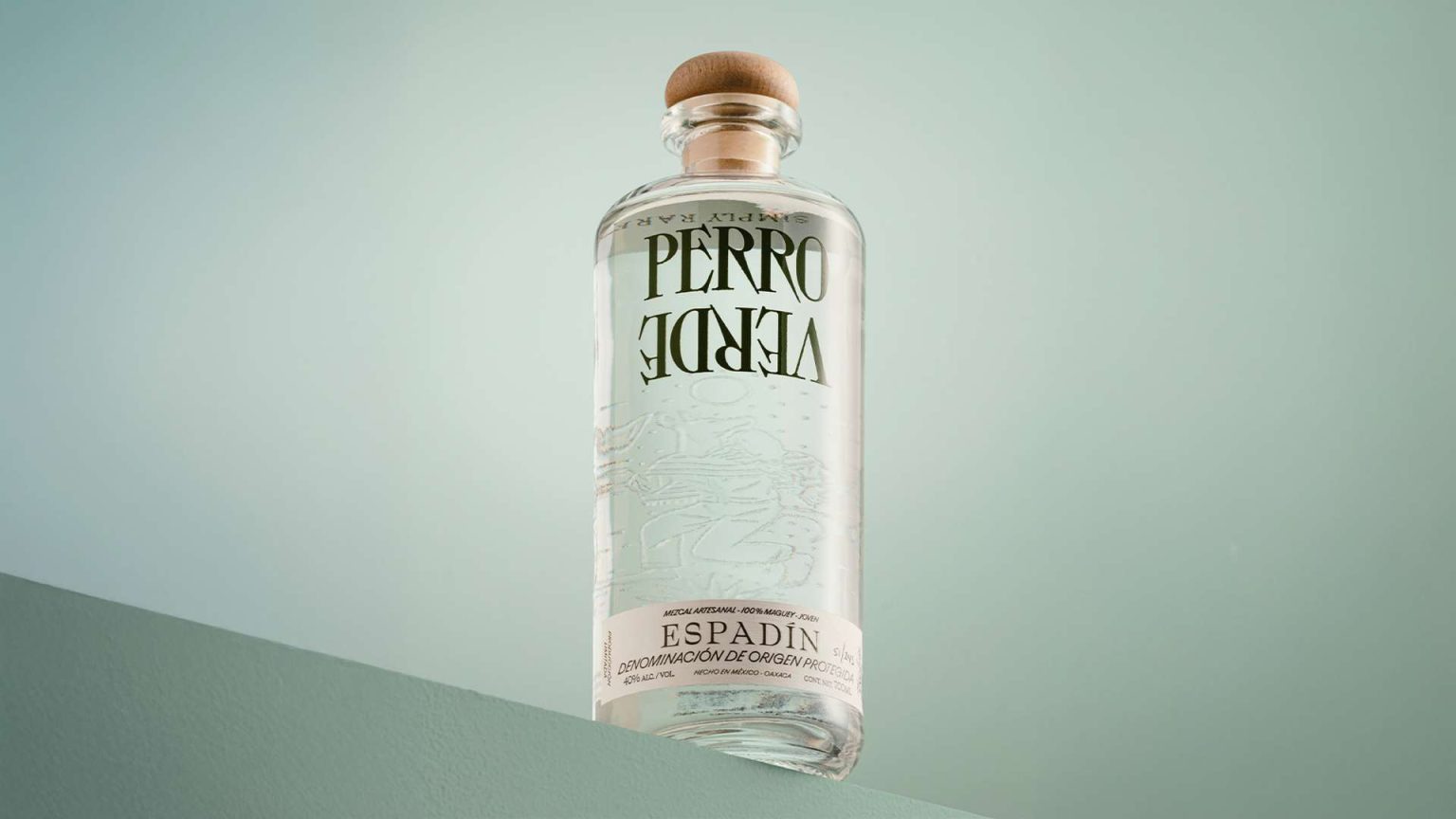
I’m not getting neon party juice vibes here—this is heritage in a bottle. The embossed nahual (a mythical creature representing personal transformation) isn’t just decoration; it lives in the bottle, like a hidden spirit watching over every sip. The glass texture makes it feel like you’re unearthing a relic, not just pouring a drink.
And the typography? Chef’s kiss. “VERDE” printed upside-down—yes, upside-down!—grabs your brain and makes you look twice. Bold, serifed, and slightly vintage in flavor, it plays with convention while giving a nod to history. It’s a visual pun: rare, wild, and a bit rebellious. You don’t see labels like this trying to be symmetrical and safe—it dares you to embrace the odd.
One more subtle flex: the bottom label’s use of space. Clean, understated typography with that sexy all-caps “ENSAMBLE” front and center, paired with a whisper of certification and origin (Oaxaca, of course). This isn’t cluttered with fake badges or gold foil screams—it’s confident enough to keep things minimal.
My personal take? This is what happens when branding takes a walk on the wild side without losing its soul. The bottle feels like it was designed by a mystic graphic designer who moonlights as a rockstar distiller. It’s rare, yes—but more than that, it’s soulful. You don’t just drink what’s inside—you experience the whole mythos in your hand.
And honestly? That’s damn hard to do in the world of luxury spirits.