Welcome to Issue #135 of Packaging of the World! This month, we’ve selected the top 10 designs that stand out for their creativity and innovation; you won’t want to miss them!
These designs are making waves on social media. Follow us on Instagram, Facebook, and Pinterest to see why everyone is talking about them. From experienced designers to fresh talents, these packaging ideas are leaving a big impact.

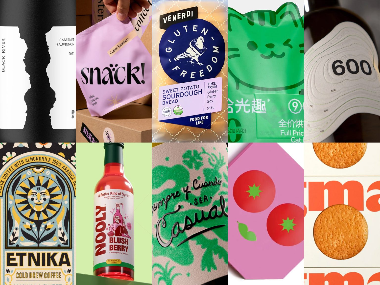
Venerdi Lifestyle Breads Refresh designed by Onfire Design
Venerdi’s refreshed brand identity brings playfulness and clarity to its health-focused bread portfolio. Building on the success of Gluten Freedom, the redesign introduces Pedro the pigeon as a central storytelling device, extended into sub-ranges with quirky illustrations and bold category-defining colors. Labels now adopt the distinctive “V” shape, pairing vibrant palettes with strong typography and clear health cues for easy navigation. By elevating Venerdi from a subtle sign-off to a confident banner brand, the design creates a cohesive system that balances personality, nutrition, and taste, while celebrating its proud, passionate, and playful heritage.

JoyEats designed by BOLD branding
JoyEats redefines fast-food packaging as a playful, post-apocalyptic spark of joy, transforming everyday moments into interactive experiences. The design merges geometric minimalism with pop-art boldness, pixelated graphics, and witty text to create packaging that talks, surprises, and delights. Bold colors, layered visuals, and hidden messages turn each box into a self-contained story, from pizza packs that double as posters to burger boxes disguised as t-shirts. This rule-breaking visual language balances simplicity with satire, offering a fresh, ownable identity that sparks curiosity, encourages sharing, and positions JoyEats as more than a meal—it’s an experience.

A Better Kind of Syrup designed by Widarto Impact
Nooly’s brand identity and packaging reimagine syrup with a balance of indulgence and wellness, creating a playful yet trustworthy presence on shelf and online. The bold logotype, crafted in Hobeaux, merges retro charm with modern energy, while doodle-comic illustrations give each flavor its own personality. A vibrant, flavor-led color palette enhances navigation and appetite appeal, reinforced by a clear typographic hierarchy that spotlights brand, flavor, and benefits at a glance. Anchored by the tagline “A Better Kind of Syrup,” the system unites clarity, warmth, and fun, positioning Nooly as a guilt-free upgrade for everyday moments.

Regma designed by Lavernia & Cienfuegos
Regma’s refreshed identity blends tradition with modern appeal, positioning the brand for broader retail success. The redesigned logo delivers strength and personality, serving as a bold visual anchor across packaging and communication. Vibrant colors and memorable design elements create impact on crowded shelves, while maintaining a connection to the brand’s heritage. Packaging has been reimagined to be iconic and instantly recognizable, ensuring consistency across stores, supermarkets, and online channels. The result is a cohesive brand system that resonates with younger audiences while honoring Regma’s legacy of quality and tradition.

Shiguangqu Pet Cat Food Pack designed by Darren Chen
This cat food packaging transforms the bag into a character, using playful ears, paws, and a cheeky wink to create instant personality and emotional connection. The design cleverly captures a universal cat behavior—stretching with a belly-up pose—turning a familiar moment into a graphic story that resonates with pet owners. Bright green color, minimal text, and smart icon placement balance fun with premium appeal, while clean contrasts ensure modern shelf impact. By borrowing cues from lifestyle and fashion branding, the packaging elevates pet food beyond function, making it feel stylish, engaging, and emotionally meaningful.

Casual Wines | The magic of the ordinary designed by Jacomy Mayne Studio
“Siempre y cuando sea casual” captures the spirit of spontaneity through a visual identity that feels unplanned yet intentional. Playful shapes, free silhouettes, and lively colors bring movement and chance encounters to the labels, echoing the brand’s philosophy of celebrating imperfect, human moments. Each variety has its own distinct palette and energy, unified by a handwritten custom typography that feels intimate and personal, like a note from a friend. The result is a wine identity that is casual, approachable, and authentic—embracing life’s unpolished beauty with warmth and ease.

snack! designed by marka collective
Snack!’s refreshed identity brings a bold, playful energy to coffee branding with packaging that mirrors the freshness of its beans. The punchy exclamation mark and vibrant design accents create an urban, joyful personality that stands out on shelf. Bright colors, rhythmic layouts, and confident typography reflect the brand’s lively spirit and easygoing attitude, transforming each bag into more than packaging—it’s an invitation to curiosity and good times. By breaking away from traditional specialty roaster aesthetics, Snack! establishes itself as a coffee brand that feels fresh, fun, and unapologetically different.

A New Altitude for a Timeless Wine designed by M&A CREATIVE AGENCY
Altas Quintas’ “600” rebrand elevates its identity with a design that embodies both altitude and refinement. The bold central placement of the number 600 anchors the label, symbolizing not only elevation but also purity, structure, and distinction. Minimalist typography, refined textures, and carefully curated finishes create a sense of precision and elegance, while maintaining authenticity rooted in Portalegre’s terroir. By balancing modern expression with timeless restraint, the packaging reflects the harmony between land and craft, positioning Altas Quintas 600 as a sophisticated tribute to the region’s unique high-altitude character.

ETNIKA – COLD BREW COFFEE designed by Emi Renzi
ETNIKA’s cold brew packaging combines folkloric charm with modern design, creating a vibrant identity that celebrates culture and nature. Each variety is distinguished by colorful illustrations and graphic language inspired by geography, climate, and tradition, yet unified under a cohesive brand system. The result is a visual language that feels global and inclusive—evoking cultural richness without being tied to a single place. With its bold colors, playful detailing, and modern execution, ETNIKA’s packaging positions the brand as both authentic and contemporary, reflecting the quality of its beans and the diversity of its origins.

Black River Wine designed by Vince Kidd
The Black River wine label embraces Japanese minimalism with a design rooted in the philosophy of wabi-sabi. A torn paper motif serves as the central element, symbolizing hidden layers and evoking the flow of a river between landscapes—a poetic nod to the name. Paired with restrained typography, balanced composition, and tactile textures, the label conveys quiet luxury and refined craftsmanship. The result is packaging that stands out with sophistication, inviting consumers into a contemplative experience that mirrors both the complexity of fine wine and the elegance of Japanese design tradition.