Welcome to Issue #133 of Packaging of the World! This month, we’ve selected the top 10 designs that stand out for their creativity and innovation; you won’t want to miss them!
These designs are making waves on social media. Follow us on Instagram, Facebook, and Pinterest to see why everyone is talking about them. From experienced designers to fresh talents, these packaging ideas are leaving a big impact.

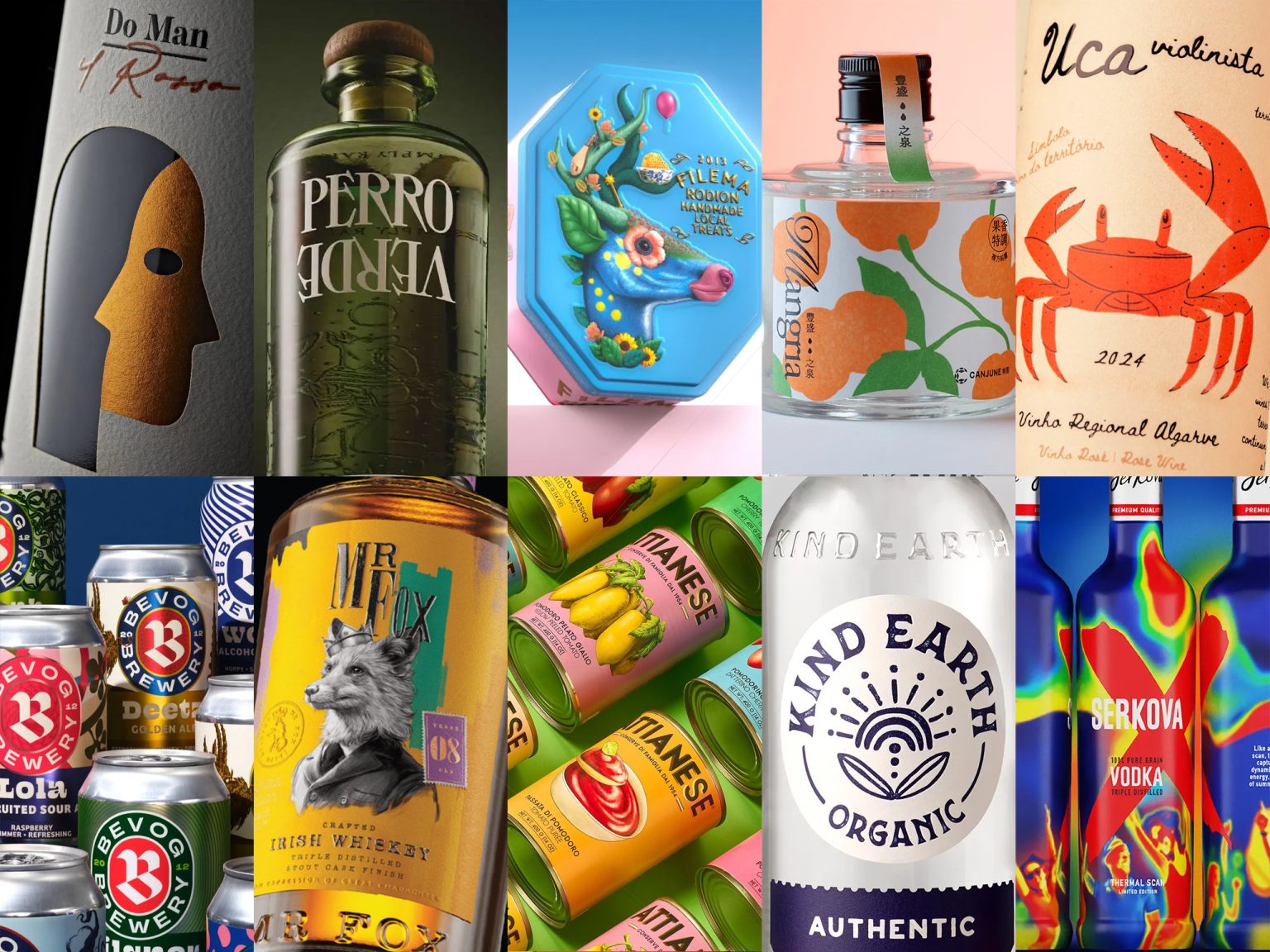
Filema Rodion – Anniversary Box designed by Luminous Design
Filema Rodion’s anniversary tin reimagines nostalgic charm through a design that echoes the timeless utility of classic candy tins—often repurposed for buttons, thread, or forgotten treasures. The packaging blends subtle elegance with emotional familiarity, evoking a sense of quiet importance. Its muted tones, tactile finishes, and retro-inspired typography celebrate tradition while positioning the brand as both sentimental and enduring. A true homage to memory, this tin feels less like packaging and more like a keepsake—crafted to be kept long after the sweets are gone.

Attianese Conserve designed by nju:design
Attianese Conserve, designed by nju:design, transforms pantry staples into shelf-worthy art with a vibrant nod to vintage Mediterranean charm. Each label bursts with custom hand-illustrated tomatoes, evoking 1950s Italian nostalgia while maintaining a fresh, modern layout. Distinct Pantone palettes help differentiate product types at a glance, making the design both functional and collectible. The typography strikes a perfect balance—“Attianese” stands bold like a family crest, while clean lines and thoughtful spacing offer contemporary elegance. This packaging is a love letter to tradition, elevated through smart design and irresistible visual flair.

CANJUNE – Botanical Hydrosol Blends designed by I Chyi Chang
Designed by I Chyi Chang, CANJUNE’s hydrosol packaging captures a refined balance between botanical serenity and understated luxury. The squat, rounded glass bottles evoke a vintage apothecary charm, grounded and intimate in form. Each label is artfully expressive—Mangria bursts with vibrant orange and lush green, while Minjito embraces cool, airy tones with perilla-inspired motifs. The floating graphics and subtle typographic gestures mimic breath and movement, creating a sensory visual rhythm. A sleek vertical strip atop the cap adds a thoughtful touch of asymmetry, transforming each bottle into a quiet ritual piece—crafted not just to be seen, but to be savored.

Mr Fox Irish Whiskey – Uncrowned & Unconventional designed by Backbar Studios
Backbar Studios delivers a bold visual identity for Mr Fox Irish Whiskey, merging historic intrigue with urban edge. Inspired by Charles Stewart Parnell’s secret alias, the packaging fuses letterpress typography, vibrant color palettes, and coded visuals to reflect the brand’s rebellious spirit. The design disrupts whiskey norms with street art elements, old-world symbolism, and UV-reveal details—turning each bottle into a layered narrative. Crafted for both shelf impact and digital platforms, the versatile system spans single drams to collector editions, speaking directly to a younger, design-conscious audience while honoring Dublin’s storied past through a contemporary lens.

Perro Verde Mezcal designed by S&Co (Siegenthaler &Co)
S&Co’s design for this mezcal is a masterclass in soulful storytelling through form and texture. Anchored by an embossed nahual—an emblem of personal transformation—the bottle evokes mysticism and heritage with every tactile detail. The textured glass feels ancient and intentional, like unearthing a sacred relic. Typography plays the rebel here: “VERDE” flips convention upside-down, while bold serifed lettering and minimalist composition strike a balance between wild spirit and refined craft. With subtle cues from Oaxaca’s roots and a confident, uncluttered label system, this design doesn’t just package mezcal—it invites you into its mythic, moonlit world.
![]()
Kind Earth designed by CF Napa Brand Design
Kind Earth Organic Vodka stands out with a vibrant, eco-conscious design that blends playful modernity with nostalgic charm. The custom bottle features a two-piece label system for easy line extension, while bold, fruit-forward color palettes distinctly represent each flavor. At the heart of the branding is a custom icon and wordmark inspired by woodblock printing, evoking a minimalist yet earthy aesthetic. The sun-kissed emblem—a nod to nature’s abundance—channels a retro 70s vibe, reinforcing the brand’s organic roots and feel-good ethos. It’s a design that’s as refreshing and approachable as the vodka itself.

Serkova Summer Limited Edition designed by Antonia Skaraki
Serkova’s Thermal Scan Limited Edition is a bold visual manifesto that fuses design with nightlife culture. Inspired by thermal imaging, the bottle becomes a heat map of after-dark energy—silhouettes in motion, electric gradients, and a UV-reactive finish that comes alive under blacklight. The iconic red “X” cuts through the saturated chaos, anchoring the design in rebellious confidence. This isn’t just packaging—it’s an immersive artifact of the dancefloor, capturing fleeting moments in a collectible form. From concept to execution, Serkova turns up the temperature with a bottle that glows, pulses, and dares to be unforgettable.

UCA VIOLINISTA designed by RitaRivotti
UCA VIOLINISTA captures the soul of Algarve’s coastal vineyards through a bold and poetic design narrative. Inspired by the region’s native fiddler crab, the packaging blends environmental storytelling with striking visual identity. The crab, mid-wave with its iconic claw, becomes a dynamic emblem—symbolizing both nature’s rhythm and the wine’s vibrant character. Hand-drawn illustrations, organic textures, and a clean typographic system anchor the design in artisanal authenticity. More than a label, it’s a tribute to local biodiversity—turning each bottle into an ambassador for Algarve’s rich ecosystem and the craftsmanship rooted in its land and sea.

Do Man designed by killeridea
The label for “Do Man” masterfully visualizes collaboration through a striking dual-faced motif, using Gestalt-inspired design to suggest two identities in one. A laser-cut silhouette on textured paper reveals the wine beneath, transforming the liquid into the soul of the artwork. Layered over a metallic gold base, the design plays with light and dimension, evoking warmth and hidden depth. The clever interplay of materials and negative space captures the essence of partnership, while the name—Trentino dialect for “two hands”—anchors the concept in regional authenticity and shared craftsmanship. A refined, symbolic design that speaks volumes with subtlety.

Bevog Craft Brewery Rebranding designed by Trampolin Studio
Bevog Craft Brewery’s rebrand introduces a bold, cohesive design system that reinforces shelf presence while preserving the brand’s eclectic personality. Rooted in Bevog’s rich history and European craft brewing tradition, the refreshed identity centers around a redesigned logo and a clear typographic hierarchy—ensuring instant recognition across an expanding portfolio. Each beer maintains its individual narrative through unique illustrations and visual cues, yet aligns within a structured system for consistency. The result is a unified, expressive visual language that cuts through shelf noise, reclaims attention, and future-proofs the brand’s visual direction without sacrificing its creative edge.