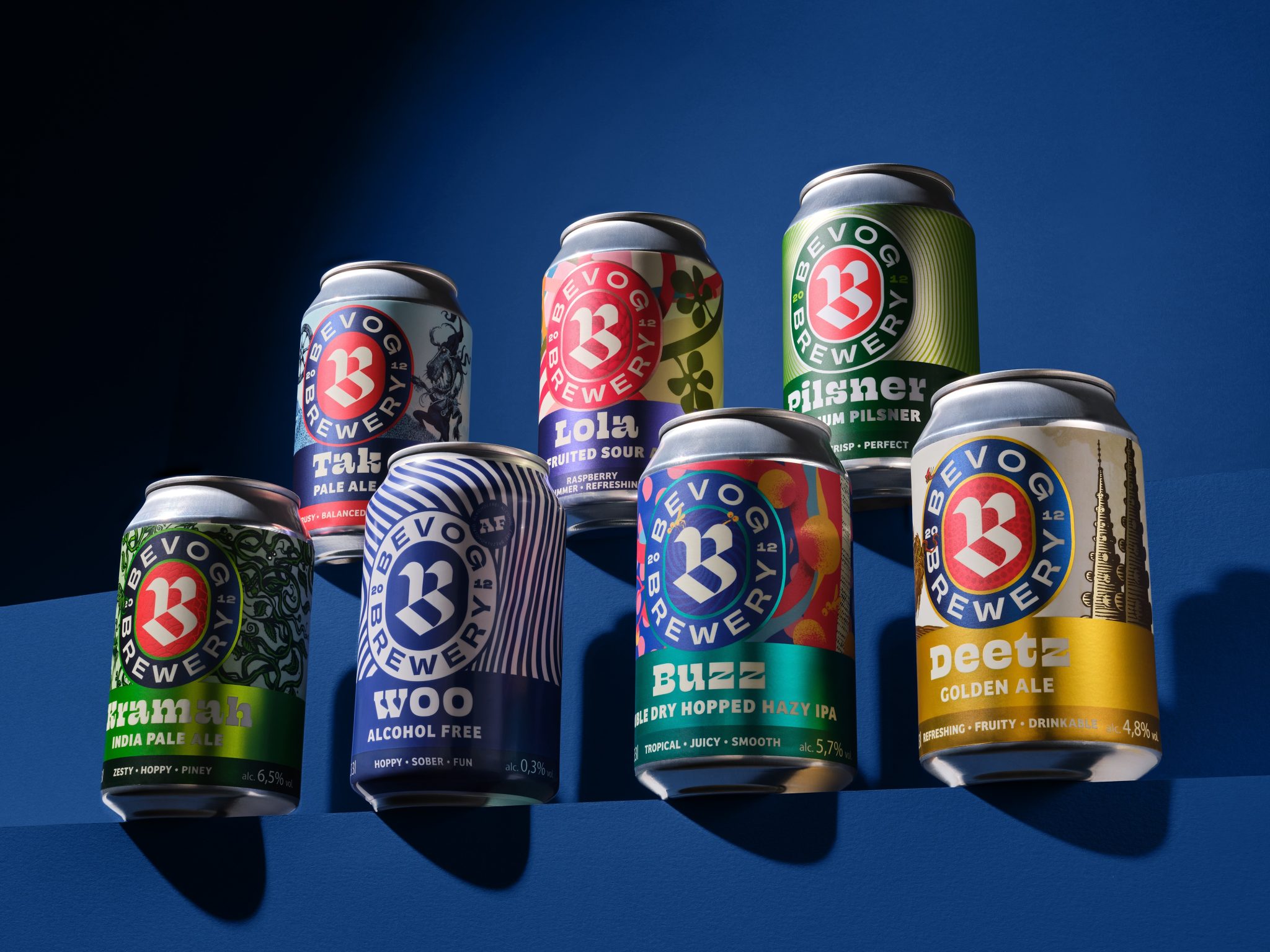
When Bevog Craft Brewery was established in 2012, it quickly became the leading craft brewery in Slovenia and neighboring Austria, partly due to limited competition at the time. Today, the craft beer market is larger and more crowded, and Bevog faced the challenge of an inconsistent visual identity — resulting in the brand becoming less recognizable on increasingly saturated shelves. The goal was to strengthen the brand’s expressiveness and coherence through a clear, well-thought-out design system. This system needed to ensure the products remained attractive and unique, preserved the brand’s character, and at the same time provided clarity, visibility, and a strong shelf presence.
We began the process by delving into the history of the Bevog brand and the broader tradition of craft brewing in Europe. We studied leading brands and defined a creative direction that would allow Bevog to preserve its distinctive character while undergoing a complete visual renewal. Next, we developed a design system that establishes a clear hierarchy of typography across all products, placing the redesigned logo at the center — serving as a strong visual cue to attract attention, even on the most saturated shelves. Each beer follows this hierarchical system while maintaining its own unique story and visual identity.
Bevog now claims valuable shelf space in a confident, visible, and unified way — serving as both a visual and taste refreshment in any setting. The rebranding has been enthusiastically embraced by Bevog and craft beer lovers alike, giving the brewery fresh momentum and brand stability. This solid foundation allows Bevog to expand its product portfolio without uncertainty about the visual direction of future beers, as each new product can be seamlessly integrated into the established design system, while still adding its own unique story.


