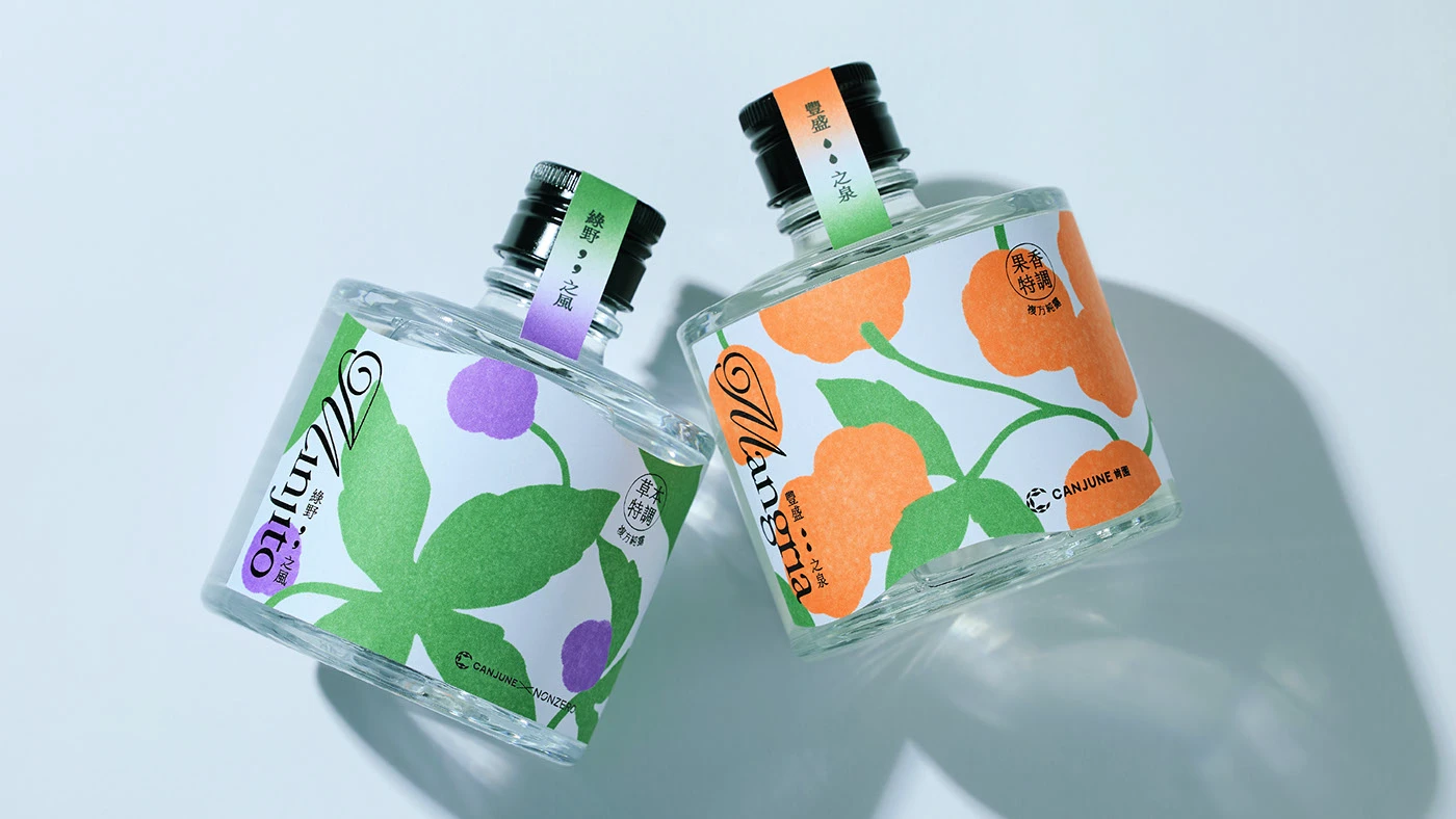
Oh, now this is a vibe. Let’s talk about CANJUNE’s hydrosol packaging 🍊🍃 designed by I Chyi Chang — because honestly, it’s giving “quiet luxury meets botanical joy,” and I am 100% here for it.
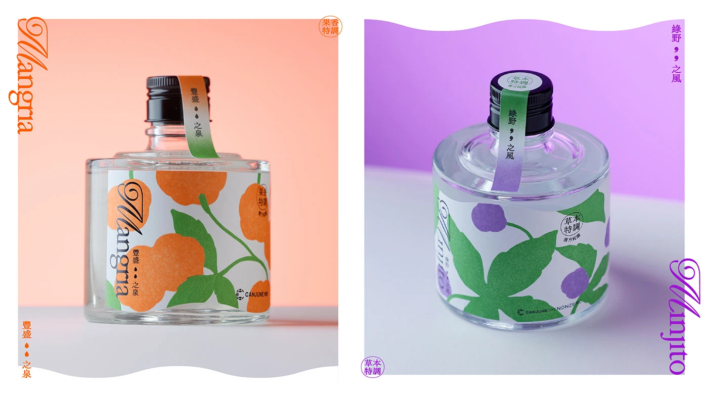
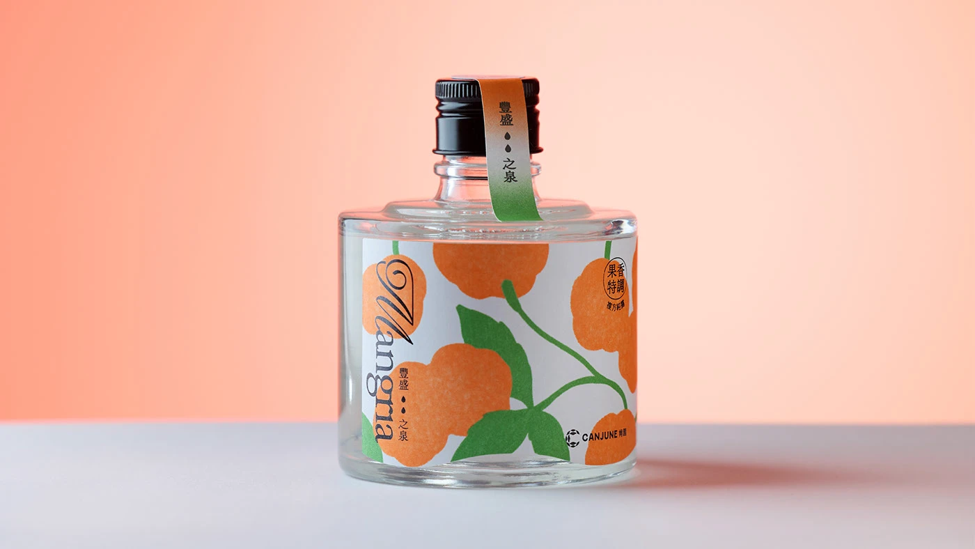
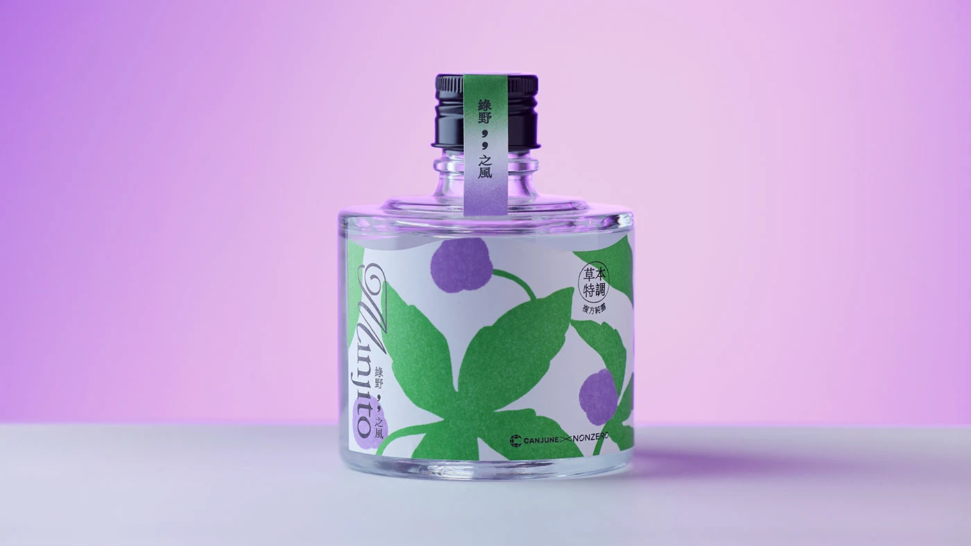
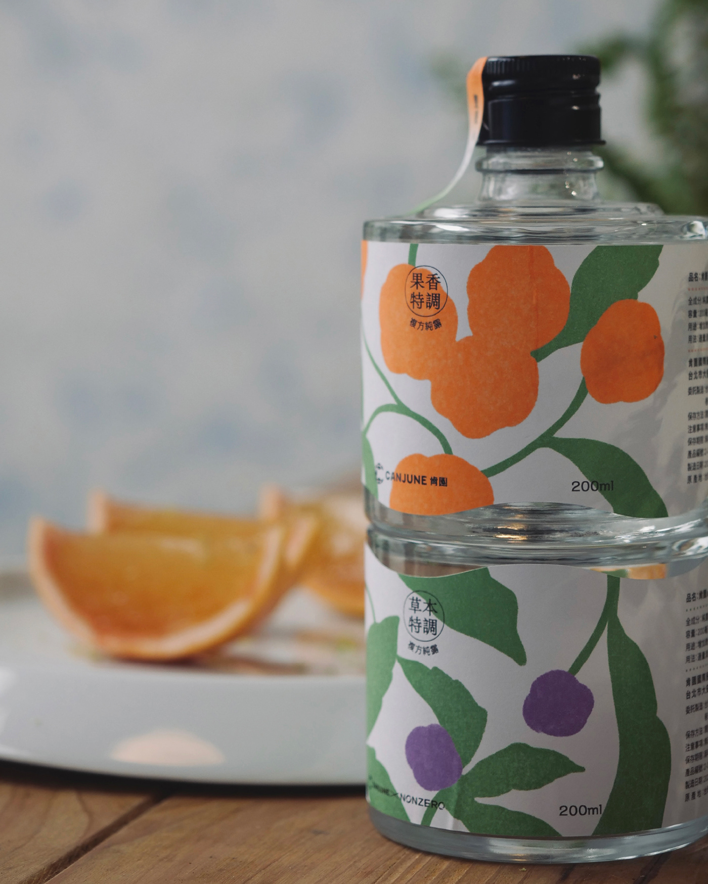
First off, let’s talk structure. The squat, rounded glass bottles? Big win. They’re sturdy yet elegant — like if your favorite vintage apothecary got a design degree in Kyoto. It’s not trying to be tall and glamorous. It’s grounded, honest, and intimate — like the kind of product you actually want to keep by your bedside or sink, not just Instagram and forget.
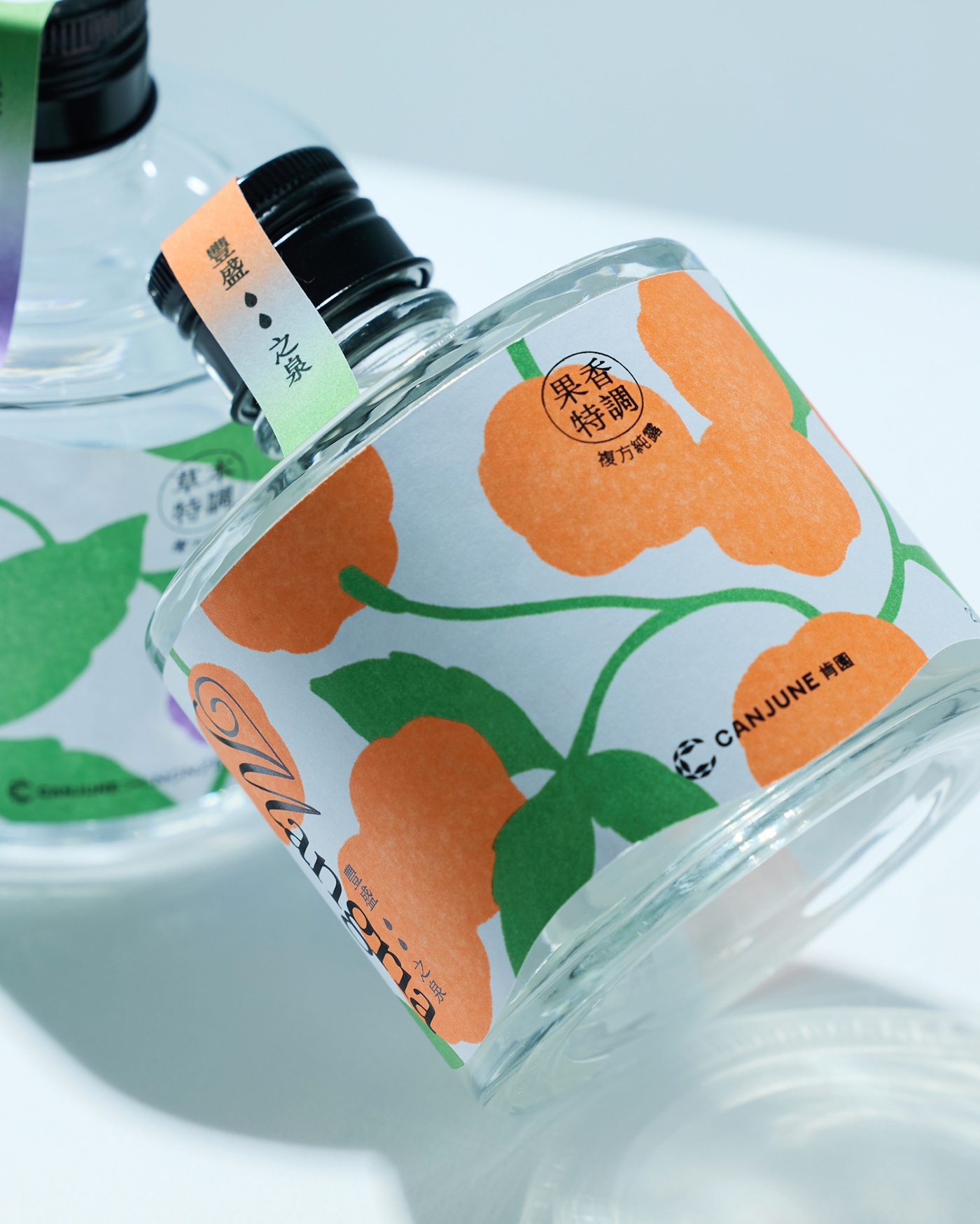
- Mangria’s label dips like spring water, complete with little droplets that feel like they’re dancing. It moves — like the scent wants to flow into your skin.
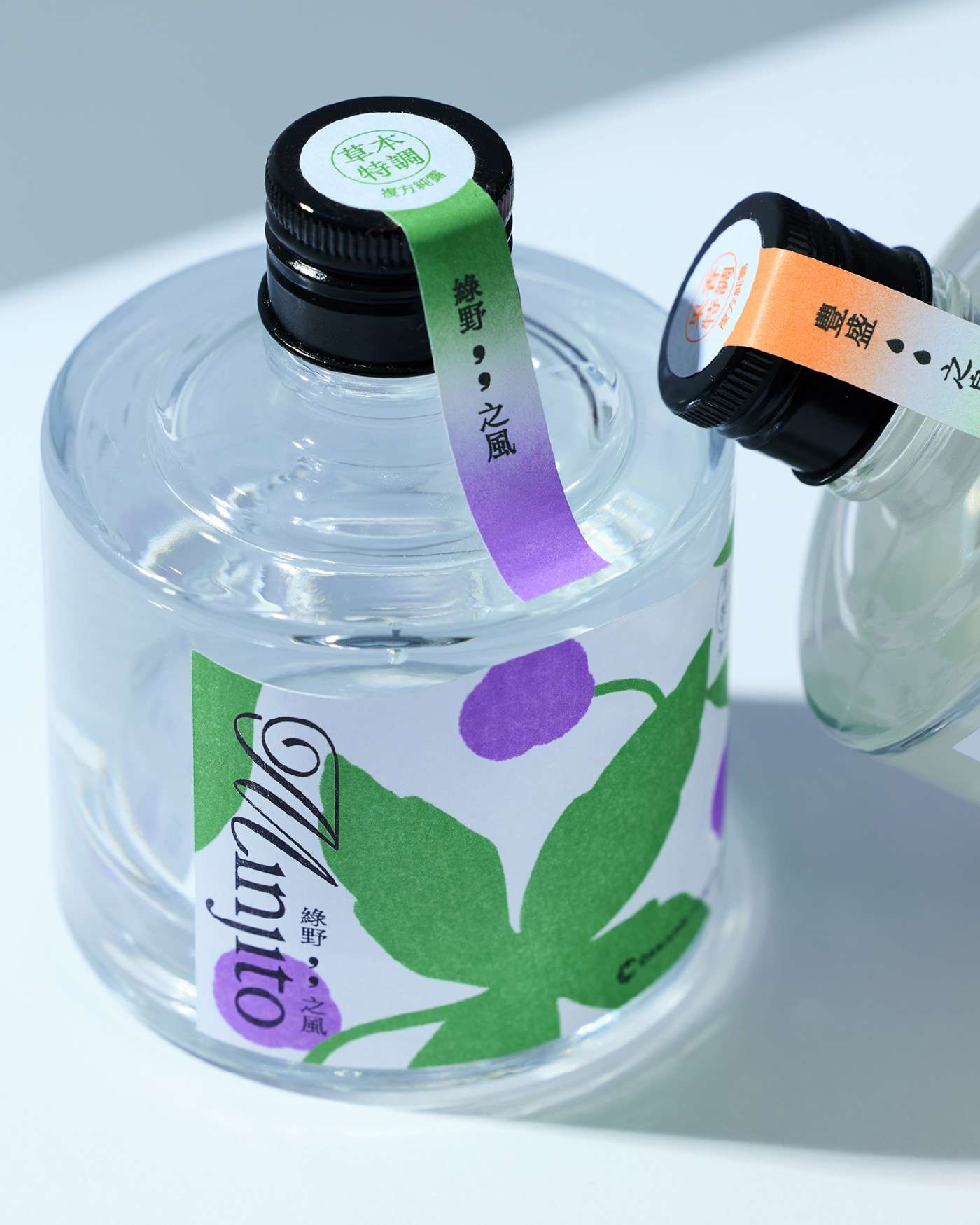
- Minjito’s label floats upward, like a breeze whispering through shiso leaves. The comma-like marks? They’re literal breath marks in visual form.
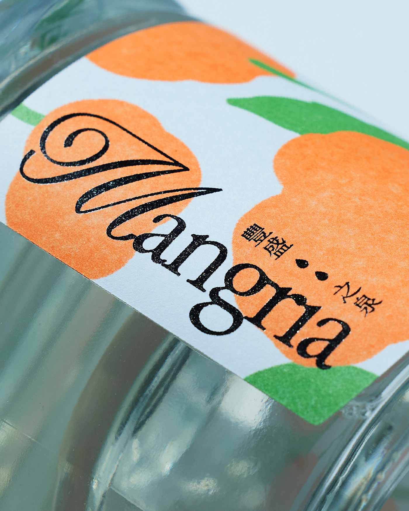
- Mangria bursts with saturated orange globes and fat green leaves — think tangerine punch meets a sunlit orchard. It’s juicy, but stylized. Almost nostalgic.
- Minjito, meanwhile, tones it down with more space to breathe. The purple fruits (perilla, for those in the herbal know) feel quieter. The color palette cools down and says, “Take a breath. I got you.”
Let’s not ignore that beautifully simple vertical label strip over the black cap — almost like a sealing ribbon. It breaks the symmetry in a satisfying way and guides the eye down. That tiny gesture? It elevates the whole experience, like unwrapping a small gift with a secret inside. (Also makes it shelfie-ready. Because let’s be honest, aesthetics matter.)
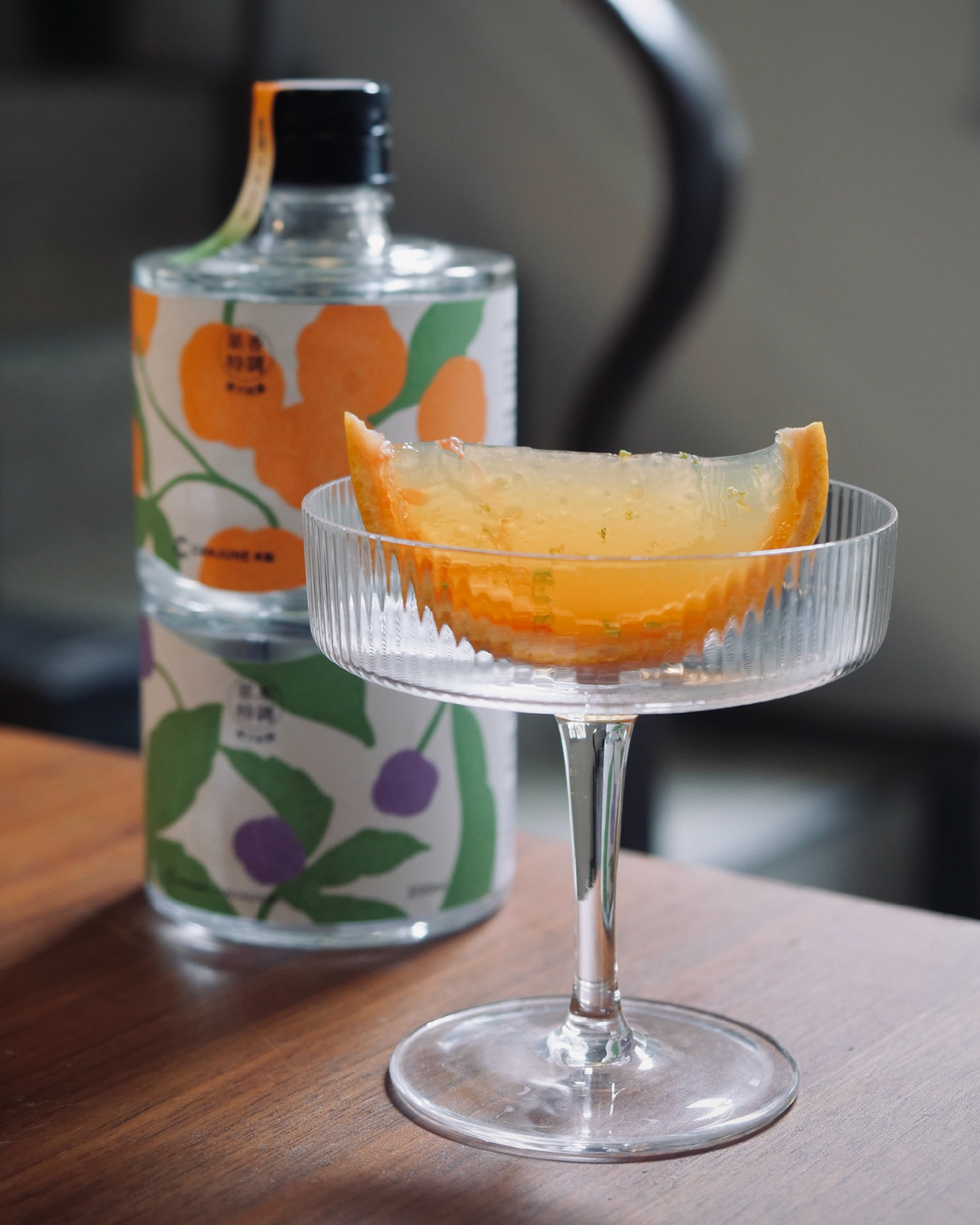
This packaging walks the line between playful whimsy and mindful ritual.