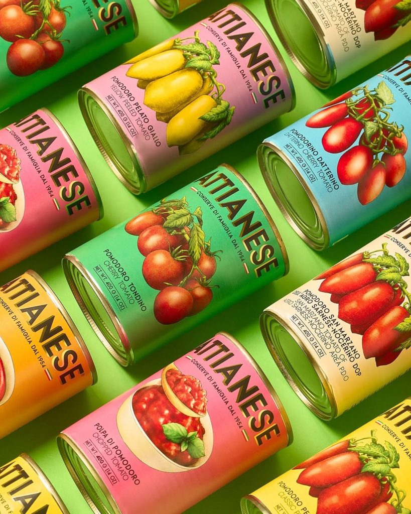

Oh wow—Attianese Conserve designed by nju:design is straight-up tomato couture! Let’s take a look at this lovely packaging in this Curator’s Insight, shall we?
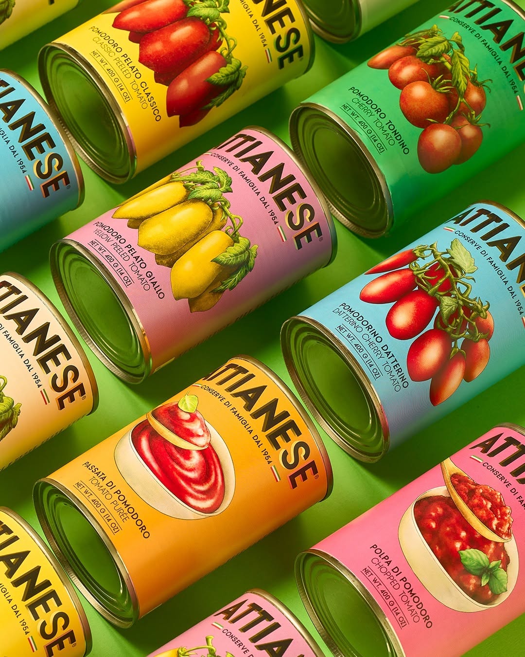
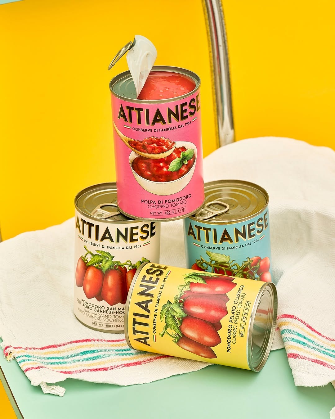
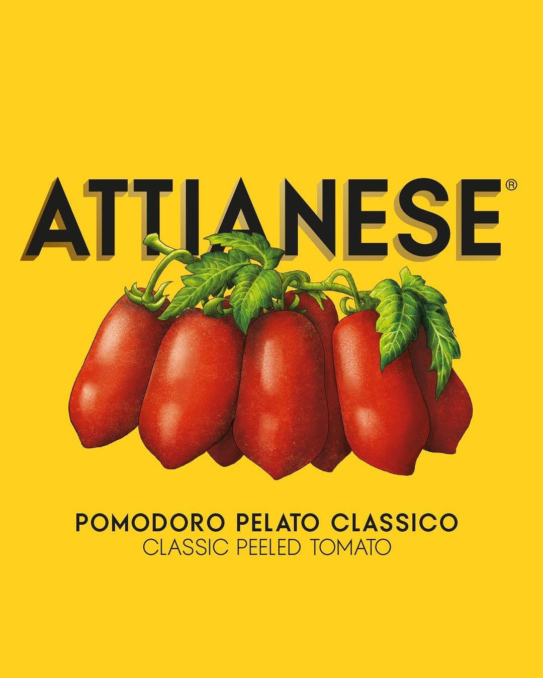
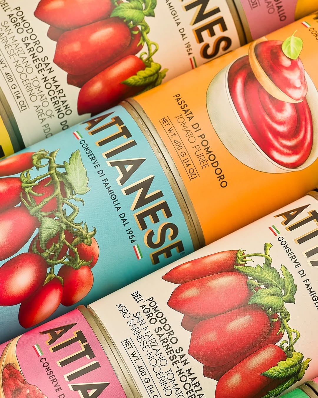
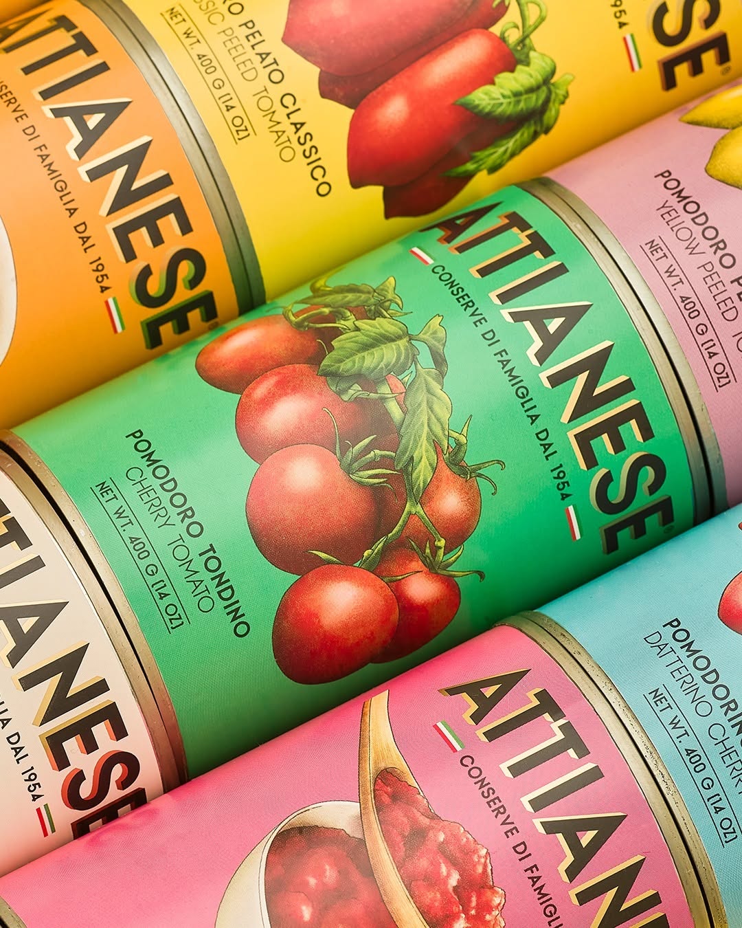
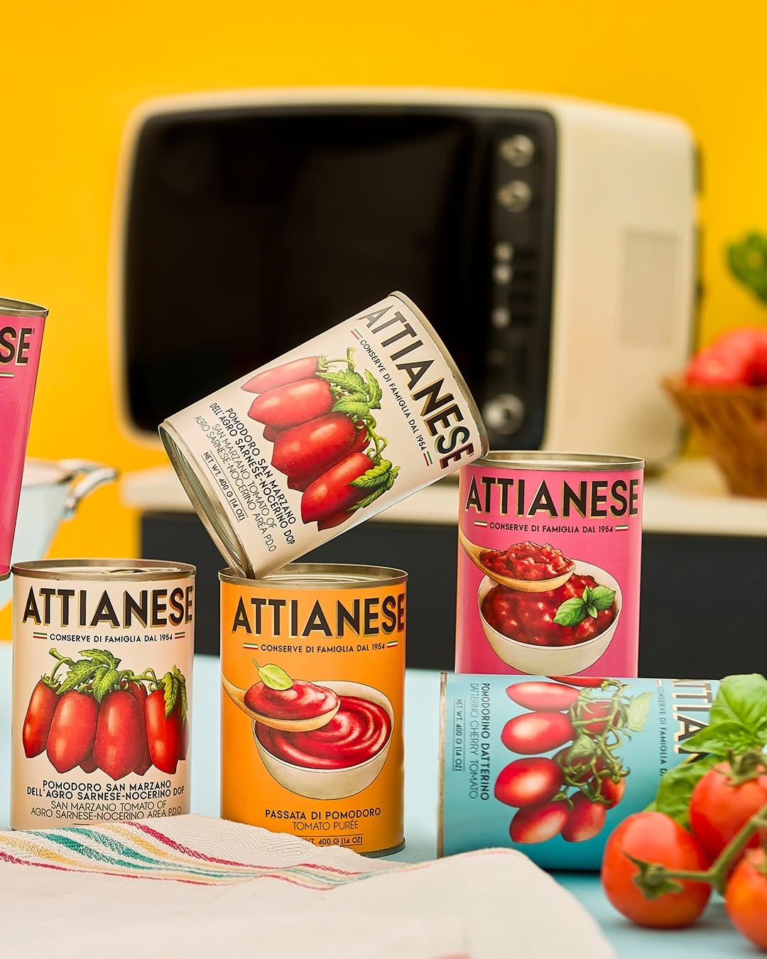
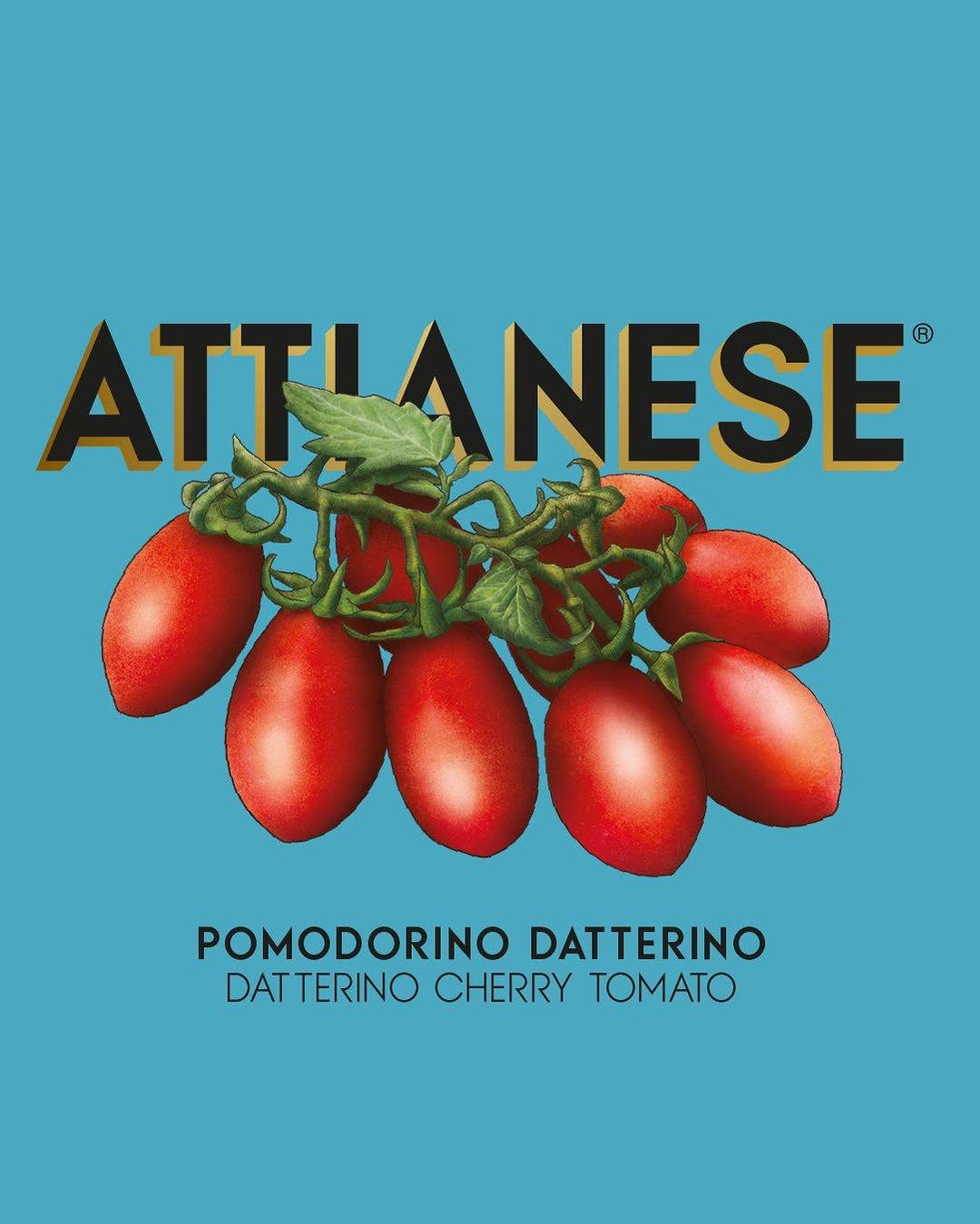
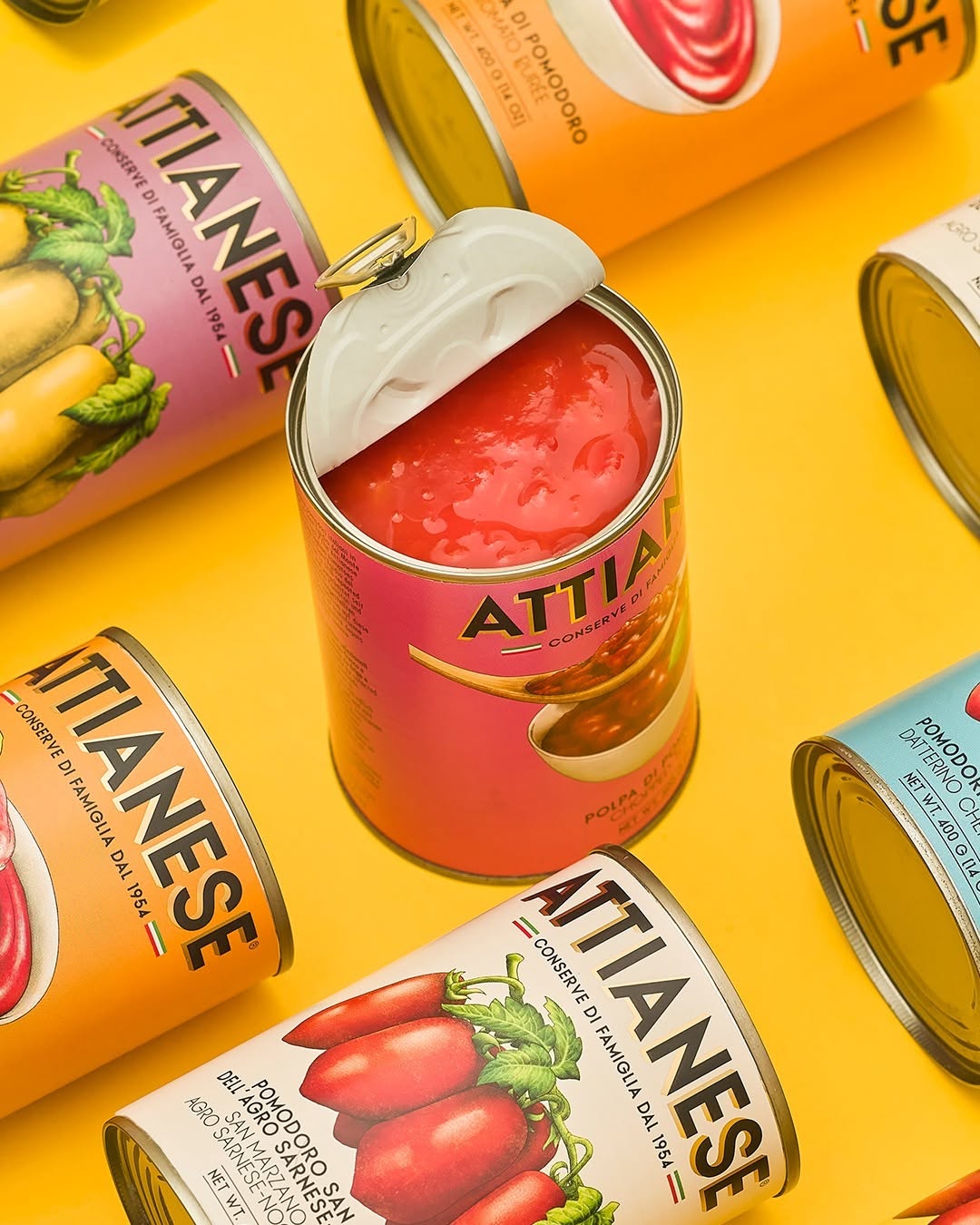
The first thing that hits you? Color. This is a full technicolor dreamcoat of hues that scream vintage Mediterranean romance while whispering modern design fluency. It is charming, bold, and unapologetically nostalgic. No stock photos here—every tomato is lovingly hand-illustrated like it’s the lead in a botanical opera. This throwback to traditional 1950s-style labels adds soul and craftsmanship to the brand.
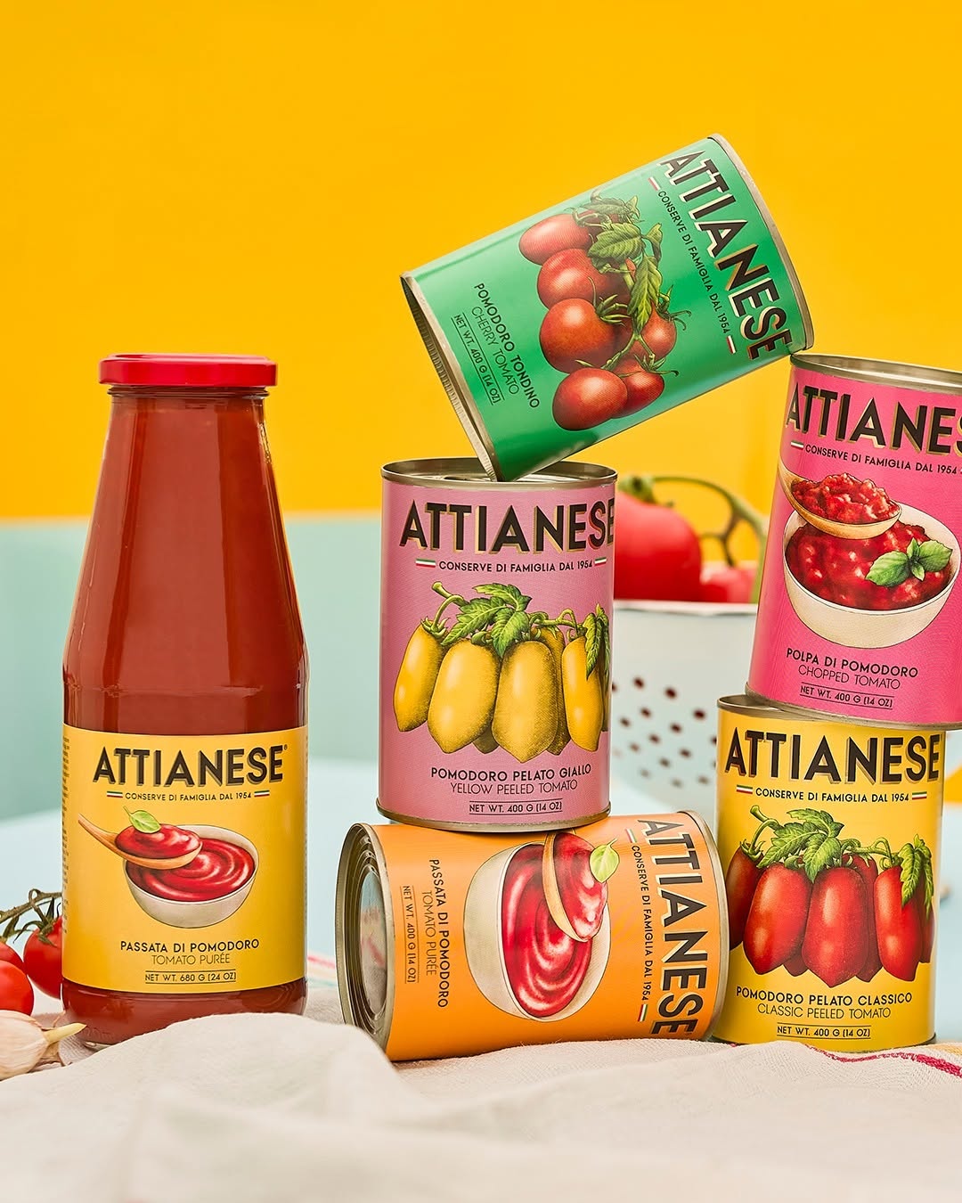
Each label pops in its own signature Pantone fever dream. Not only is it visually exciting, but it’s also functional branding—even from across the aisle, customers can spot the yellow tomato or the chopped tomato instantly. It’s not just pretty—it’s smart.
The typography is neat, centered, and confident. “Attianese” is proudly stamped like a family crest, radiating that old-school Italian pride, but the rest of the label? Clean lines, breathing space, and nothing screaming at you. That balance between ornate illustration and modern restraint? Chef’s kiss.
Attianese Conserve nailed it. It’s a beautiful bridge between past and present, function and art, tradition and innovation. Honestly, this is the kind of can you’d leave out on your counter on purpose just so guests ask about it.
Would buy. Would hoard. Would design fan-girl over.
 lunapanda
 Tridimage
 Analoguecreative
 lettera7
 alchimistestudioParis
 Lana B
 Colossal
 Pivot Studio
 M&A CREATIVE AGENCY
 monther al omari
 Anastasia Cherepanova | xtramez
 Hollóka Grafikai Műhely / Graphic Design Studio
 BOLD branding
 Antonia Skaraki
 Pâmella Lorrany
 Z9BKAdsgn
 Francesco Paternoster
 b1studio.ro
 Chris Creative Works
 Boordon
 Dmitriy Kuzovlev
 Brand Society
 yasharpic