

In this Curator’s Insight, we take a look at Aeris designed by Opera Prima.
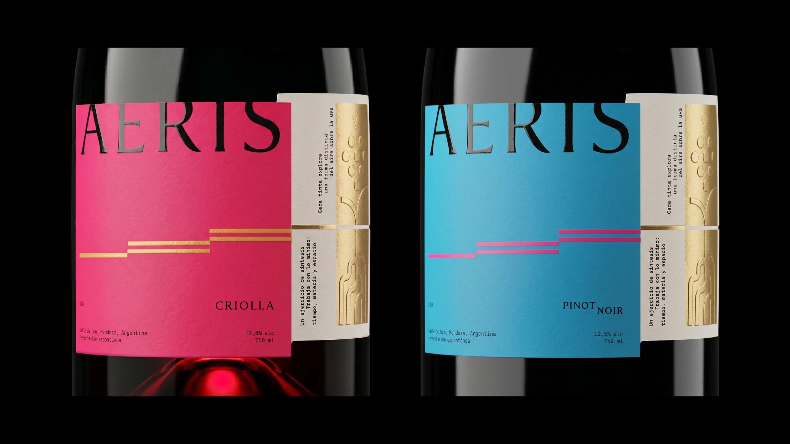
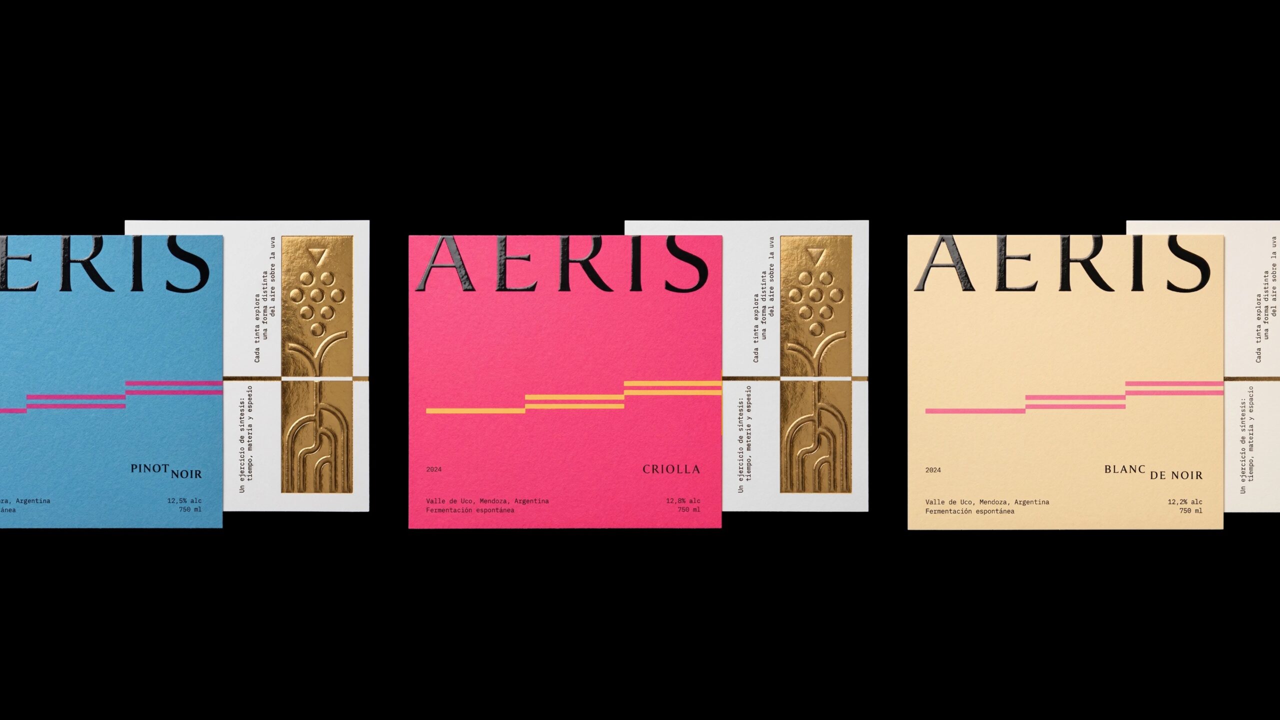
Aeris is a speculative wine brand from Opera Prima that starts with a quietly ambitious idea: making the invisible visible. Rather than leaning on the usual codes of wine, such as crests, chateaux and heavy ornament, the concept turns to air, wind, breath and open landscapes, things that cannot be held but can be deeply felt. The identity is built on restraint. A refined typographic system anchors each label, with the wordmark cropped and floating at the top edge like a thought caught mid-sentence, while a custom serif with slightly irregular, hand-worn letterforms is rendered in hammered gold leaf for the presentation.
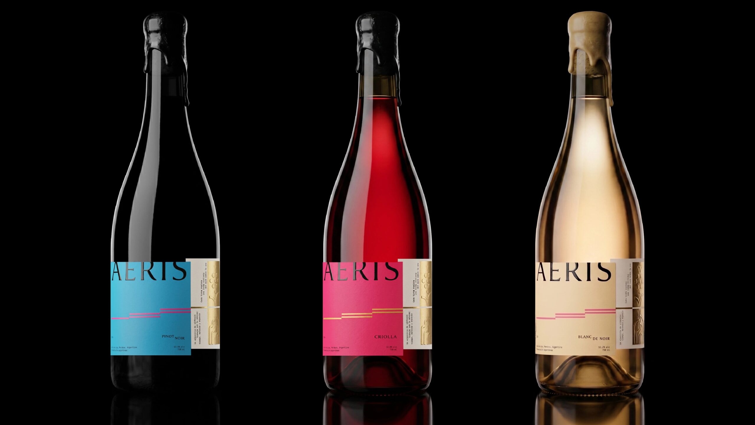
Generous negative space lets the bottle breathe, and the palette stays disciplined, so the brand feels elegant without turning cold. Across the range, each variety gets its own saturated field, an electric blue for Pinot Noir, a vivid pink for Criolla and a soft cream for Blanc de Noir, all tied together by a stepped ribbon of fine lines that suggests a breeze or a rising current. A second, lighter label wraps around the side, pairing tiny monospaced Spanish copy with a gold embossed vine and grape motif, a small, tactile reward for anyone who turns the bottle. Wax-dipped necks in black and pale cream add a handmade note that grounds the airy graphics in craft.
What makes Aeris work is how the label handles the tension between loud and quiet. The saturated blue and pink fields are bold, yet the wordmark is cropped at the top edge and the layout stays open, so the color reads as atmosphere rather than noise. The label also lets the wine itself take part: the Criolla glows red through the glass and the Blanc de Noir warms the cream label, so each bottle shifts a little depending on what is inside. The two-part label is a smart move too. The front stays clean and confident, while the side panel with its embossed gold motif and small monospaced copy rewards a closer look. Together with the wax-dipped necks, it gives a very digital-feeling palette an unexpectedly handmade finish.
 Axiniya Knyazeva
 Hadi Samir
 Atiq Alam
 Furt Goods
 宏洛图品牌设计HONGLT
 Ampersand Creative
 Modern Theory
 Palashcc
 neo creative studio
 Valérie Colace
 Anshuman
 Archi Jain
 DESIGN CONCEPTS
 Shapers Studio
 jamajkajakub
 tamara barakat
 VincoStudio