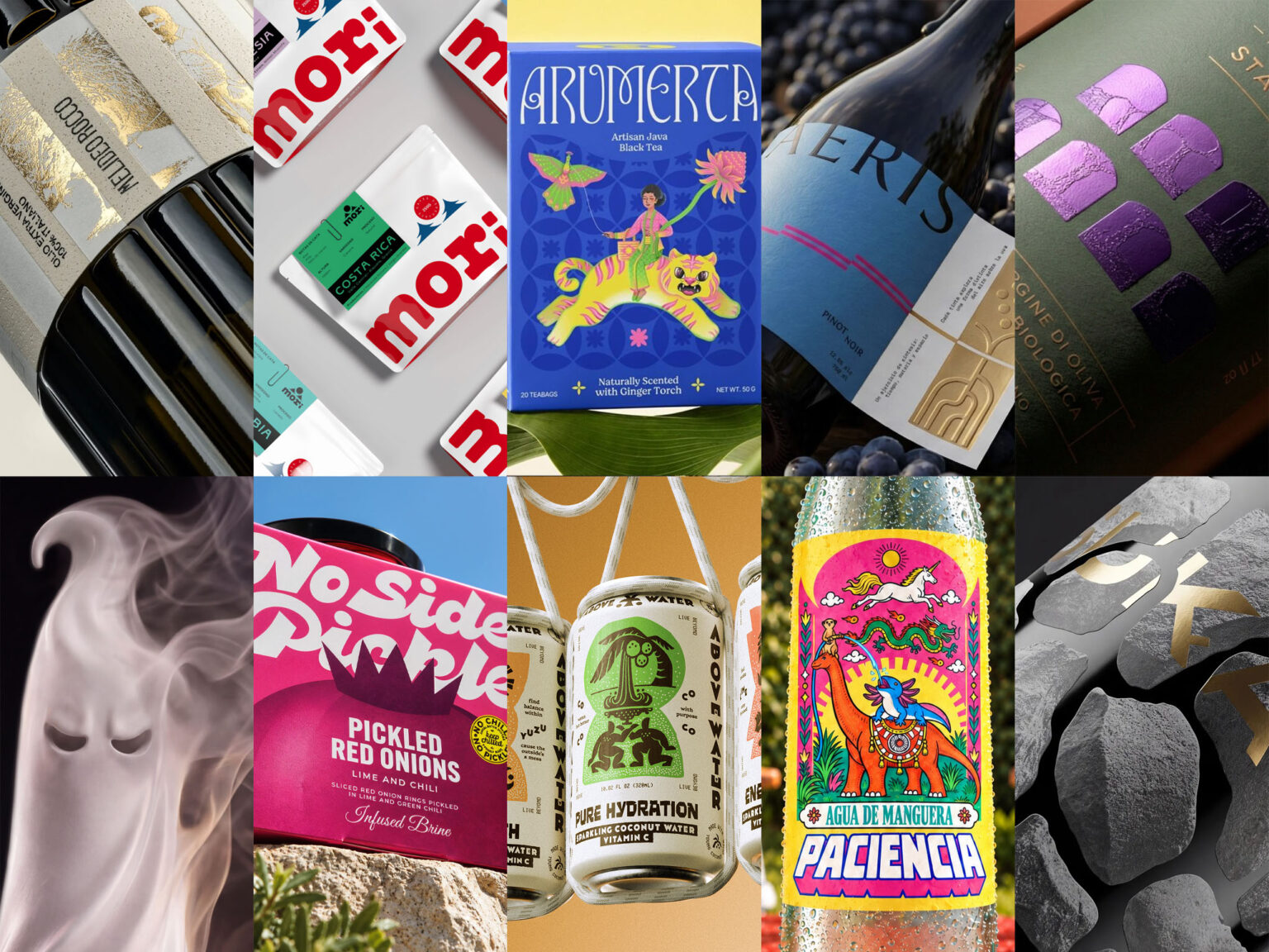

Issue #147 brings together ten packaging projects where one strong idea shapes every decision, from structure and material to tone of voice. A Javanese tea box turns folklore into a mythical ride, a garden hose becomes the prestigious source of a bottled water parody, an ancient coconut ritual is re-engineered for a sparkling can, and a ghost is sculpted into the form of a liqueur bottle. Olive oil labels built from cut paper strips, ancient arches, and dry-stone walls show how heritage can be handled with a contemporary eye. Chosen by the Packaging of the World community, each one shows packaging doing more than holding a product. It shapes how the product is seen, understood, and remembered.
Stay up to date with packaging design and creative work by following us on Instagram, Facebook, and Pinterest. Have a project worth sharing? Designers, studios, and brands from around the world are welcome to submit.
Sign in or create an account to share your work with our global community.

Arumerta Javanese black tea designed by Studio Moara
Studio Moara gives Javanese black tea a storybook personality, where heritage feels like a living tradition rather than a museum piece. Saturated colour blocks make each flavour instantly recognisable on shelf, while ornamental borders and bespoke lettering frame a central illustration that invites a closer look. The result is a range that feels collectible, reads clearly as a family, and stands apart in a category that often leans on muted, familiar cues. Arumerta earns its place in the top 10 by showing that cultural references can be handled with wit, confidence, and a clear point of view.

Paciencia designed by SANTIAGO
Santiago’s Paciencia answers the quiet, minimal conventions of premium bottled water with warmth and mischief. The label borrows the formal rhythm of a prestige seal, then fills it with a lively, hand-crafted world that feels closer to a festival poster than a product panel. Confident colour and ornate detail give each bottle strong shelf presence, while the tone stays affectionate rather than mocking. It earns a place in the top 10 by proving that humour can be a serious branding tool, and that a category built on restraint still has room for personality, craft, and a good story.

Above Water Coconut Sparkling designed by Chochoi Creative
Chochoi Creative’s Above Water Coconut Sparkling shows how much a category can gain when a brand stops borrowing its neighbours’ codes. Where coconut water usually plays it soft and sunlit, this range arrives with a sharper, more theatrical presence, and the cans feel closer to collectable objects than everyday refreshment. The tone is playful but controlled, and every element seems to belong to the same imagined world. It earns its place in the top 10 for turning a familiar product into something with a real point of view, proving that a bold idea, applied consistently, can make a crowded shelf feel fresh again.

Melideo Rocco designed by Stefano Bracci
Stefano Bracci’s Melideo Rocco treats the olive oil label as a crafted object rather than a surface for printing. Warm, tactile materials and a restrained palette give the bottle a quiet, premium presence, and the gold accents add richness without tipping into excess. The design feels personal and carefully considered, speaking to tradition while staying clean and contemporary. It earns its place in the top 10 for showing how a story-led brand can feel intimate and elevated at the same time, with a look that invites people to pick it up, turn it over, and take a closer look.

Agarcia Studio’s rebrand of Mori gives a specialty coffee range a crisp, confident identity that feels refreshingly unfussy. Clean geometry, generous white space, and bold flat colour create a look that is calm and modern while still having a distinct personality. The system feels easy to read and easy to remember, with a graphic simplicity that suits the quiet precision of Japanese design. It earns its place in the top 10 for showing how restraint can be just as eye-catching as decoration, giving the brand a contemporary shelf presence that feels polished, flexible, and ready to grow.

No Side Pickle designed by sayadworks
Sayadworks’ refresh of No Side Pickle brings a sharp sense of humour to a category that rarely takes risks. Bold colour, lively lettering, and a cheeky mascot-style mark give the jars a strong personality, while a tidy layout keeps the whole range feeling organised and confident. The design speaks in the same irreverent voice as the brand, so the attitude feels natural rather than forced. It earns its place in the top 10 for turning a humble pantry product into something memorable, proving that wit and polish work well together when the idea is clear.

Parco di Stalla designed by Alessandro Ammaturo
Alessandro Ammaturo’s Parco di Stalla packaging shows how a strong graphic device can give a food brand both depth and presence. A repeated architectural form creates a confident, ordered rhythm across the range, while rich colour and refined finishes lend the bottles a quiet sense of luxury. The balance between structure and expression keeps the system feeling elegant yet distinctive, with enough variation to tell each product apart. It earns its place in the top 10 for turning a simple, well-chosen shape into a memorable identity, proving that careful restraint and a clear visual idea can still feel rich and full of character.

Guka designed by Studio Tumpic/Prenc
Studio Tumpic/Prenc’s Guka brings a strong sense of place to the olive oil shelf through a look that feels grounded, modern, and quietly premium. The monochrome palette and tactile finishes let the bottle speak with calm authority, while the lettering sits naturally within the overall composition rather than on top of it. Everything feels considered and cohesive, with a presence that suits a product meant to be savoured. It earns its place in the top 10 for turning a deeply local idea into an identity that feels both rooted and fresh, and for showing how far a disciplined concept can go.

Nébora Liqueurs designed by Andrea Marinnn
Andrea Marinnn’s Nébora Liqueurs gives a familiar seasonal figure a polished, gallery-worthy makeover. Soft, flowing forms and a hushed palette bring a sense of mystery and refinement, while the trio of bottles feels related yet individual, like a small cast of characters. The mood is atmospheric and elegant rather than spooky, which lifts the whole range above typical themed packaging. It earns its place in the top 10 for treating a playful idea with real sophistication, showing that imagination and craft can make even a well-worn icon feel new, desirable, and worth displaying.

Aeris designed by Opera Prima
Opera Prima’s Aeris takes a thoughtful route through wine packaging, trading traditional signals of status for a lighter, more modern sensibility. Bold colour, confident lettering, and plenty of breathing room give each bottle a calm but striking presence, while small tactile touches add warmth and a sense of craft. The range feels cohesive yet distinct, with a mood that is airy, stylish, and quietly self-assured. It earns its place in the top 10 for proving that a wine brand can feel fresh and contemporary without losing its sense of care, and for making restraint look genuinely exciting.
 Natasha Spitsyna
 babyage
 GruppoSaida
 ahmedraoudgfx
 Hi estudio
 Nadezhda Gorelikova
 Studio Garces
 Brandsbylufo
 Rewot
Rewot alchimistestudioParis
 Asprey Creative
 kat bres
 Valérie Colace
 Atiq Alam
 Sara Communications
 David Hakobyan
 monther al omari
 Innovāt - Empowering Creative Innovation
 mmdesign
 Amjad Battal
 Hollóka Grafikai Műhely / Graphic Design Studio
 Palashcc
 ABC Design Communication
 ChrisSkarlatos
 Hedayat Hadavi
 Tia Nguyen