
CONTEXT
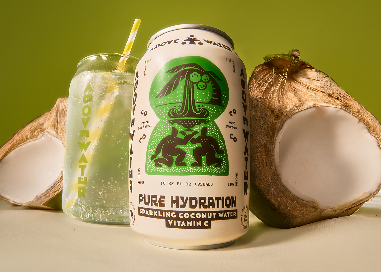
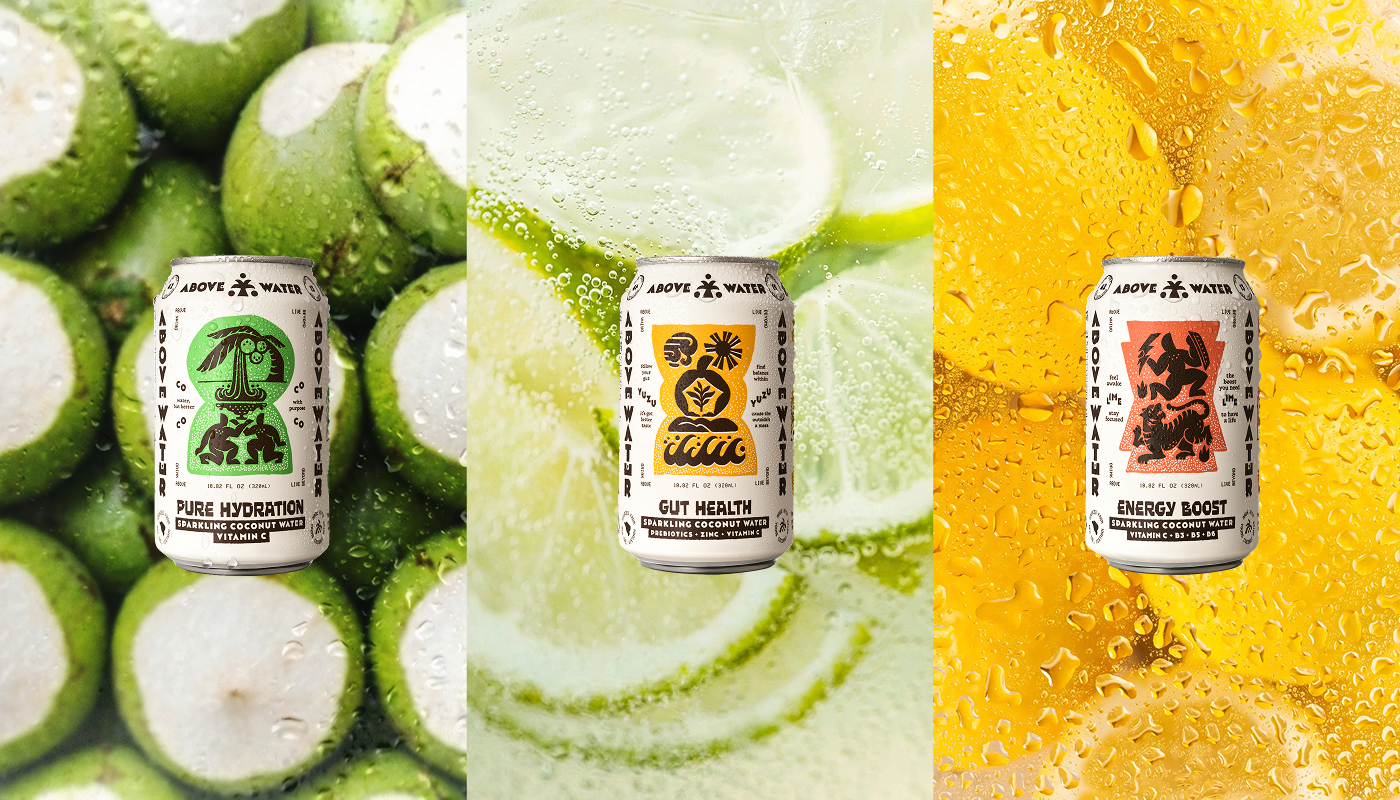
The coconut water category has been using the same visual recipe for years. White. Green. Clean stream and palm leaves.A close-up shot of cracked coconut to guarantee extra freshness. It works.
Until every bottle starts looking like it came from the same photoshoot.
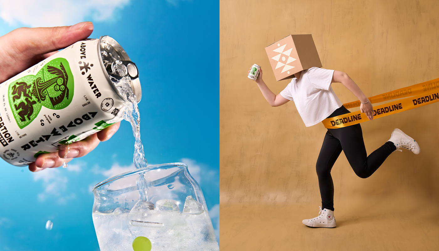
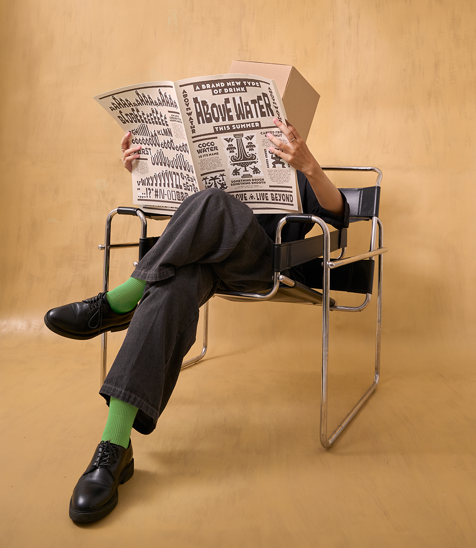
Above Water was already doing something different. By combining coconut water with sparkling soda, vitamins, and minerals, it had far more energy than the category it came from. So instead of trying to disguise it as another “natural” drink, we saw an opportunity to position it around performance, retrospect, and a distinct cultural perspective.
CONCEPT
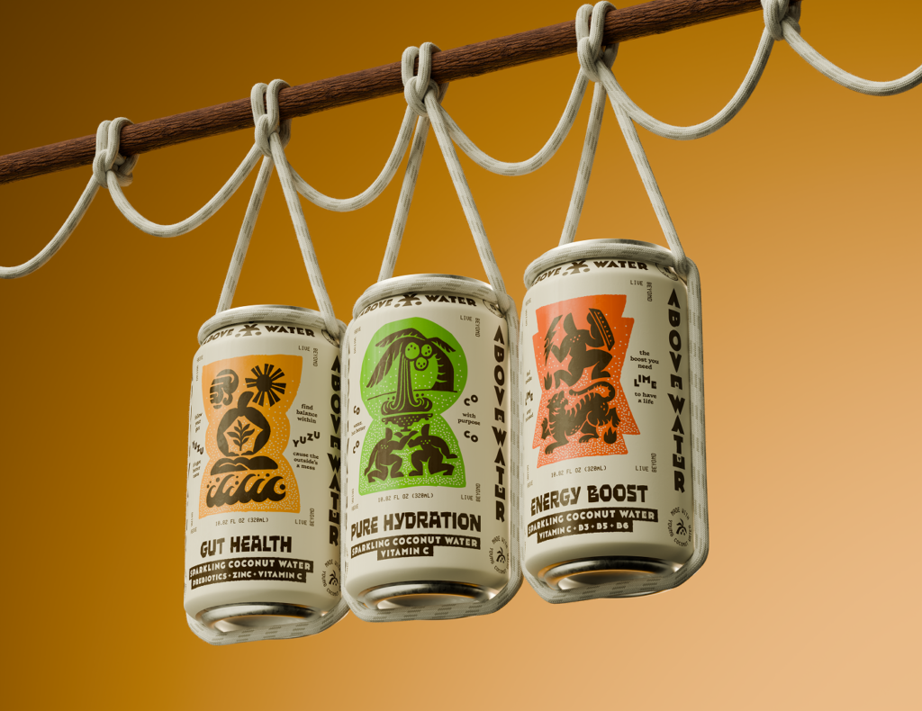
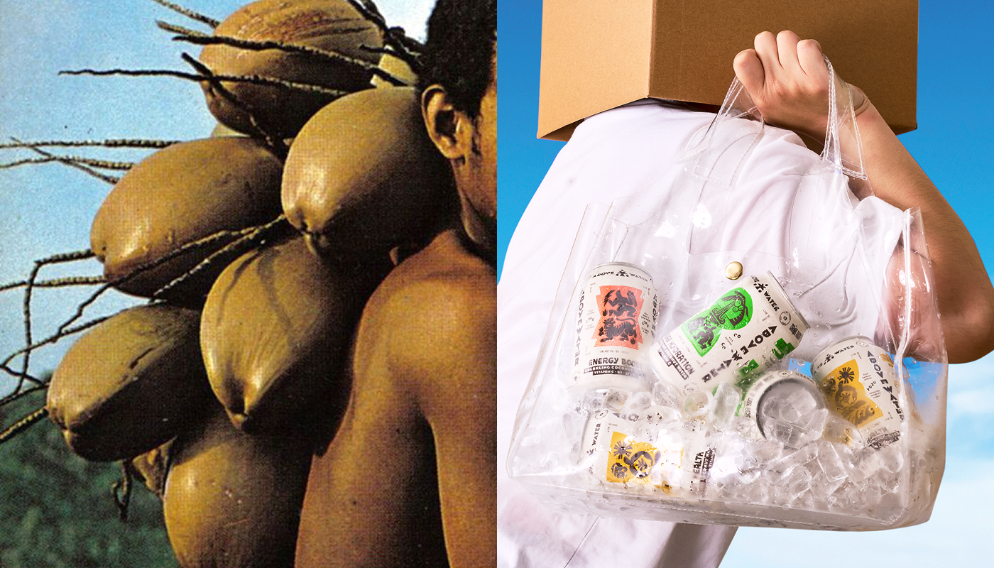
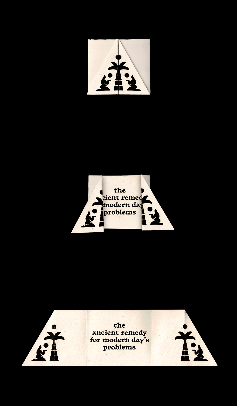
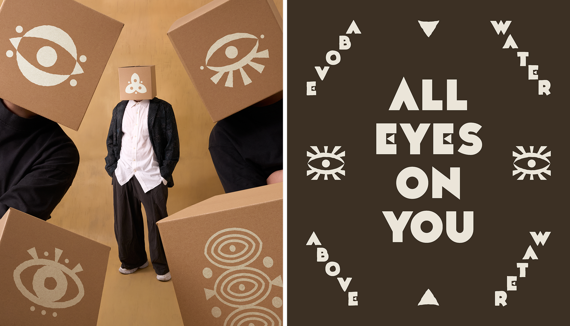
We skipped the tropical clichés and dug into the coconut itself. For centuries,it has been more than just a fruit. Across many cultures, coconuts have been offered in sacred rituals as symbolic stand-ins for the human head, carrying ideas of sacrifice, renewal, and divinity. We imagined a world where those ancient beliefs never disappeared, but simply continued evolving alongside us.
An age-old ritual, re-engineered for today’s problems.
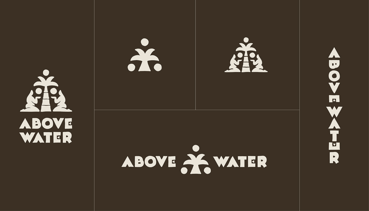
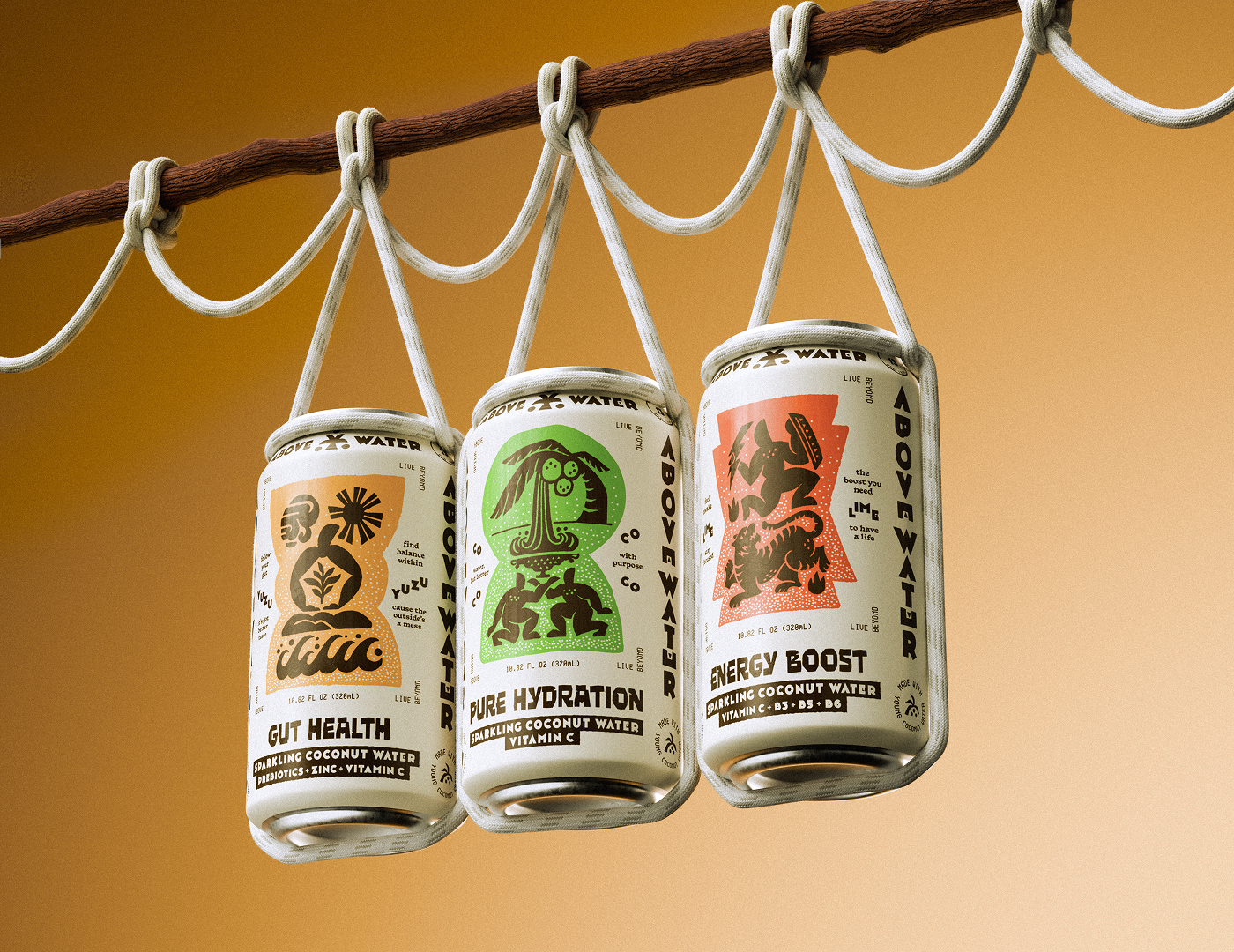
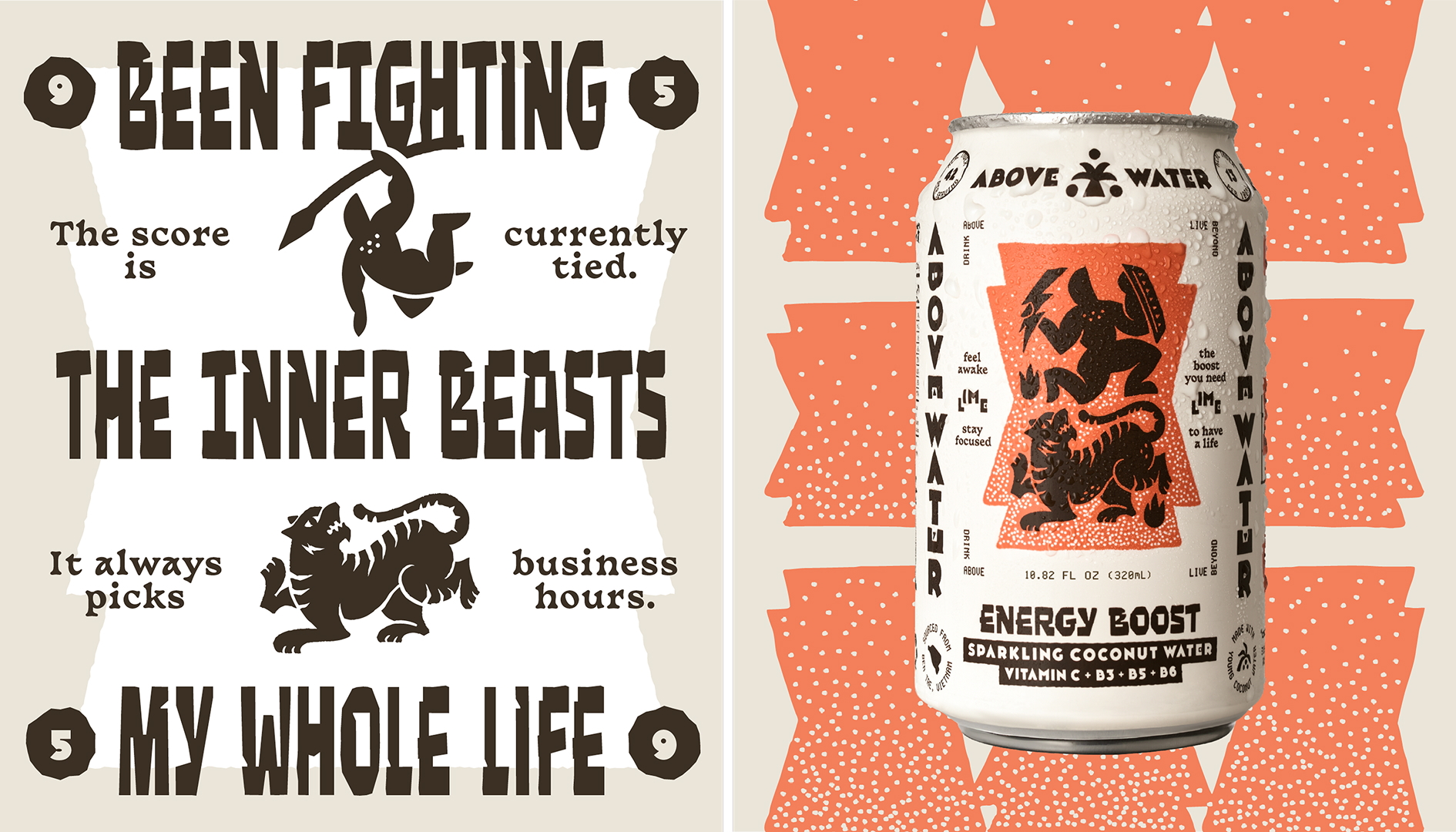
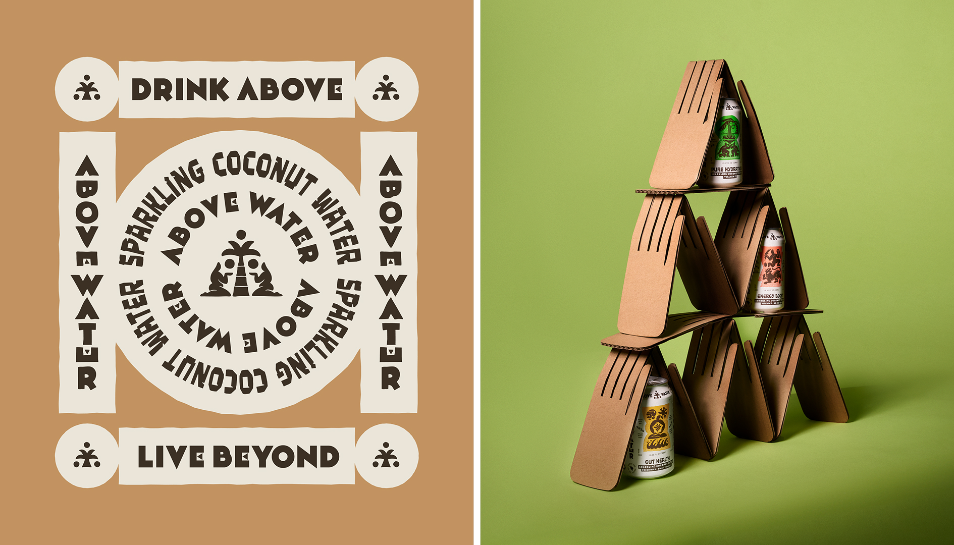
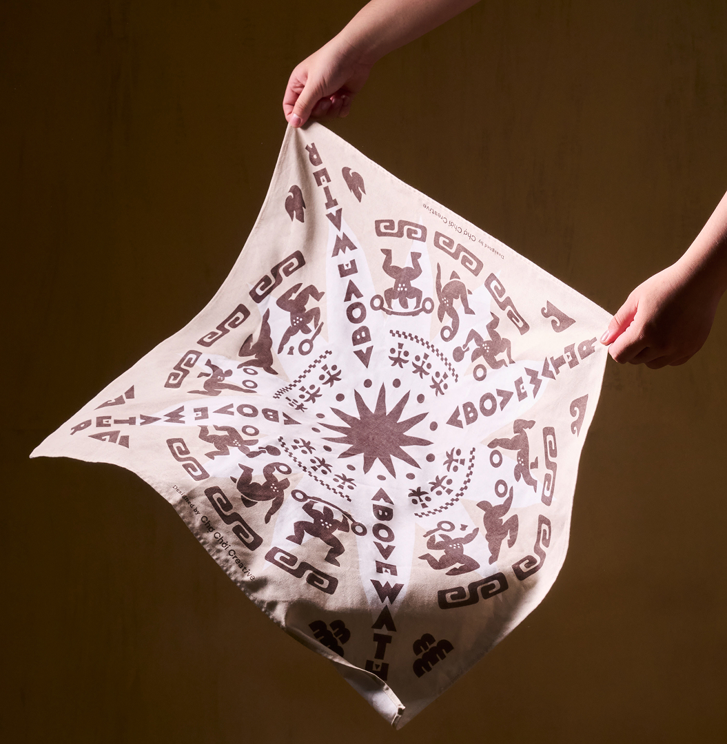
That idea shaped the entire identity visual language. Bold, totem-inspired letterforms sit alongside a technical monospace typeface, creating a dialogue between ritual and performance, heritage and technology. Alongside them isa series of illustrations inspired by carved stone reliefs, once used to document everyday life, celebrate legendary victories, and preserve stories forfuture generations.
Above Water wasn’t trying to stand out on the coconut water shelf.It was designed to make the shelf have a minor identity crisis.
TYPOGRAPHY
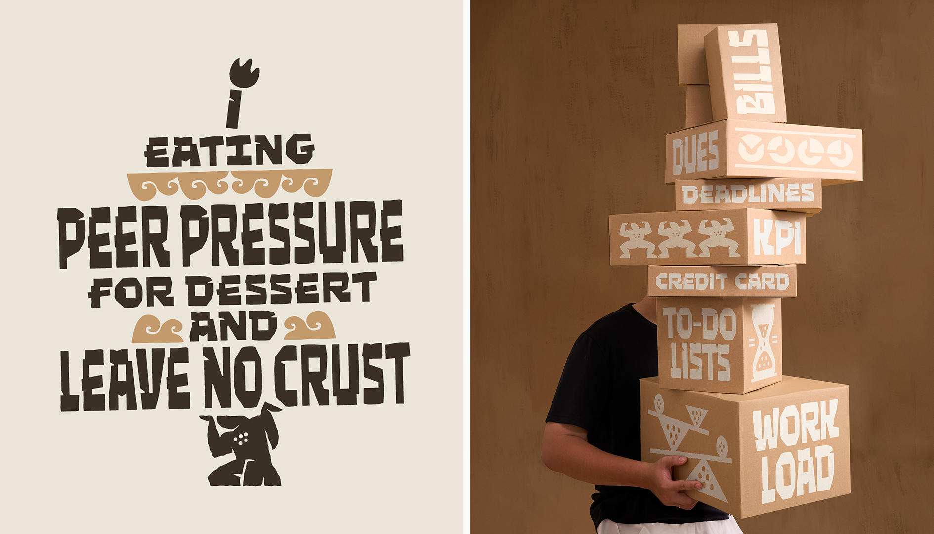
We wanted the typography to feel like it was constantly slacklining between two worlds: one speaks in laboratory statistics – the other speaks in cryptic legends. Four distinct typefaces carry this tension, shifting the tone from cutting-edge science to something that feels almost pulled from a long-lost legend.
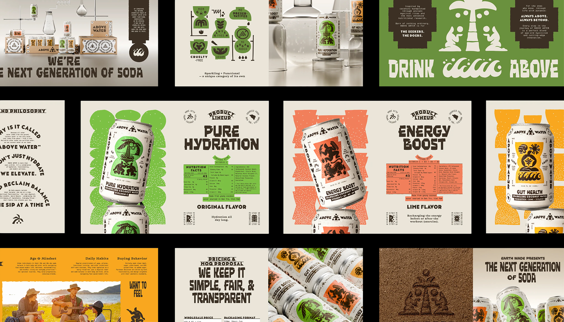
We deliberately developed Coco from scratch, a variable typeface inspired by the climb to harvest coconuts, where the best fruit usually waits at the top.The typeface was also developed to solve a practical packaging challenge.Titles vary significantly in length while the can offers very little space.Coco’s variable height allows titles to expand or compress without compromising the boldness or consistency of the identity.
One of our favorite parts of the project was giving Above Water a voice as distinctive as it looks. Instead of listing product benefits like a nutrition label, we translated them into the little moments everyone recognizes.Surviving the 3 p.m. meeting. Discovering your account balance has entered its minimalist era. An energy spoke after your crush replied with more than just “ok”.
Those stories are supported by a custom icon system inspired by laboratory specimen tubes preserving ancient artifacts, continuing the conversation between science and ritual across every touchpoint.
Curator’s Insight
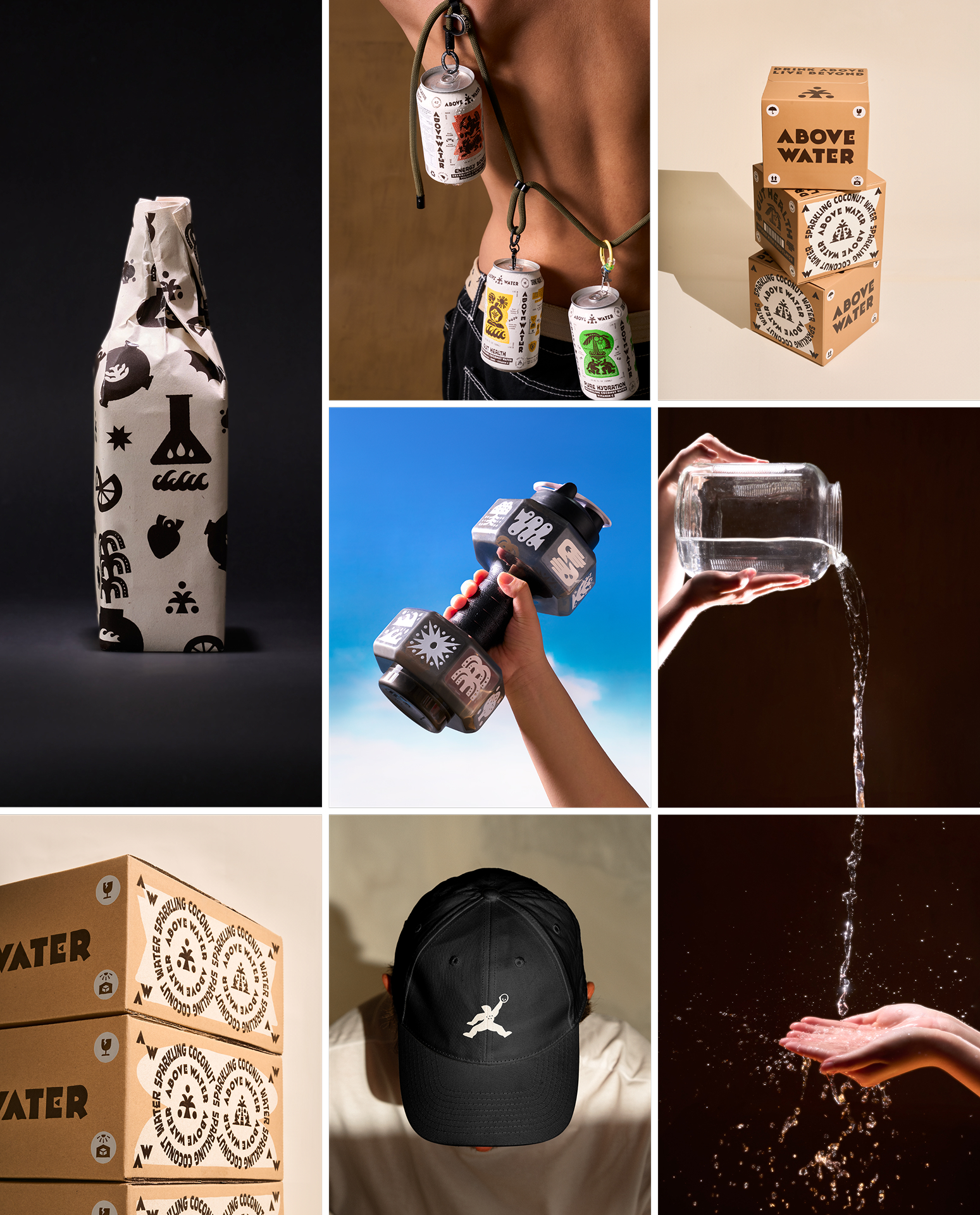
Most identity systems built around a “clever concept” stay decorative, confined to whichever panel faces the camera. What is worth noting here is how far the totem logic travels beyond that hero panel.
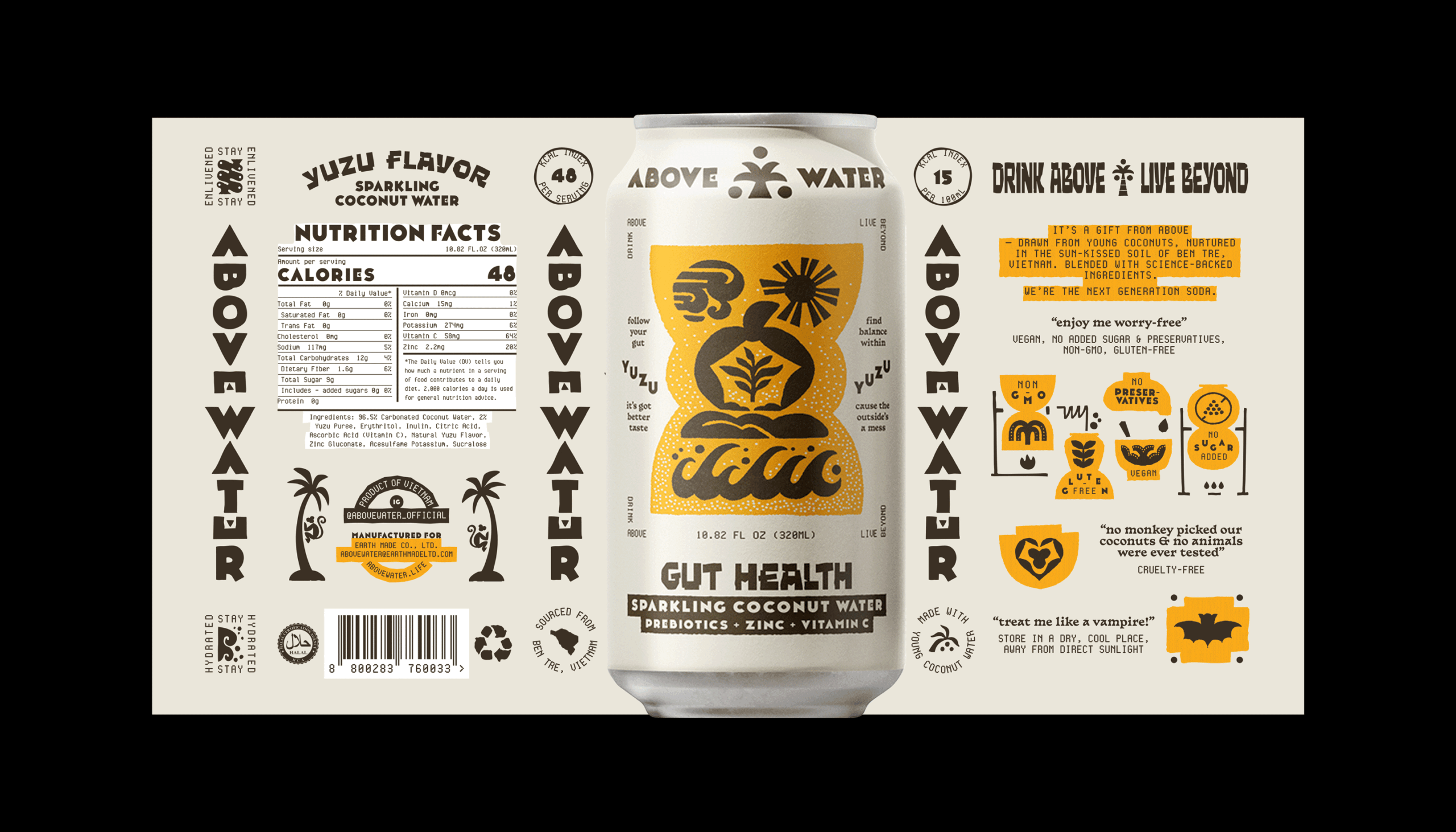
Each flavor’s illustration sits inside its own geometric field, a stepped mound for Gut Health, a circular medallion for Hydration, a diamond for Energy Boost, functioning less like decoration and more like a seal. That kind of shape-coded differentiation is a shelf-scanning shortcut borrowed from how stamps and seals historically signaled authenticity at a glance, before anyone had to read a word.
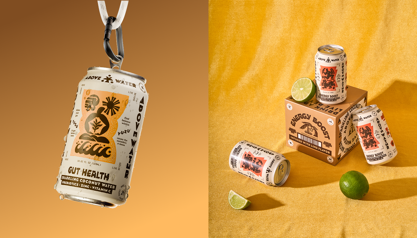
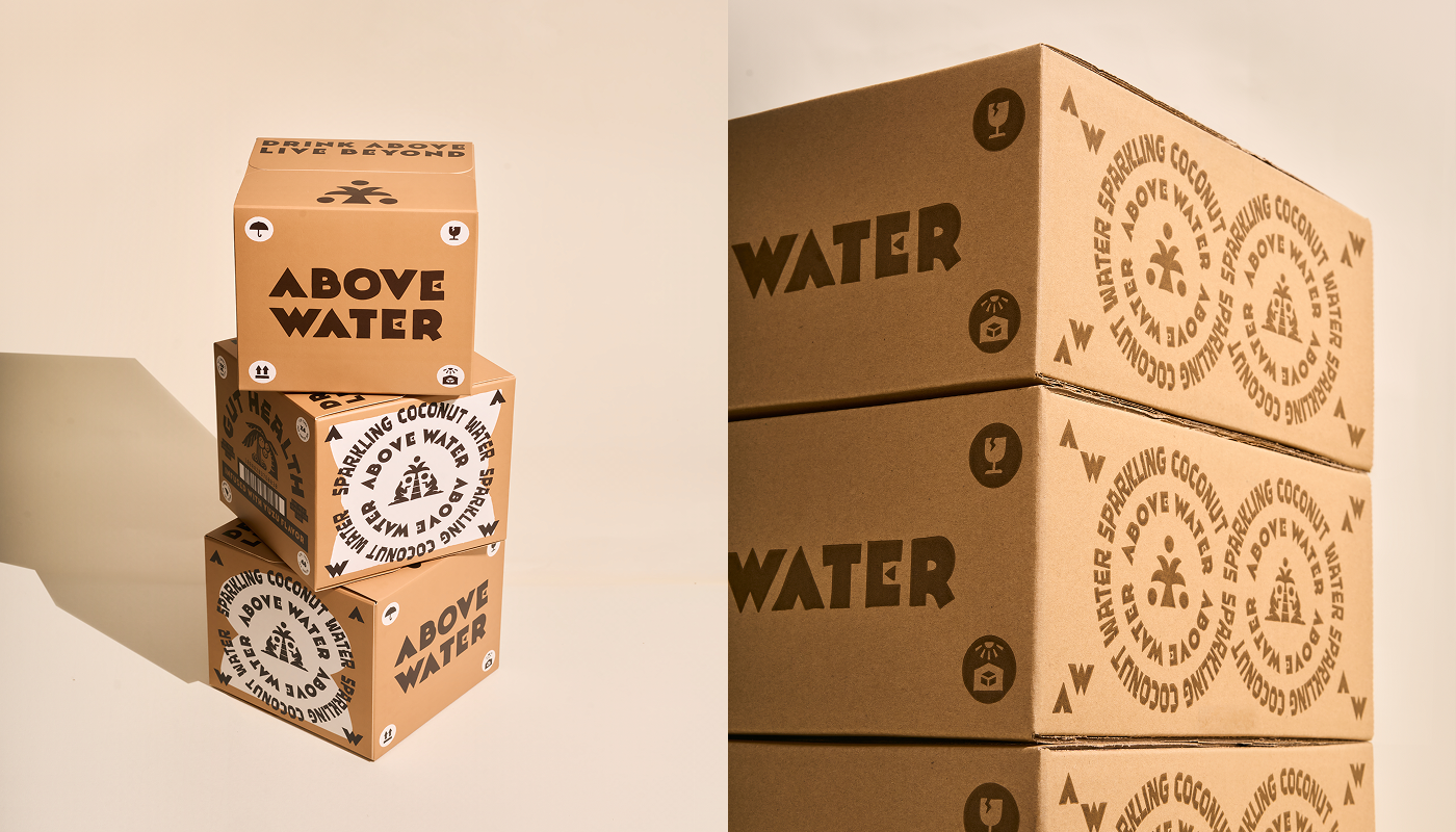
The system’s real discipline shows on the surfaces brands usually treat as afterthoughts. The back-of-can copy, normally dead legal space, is rewritten as apothecary-style inscriptions (“treat me like a vampire” for storage conditions). Even the outer shipping cartons carry the same circular stamp motif meant for consumers who will never see them.
 Derrick Lin
 monther al omari
 43oz
43oz lilyz design23
 Modern Theory
 Eighteen Brand Studio
 Bhumika Singh
 MohamedMashaly
 Pixels Studio
 Gulya
Gulya UPRISE
 Lizaveta Kharitonyuk
 Bonsanco Creative Studio
 DesignRepublic
 GIRAFA STUDIO
 PiotrWisniewski
 Sophiagdotcom
 CreativeWise
 SoreThumbStudio®
 Modern World Studio
 Palashcc
 Valérie Colace