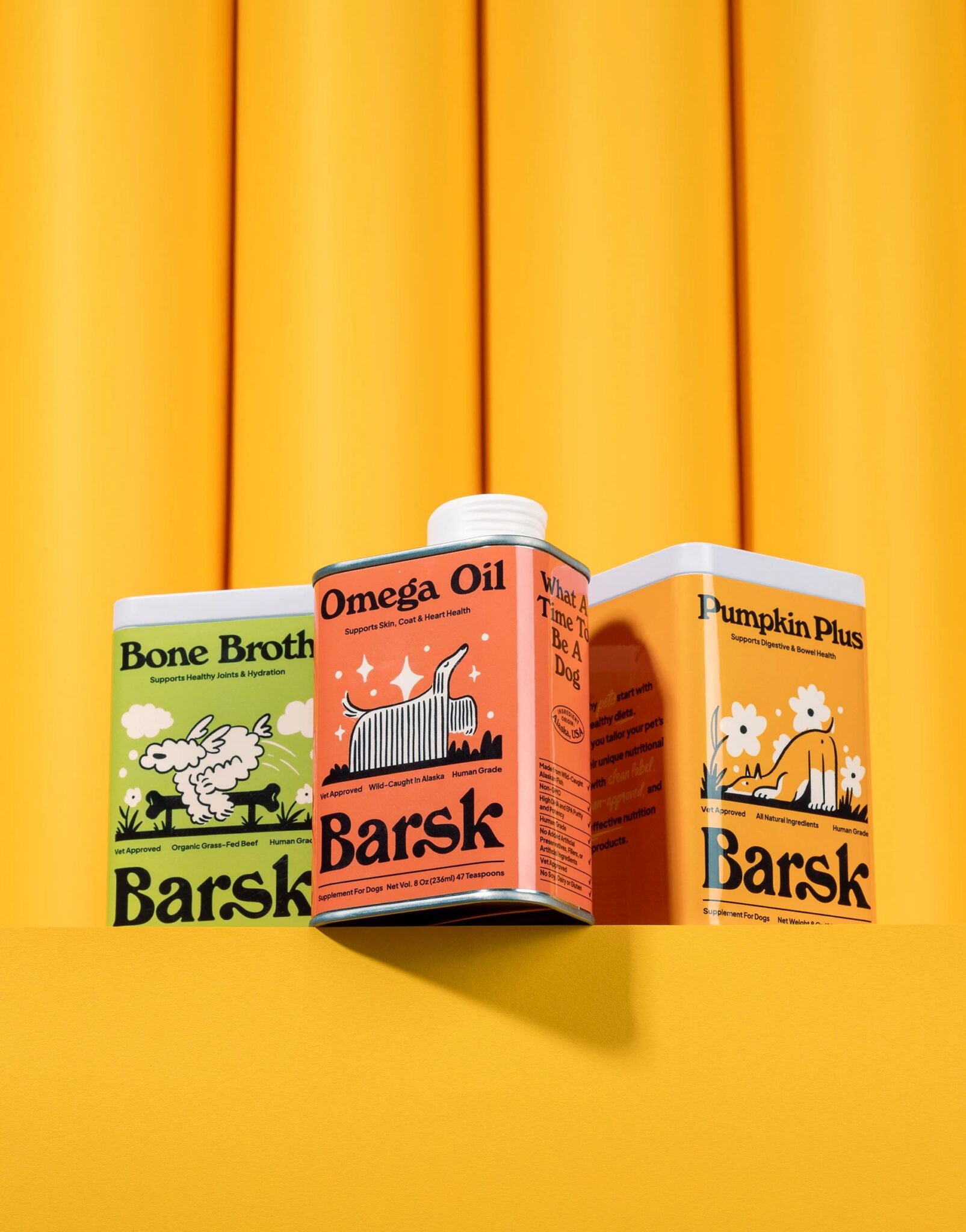

In this Curator’s Insight, we take a look at Barsk designed by Heavy.
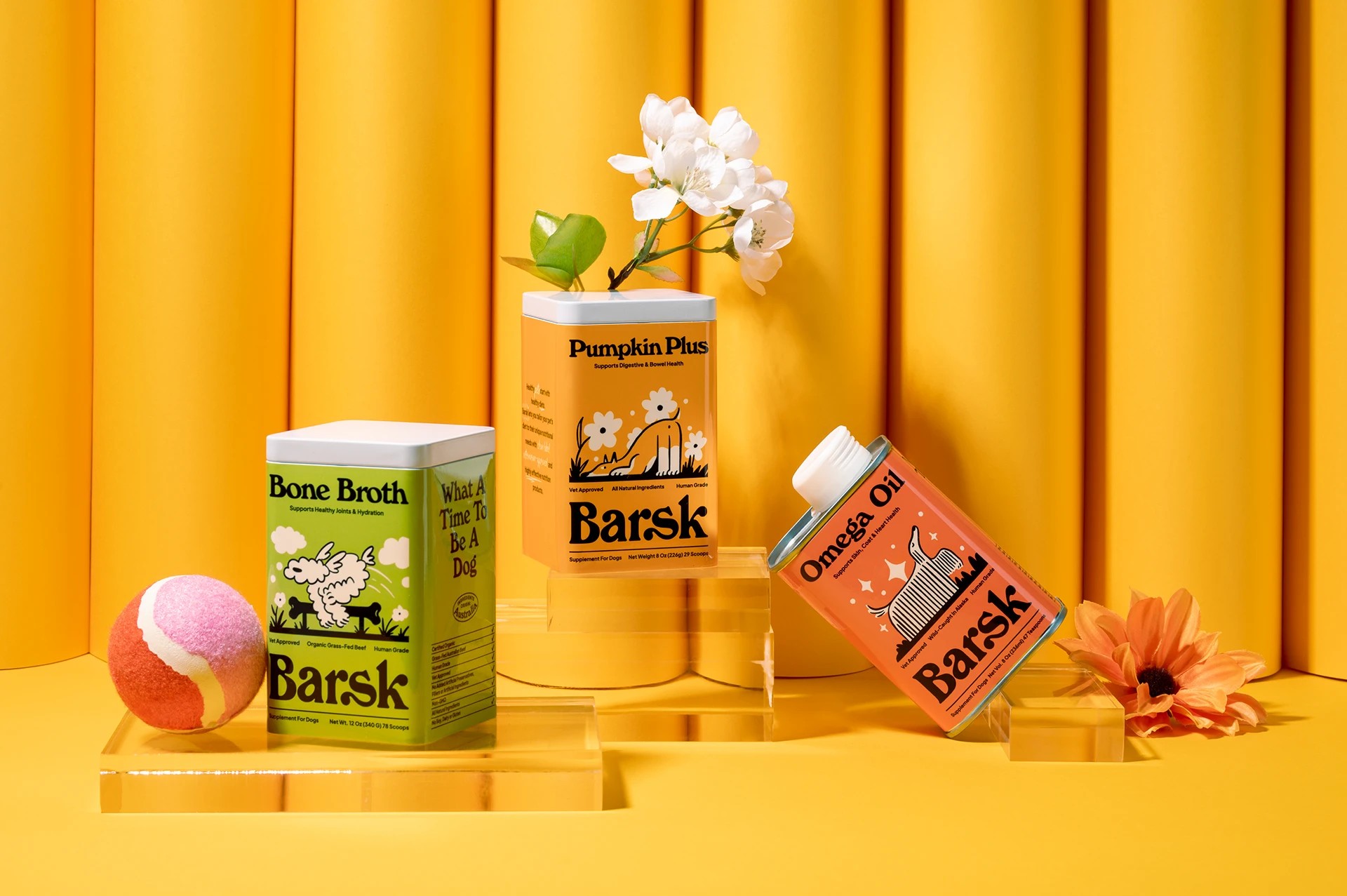
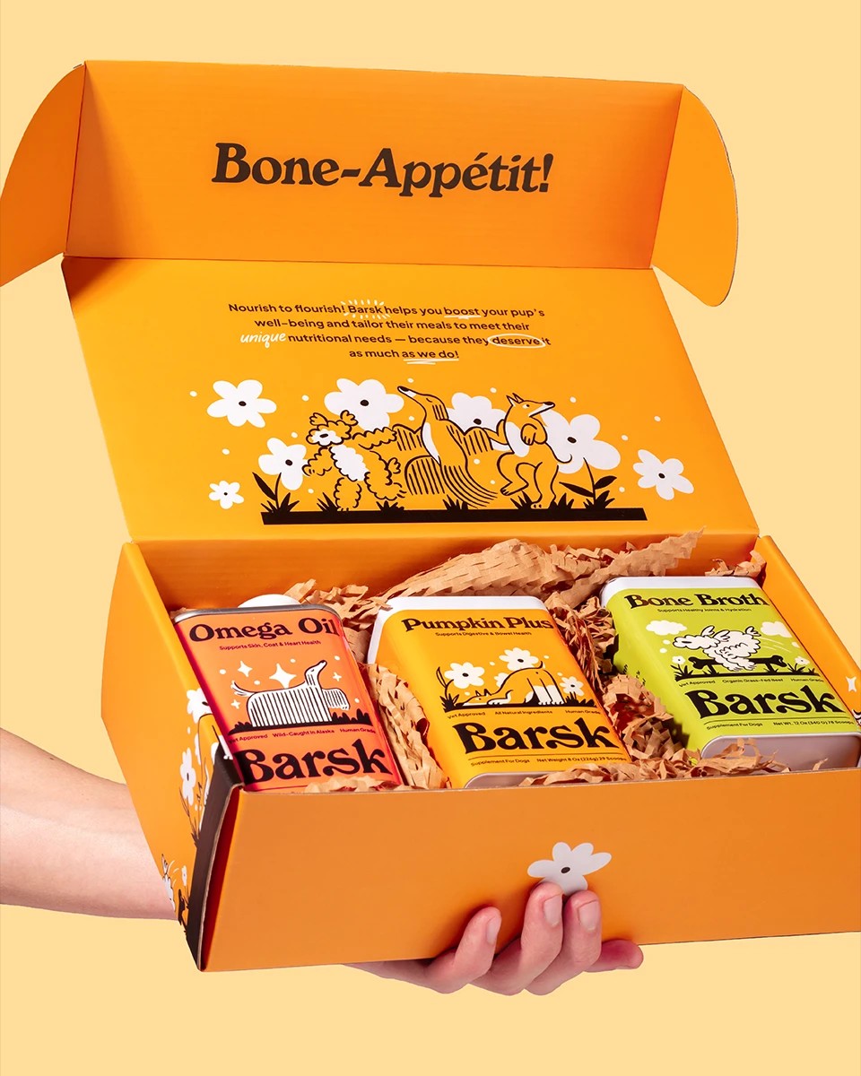
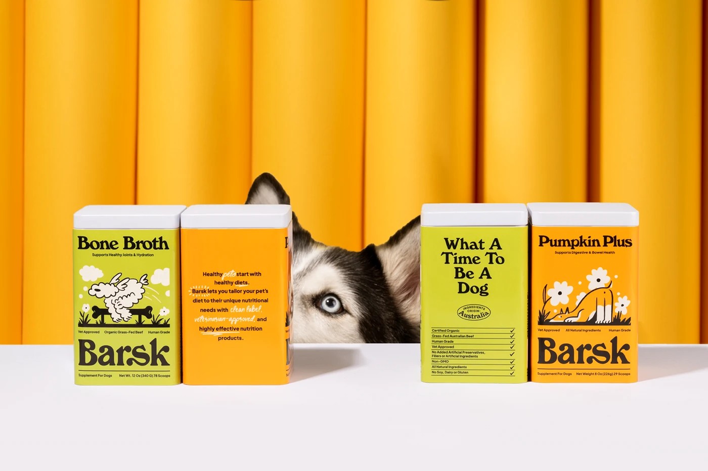
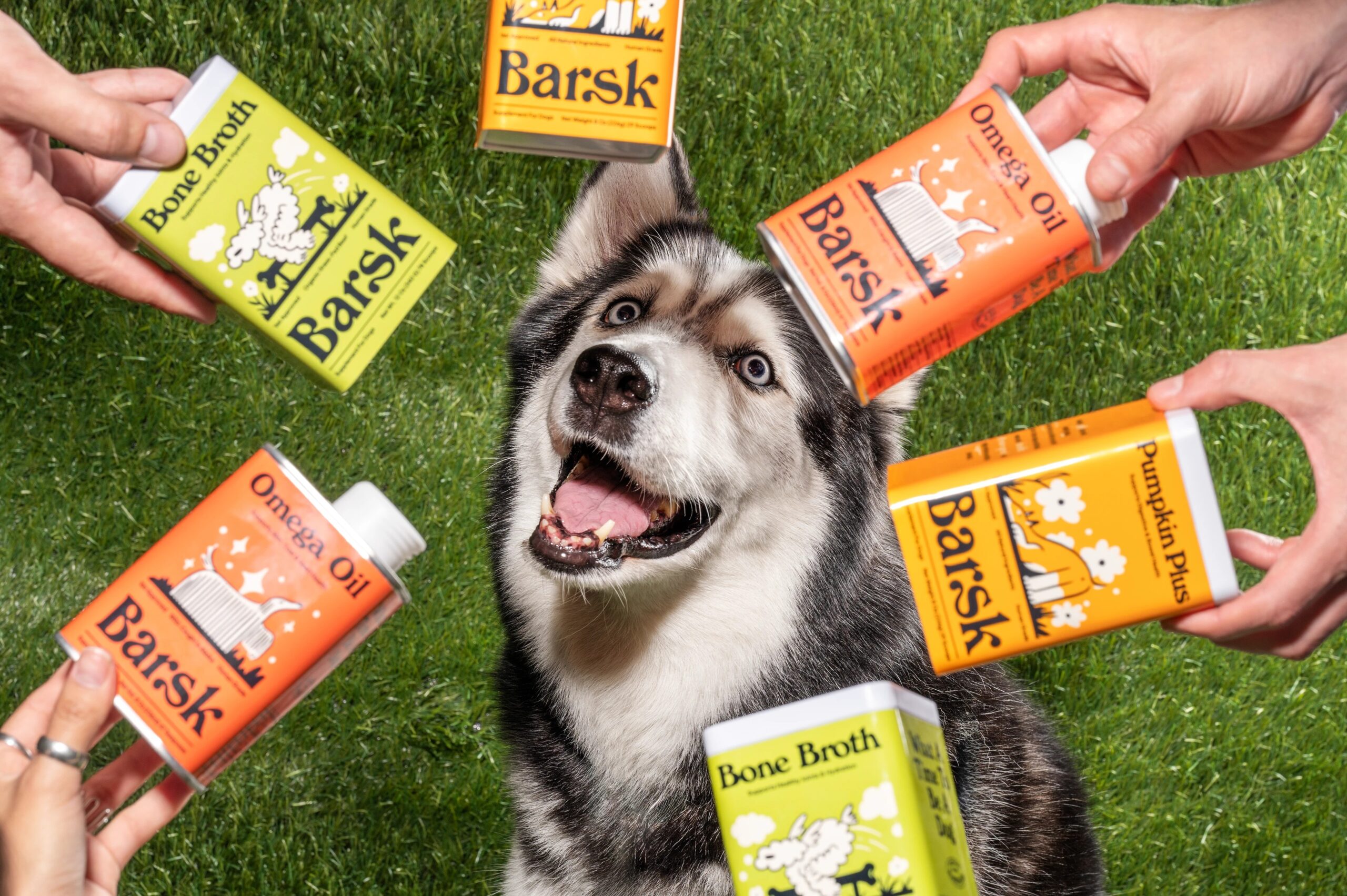
Barsk turns the clinical language of pet supplements into something you actually want to pick up. The Singapore-based brand set out to soften the sterility that usually comes with anything labeled “pharmaceutical grade,” and the studio behind its identity leaned into that tension rather than away from it, building a system that feels playful without losing credibility. Warm, saturated tins in citrus orange, olive green and marigold sit against equally punchy backdrops, giving the whole range instant shelf presence.
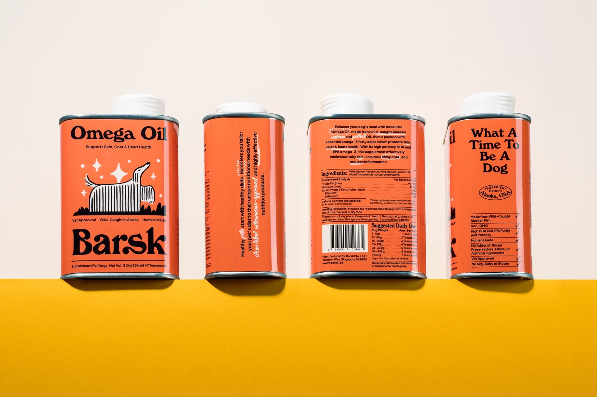
Illustrations of leggy, expressive dogs (all elongated limbs and cartoonish snouts) nod to seventies packaging tropes, lending the brand a nostalgic, hand-drawn warmth that keeps it from ever feeling clinical. A bold, rounded serif carries the logotype and headlines, striking a balance between friendly and trustworthy, the kind of typeface that reads like a promise rather than a prescription. Copy lines like “What A Time To Be A Dog” and “Bone-Appétit!” carry the tone through, injecting humor into what could easily be dry, functional messaging.
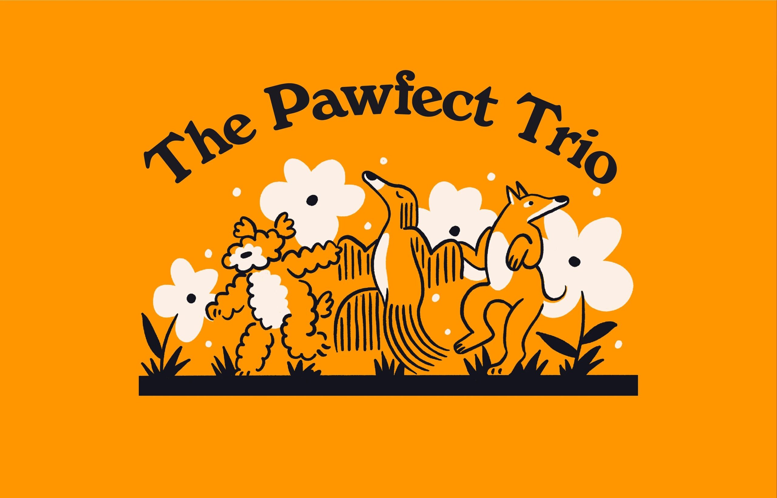
The supporting cast, flower motifs, sparkles and little dog illustrations wandering through grass, extends the world beyond the label itself, showing up on secondary packaging and mailer boxes so the experience of opening a Barsk box feels as considered as the product inside. Even the structural choices, square tins with a printed wraparound label, echo classic apothecary or spice-tin formats, another subtle wink at the “pharmaceutical grade” claim, reinterpreted through a much friendlier lens. Ultimately, the branding does the work of making health-forward pet care feel joyful rather than obligatory, proof that a supplement brand can be both credible and genuinely fun to look at.
What stands out here is the restraint behind the playfulness. It would have been easy to lean fully into cartoon territory, but the palette is disciplined to just a few saturated tones, and the dog illustrations, despite their loose linework, stay consistent in proportion and pose across every SKU. That consistency is what lets the brand feel like a system rather than a set of one-off illustrations. The choice to keep the tin shape itself understated (no die-cuts, no unusual structure) also reads as intentional, letting the color and character work carry the personality while the format stays functional and stackable on shelf.

 VincoStudio
 lisakaplina
 CreativeWise
 alchimistestudioParis
 Adriana Adamo
 tauqueer
 MAISON D'IDÉE Prague
 Pixels Studio
 Atchayaa
 DESIGN CONCEPTS
 hello ocean
 monther al omari
 the Labelmaker
 alamgirbrands
 kat bres
 Vantablack Studio
 GruppoSaida
 studiorevv
 grafisercreative
 Kate Reichel
 UPRISE
 Modern Theory