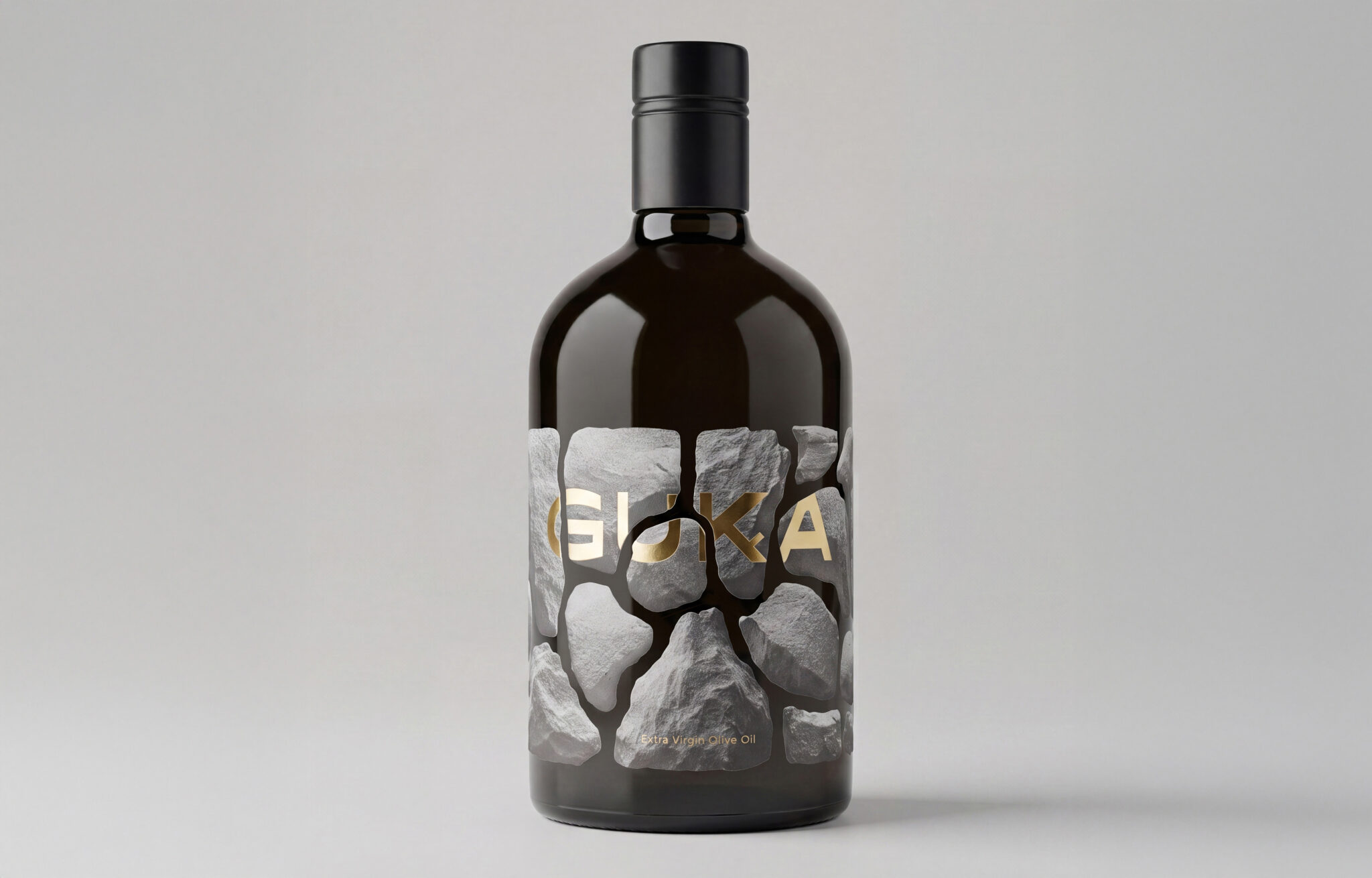

OPG Arbulić is a family-run agricultural estate from the Dalmatian region of Croatia, known for its karst landscape, stone, and centuries-old olive trees. For their new line of extra virgin olive oil, we developed the brand name and visual identity.
The name “Guka” derives from the local term for the regenerative organ of the olive tree that develops at the trunk base and root collar of young trees, enabling the growth of new shoots, rootlets, and roots.
The visual identity of the packaging is inspired by the dry-stone walls characteristic of the Mediterranean landscape, traditionally built from stones removed while clearing the land. What was once considered excess material has become an element that shapes and defines the identity of the landscape.
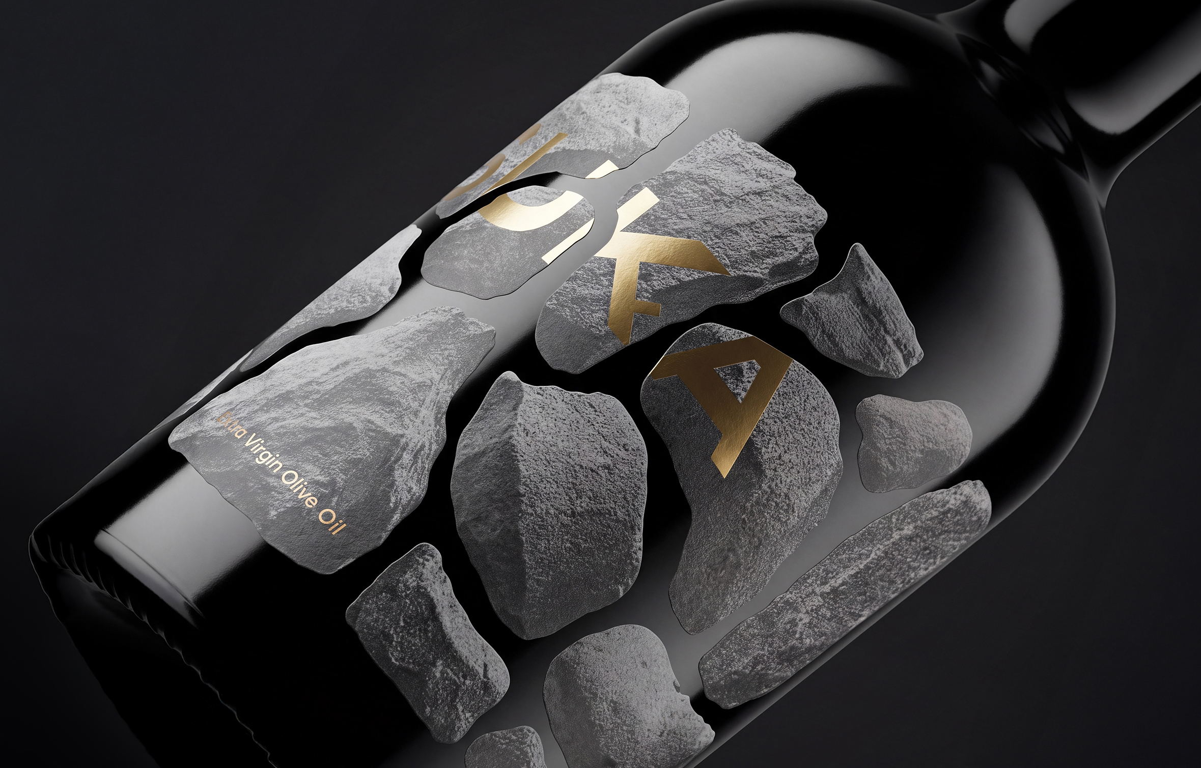
This idea was translated onto the bottle through a structure of stones arranged in the manner of a traditional dry-stone wall. Each stone was created as a separate object and then digitally cut out from its original background. As a result, each one appears as a unique cut-out element, retaining its visible texture, irregular edges, and individual shadows.
The stones are treated in a grayscale, monochromatic palette with an intentionally distinctive texture, while negative space is left between them, allowing the dark glass of the bottle itself to show through. This creates the visual effect of cracks and gaps characteristic of dry-stone walls.
The brand name is integrated directly into this dry-stone structure and further interpreted through the logo itself. The letter “K” is shaped like a branch from which a small shoot emerges, referencing “guka”, the regenerative organ of the olive tree from which new shoots, rootlets, and roots develop.
The wordmark is finished with gold foil, chosen as a visual synonym for premium, high-quality olive oil. The letters are cut in accordance with the stones in the background, making the typography an integral part of the dry-stone structure. A subtle detail is hidden within the letter “K”: its lower stroke is shaped as a small olive branch.
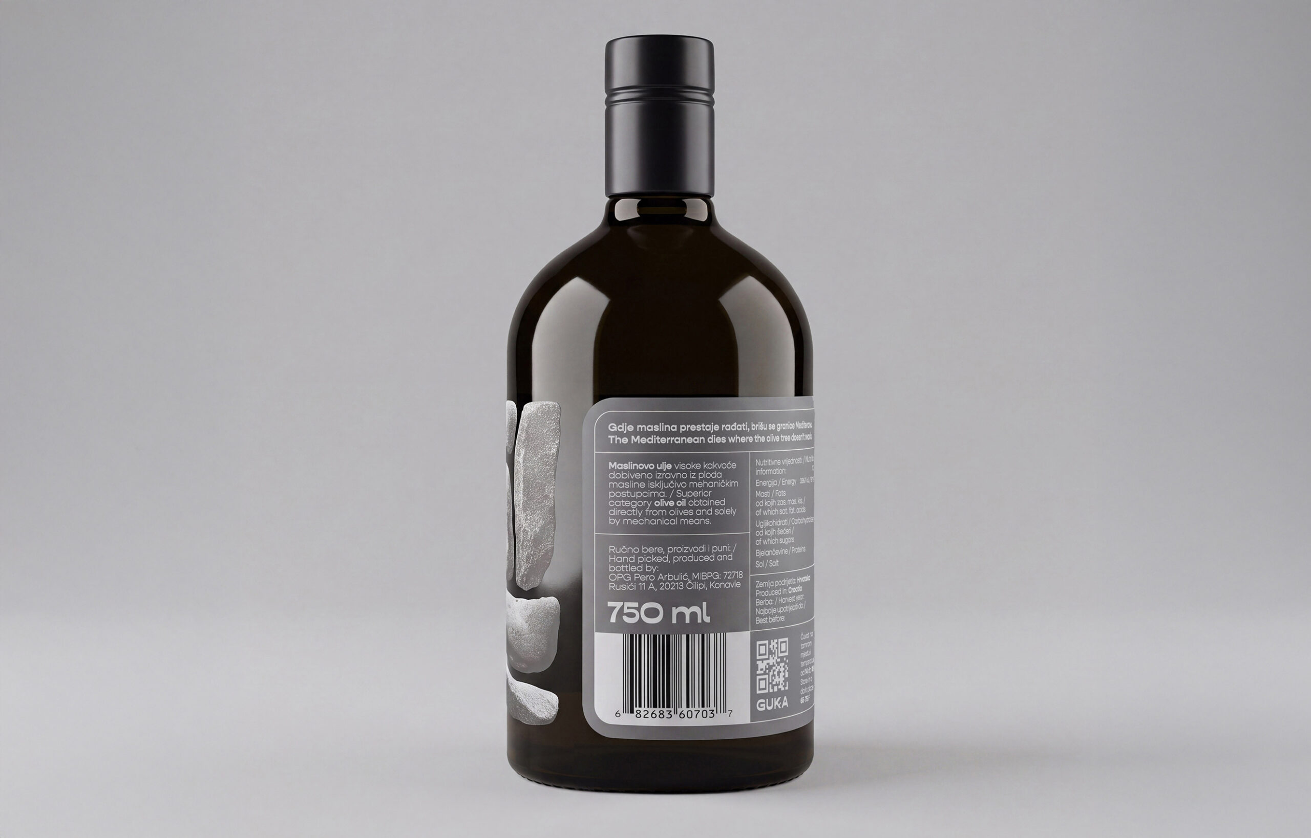
The label is printed on a highly textured matte paper, creating a tactile contrast with the glossy, dark glass of the bottle.
Curator’s Insight
What’s notable here is the restraint in how the stone motif is built. Rather than illustrating a dry-stone wall as a flat graphic pattern, each fragment was treated as its own asset with independent lighting and edge irregularity, which means no two “stones” repeat and the composition avoids the tiled, stamped look that this kind of texture usually falls into on a curved glass surface. That’s a harder production problem than it looks, since label artwork has to read correctly once wrapped around a cylinder, not just as a flat file.
The negative space carries more weight than the stones themselves. By letting the dark glass show through the gaps, the label doesn’t need a background color at all, it borrows the bottle’s own material as part of its palette. That’s an efficient way to get a two-tone effect (near-black glass against pale grey stone) without adding a second ink or substrate.
The logotype’s integration is the other quiet win. Letting the K’s lower stroke double as a branch, and cutting the wordmark to the same broken-edge logic as the stones around it, means the identity isn’t sitting on top of the packaging concept, it’s built from the same construction method. That’s the difference between a logo placed on a pattern and a logo that is the pattern.

 andreamarinnn
 Chochoi Creative
 Hi estudio
 bachir bachchar
 Aferdini
 AUN BRANDS
 vitoramockup
 InterWish
 ash123456
 Studiotaketwo
 monther al omari
 Maruf Nishat
 secondpound
 Sun Jia Yang
 宏洛图品牌设计HONGLT
 Palashcc
 Clever Branding
 ARTKA
ARTKA Boordon
 SANTIAGO
 Studio Husk
 Studio Zak
 Abbas Sayyed
 Antonia Skaraki
 Luminous Design
 eldiyar