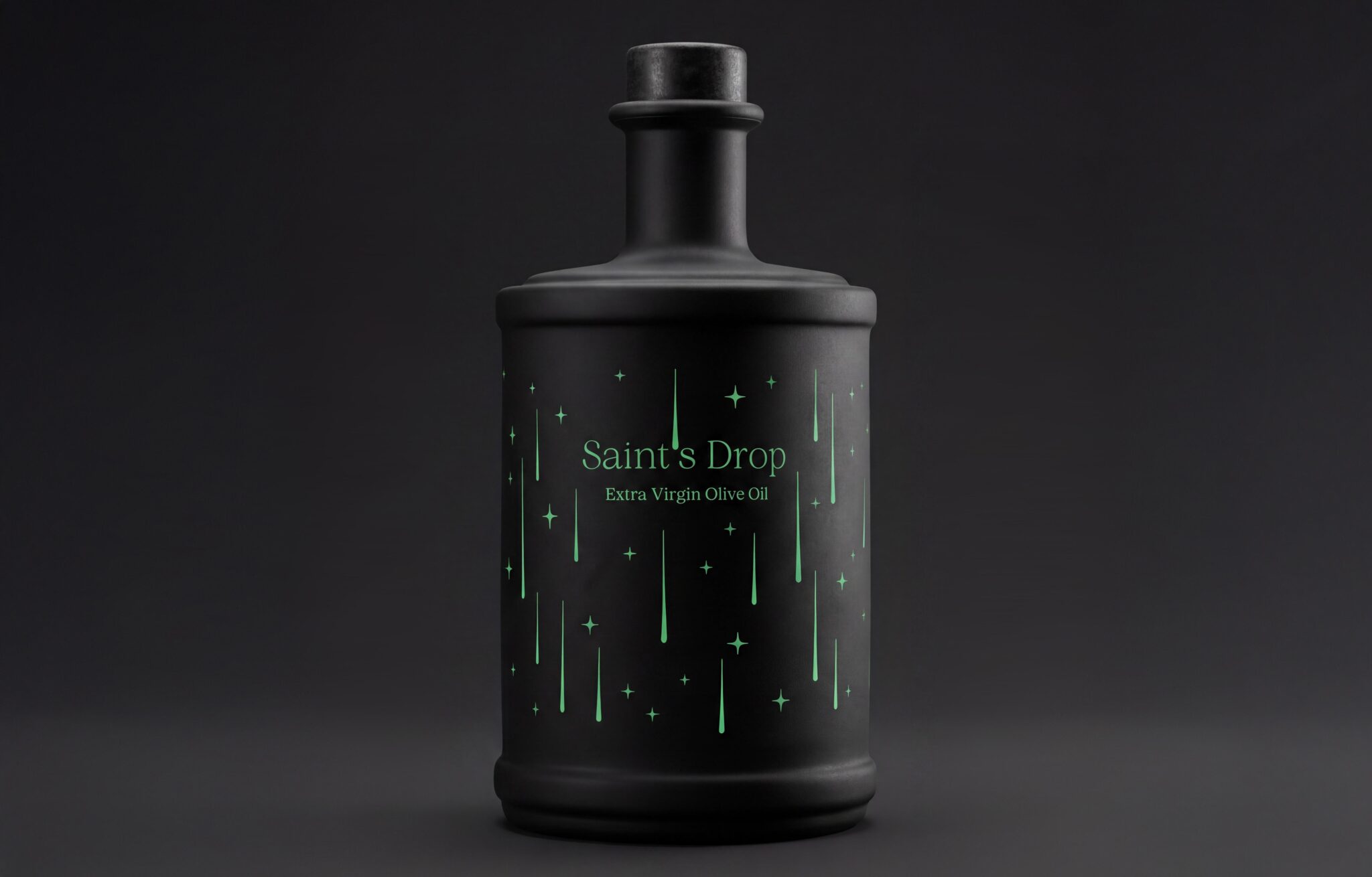

The development of a new olive oil brand from Sveti Lovreč in Istria involved creating its name and visual identity. The name “Saint’s Drop” is inspired by the “Tears of St. Lawrence”, the Perseid meteor shower that appears every year around St. Lawrence’s Day, the feast day of the town’s patron saint. This connection brings together local tradition and a natural phenomenon, creating the foundation for the brand’s visual language.
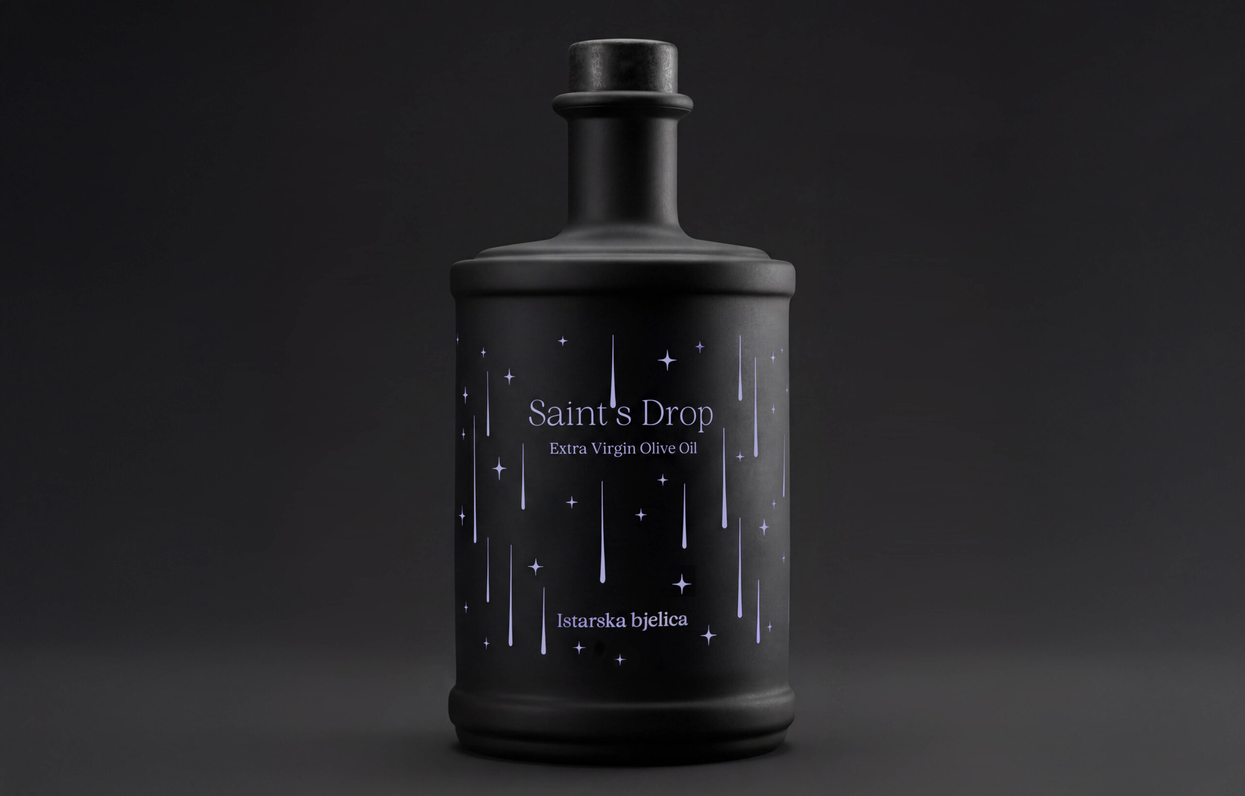
The textured, dark surface of the bottle conveys a sense of elegance and refinement, emphasising the quality of the product while simultaneously evoking the night sky.
The front of the bottle is finished using direct-to-glass printing, creating a distinctive and lasting element of the packaging that remains consistent across different harvests and all three olive oil varieties. The back label, on the other hand, is applied separately and contains product information that can be updated with each new harvest.
Stars are distributed across the surface of the bottle as the key visual motif. A distinctive detail within this starry sky is the falling stars, shaped to simultaneously evoke drops of olive oil gently sliding down the bottle. This creates a subtle symbolic connection between the night sky and the product itself, tying the story of Saint’s Drop together through both form and meaning.


 GruppoSaida
 ahmedraoudgfx
 Hi estudio
 Nadezhda Gorelikova
 Studio Garces
 Brandsbylufo
 Rewot
Rewot alchimistestudioParis
 Asprey Creative
 kat bres
 Valérie Colace
 Atiq Alam
 Sara Communications
 David Hakobyan
 monther al omari
 Innovāt - Empowering Creative Innovation
 mmdesign
 Amjad Battal
 Hollóka Grafikai Műhely / Graphic Design Studio
 Palashcc
 ABC Design Communication
 ChrisSkarlatos
 Hedayat Hadavi
 Tia Nguyen
 étiquette
 Derrick Lin