Hills to Hands: Bridging the Gap Between Nature and Your Kitchen
Creative Studio: Logosaylove
Client: Hills to Hands
Category: Food Packaging, FMCG
Country: India
Design Year: 2023
Project Overview:
Hills to Hands is a direct-from-the-farm spice brand, born from a mission to deliver mountain-fresh ingredients straight to Indian homes. In a category cluttered with generic packaging and uninspiring visuals, we saw an opportunity to create a packaging system that celebrates origin, purity, and human connection.
Design Objective:
Our goal was to reflect the soul of the Himalayas—raw, untouched, and abundant—while building a modern, credible identity in the growing D2C spice market. The brand needed to stand out on shelves, communicate its direct-from-source model, and appeal to a health-conscious, quality-focused urban buyer.
Design Solution:
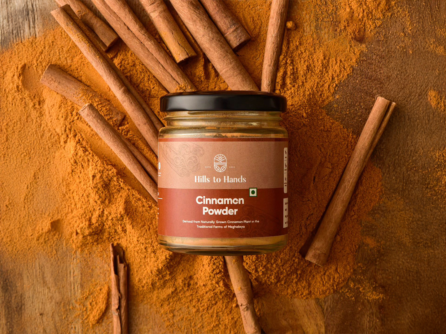
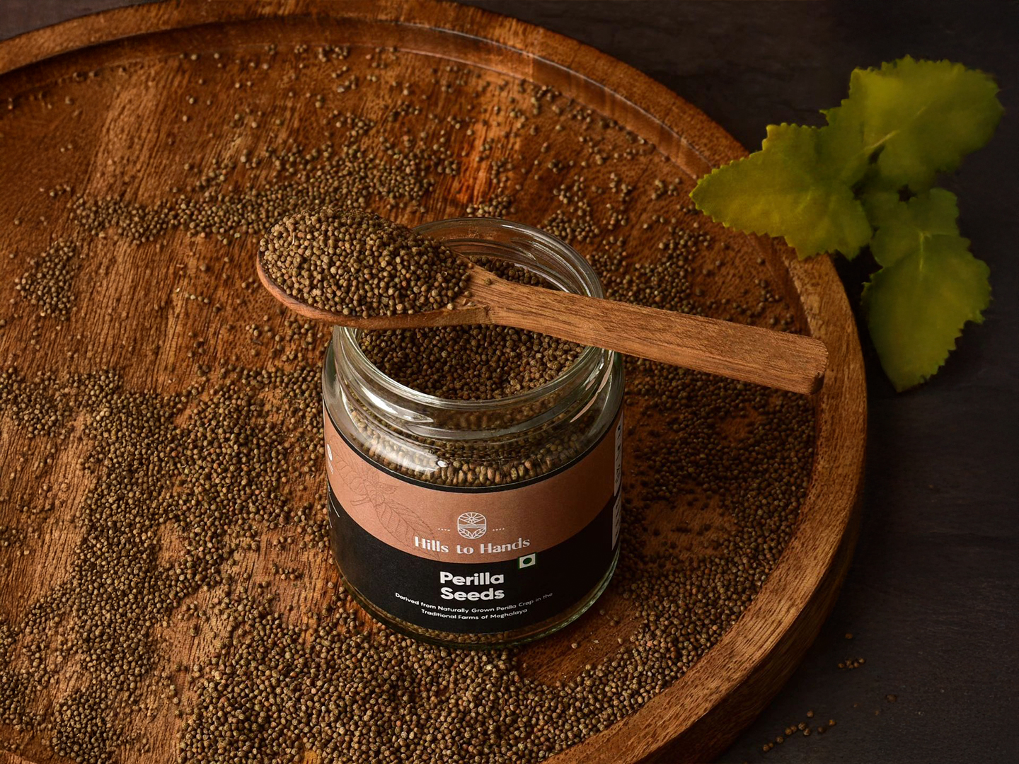
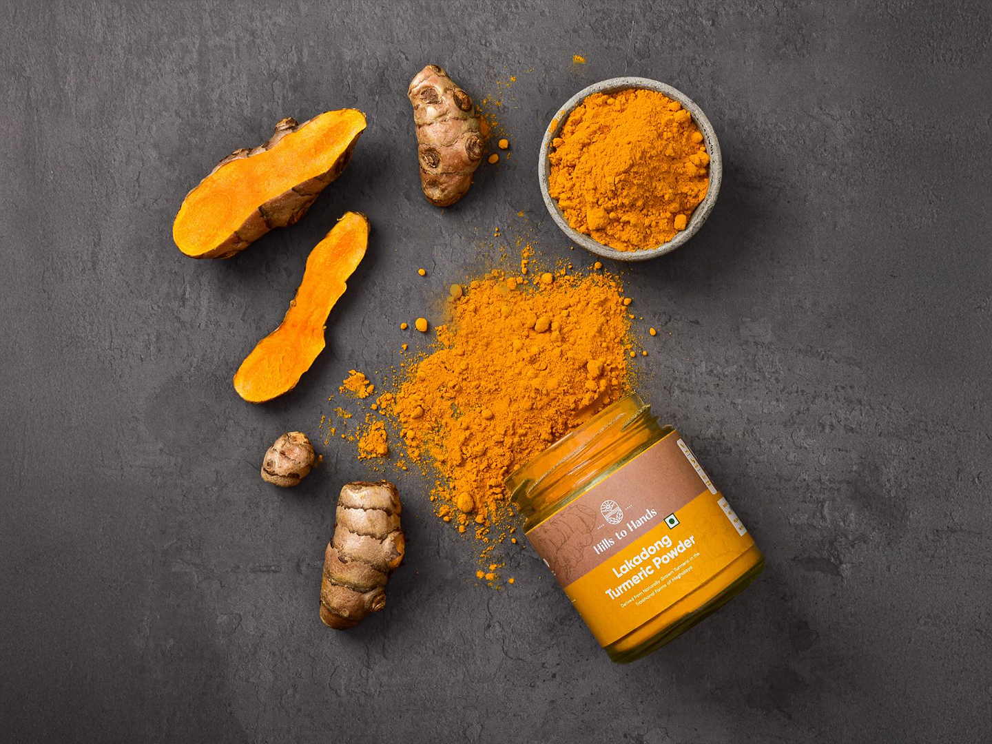
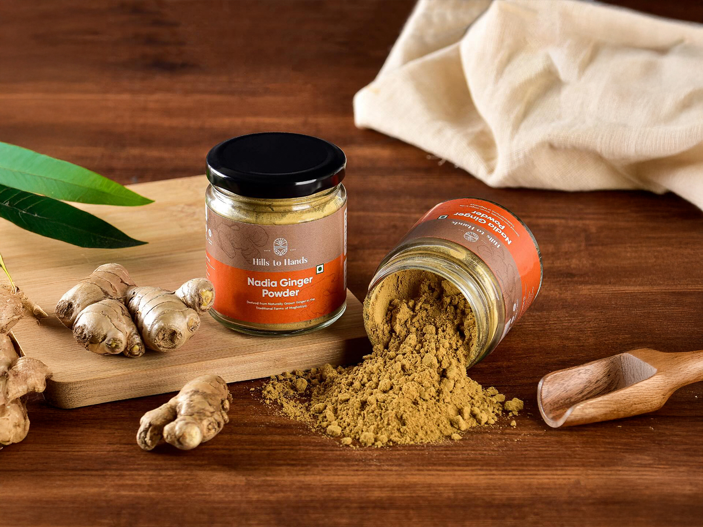
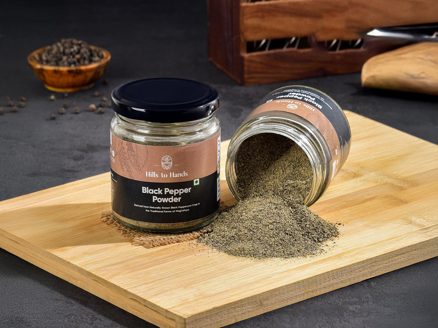
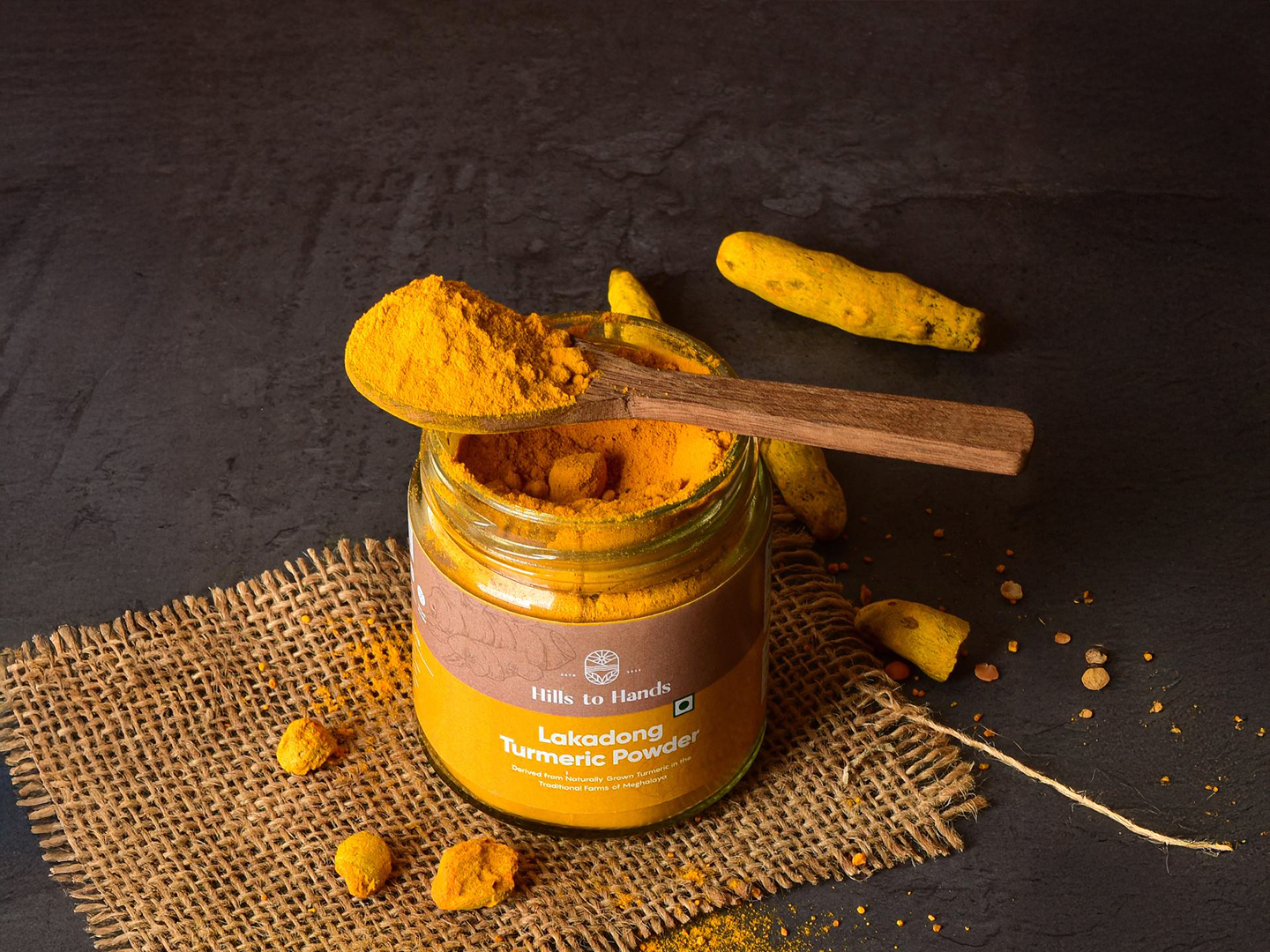
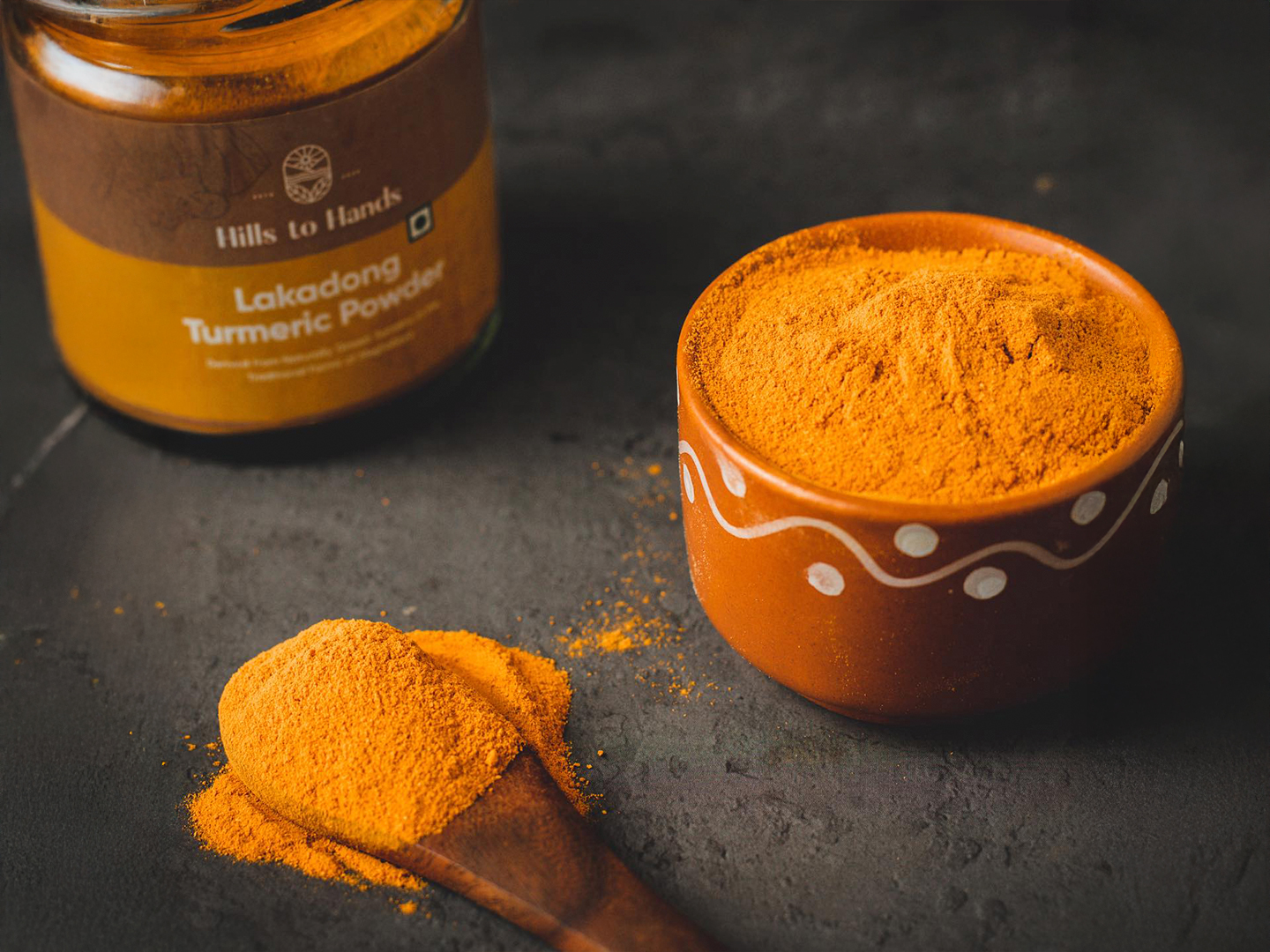
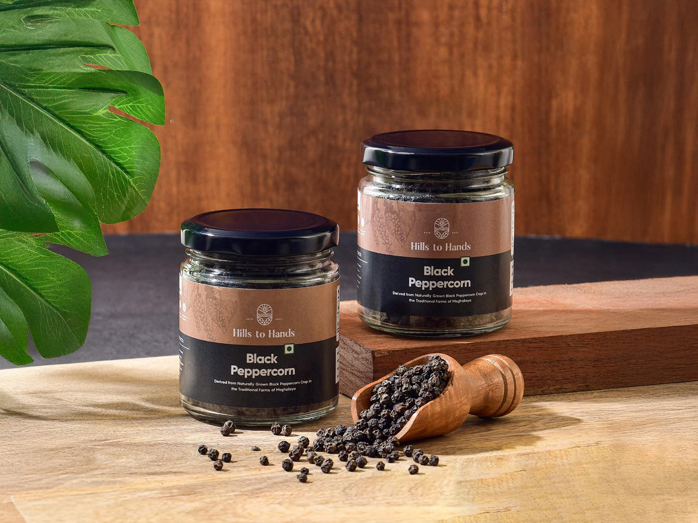
We crafted a clean, earthy packaging system that balances simplicity with storytelling.
Color Palette: Inspired by the terrain of the Himalayas—subtle greens, dusty browns, and organic whites—bringing a natural, grounded feel.
Illustrations: Hand-drawn mountain ranges and minimal iconography tell the story of origin while maintaining premium cues.
Typography: A modern serif meets clean sans-serif, symbolising the balance of tradition and new-age directness.
Materials: Eco-friendly kraft paper textures were mimicked on matte-finished pouches to signal sustainability.
Each SKU carries a visual thread of the mountains and farms, ensuring brand consistency while making room for future category extensions—from salts to teas.
Impact:
Within 3 months of launch, the brand witnessed significant traction in online orders and social media engagement, with packaging being the most mentioned brand touchpoint in customer feedback. The aesthetic helped communicate trust, purity, and value, crucial for a new player in the spice market.