CHALLENGUE/ A specialty Italian coffee in capsules. The challenge: to create packaging that conveys excellence and approachability, bringing the premium experience within everyone’s reach.
CONCEPT IDEA/
Brewing coffee is an art full of nuances, where every detail matters to achieve the perfect cup. Here’s an example recipe:
- Dosage: 20 g (medium, 7.5 Mahlkonig EK43)
- Water: 300 g a 94ºC.
- 3 pours: 00:00 to 40g // 00:50 to 140g. // 01:45 to 200g. // 2:30 to 300g.
- Total extraction time: 4.00 min
- TDS: 1.33%. Extraction: 20.25%.
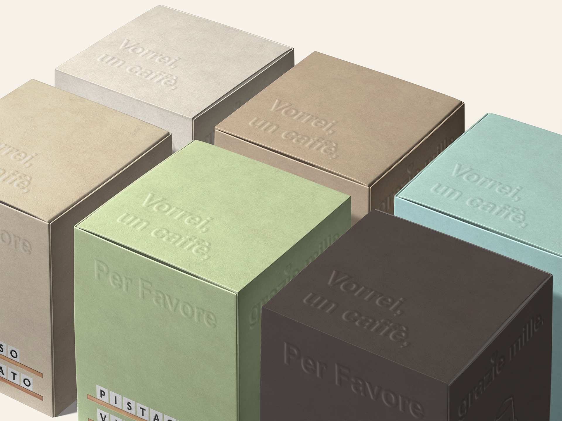
A meticulous, almost grid-like process.This precision inspired the visual concept: drawing from the iconic interchangeable letter boards found in coffee shops, where every character is placed with exactness. Before designing, I created a moodboard with wood and typography references to capture that timeless, precise aesthetic. Inspired by the grid-like precision of interchangeable coffee boards, a grid was created to guide the entire design.
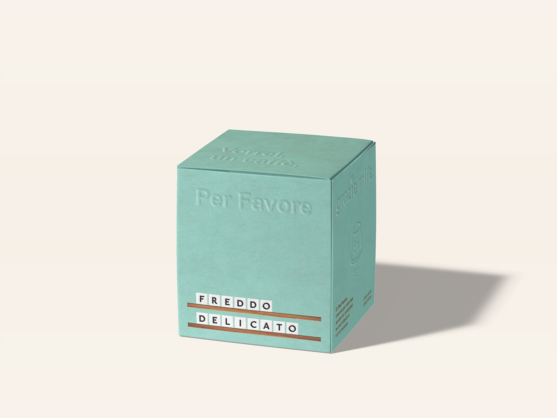
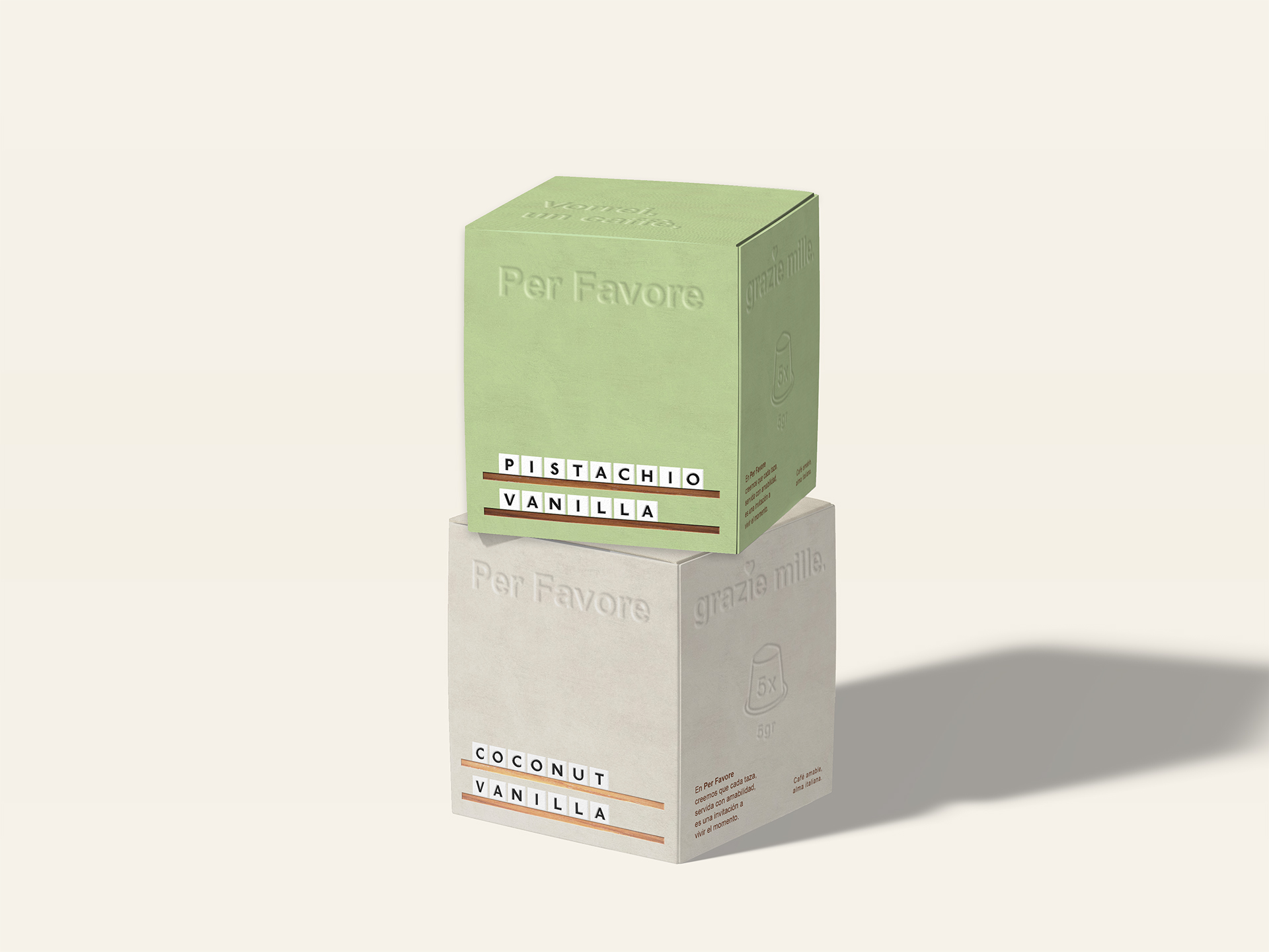
DESIGN/ A common template design was created for all elements, where only the background color and wood tone vary according to the flavor. This way, we achieve a brand identity that is easily recognizable on the shelf, with a minimalist look & feel and an air of exclusivity. Additionally, each box can become a decorative object in itself, extending the product’s lifespan.
NAMING/ The name comes from the act of ordering a coffee from your favorite barista.
In Italy, per favore (“please”) is more than just a phrase: it conveys courtesy, warmth, and closeness.
Short, melodic, and easy to remember, it evokes the experience of an espresso served with a smile.
It also encapsulates three key values:
- Courtesy → friendly and approachable service.
- Authenticity → connection with Italian coffee tradition.
- Elegant simplicity → standing out without artifice.
WHAT’S UNIQUE?/ Per Favore is a project that combines human warmth and Italian tradition with a structured, modern design, offering a premium coffee experience that feels close, elegant, and authentic.
CREDITS/
- Concept Idea, Art Direction, Graphic Design/ Marco Arroyo-Vázquez
- Industry/ Food/Beverages.
- Market Region/ Europe.
- Project Type/ Concept.
- Format/ Box.
PD: grazie mille 🙂