
ABOUT
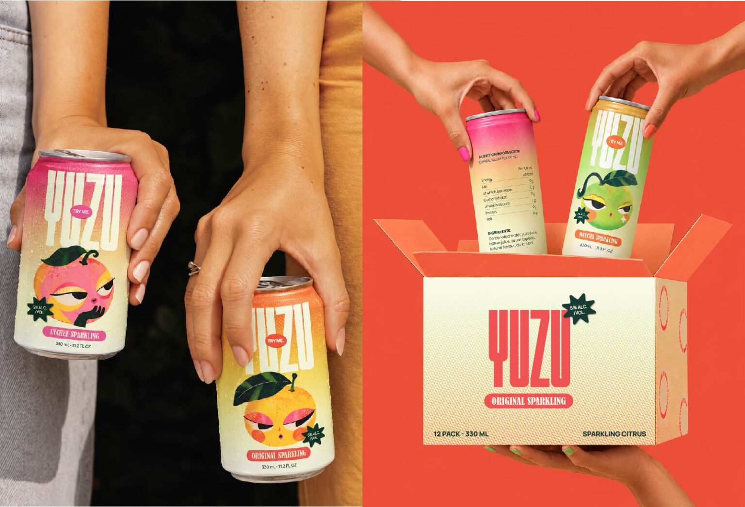
YUZU takes its visual cues from the expressive character design and graphic traditions of East Asia, particularly the way colour, texture, exaggerated features and playful personalities are used to create memorable characters. I wanted the brand to carry that same sense of energy with bright, slightly eccentric details along with a modern clean layout.
SOLUTION
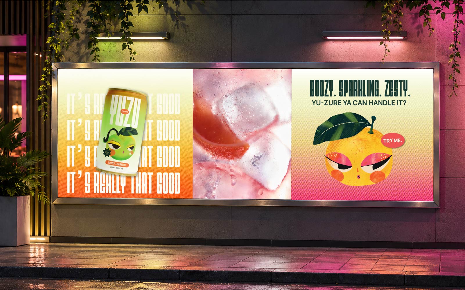
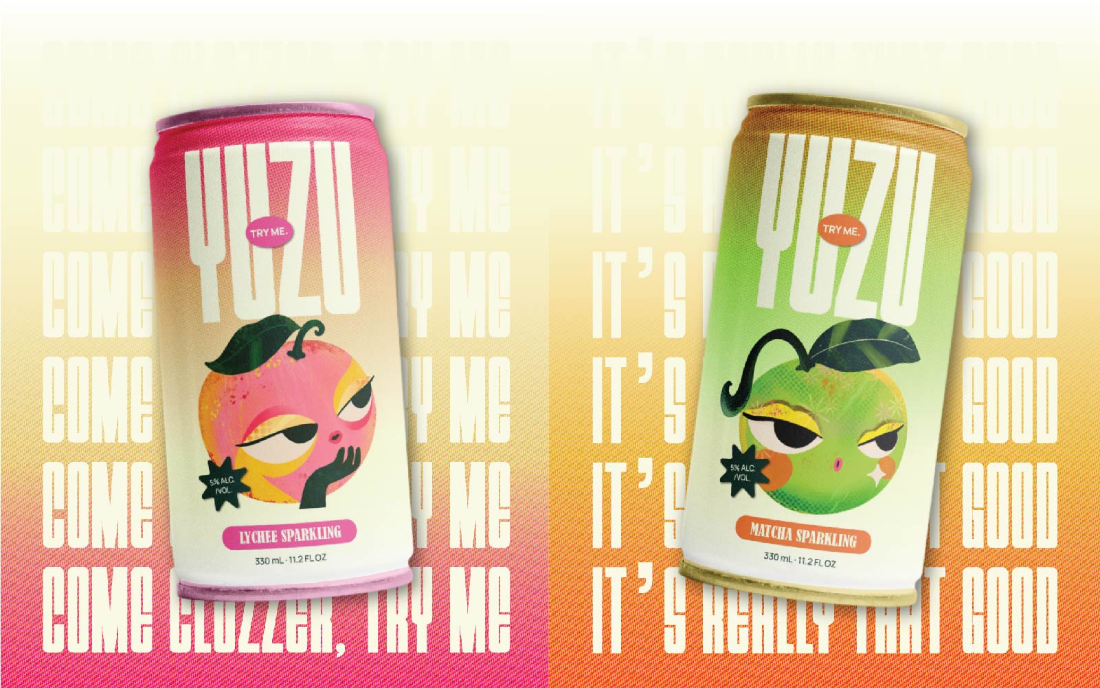
The characters became the heart of the identity. Their textured faces, expressive eyes, graphic makeup and exaggerated features give each one a distinct personality, while the bright pinks, oranges, yellows and greens reflect the punchy character of the drink. These colours, combined with halftone textures, illustrated details, bold typography and playful patterns, create a visual language that feels vibrant and tactile rather than flat or overly polished.
RESULT
The result is a brand world where the cans, characters and supporting graphics feel like part of the same visual universe. The East Asian influence gives YUZU its character and detail, while the clean compositions and contemporary typography keep it fresh, approachable and relevant, creating a brand that feels bright, fizzy, and full of personality.




 Derrick Lin
 salutifg
 ADStudio
 WeAreDepot
 Manuvila
 Yellow Umbrella Creative
 Toka
Toka Studio Zak
 Atiq Alam
 monther al omari
 Modern Theory
 Sirka Agency
 DESIGN CONCEPTS
 Eva Chistyakova
 Puigdemont Roca
 marianaaworks
 bloomburo
 andreamarinnn
 Alina
Alina Saadmost
 Bruhken
 Maruf Nishat
 Richest Branding Pvt. Ltd.
 Sophiagdotcom
 saifullahmaslool
 Up-Brands