Agency: ADVISION
Project manager: Gerda Kvietinskaite
Creative director: Audrius Karecka
Designer: Jurgita Kuriene
Project Type: Produced, Commercial Work
Client: Imlitex Holdings
Location: Kaunas, Lithuania
Packaging Contents: Salt, food
Packaging Substrate / Materials: Paper
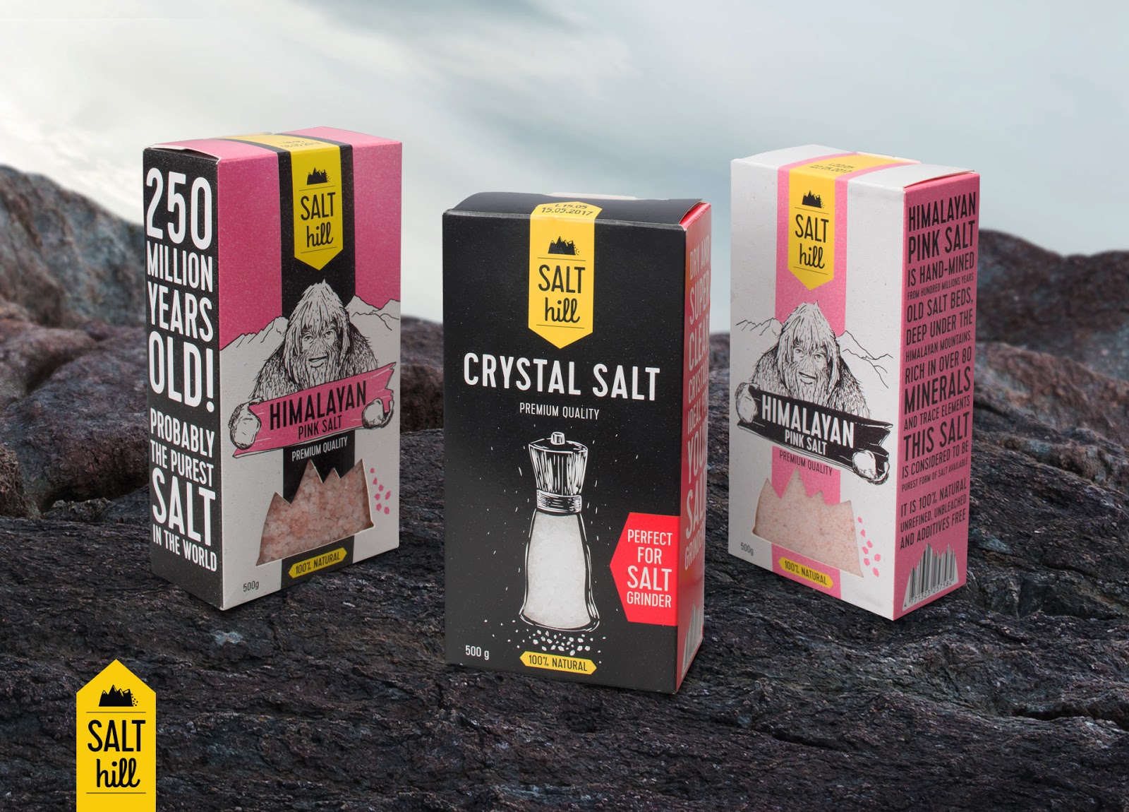
Food business group IMLITEX HOLDINGS has approached our agency and asked us to create a packaging for a table salt group SALT HILL so that its unique design would stand out from other manufacturers and become appealing to a modern consumer.
The brand SALT HILL and packaging design for the salts line were created.
The SALT HILL salt is unprocessed, natural, and mined from the caves that formed 250 million years ago when the ocean at the foot of the Himalayas dried out. This is the reason why we have decided to use images of mountains and a primitive human.
In order to intrigue a client who is looking for innovations, we have created unique and attention-drawing illustrations, which communicate a modern, hipster style. Shades were chosen in a bid to emphasize the type of product – pink Himalayan salt. In order to demonstrate the shade and grittiness of the salt, we have made a transparent window-like shape in the packaging.
Sides of the packaging look as if they are imitating slogans, as they communicate the core message, which was emphasized by using a larger font and exclamation marks.