
Founded in 2020 by a pair of Tea Sommelier brothers, Leafbox specializes in curating India’s finest teas and infusing them with all-natural elements, resulting in blends that are both flavorful and healthy. Each tea offered by Leafbox is comprised of whole leaves, ensuring a rich and fulfilling experience.
The tasks involved in creating a brand for Leafbox encompass a range of activities, starting from market research of existing brands to the design and implementation of various brand elements. Here is an outline of the process:
- Market Research: Conduct thorough research on existing brands in the tea industry to gain insights into their strategies, visual identities, target markets, and positioning. Identify key differentiators that will help Leafbox stand out.
- Logo Design: Develop a distinctive and visually appealing logo that represents the essence of Leafbox. The logo should reflect the brand’s values, such as authenticity, craftsmanship, and the direct sourcing of teas from farmers.
- Branding Guidelines: Create comprehensive branding guidelines that outline the brand’s visual identity, including logo usage, color palette, typography, and design principles.
- Icons: Design a set of icons that should be consistent with the overall visual identity and represent different aspects of the brand or product offerings.
- Packaging Design: Develop visually appealing and informative packaging designs for Leafbox’s tea products.
Packaging Design Deliverables
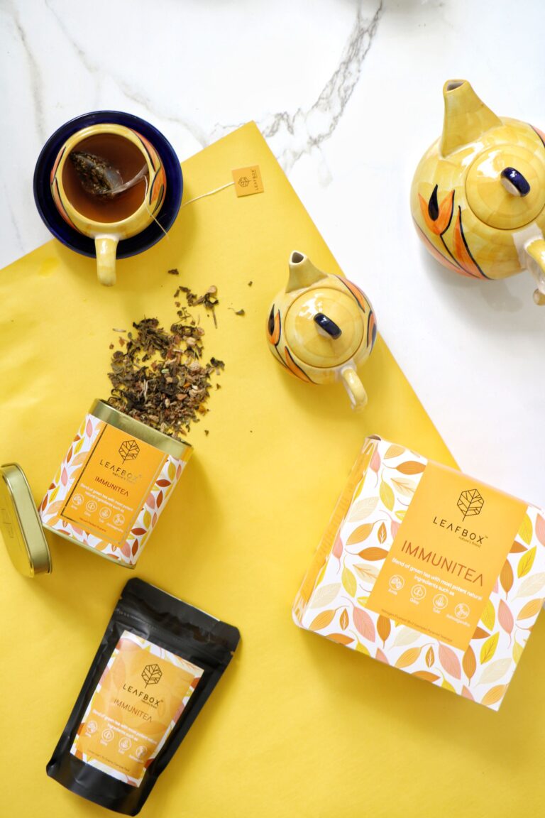
- Tea sachet (The small tea bag sachets are simple monochrome, highlighted with individual stickers for every product on the top to differentiate. The backside of the stickers has icons and info about steeping notes for each tea)
- Tea sample pouches (front & back label derived from master packaging boxes – 10g sample sachet not to be sold but to be sent B2B or B2C marketing)
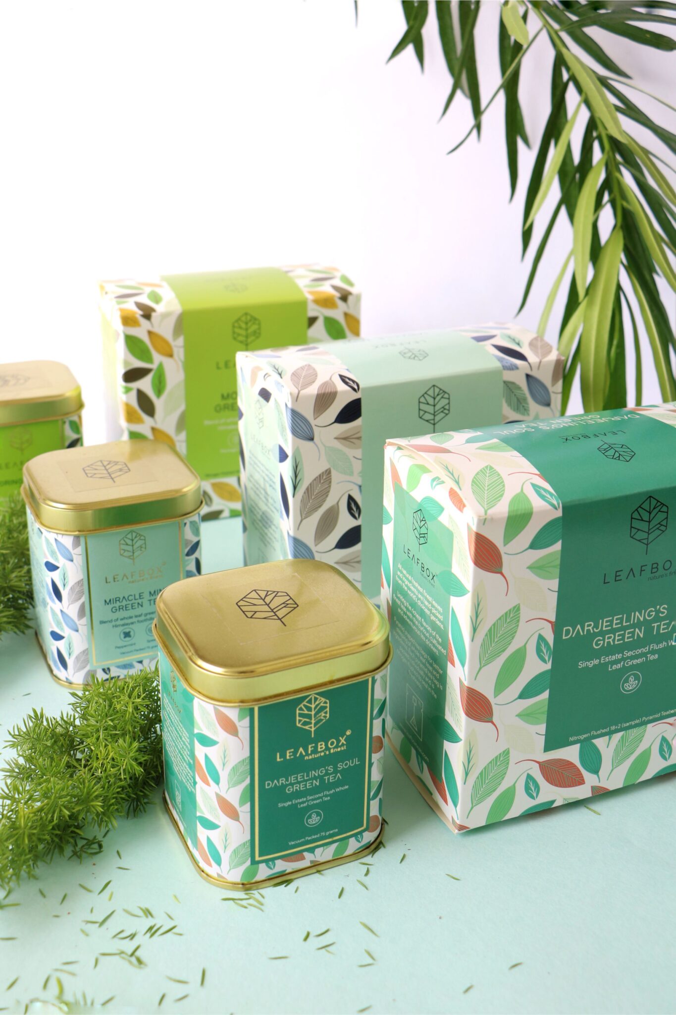
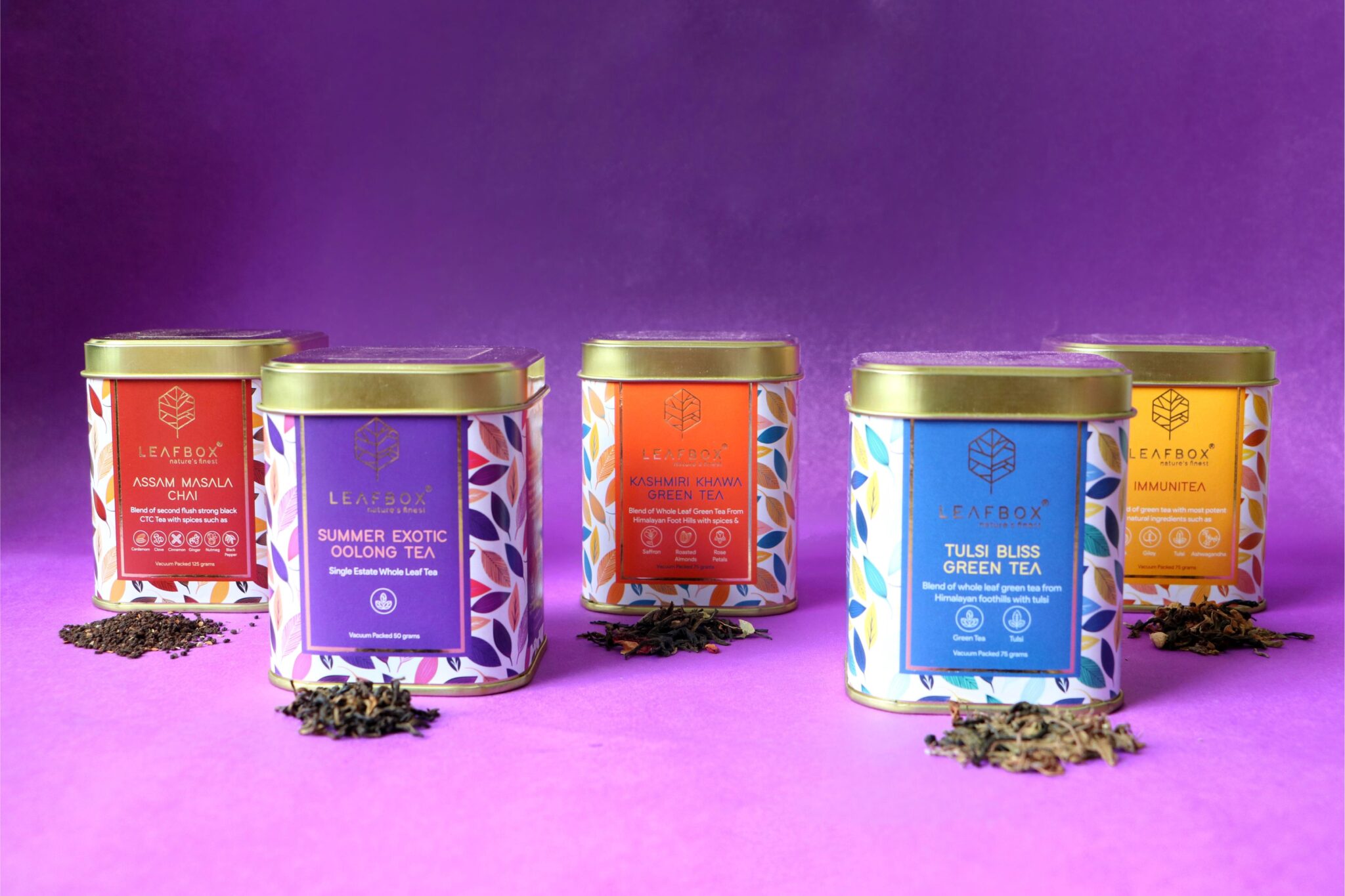
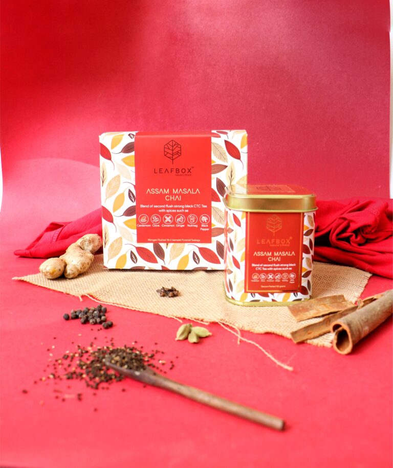
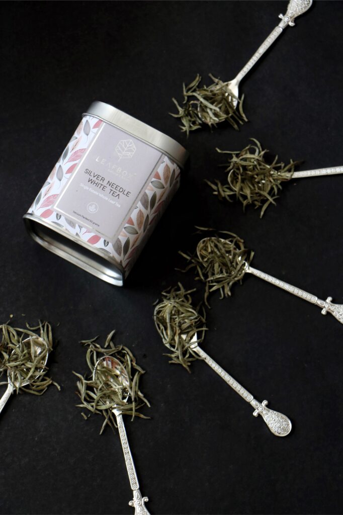
- Tin boxes (Loose tea leaves & ingredients were vacuum packed in plain pouches and stored in branded tin jars with gold leaf highlights)
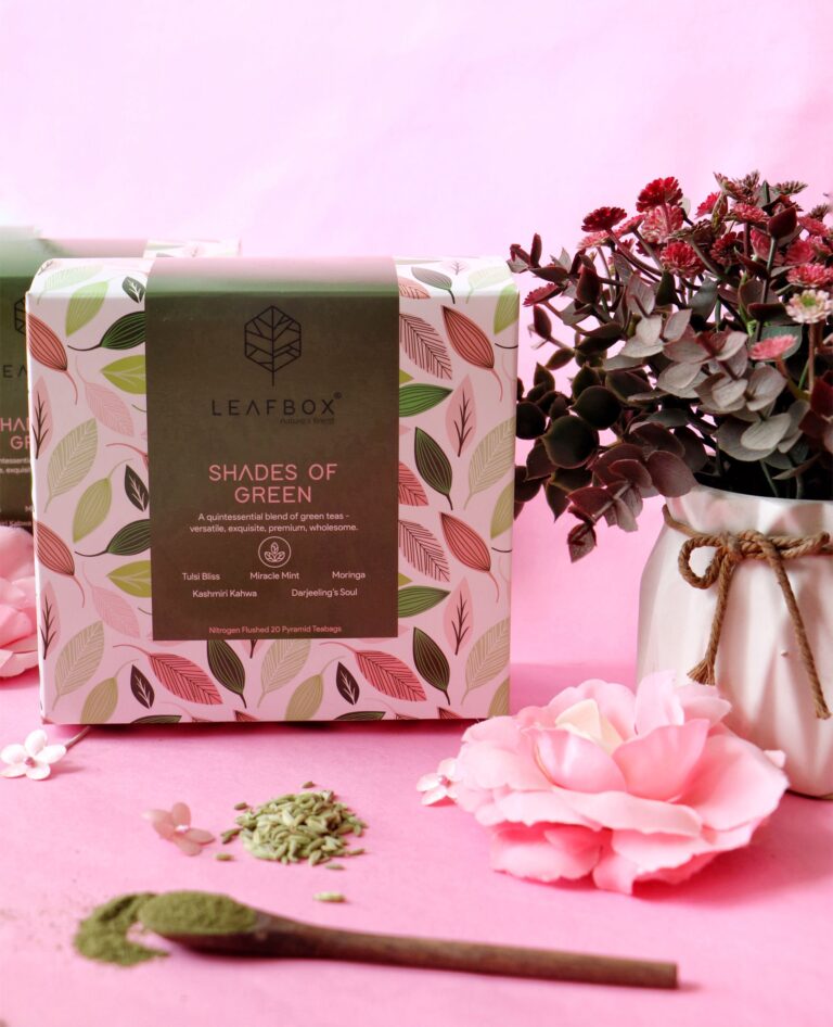
- Paper boxes (Printed in premium paper for quality & sturdiness. Single design with different color pallet theme and iconography for ingredients.)
Result
Each tea and its flavorful ingredient were highlighted through a specific color pallet unique to the variety. The ingredients were showcased using icons to make the design look more minimalist yet informative. The logo is a simple two-color design with geometric lines forming a leaf while the rest of the packaging if full of energetic color schemes followed across all forms of packaging.







 Derrick Lin
 Biaa
Biaa Petitmoulin Studio
 White Bear Studio
 Eva Chistyakova
 monther al omari
 Atipus
 alchimistestudioParis
 oneandother
 bloomburo
 helocrene
 Shapers Studio
 Denver Design
 Aidearte
 andrew.huerta
 softmachine
 airobtq
 Buzz & Co.
 Ruby
Ruby themythographer
 IDNB Inc.
 viktorflr
 Zenpack