
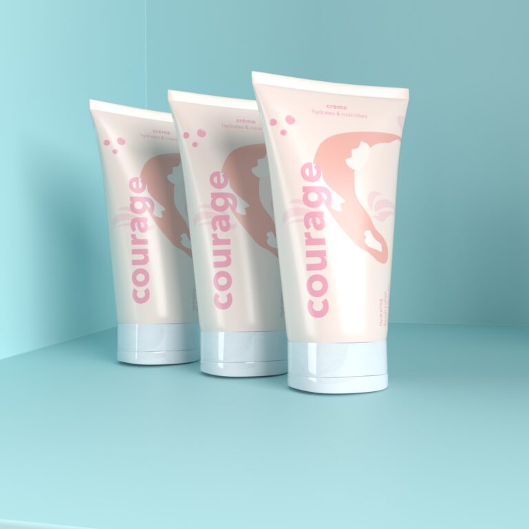
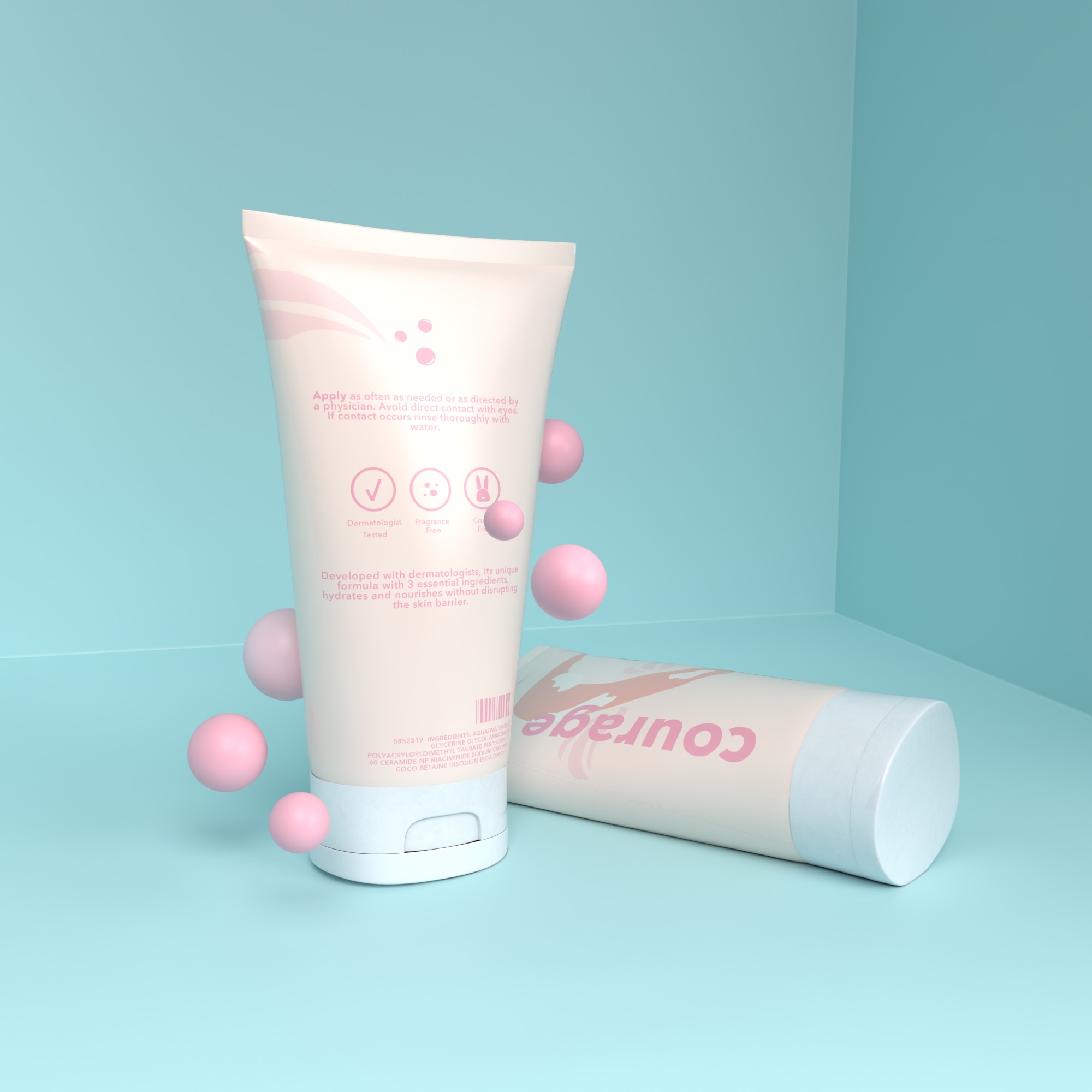
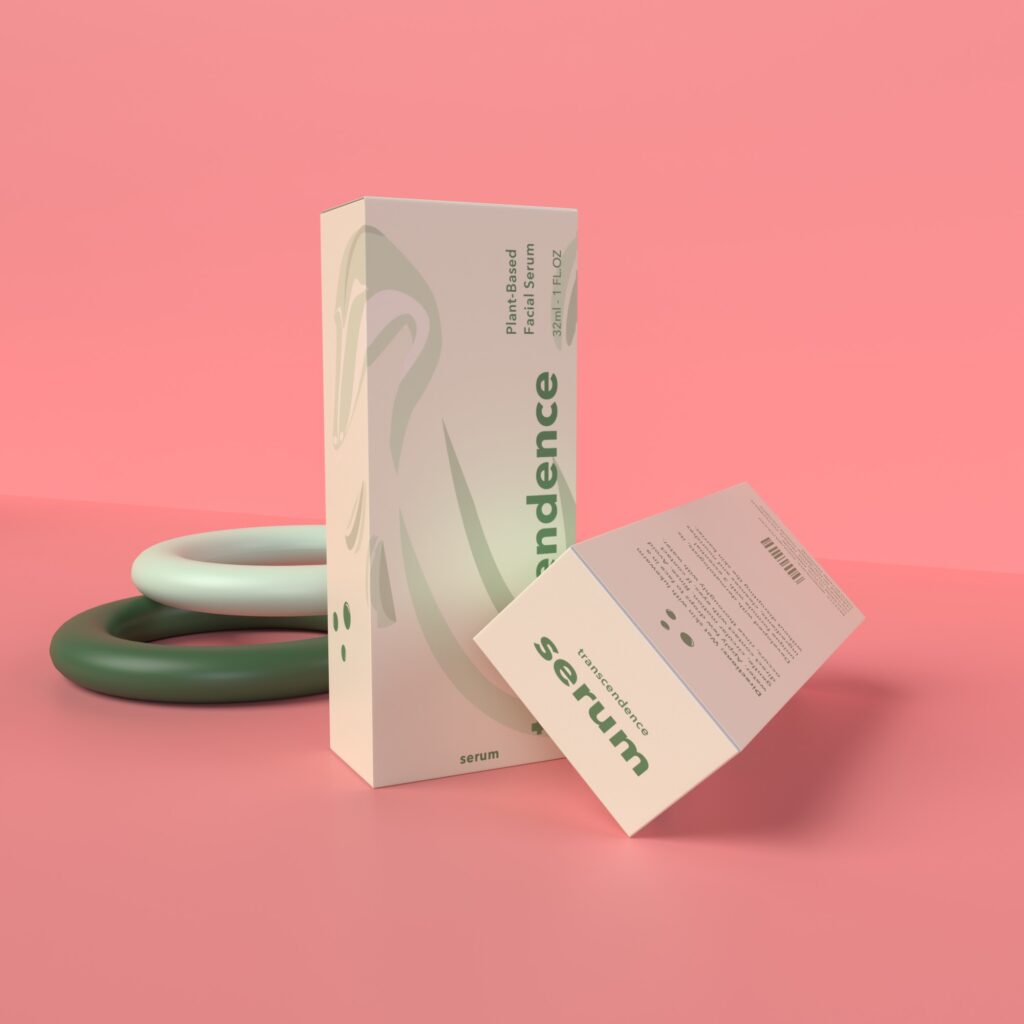
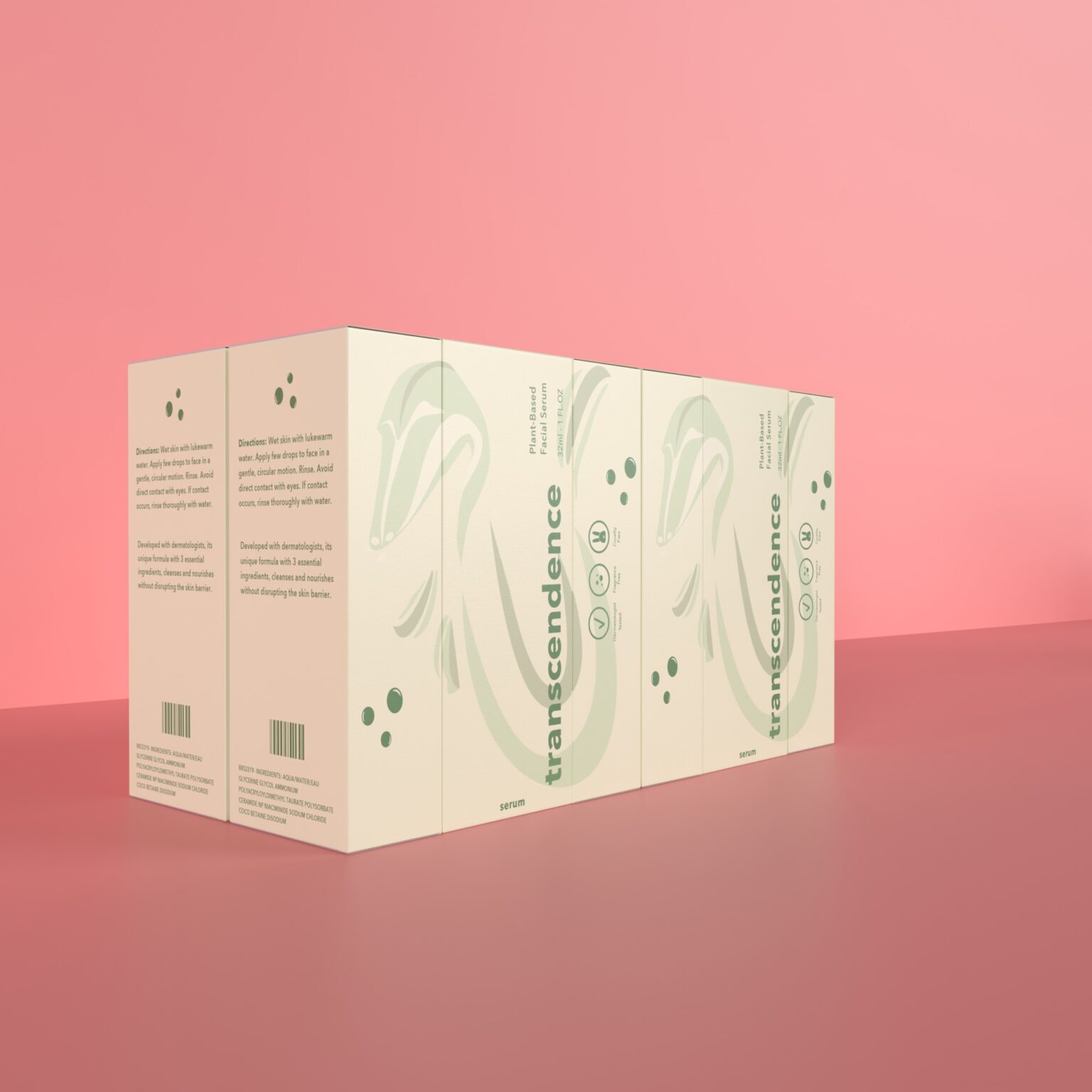
Inspired by the cultural stories of fish, each packaging design embodies the virtues of both Justice, Courage, and Transcendence. When combined with bold typography and monochromatic, contrasting colors, these elements work together to create both a modern, and minimalistic feel that gives a sense of “clean” skincare. My name is Dimitri Kyriacou, and I am currently a junior attending Ball State University, studying Graphic Design. For our final project, we were given the task of developing three packaging concepts based on the three logos we produced for the Six Virtues idea. I selected Justice for a cleanser bottle, Courage for a moisturizer tube, and Transcendence for a plant-based serum box.
My goal in designing these products was to utilize the principal that less is more. In order to make my designs both clean and minimalistic, I opted for bold typography, and monochromatic colors. Each creation that you see has a large, loud title, with an even larger pictorial. The colors used on the body of the fish were chosen, as they represent the standard colors those fish bare in popular culture. Thus giving them a recognizable identity. I also wanted my products to represent an eco-friendly nature, so I chose a glass bottle, plastic tube, and a cardboard box to keep sustainability in mind. Regarding the Cleanser bottle, the swordfish can be seen in the background wrapping around the title letters. The Japanese Koi fish wraps around its moisturizer tube, as the tail follows along the back of the packaging. And lastly, the Ancient Tikataalik, can be seen wrapped all around its box. This design choice was added to create both a sense of movement and playfulness as a way of amplifying the simplicity of each design.
Overall, I believe these designs work well, in that together they are simple and straight to the point. Just like skincare should be.

 dimitrik25
 Biaa
Biaa Petitmoulin Studio
 White Bear Studio
 Eva Chistyakova
 monther al omari
 Atipus
 alchimistestudioParis
 oneandother
 bloomburo
 helocrene
 Shapers Studio
 Denver Design
 Aidearte
 andrew.huerta
 softmachine
 airobtq
 Buzz & Co.
 Ruby
Ruby themythographer
 IDNB Inc.
 viktorflr
 Zenpack
 Wessam Hussien