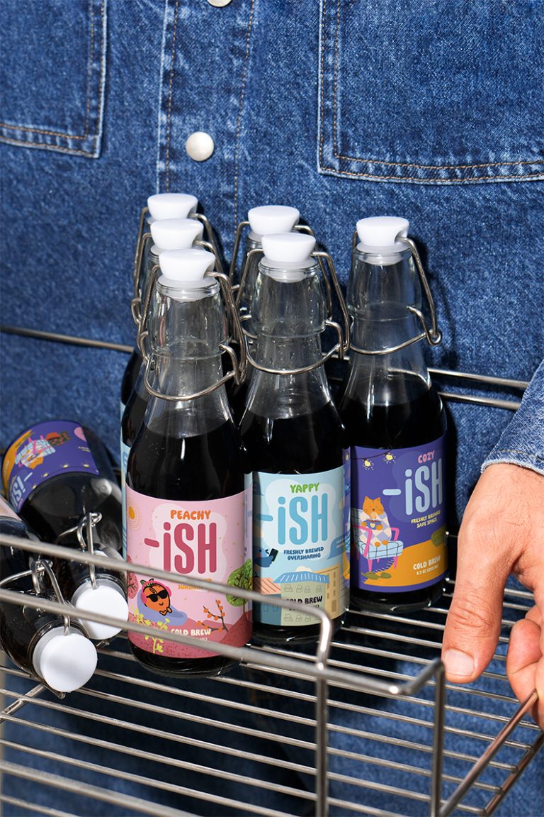

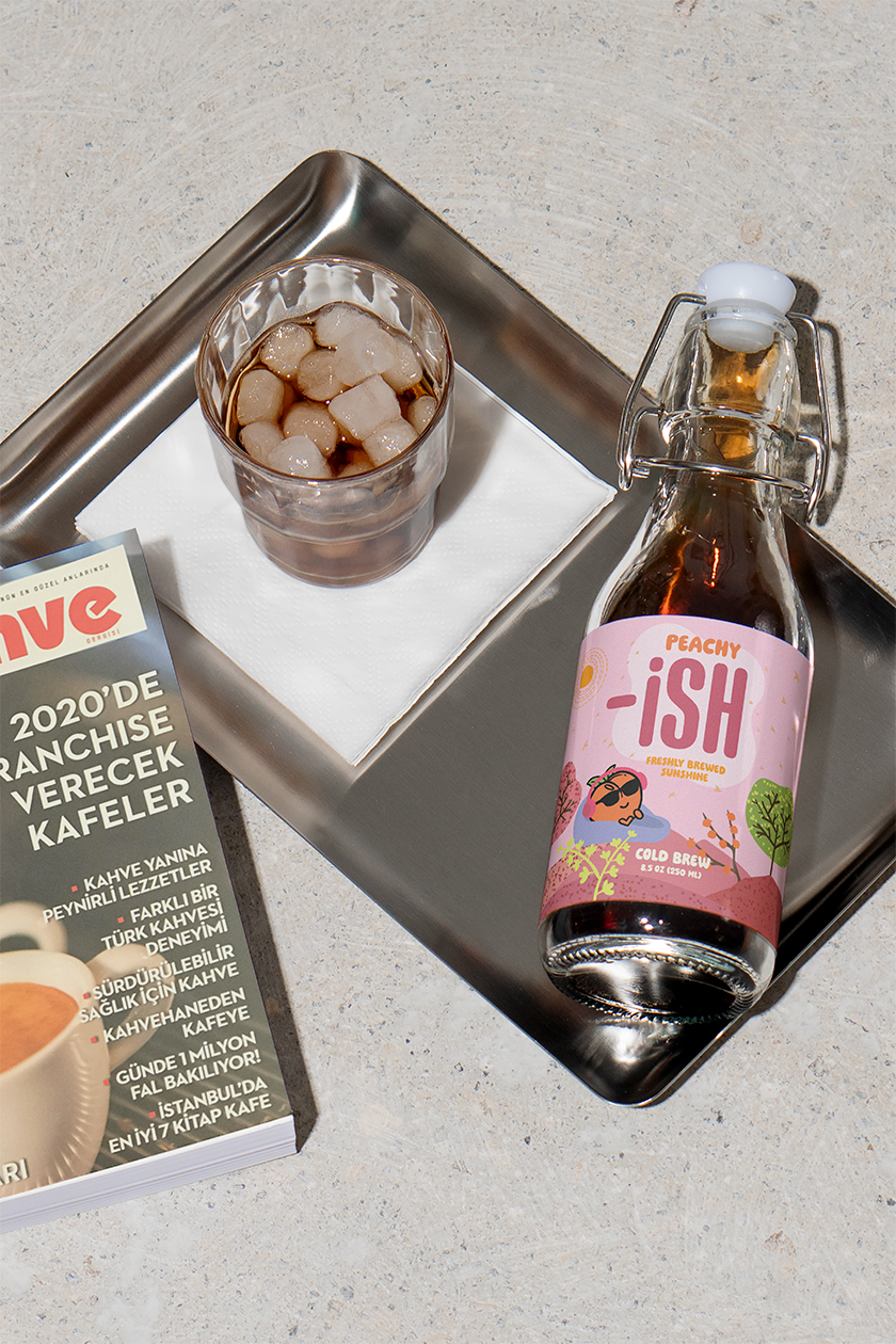
This summer, I created -ISH, a cold brew packaging project inspired by my name (Ishita) and the ever-shifting moods I cycle through in a day. As someone who brews cold brew at home regularly, I wanted to bring joy to the routine by designing my own playful, mood-based bottles.
Each bottle acts like a mood verb, a visual and emotional cue for how I’m feeling at a certain hour:
- ☀️ Peachy-ISH (morning optimism)
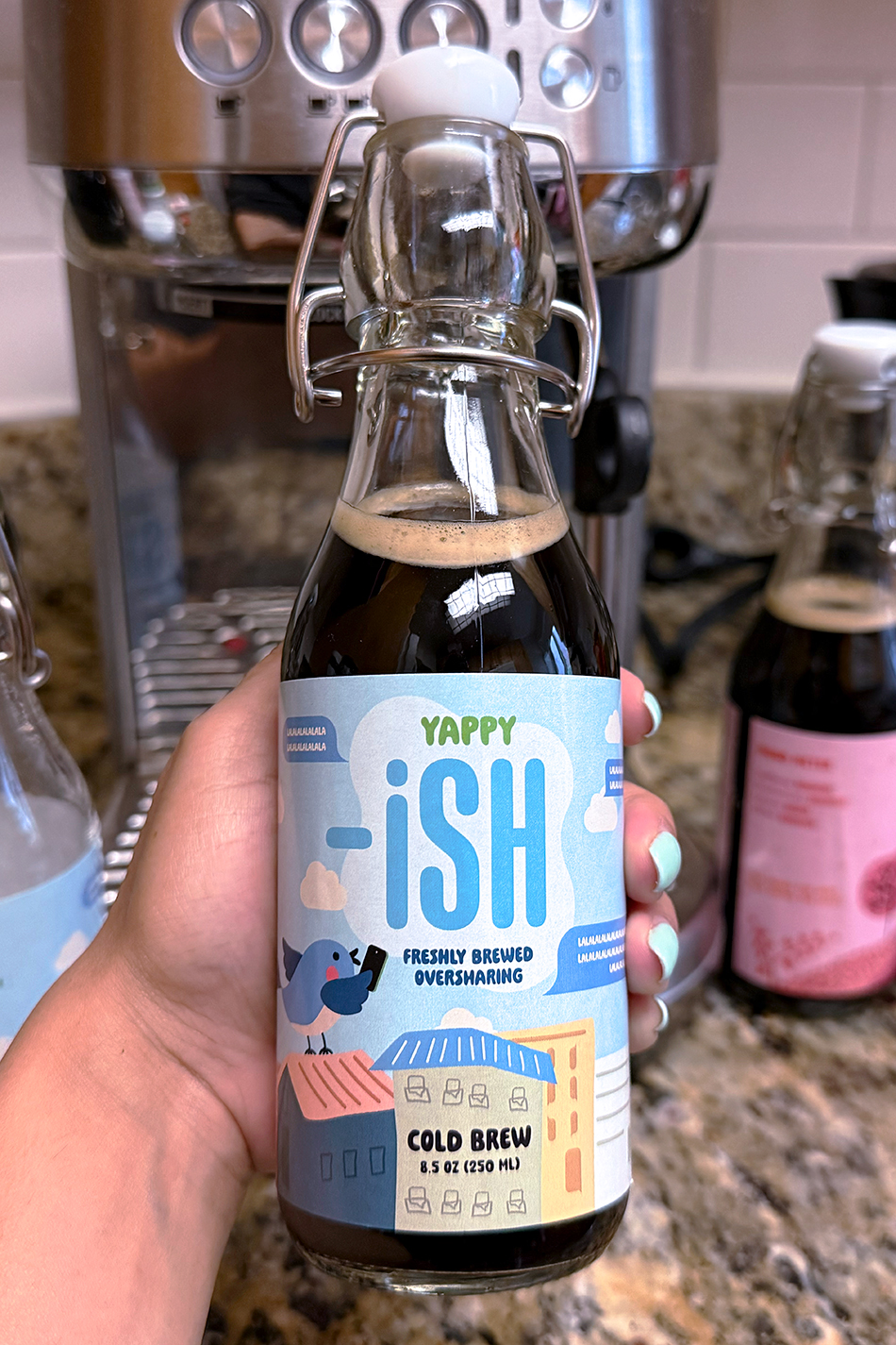
- 🌪️ Yappy-ISH (afternoon chaos spiral)
- 🌙 Cozy-ISH (evening calm and curl-up vibes)
The project name plays on the familiar “ish” suffix we use when life doesn’t fit into neat boxes, like tired-ish, fine-ish, or happy-ish. At the same time, it’s a nod to my name and personality, bringing a sense of intimacy to the packaging.
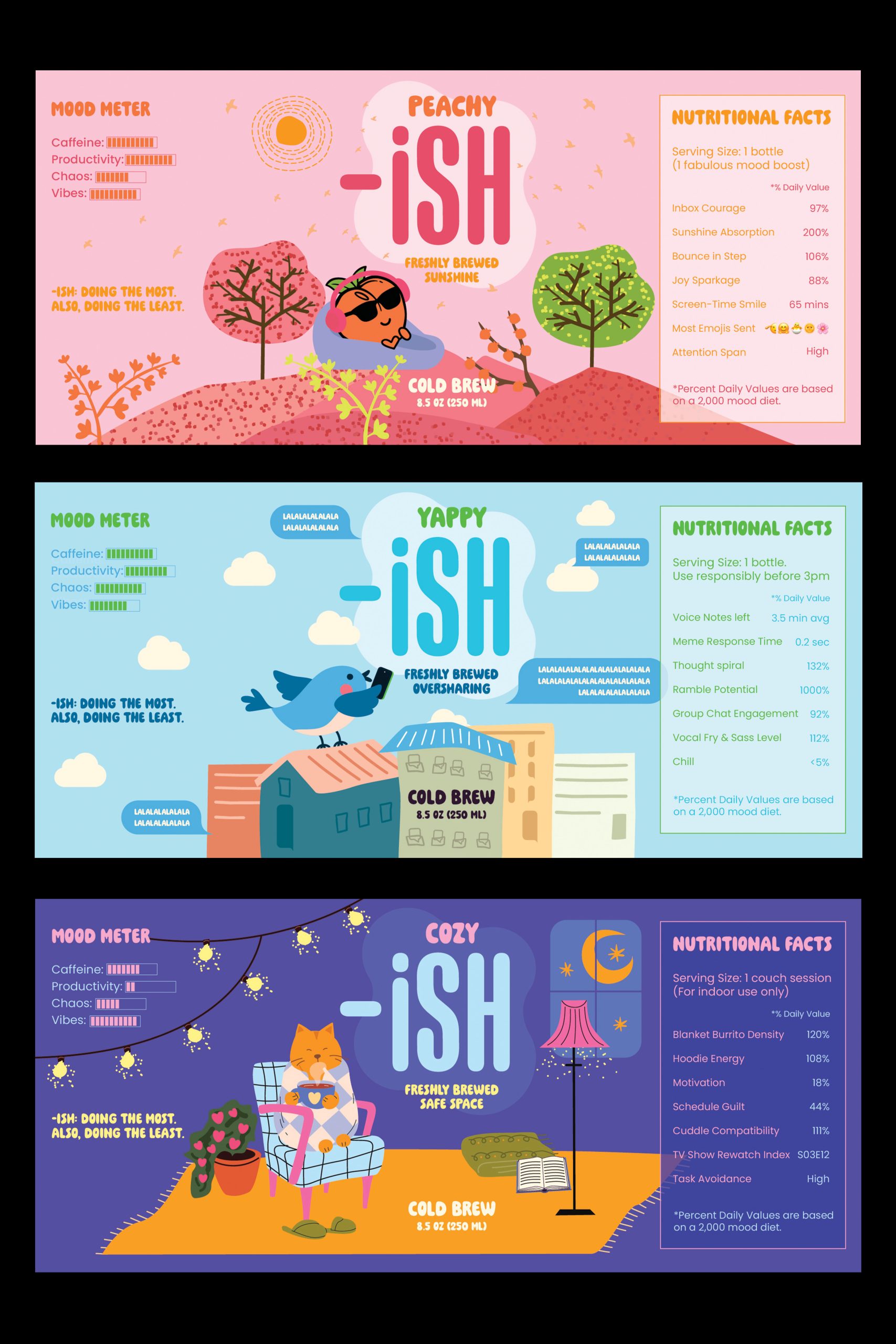
The visual language of -ISH is rooted in bold, colorful illustrations that feel vibrant, mood forward, and undeniably personal. Each label features a distinct color palette and world-building design inspired by the mood it represents, from the sun-soaked optimism of Peachy-ISH to the overstimulated swirl of Yappy-ISH to the warm, dim calm of Cozy-ISH. Each bottle features a cheeky Mood Meter, a playful bar chart that reflects the emotional energy behind each brew. It’s paired with mock Nutritional Facts that turn everyday feelings into data, topped off with a wink.
While made for personal use, -ISH is a love letter to creative energy, emotional range, and the little joys that shape our routines.

 United Creatives Studio
 Kingdom & Sparrow
 Anastasia Bakhmatskaya
 CreativeWise
 Great and Golden
 Ximena Ureta Design Studio.
 Sorted Branding
 Lisa Sirbaugh Creative
 vitoramockup
 YQIAN
YQIAN Navegante
 Anastasia Cherepanova | xtramez
 Polaris Designs
 pavlyai
 Milena Kocharyan
 monther al omari
 Mohamed sherif midoo
 DESIGN CONCEPTS
 mmdesign
 markcreativestudio
 Rosario Lo Iacono