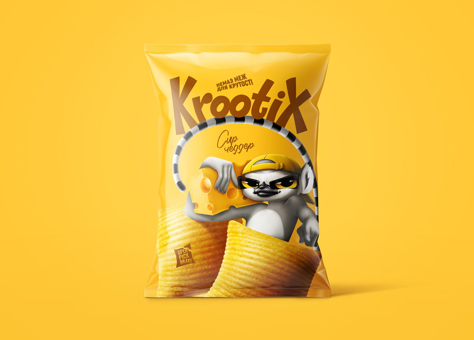

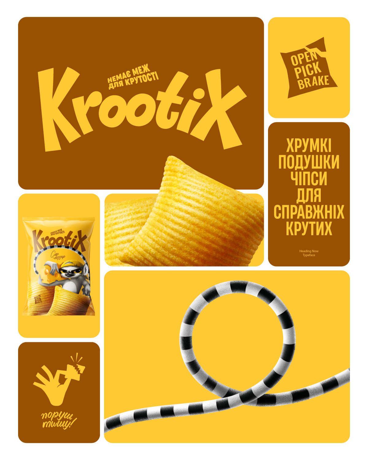
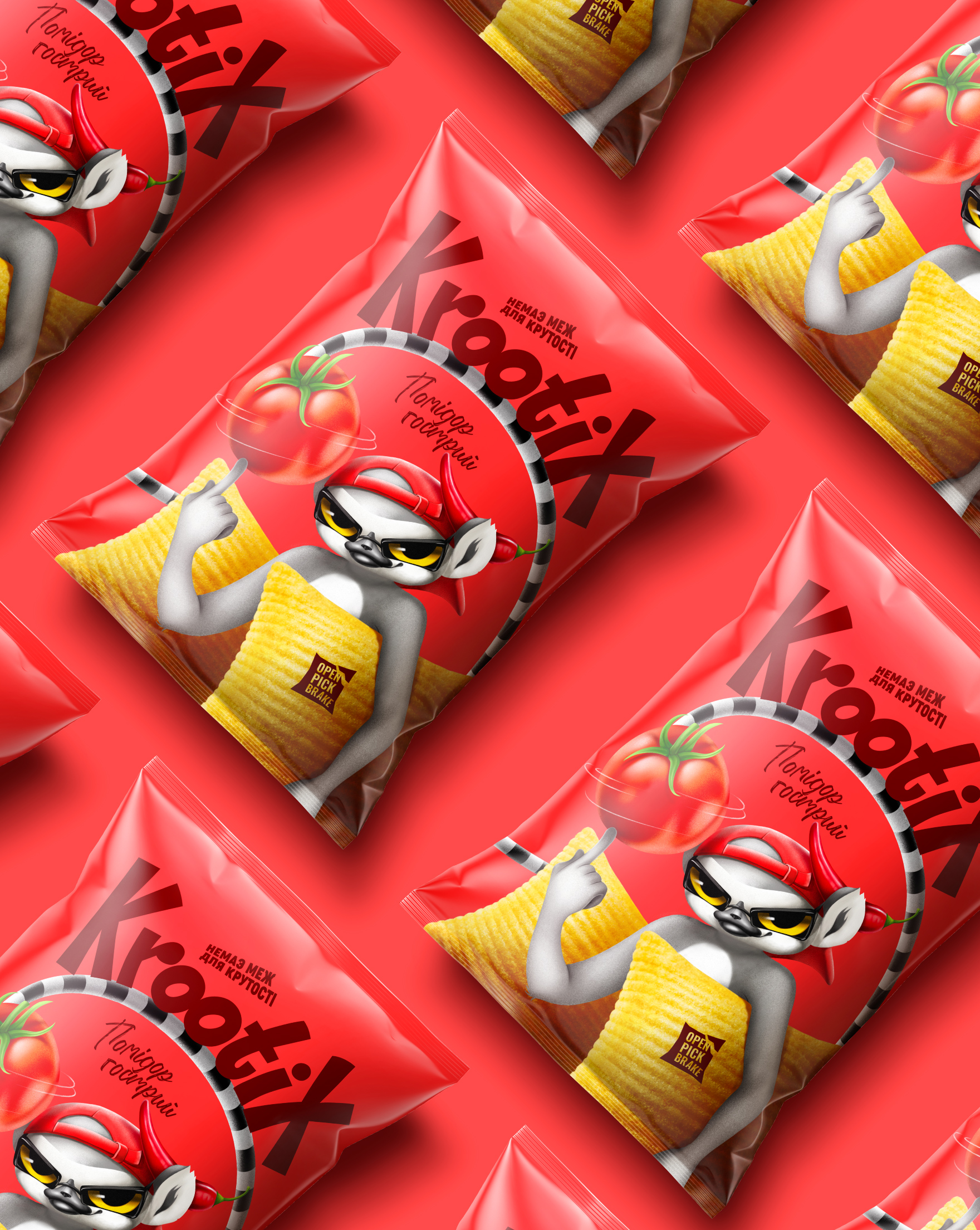
KROOTIX: branding and packaging design for a new Ukrainian chips brand.
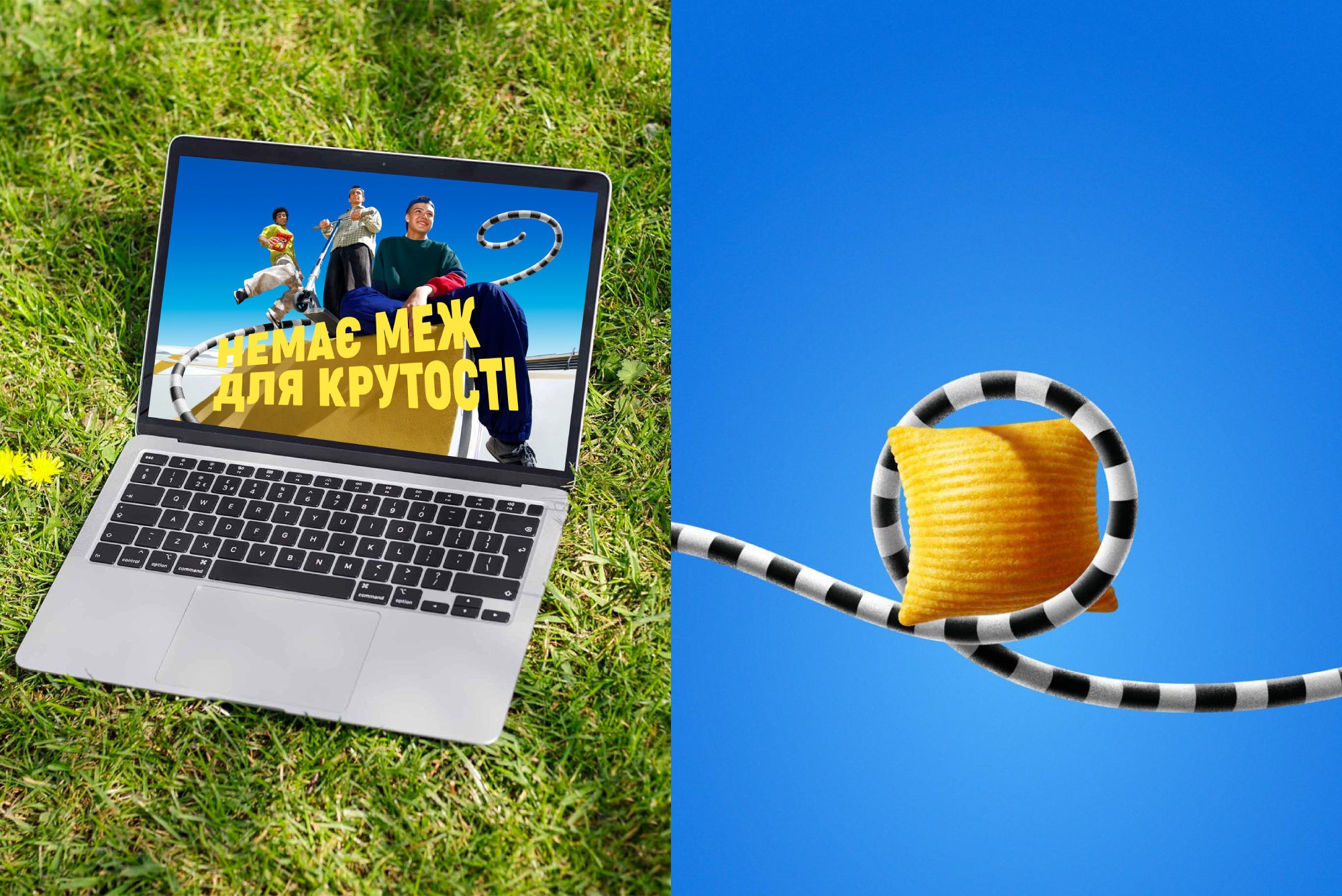
This project started with a deep dive into the audience: young people, mostly school students and teenagers. Pillow chips are especially popular among this group, who treat them as a fun, social ritual. Whether it’s after school, at a party, or just a moment with friends – the experience is always dynamic, noisy, and full of energy.
We used these insights to build a brand world that feels just as playful and expressive. The name “Krootix” is a created word, rooted in the Ukrainian “крутий” (cool), with a bold and rhythmic sound “ix” that places it naturally in the snack category.
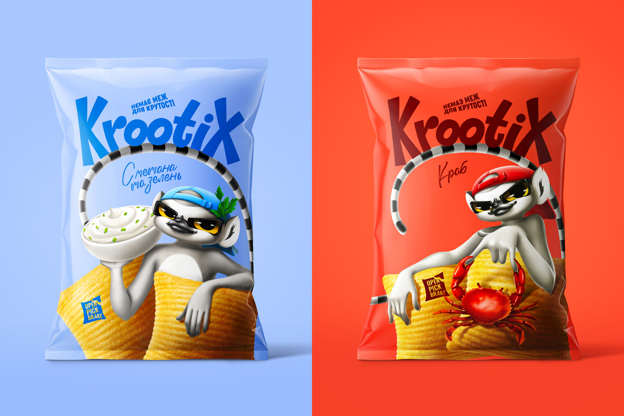
The mascot, a lemur became the symbol of this free, youthful spirit. Always in motion, always part of a group, always playful. Each flavor tells a new story, with the lemur interacting differently with the ingredients. In the cheese packaging, for example, he holds the cheese like a speaker, turning flavor into rhythm.
We developed the naming, concept, illustration, and packaging design – translating the energy of the audience into a brand that invites them to be bold, loud, and unapologetically themselves.


 butterflyhunters
 monther al omari
 Asprey Creative
 About House of Ta
 Up-Brands
 KJS CRAFT
 hello ocean
 PG Branding
 CF Napa Brand Design
 booouuuche
 Hyejung Choi
 Abbydraw Designs Unique Conceptual Branding & Packaging Designing Ideas
 Hollóka Grafikai Műhely / Graphic Design Studio
 Minim Brand Design
 saerom81
 YNL
YNL bilel tkouri
 vitoramockup
 Lampra
 Sanavala
 www.branding.uz
 alchimistestudioParis
 Estudio Argo
 Modern Theory