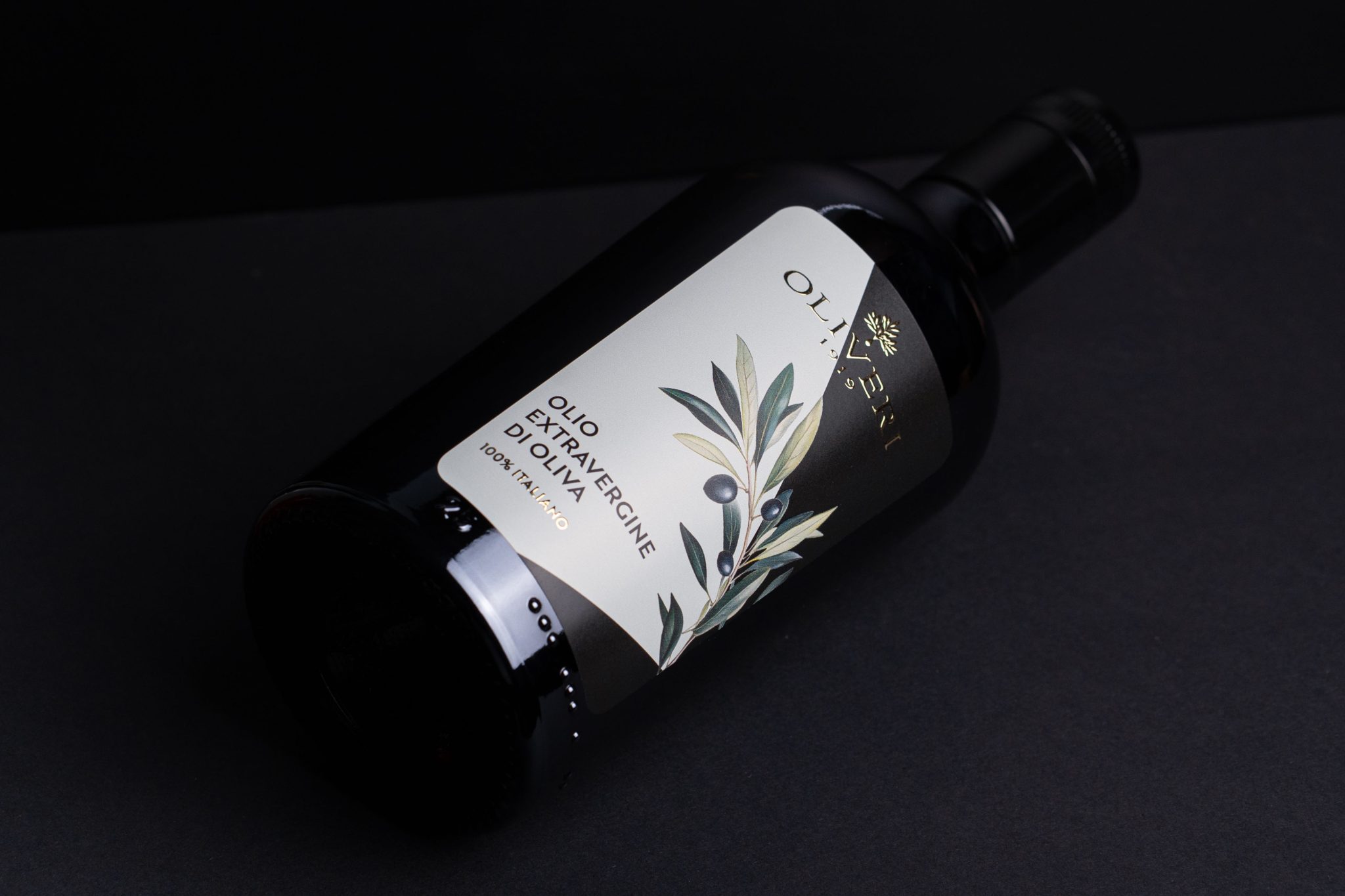

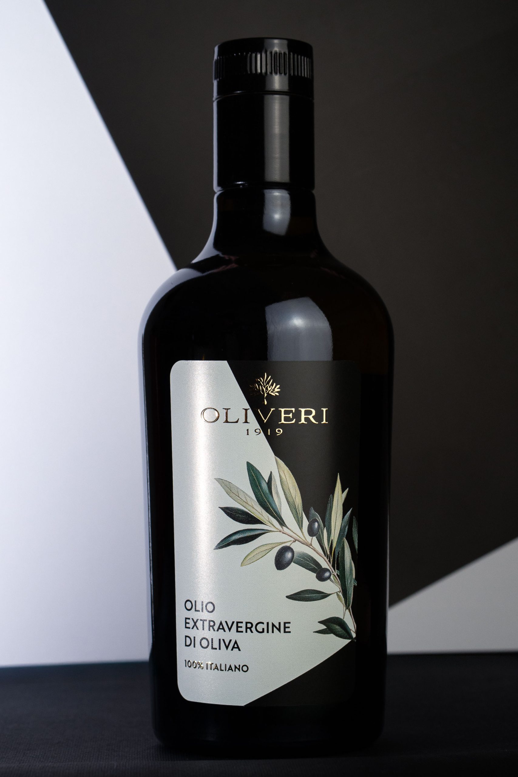
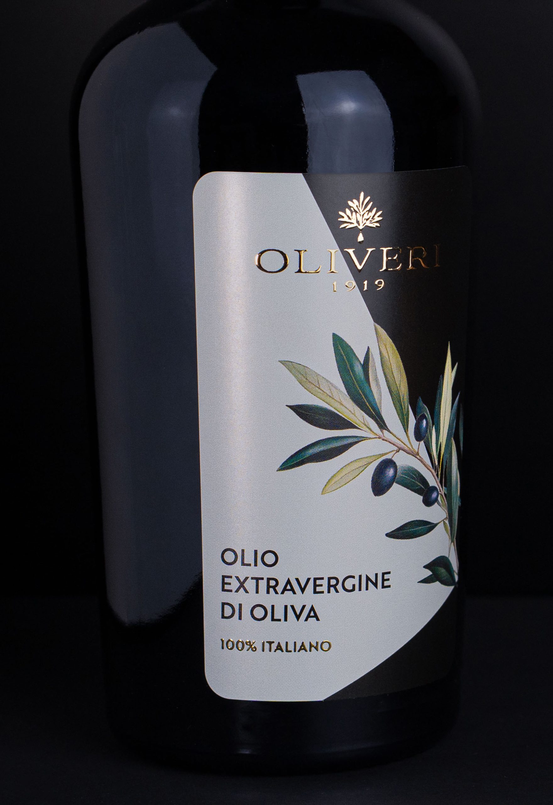
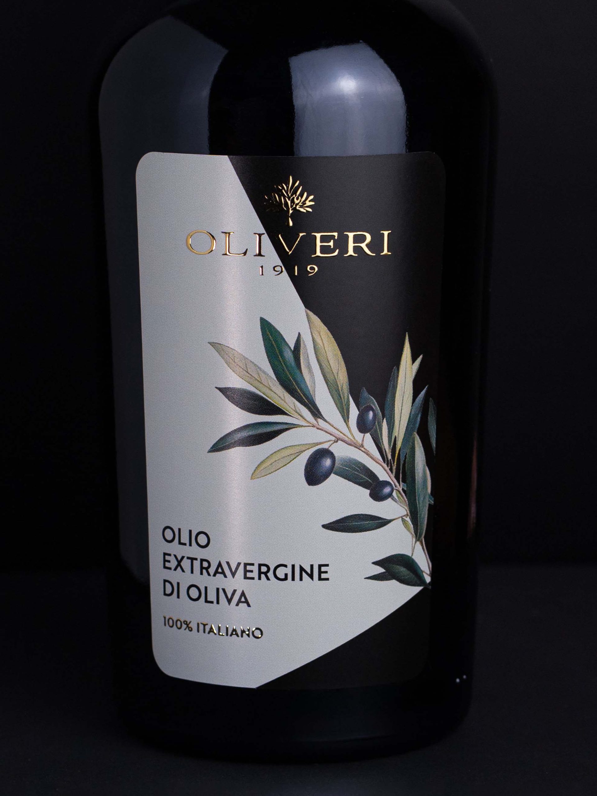
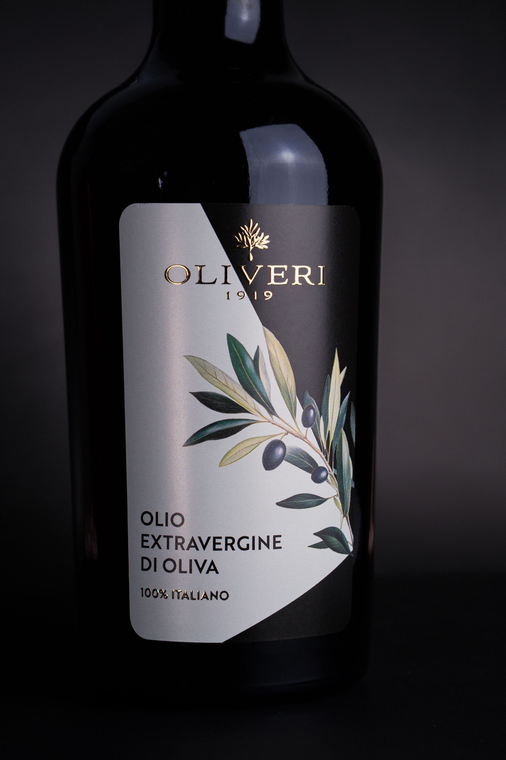
A label that interprets tradition with a contemporary twist.
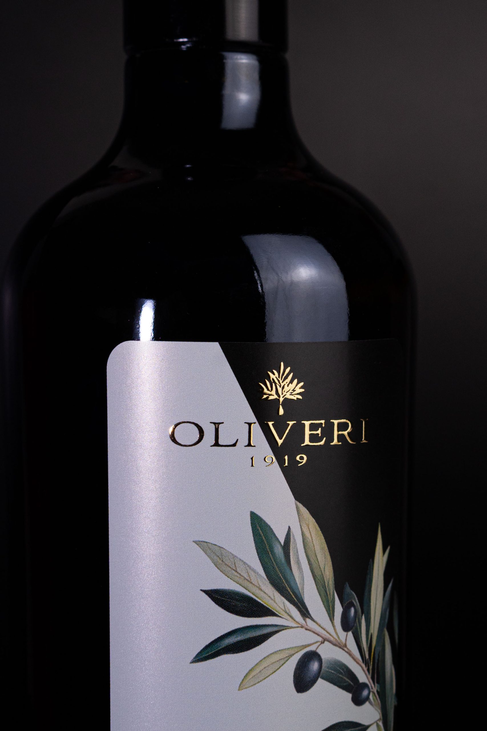
The name OLIVERI, sliced diagonally by the geometry of the label, creates a double meaning: OLI VERI (“true oils”).
A visual and semantic play that reinforces the ideas of authenticity, truth, and quality.
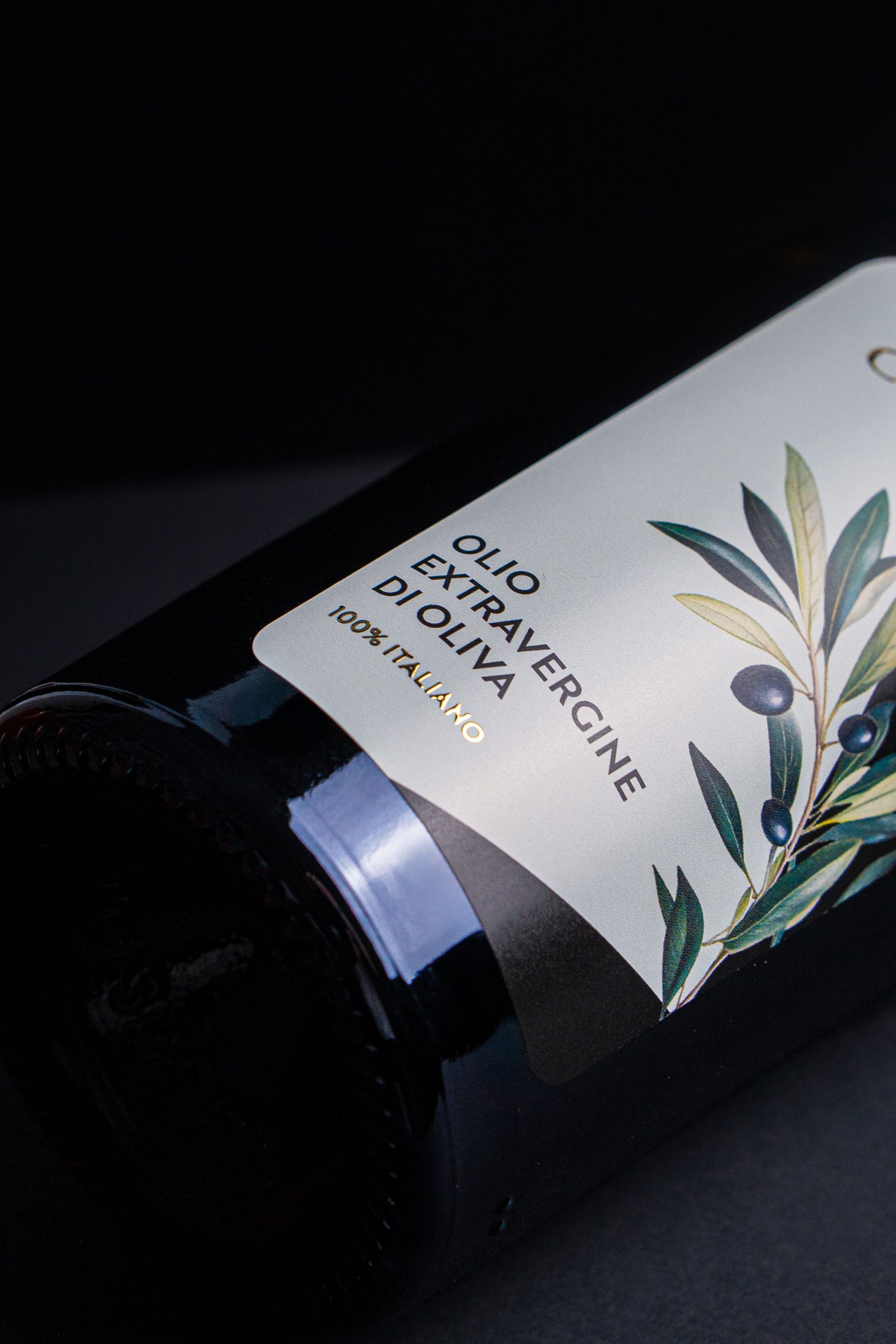
The background is split between deep black and mother-of-pearl, creating a sharp yet harmonious contrast.
The olive branch, drawn with realistic detail, takes center stage on a label that tells the story of origin, raw material, and the craftsmanship behind it.
A touch of warm gold completes the composition with a precious accent—paying tribute to the brand’s history and its timeless value.
 Affogato Brand Design
 Backbar Studios
 hello ocean
 POSH FMCG BRANDING
 Luciana
 Valérie Colace
 marjusguza
 Z9BKAdsgn
 Lilith Sivolenko
 Daria Levina
 Masha Kulichkova
 monther al omari
 Yana Chernova
 Atiq Alam
 ezgidesignstudio
 Pips Marin
 Antonia Skaraki
 Ezi Brand Design
 Kanishka Chhajer
 Zachary Kent
 SOT B&D
 Normal studio
 Garry Veda