

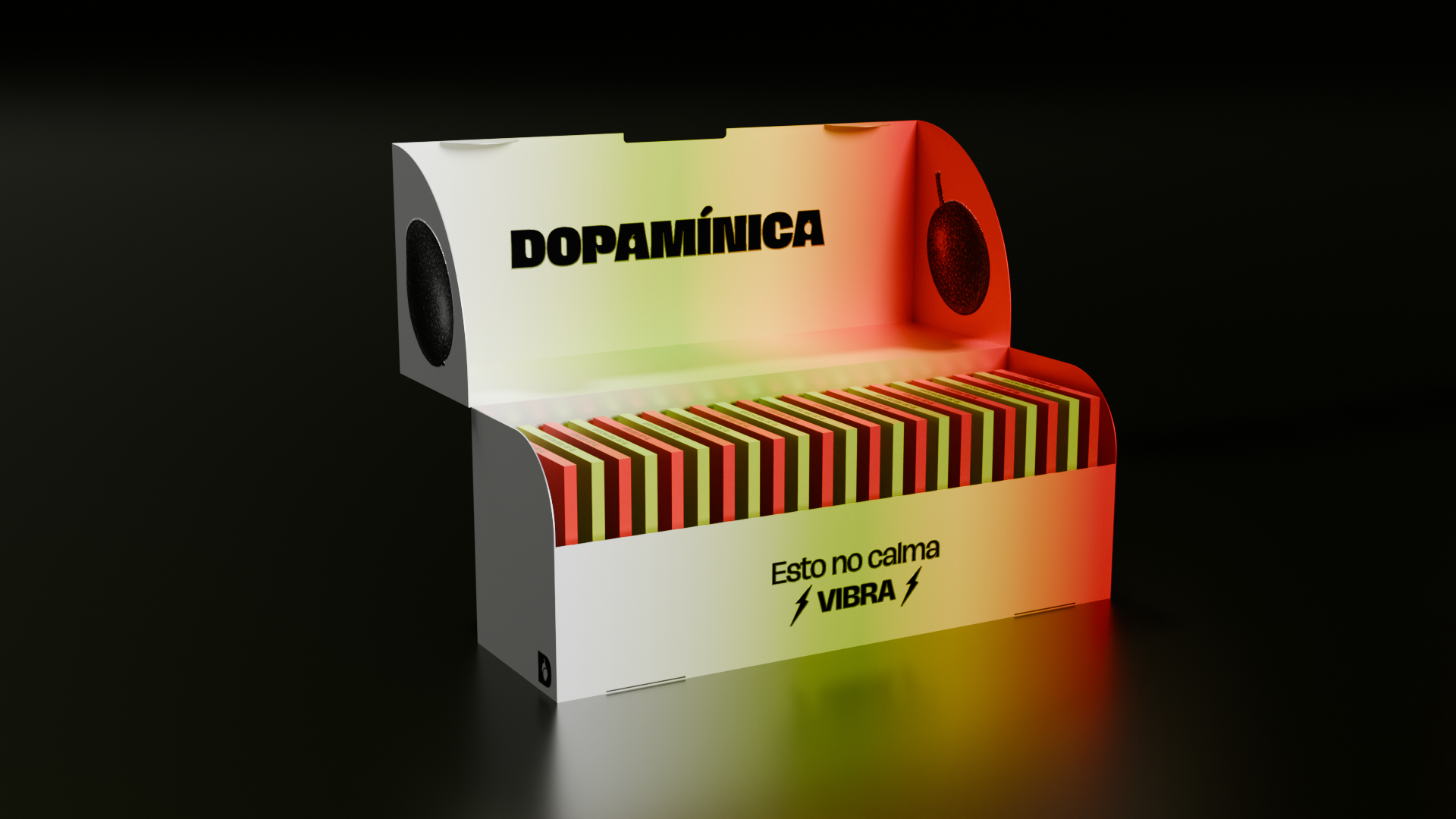
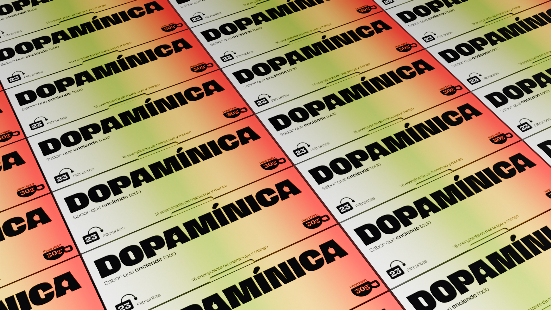
Tea doesn’t have to be calm—and neither does its identity. That’s why we created Dopamínica, an infusion brand born from scratch to break tradition. In a market flooded with serene, predictable options, Dopamínica bursts in like a shot of tropical energy: bold, vibrant, and unapologetically editorial.
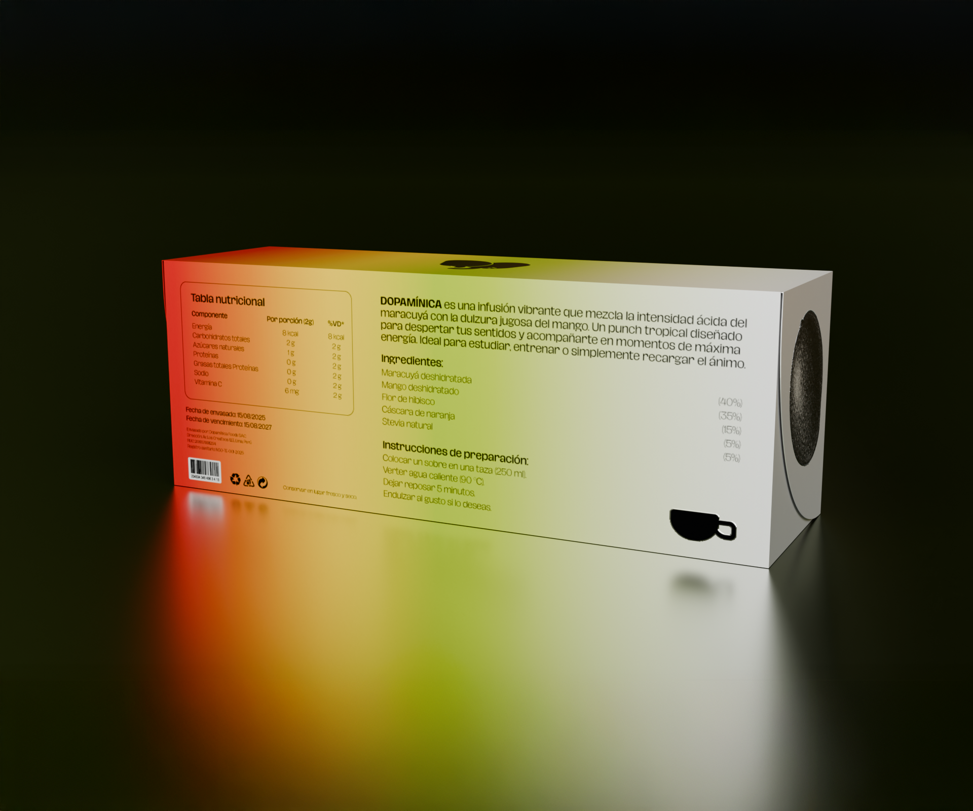
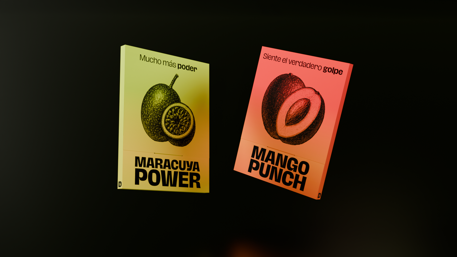
The name itself is both statement and promise: not to soothe, but to ignite. From there, the entire visual system was built with bold typography, adaptable pictograms, and an intervened photographic style that balances real freshness with graphic intensity.
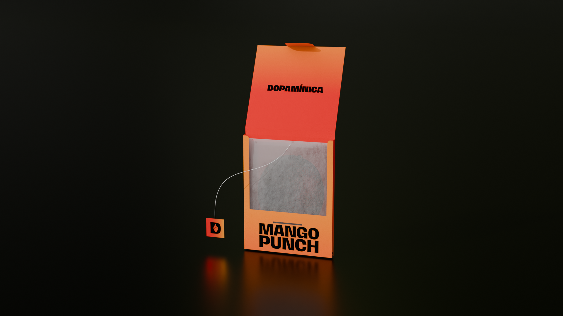
The color palette draws from passion fruit and mango, transforming them into flowing, high-impact gradients—a true visual stimulus. Every sachet, every box, every detail was designed to radiate vitality, order, and a distinctly dopaminic character.
Dopamínica doesn’t calm—it vibes. Its visual identity is pure energy, created to inspire, spread, and extend beyond packaging into a full-on brand experience.







 Eva Chistyakova
 Puigdemont Roca
 marianaaworks
 bloomburo
 andreamarinnn
 Alina
Alina Saadmost
 Bruhken
 Maruf Nishat
 Richest Branding Pvt. Ltd.
 Sophiagdotcom
 saifullahmaslool
 Up-Brands
 Atiq Alam
 daniitenaa
 artworkbysofia
 monther al omari
 Valérie Colace
 Tianqii
 Anum
Anum anisameur
 tauqueer
 SOT B&D
 Palashcc
 Derrick Lin