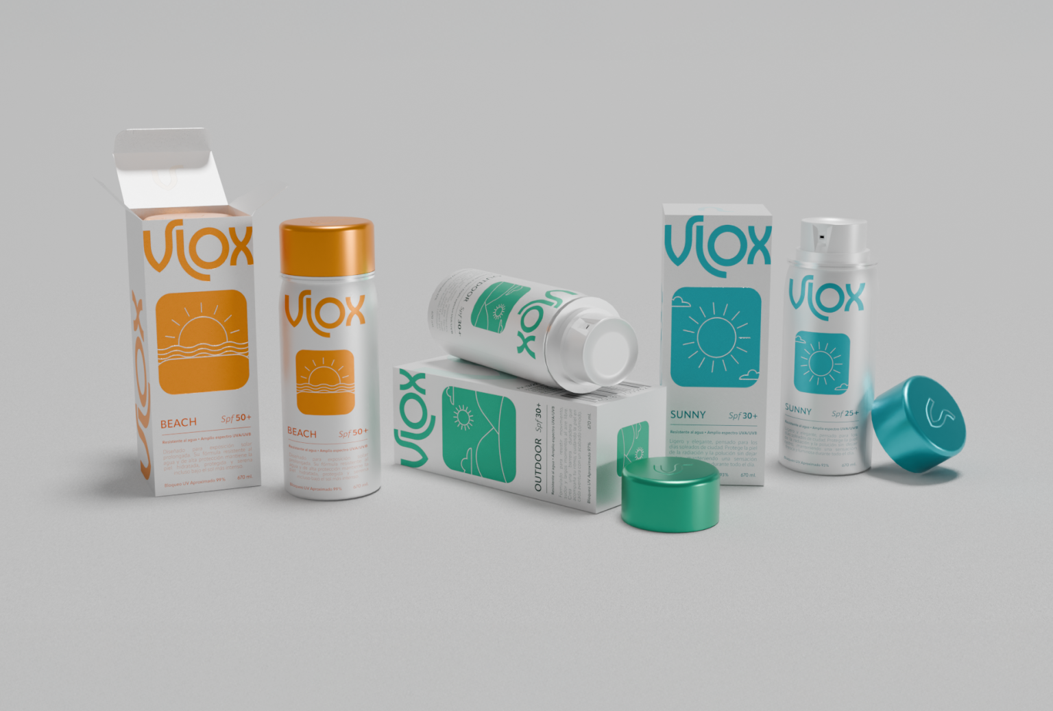

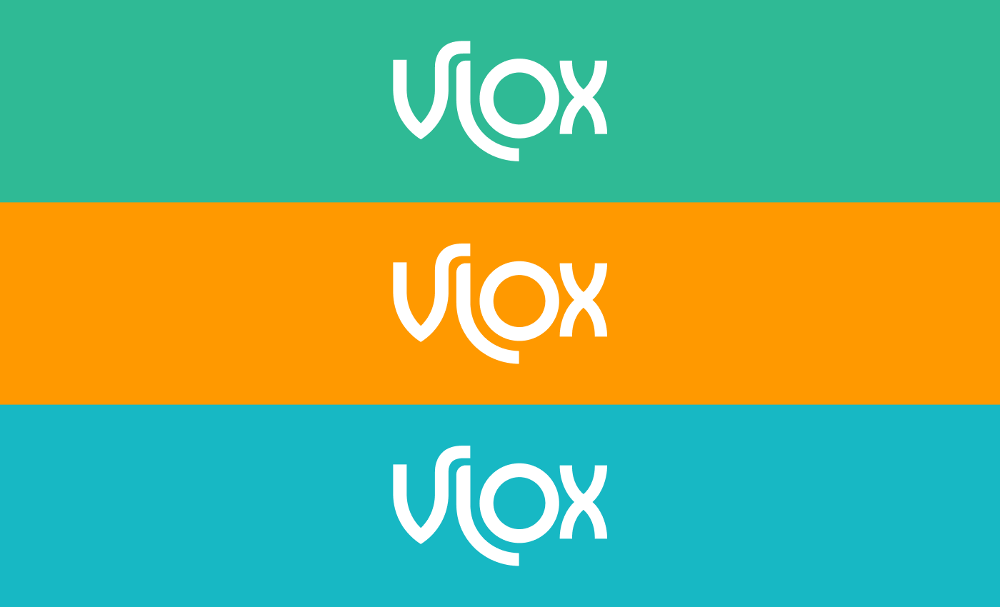
We developed the branding and visual identity for Vlox, a sunscreen brand born from simplicity, authenticity, and functionality.
The project is built on a rational visual structure that balances form, function, and clear communication. Its typography, featuring rounded lines and generous proportions, reinforces the ideas of care and approachability. From this visual language, we designed a packaging system organized through a precise grid and highly legible graphic elements.
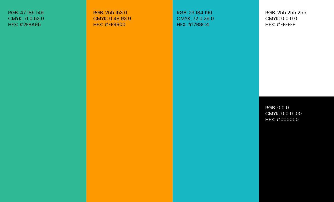
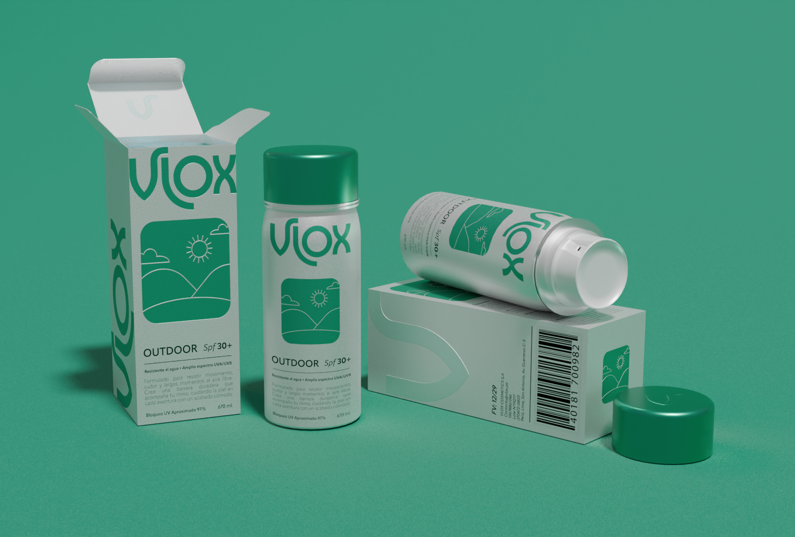
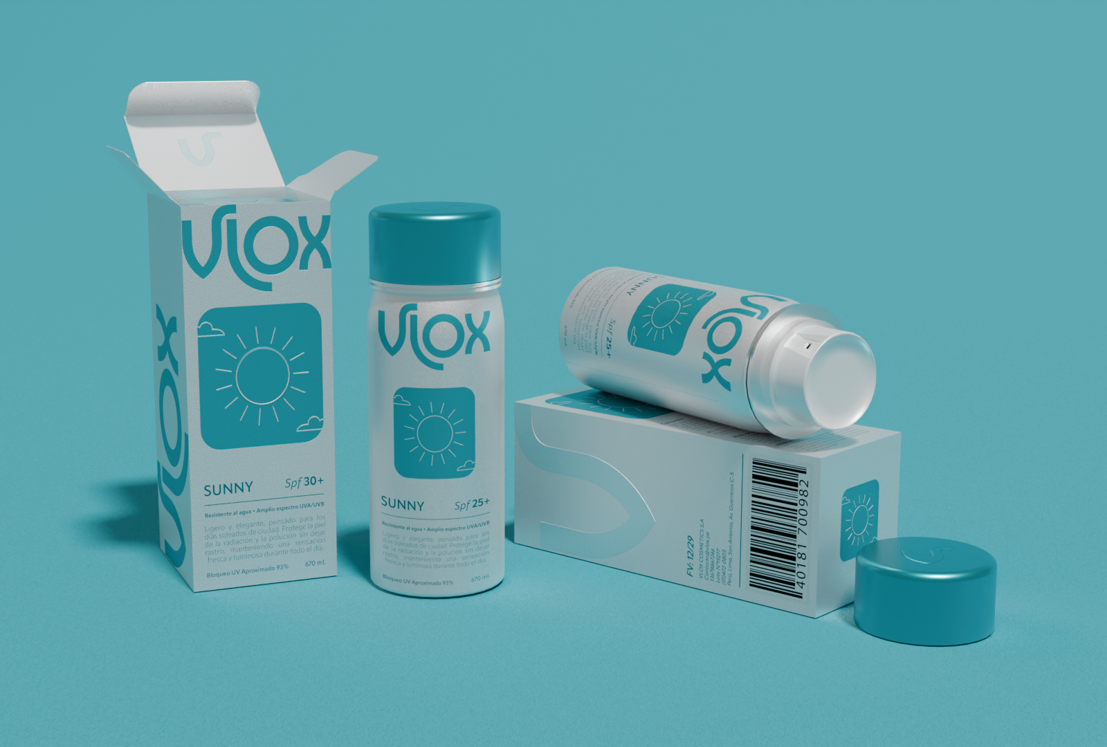
Each line — Sunny (SPF 30+), Outdoor (SPF 30+), and Beach (SPF 50+) — is distinguished by its exclusive color palette (turquoise, green, and orange) and its own sun icon, created as a geometric representation of its environment of use.
The packaging features matte surfaces and flat inks that highlight the purity of the white base, creating a clean and orderly look. This harmony between color, form, and material reflects the brand’s core values: reliable protection, honest design, and calm presence.
Vlox transforms the daily act of sun care into an aesthetic and sensory experience, where every visual decision reinforces the brand’s promise of safety, serenity, and trust.






 Affogato Brand Design
 Backbar Studios
 hello ocean
 POSH FMCG BRANDING
 Luciana
 Valérie Colace
 marjusguza
 Z9BKAdsgn
 Lilith Sivolenko
 Daria Levina
 Masha Kulichkova
 monther al omari
 Yana Chernova
 Atiq Alam
 ezgidesignstudio
 Pips Marin
 Antonia Skaraki
 Ezi Brand Design
 Kanishka Chhajer
 Zachary Kent
 SOT B&D
 Normal studio
 Garry Veda