
ABOUT
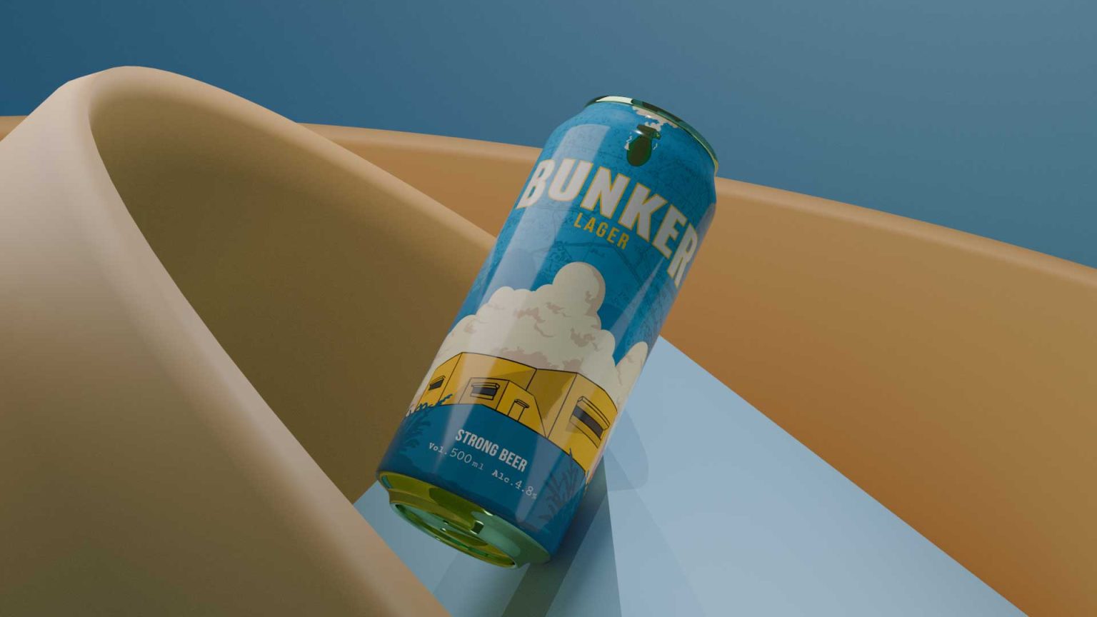
Bunker Lager is a strong beer designed around the idea of pressure, resistance, and movement. The product positions itself as bold, direct, and uncompromising, aimed at drinkers who value character over polish.
Developed by Kabir Kashyap Design Co., a branding company in Bangalore, the project focuses on using form, texture, and spatial tension to communicate strength without relying on excess ornamentation or narrative-heavy graphics.
CONCEPT
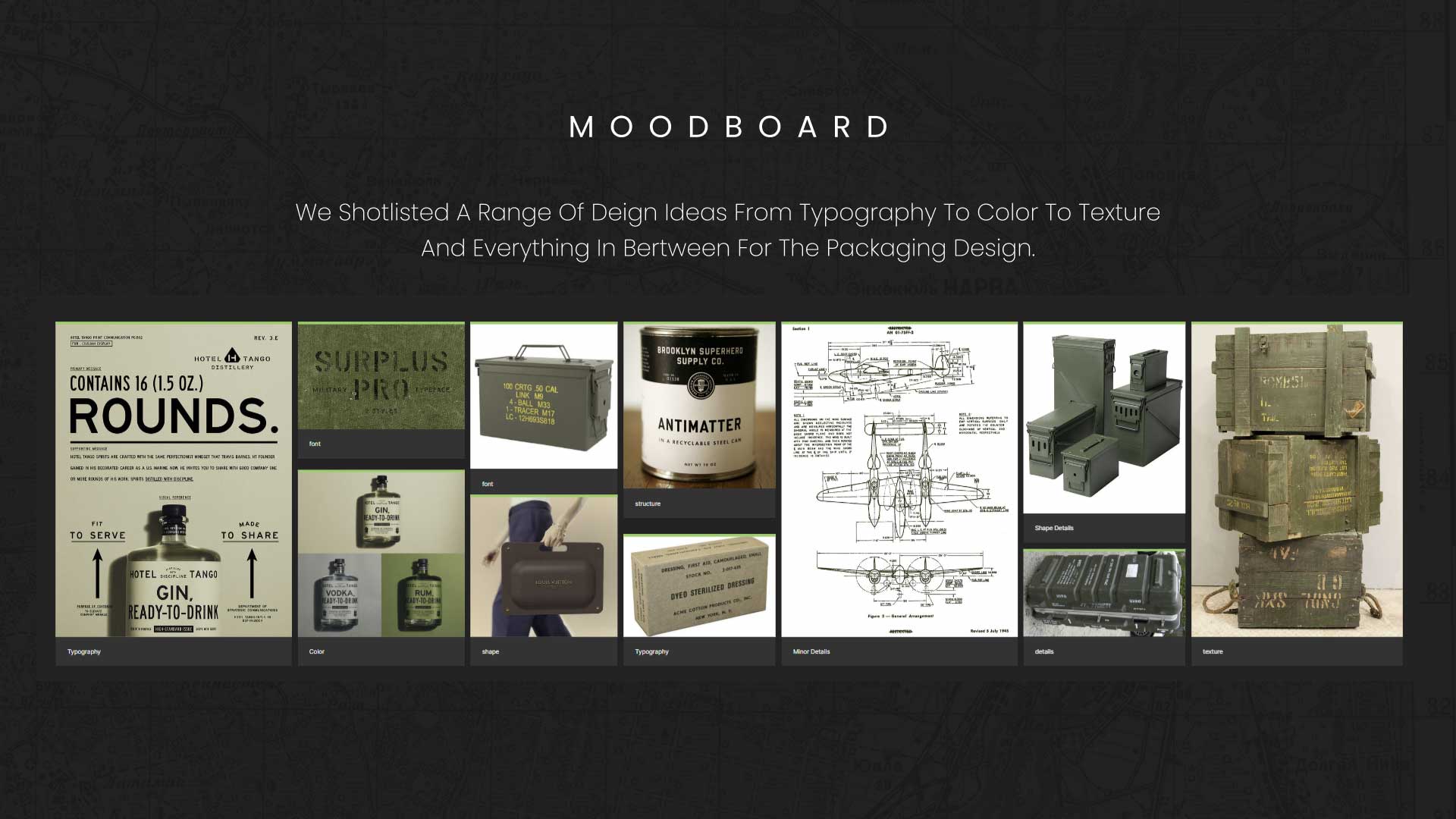
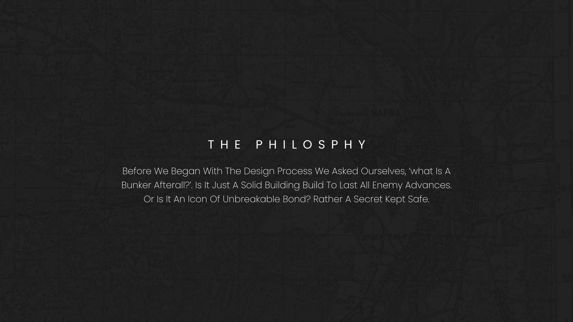
The packaging concept draws inspiration from fortified structures and wartime architecture, particularly references associated with Pearl Harbor and Japan. These spaces were designed to resist intrusion, absorb impact, and remain intact under pressure.
The visual idea explores what happens when something refuses to stop at the surface.
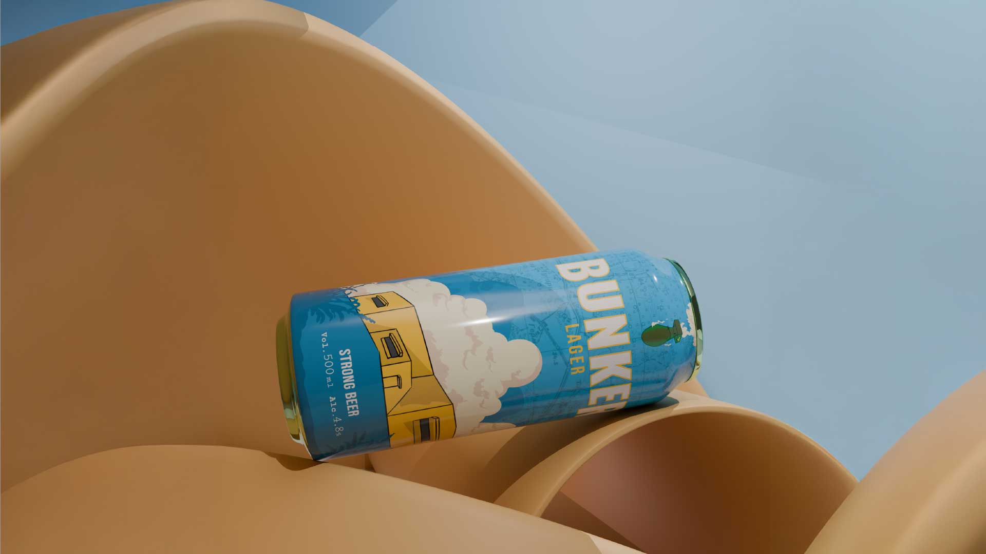
Instead of placing the can neatly within a setting, the design positions it mid-impact, wedged through rigid forms that appear smooth, solid, and immovable. The moment captured is not before or after, but during resistance, where structure begins to give way.
The can becomes the force. The environment becomes the test.
SOLUTION
The solution was to build a physical world around the can that feels engineered rather than decorative. Abstract architectural forms were designed to resemble bunkered surfaces and reinforced barriers.
Rather than adapting the packaging to the space, the space is disrupted by the packaging. The can breaks alignment, cuts through volumes, and appears lodged where it does not belong.
This approach allows the product itself to communicate momentum, impact, and defiance without the need for explanatory text or symbolic illustrations.
TECHNIQUE
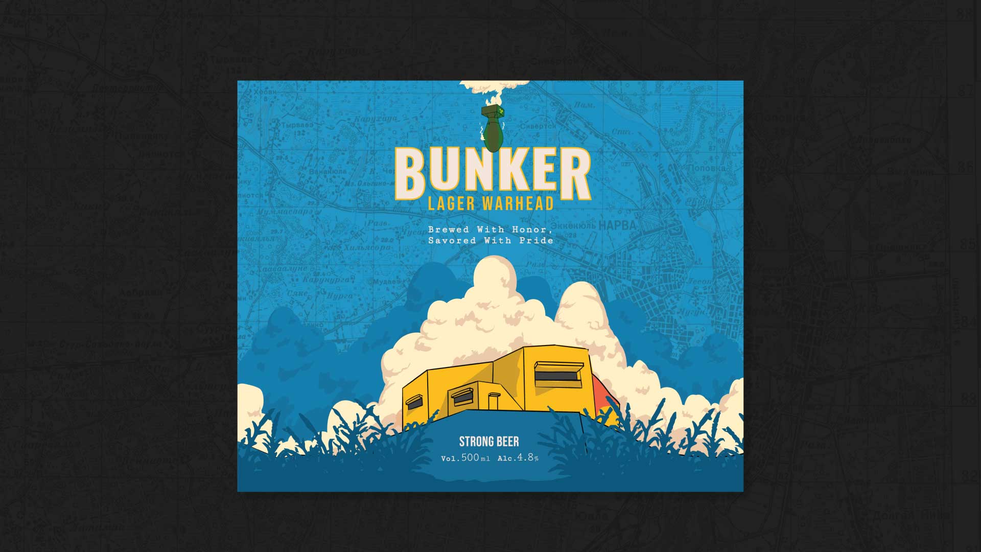
The packaging was developed using a combination of custom illustration, material-driven colour blocking, and 3D visualisation.
The can design uses a restrained colour palette with sharp contrasts and layered graphics to enhance depth and legibility at different viewing angles. The surrounding environments were modelled and rendered to emphasise scale, curvature, and resistance, creating a sense of tension between smooth surfaces and forced movement.
The final visuals were art-directed to feel paused at the point of impact, reinforcing the idea of pressure suspended in time.
WHAT MAKES IT UNIQUE
Most beer packaging focuses on storytelling, nostalgia, or lifestyle cues. This design avoids all three.
What makes this packaging distinctive is its refusal to soften the product through familiarity. There are no comforting cues, no decorative excess, and no attempt to “fit in.” The can is designed to feel intrusive, assertive, and unapologetic.
It treats packaging not as a container, but as an object in motion.
This approach reflects the design philosophy of Kabir Kashyap Design Co., recognised among the top brand consultants in Bangalore for building concept-led identities that rely on form and intent rather than surface trends.
RESULTS
The final outcome is a packaging system that communicates strength and resistance through composition rather than explanation. The visuals are immediately striking, highly memorable, and adaptable across digital, print, and physical applications.
By turning the can into the central force within the composition, the design creates a strong psychological impression that stays with the viewer long after the first glance.
The project stands as an example of how a best creative branding agency in Bangalore can translate abstract ideas into tangible, high-impact packaging without losing clarity or purpose.

 monther al omari
 Shustova p
 mutta
mutta @Allenarts13
 Sirka Agency
 Atiq Alam
 Dozen Agency
 j.substance
 SCD
SCD Cristian Lepore | crilep Copia
 Chris Creative Works
 Aligned Design Co.
 CreativeWise
 Agence des Coteaux
 Ramyromeo2024
 Grain of Design ®
 Ebbi
Ebbi BFS Studio
 butterflyhunters
 Asprey Creative
 About House of Ta
 Up-Brands
 KJS CRAFT
 hello ocean
 PG Branding