
Nourvie is a premium olive oil brand built around a simple but bold idea: that the finest ingredients deserve packaging just as expressive as the flavors inside. What began as a brief to design single-serve 10ml olive oil sachets evolved into a full sensory world — one where packaging doesn’t just contain a product, but tells its story.
The range spans four distinct variants — Pure Classic, Chilli & Honey, Basil & Garlic, and Herb & Rosemary — each with its own visual identity, color language, and ingredient narrative. The design system uses gradient-washed foil sachets that shift in tone from deep crimson to warm amber, forest green to soft sage, allowing each flavor to speak through color before a single word is read.
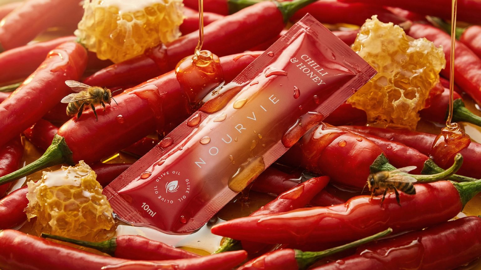
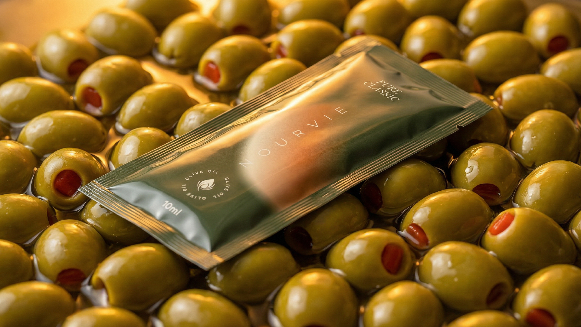
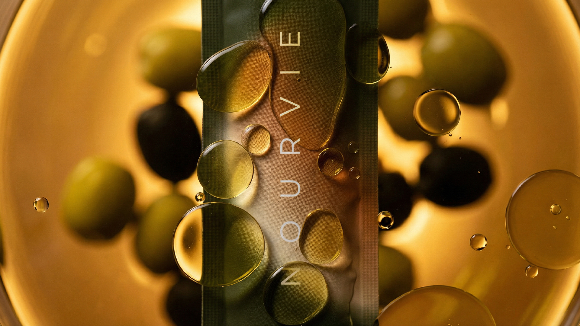
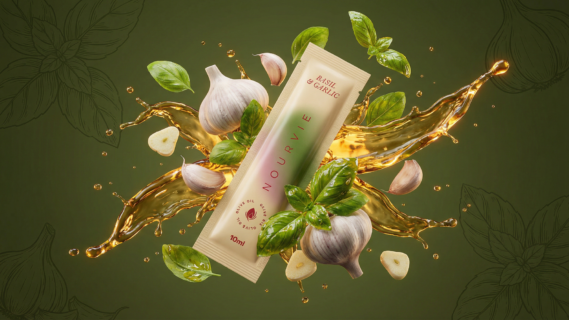
Every variant was shot in its natural ingredient world: the Chilli & Honey sachet nestled among fiery red chillies with honeycomb and live bees; the Pure Classic submerged in golden oil drops and marinated olives; Basil & Garlic suspended mid-air with a burst of herb-infused oil; Herb & Rosemary laid flat across a lush bed of fresh Mediterranean herbs. The photography was conceived as an extension of the packaging design itself — not a campaign afterthought, but a visual language that began at the label.
This project was conceived and executed by one of the leading graphic design studios in Bangalore, with a strategic approach that goes beyond aesthetics. The packaging was designed to function across retail shelves, hospitality settings, and direct-to-consumer gifting — each context demanding a different kind of visual authority. As a branding agency in Bangalore working with food and lifestyle brands, the studio brought together typographic restraint, material sensitivity, and flavor-forward art direction to create a cohesive system that feels both premium and approachable.
The logotype — NOURVIE — runs vertically across each sachet in fine, spaced letterforms, a deliberate choice that references European epicurean culture while feeling distinctly modern. The circular “Olive Oil” badge at the base of each pack anchors the design with craft credibility. The gradient body of each sachet does the heavy lifting: it signals flavor, evokes emotion, and photographs beautifully across every surface it touches.
Among branding companies in Bangalore, projects of this scale — where packaging design, photography direction, and brand identity are unified under a single creative vision — remain rare. Nourvie is a demonstration of what becomes possible when a design company in Bangalore operates with the ambition of a global creative studio.
The result is a packaging family that feels like it belongs in a Michelin-starred kitchen, a boutique deli, or a curated gift box — yet is grounded in the everyday ritual of good food and good oil. It is considered, confident, and crafted with intent.
This work reflects the broader philosophy of the studio: that packaging is not a vessel, but a voice. As one of the more recognized design agencies in Bangalore with a growing international portfolio, the studio continues to work with food, wellness, and lifestyle brands that are ready to build something lasting — not just something that looks good on a shelf, but something that earns its place in a person’s life.
Nourvie is that kind of brand. And this is the kind of work that only comes from being among the best branding agencies in Bangalore — and, increasingly, recognized as the best branding agency in India for premium food and lifestyle packaging.






 softmachine
 monther al omari
 alchimistestudioParis
 airobtq
 Buzz & Co.
 Ruby
Ruby themythographer
 IDNB Inc.
 viktorflr
 Zenpack
 Wessam Hussien
 samarabdelmonem
 StudioMordius
 Polaris Designs
 Atiq Alam
 duha mohamed
 HassanEtman22
 agarcia studio
 Wynand88
 Eva Chistyakova
 Maria Bukhtilova